Since 2009, HelloAsso has helped people across France get involved by making life easier for non-profits. By acquiring tools from across the sector, the social enterprise has grown from a simple service into a suite of solutions that caters to even the largest organisations. To get that across, and retain growing organisations as they scale, the brand architecture needed rethinking, along with a cohesive identity that could grow and adapt.
One insight guided our approach: France’s favourite brands are brands with values. Entirely free and built on solidarity, HelloAsso has a place among them : it just needed a face, a style, a world people could relate to and see themselves in. In short, the new identity had to make some noise.
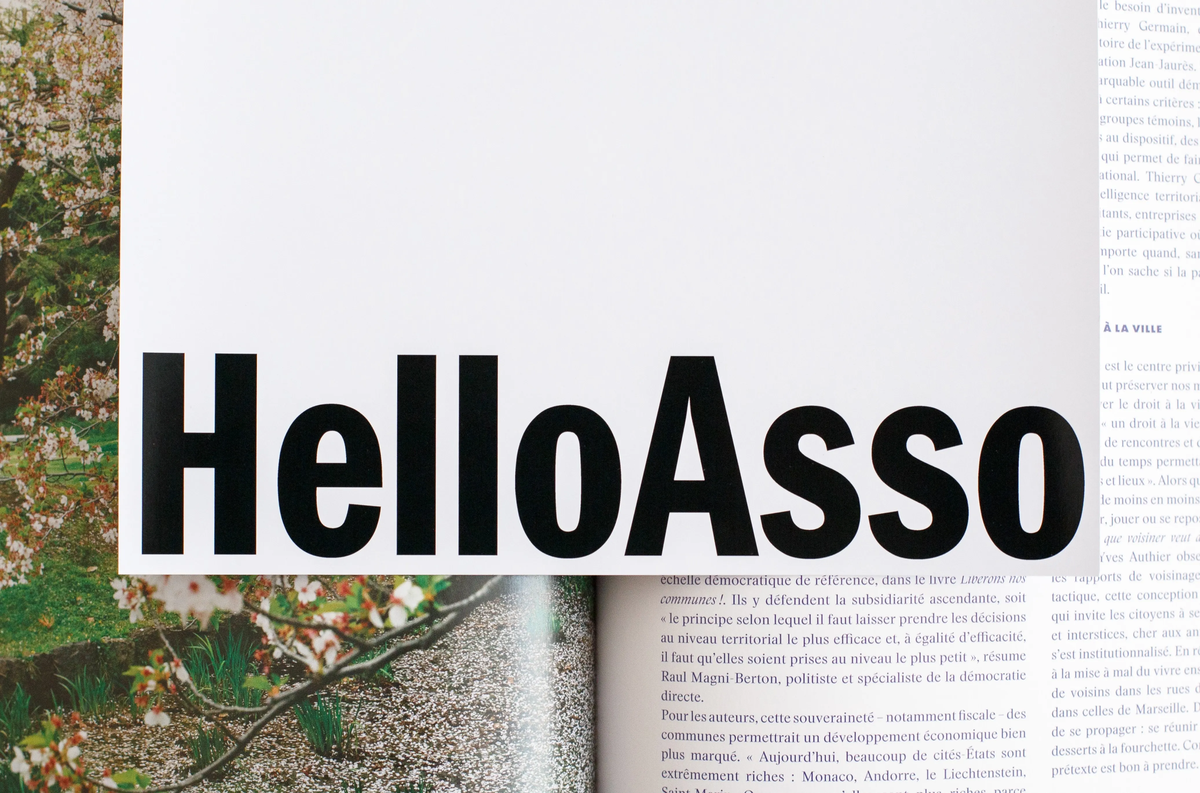
The result is a boldly campaigning parent brand, with knowing, assertive slogans, typography that echoes 1970s posters, unapologetic black and white, an extroverted colour palette and candid photography capturing real people. The mosaic pattern reveals the individuals behind the collective, with one square splitting in two to give the text room to spread out.
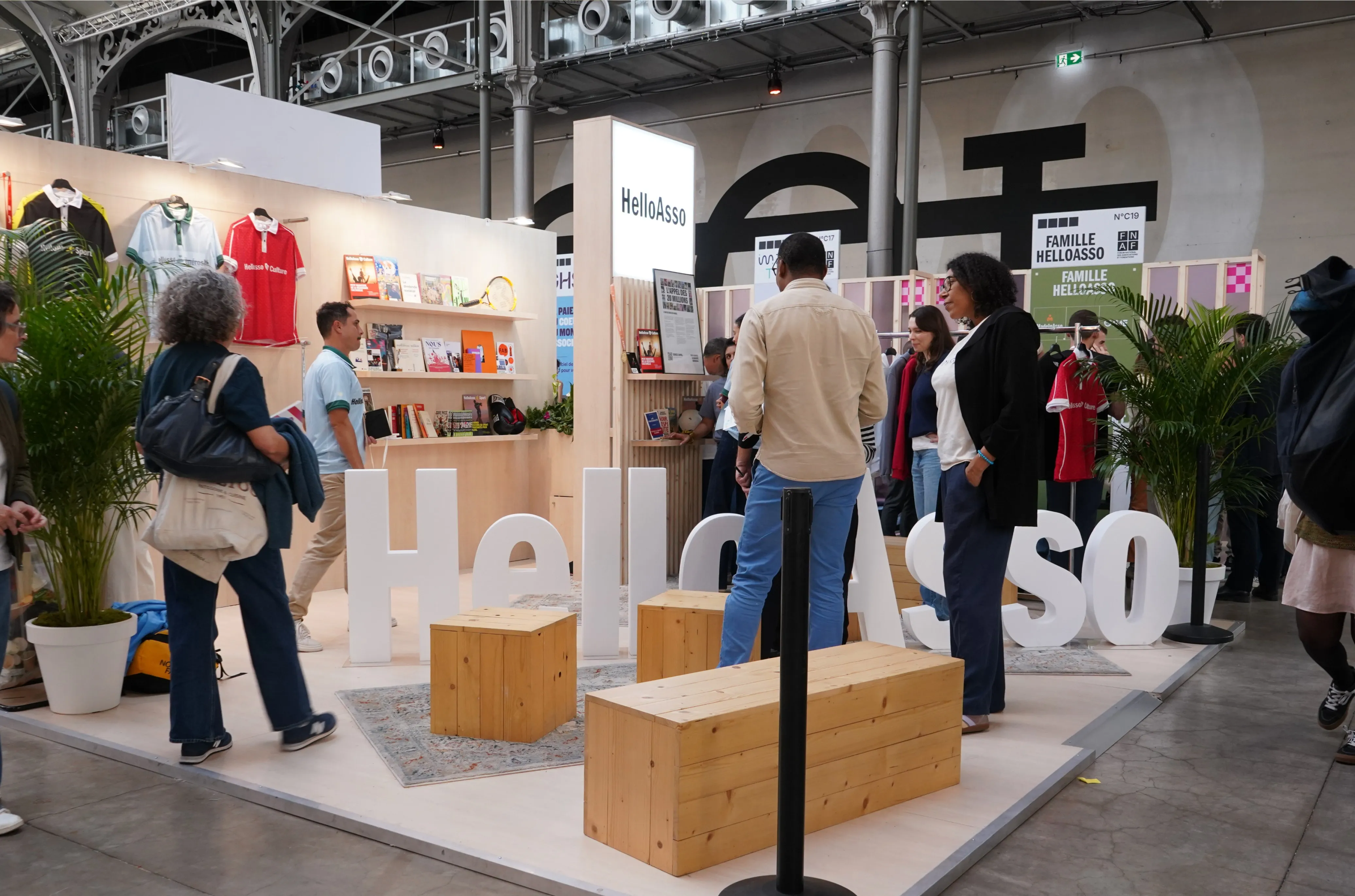
As for the three offers, Sport, Generosity and Culture, and The HelloAsso Fund, each brings its own personality to the fore, complete with its own logo. HelloAsso Sport speaks the language of the pitch, with an energetic lime yellow that feels more Nike than service counter. HelloAsso Generosity takes a warmer, more welcoming approach, with natural colours and rounder layouts. HelloAsso Culture, meanwhile, borrows from the world of live performance: theatre posters, Télérama covers and other design treats. A red, black and white palette, carefully centred text and a variation on the mosaic pattern arranged in theatre-style banners complete the picture.
The HelloAsso Fund, finally, unveils a no-nonsense black and white, close to the parent brand’s identity, minus the green.
To empower HelloAsso’s teams, the brand guidelines have been set out in an online brandbook, partly open to the public.