

Varsity
Rebranding Varsity, a European VC fund, with a warm and human identity built around one idea: founders think better when they're backed by more than one mind.
Informations
Bringing a legendary place to life beyond its walls.
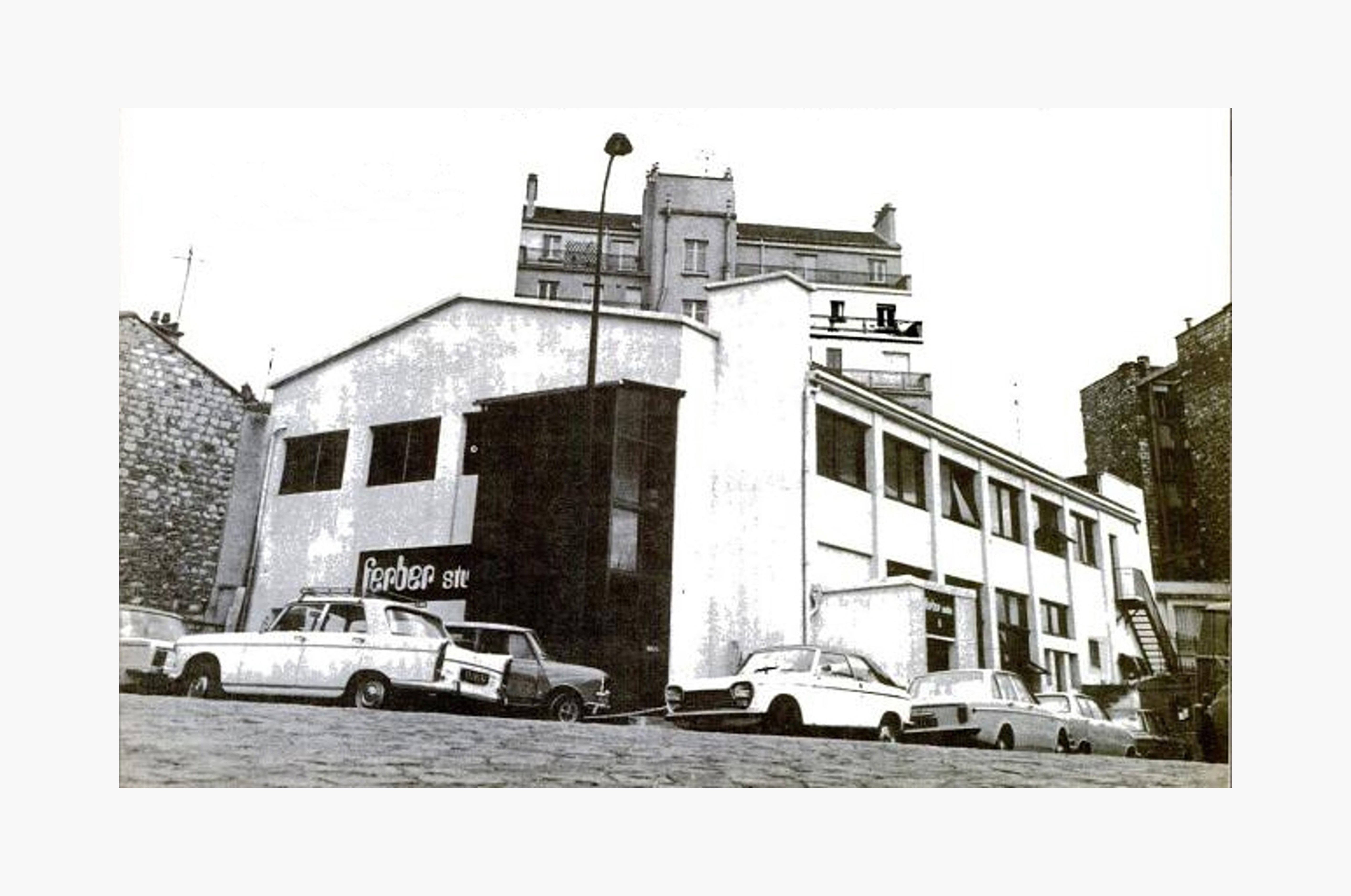
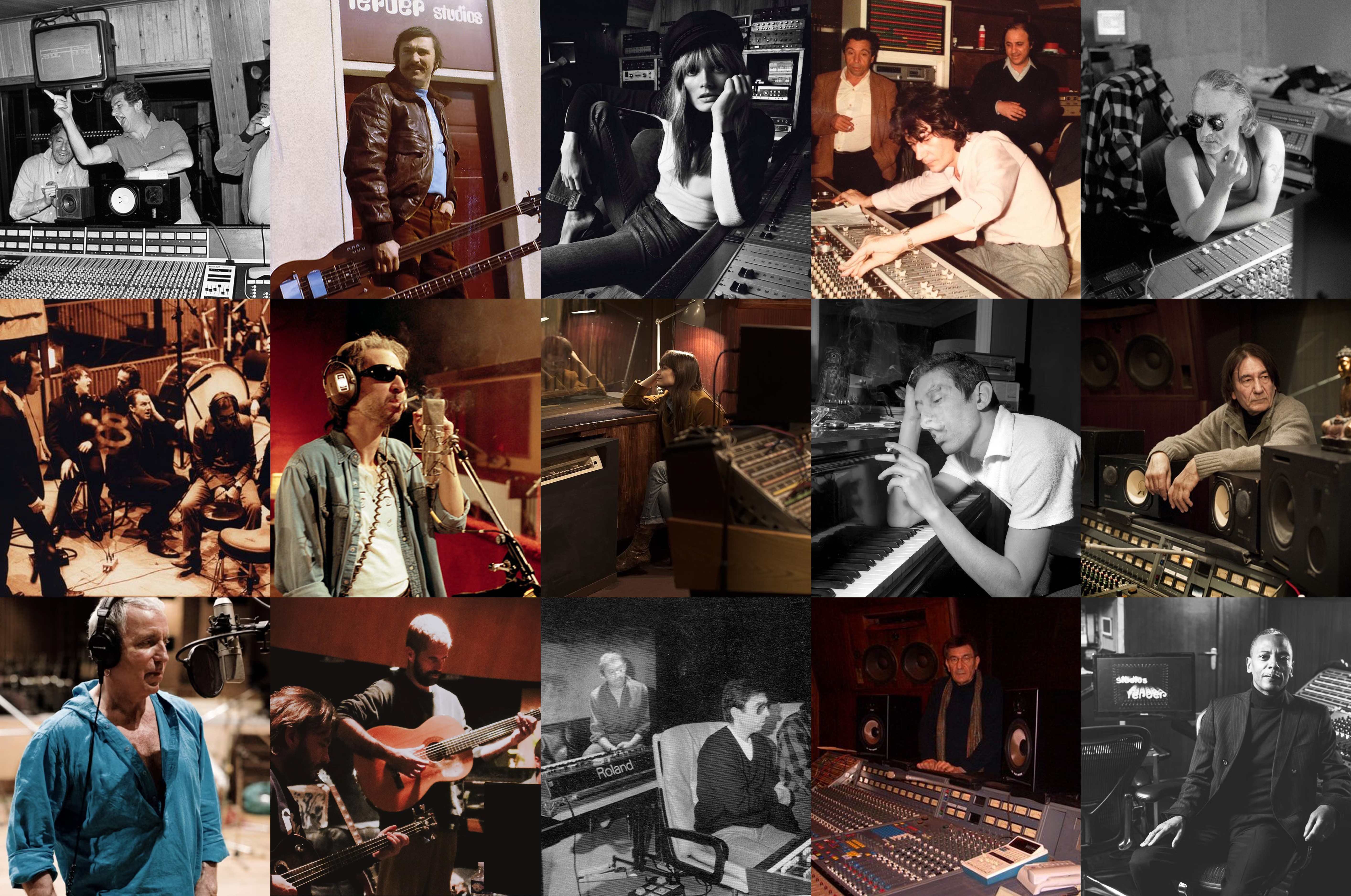
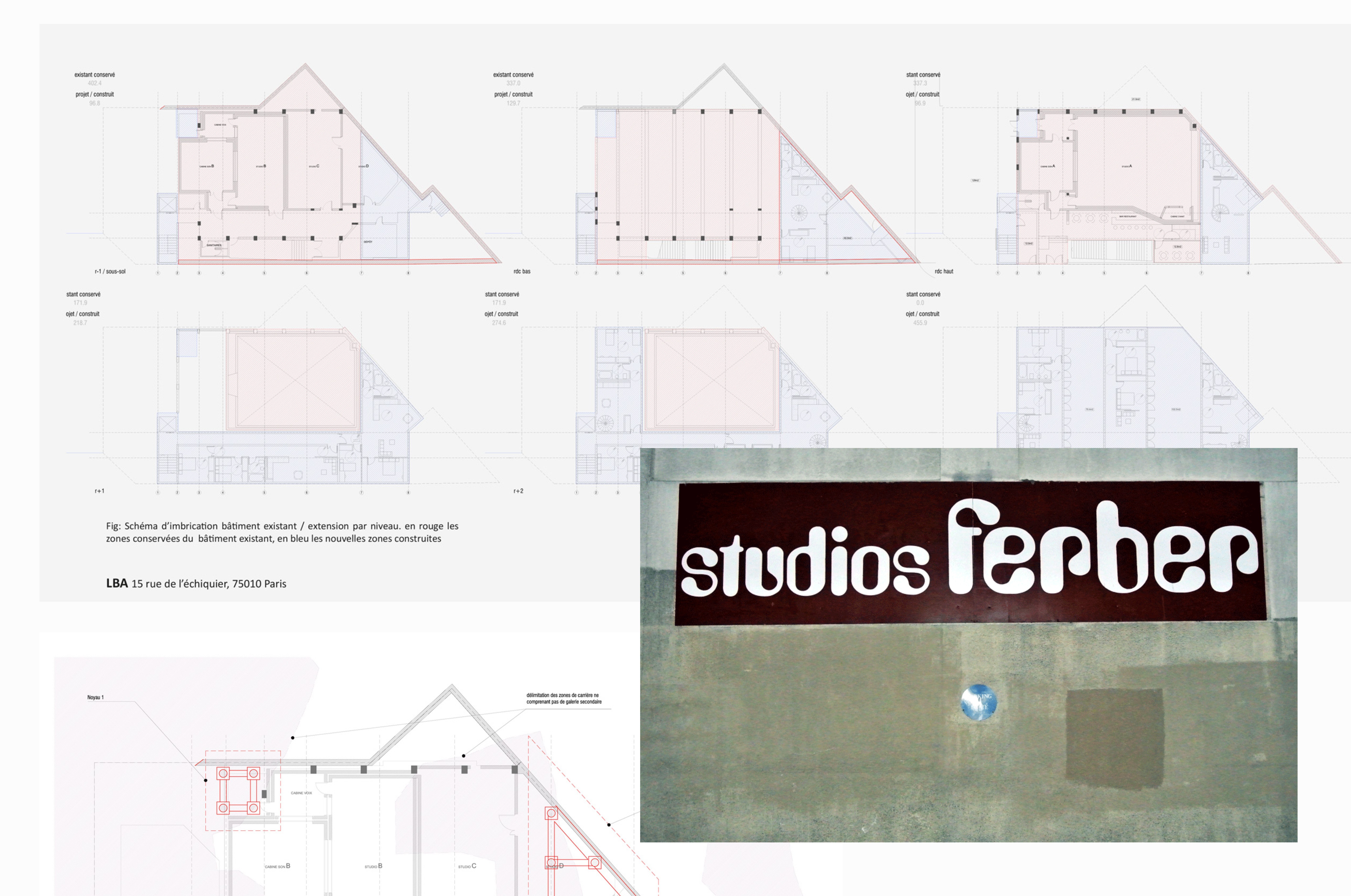
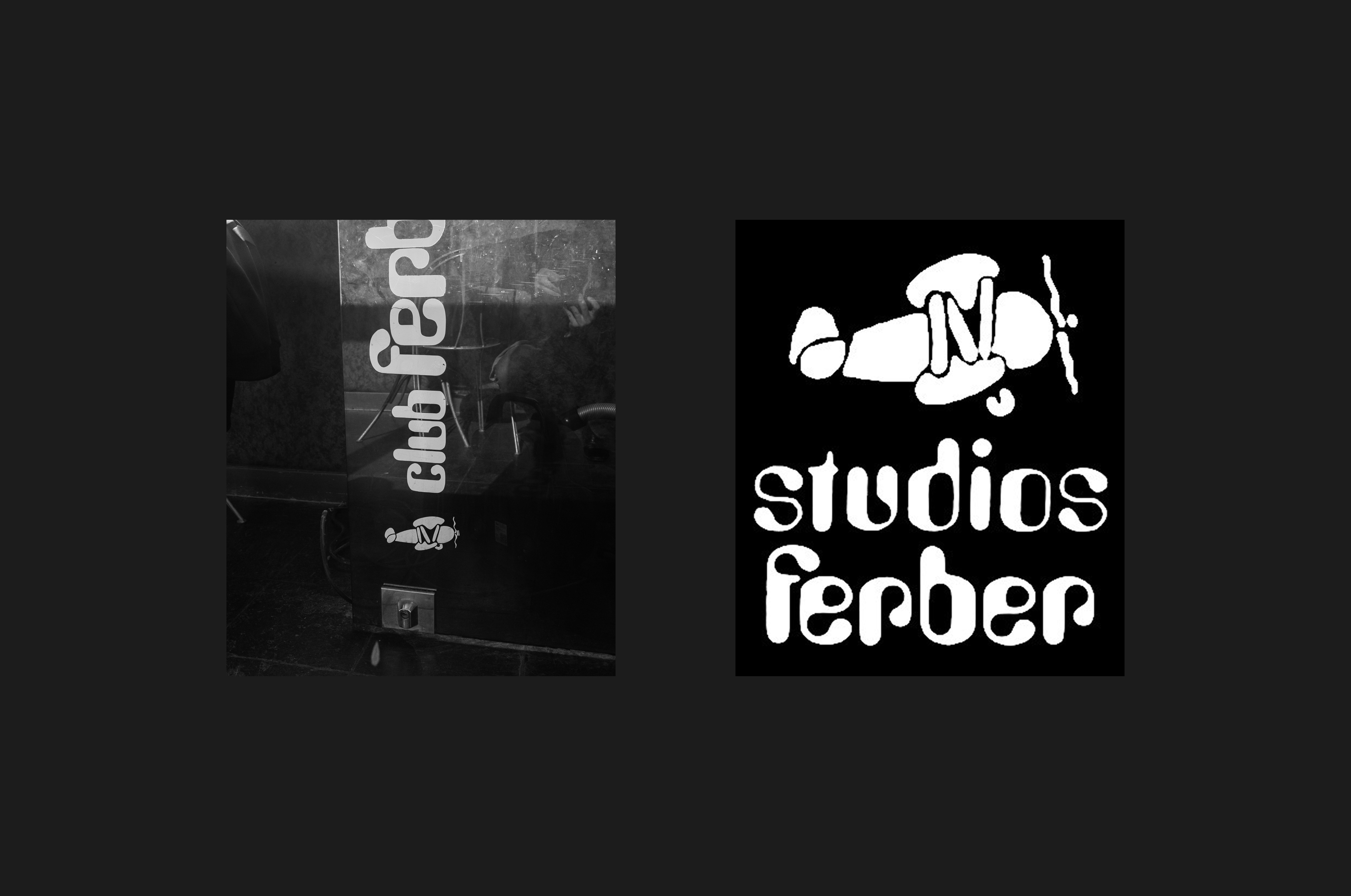
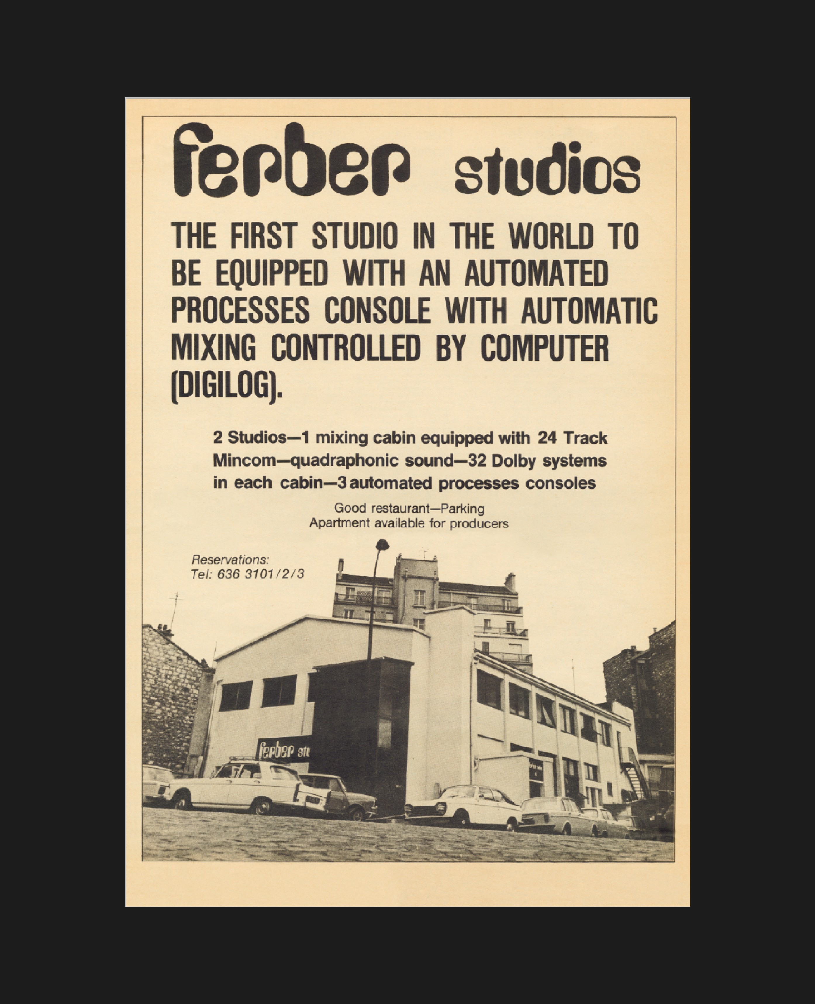
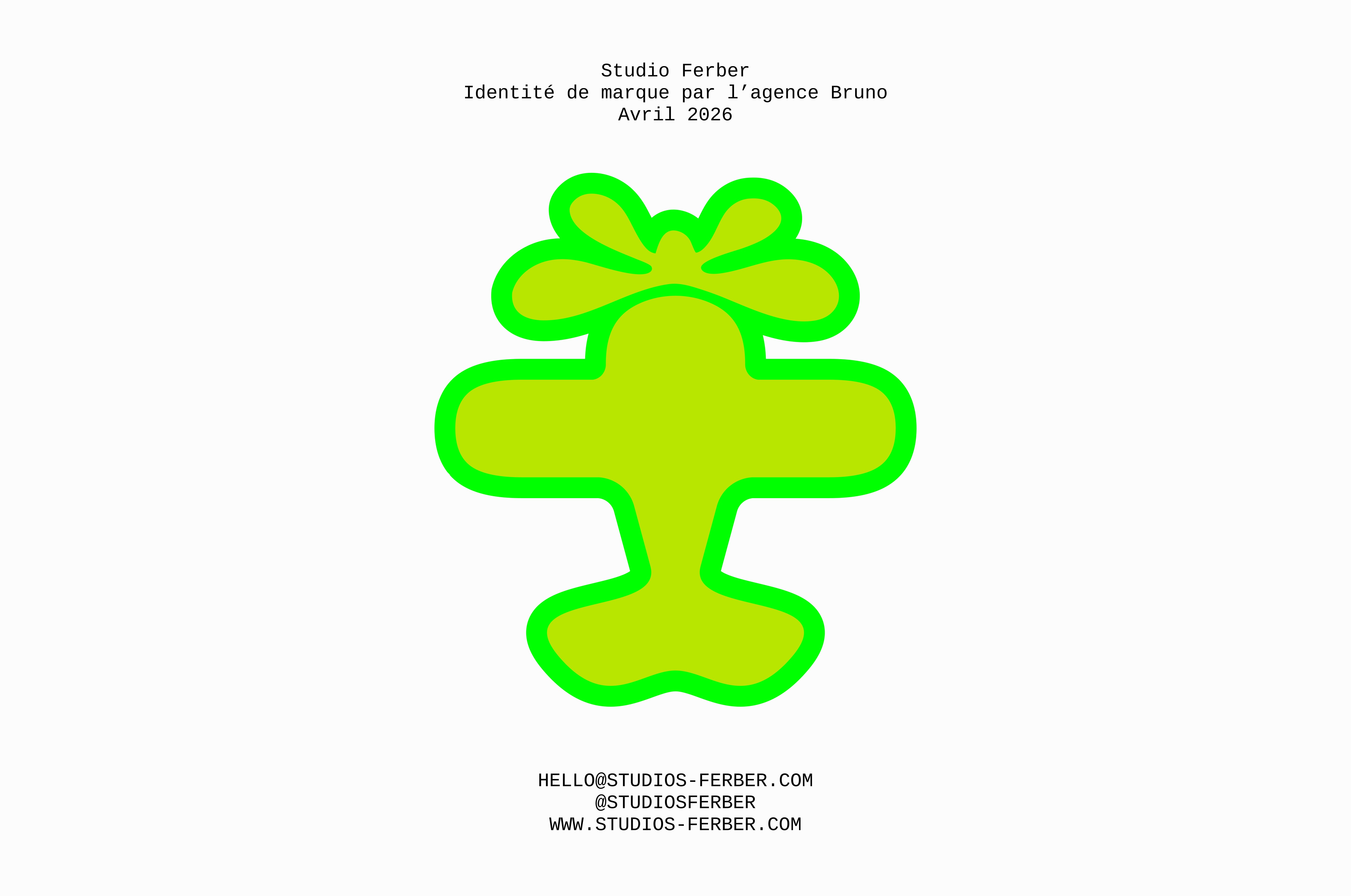
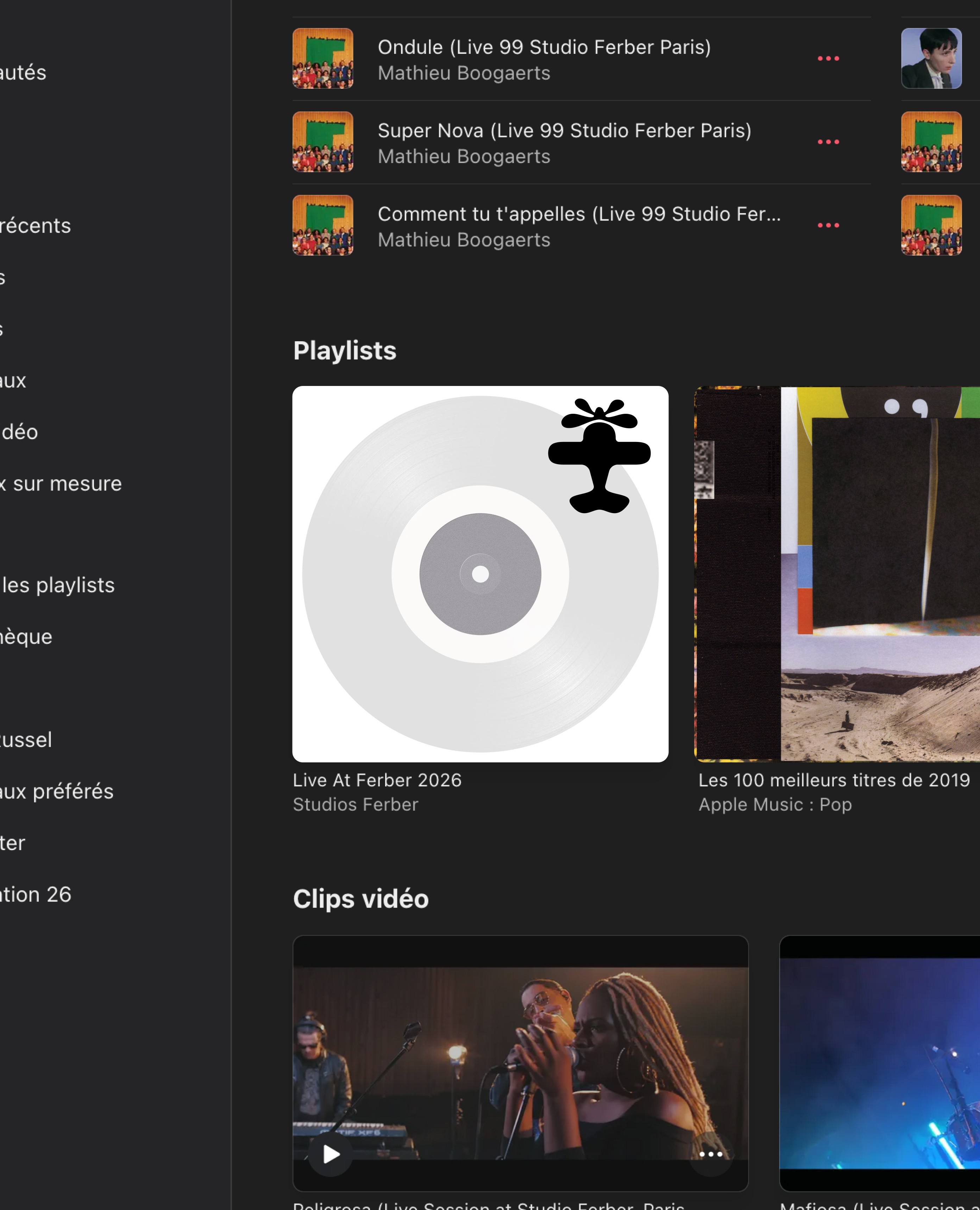
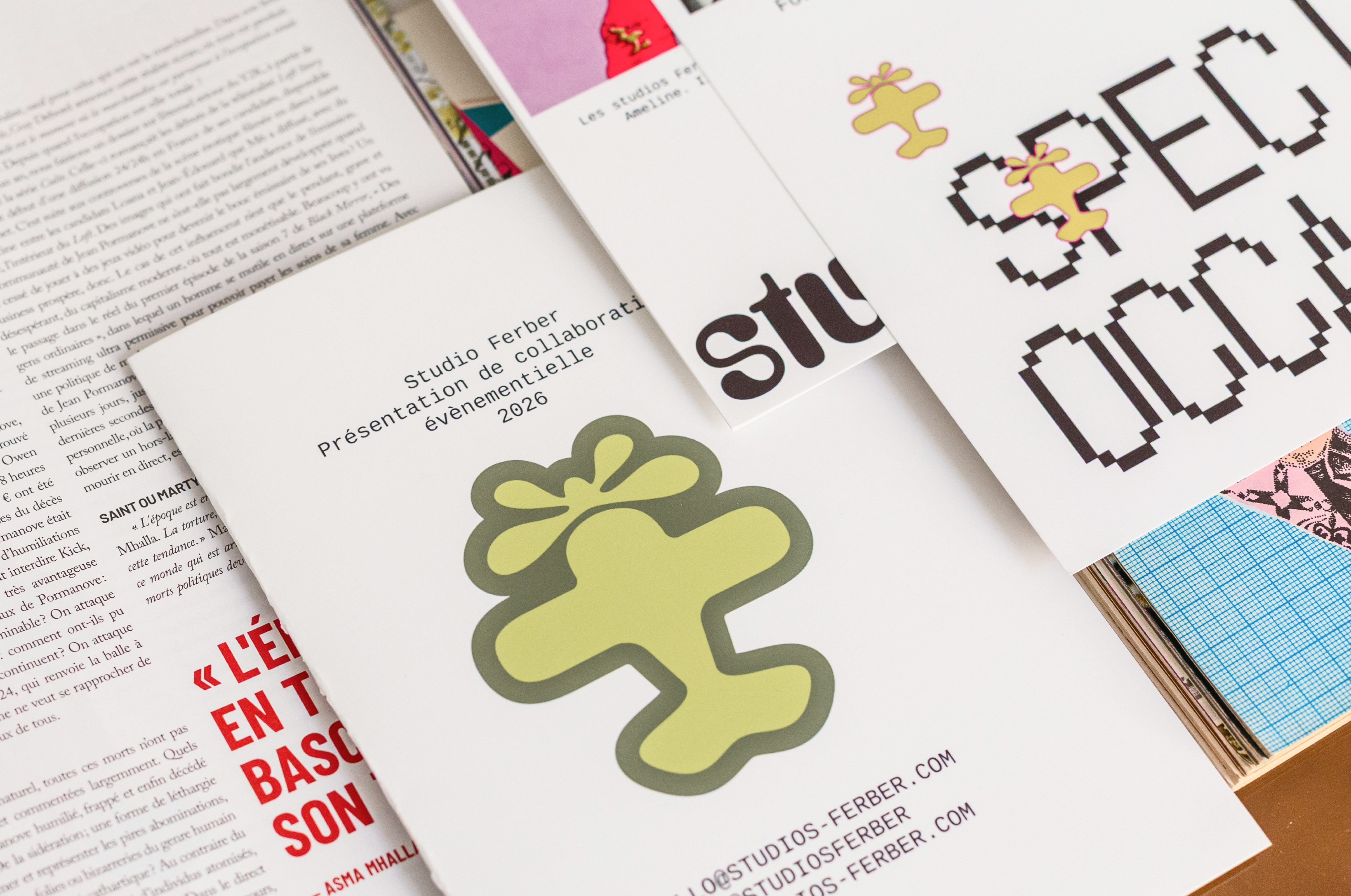
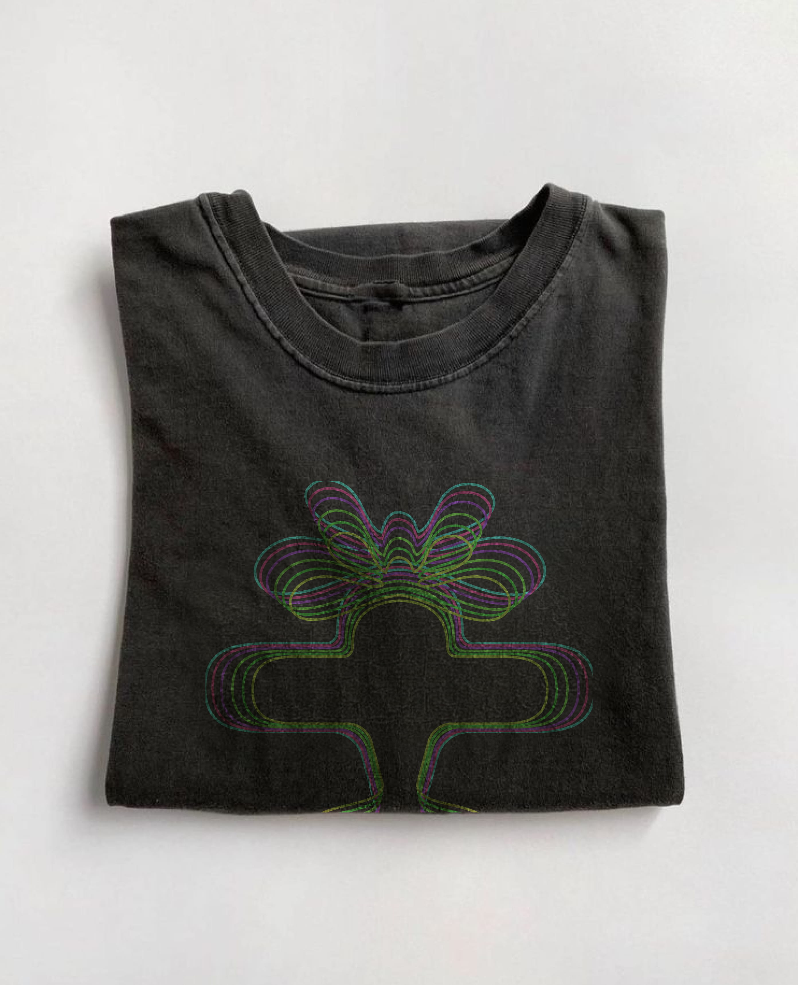
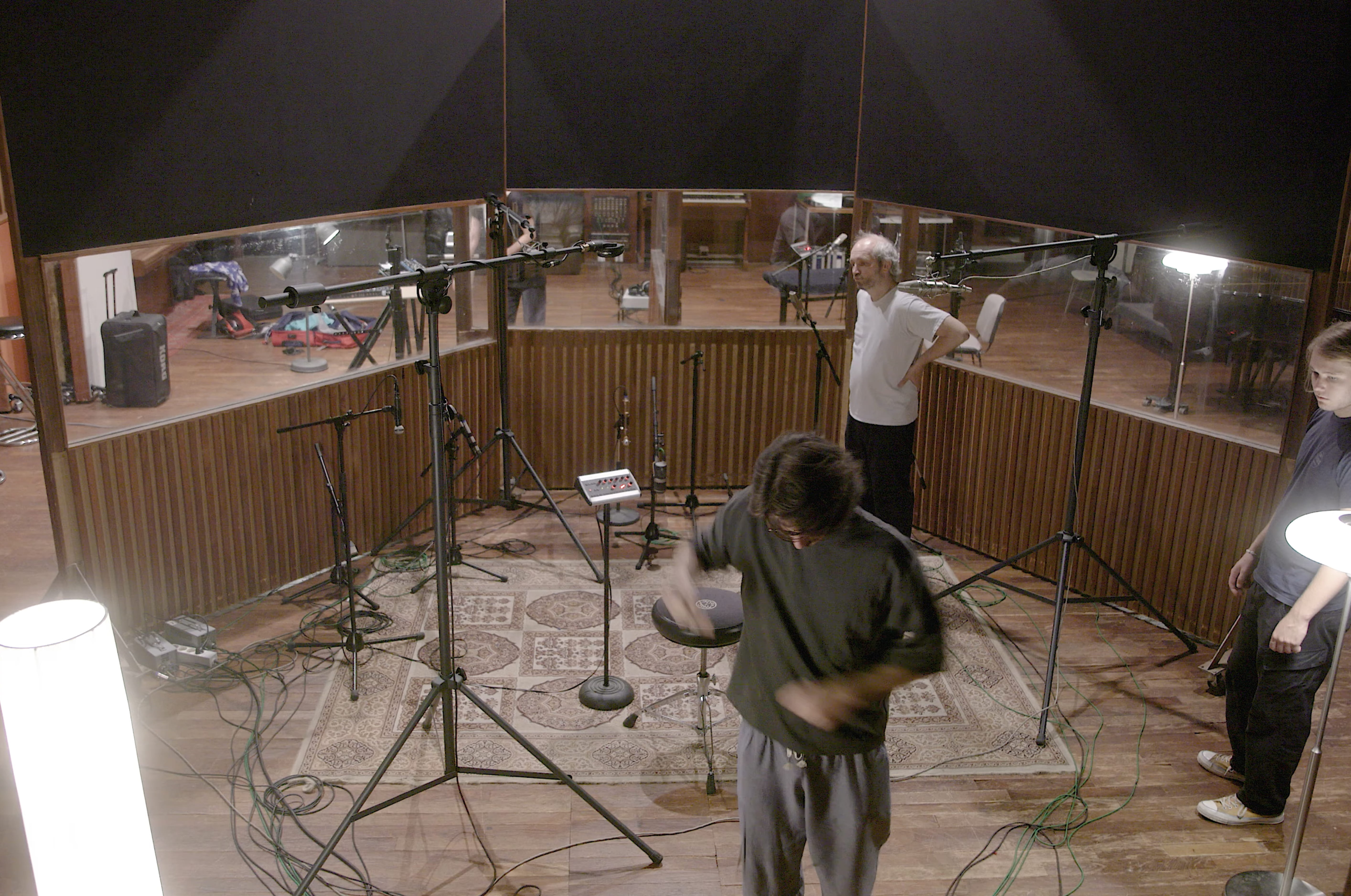
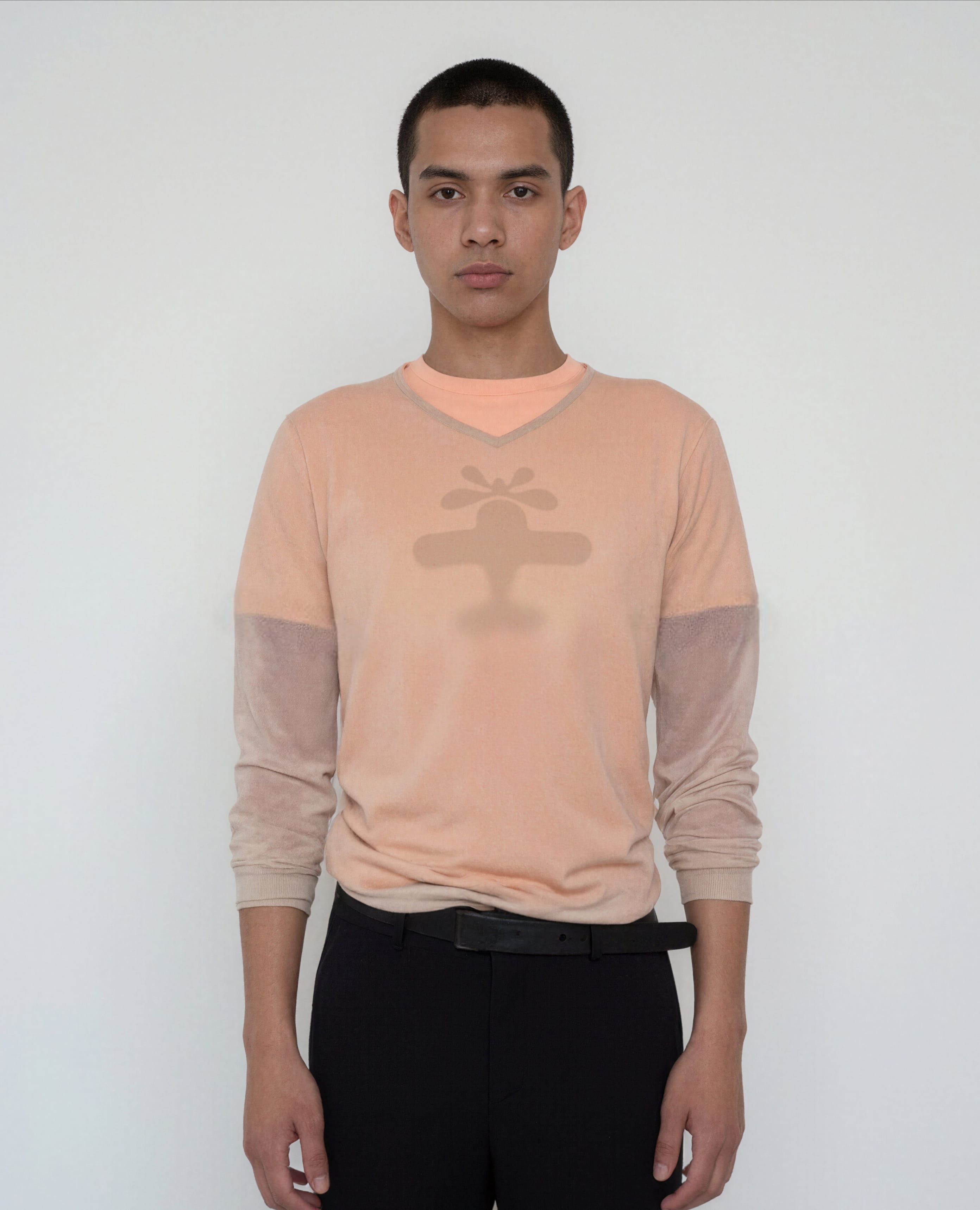
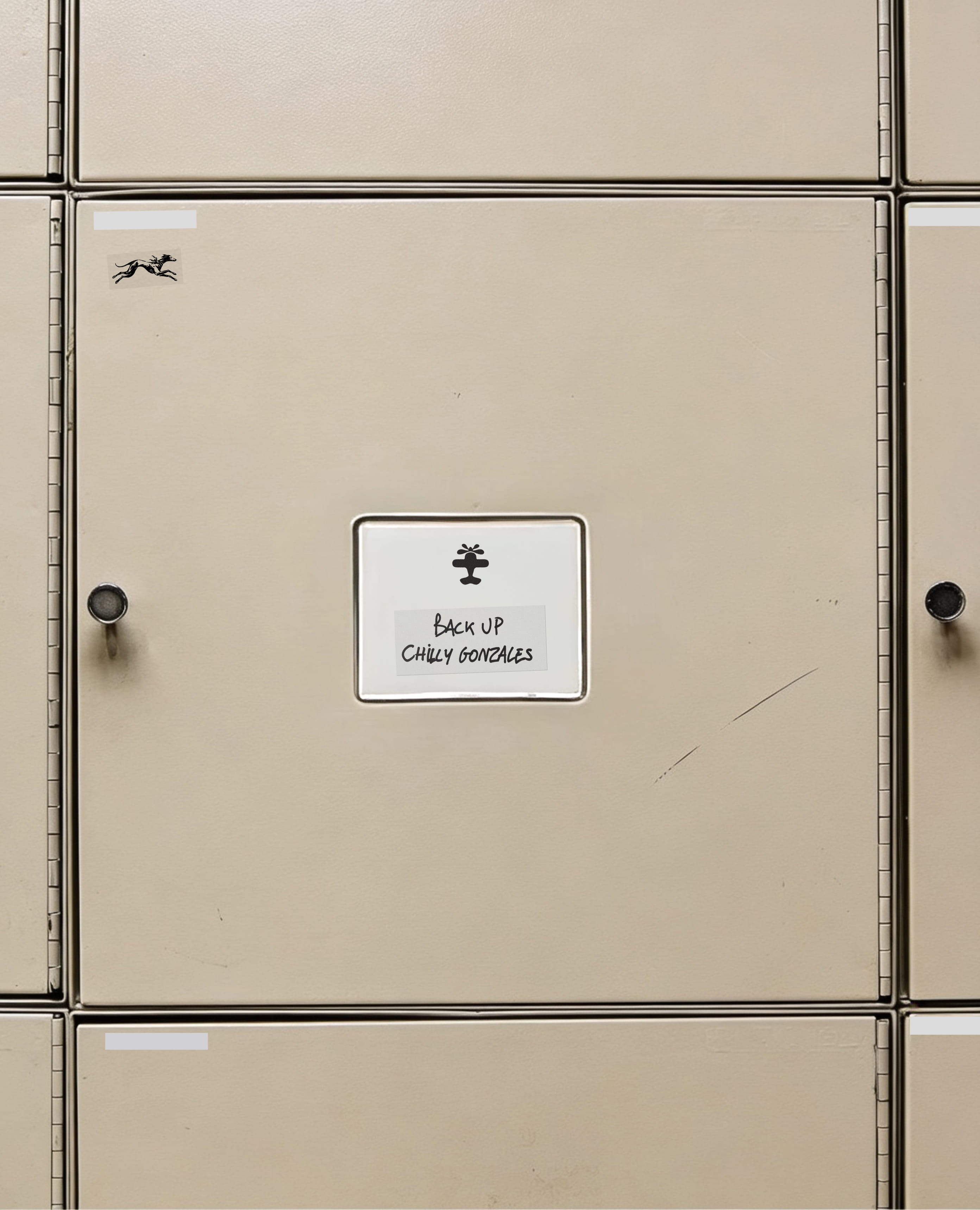
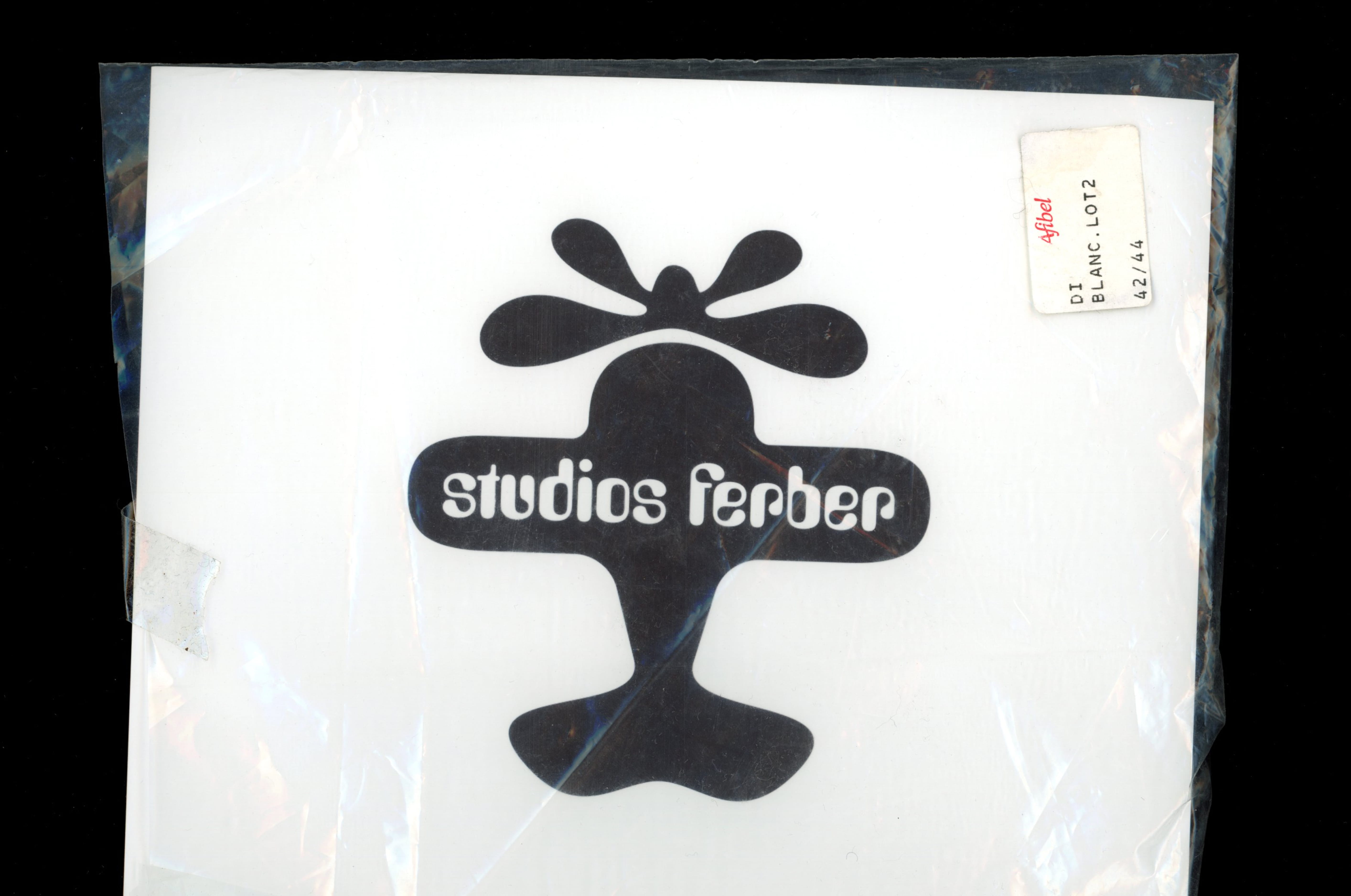
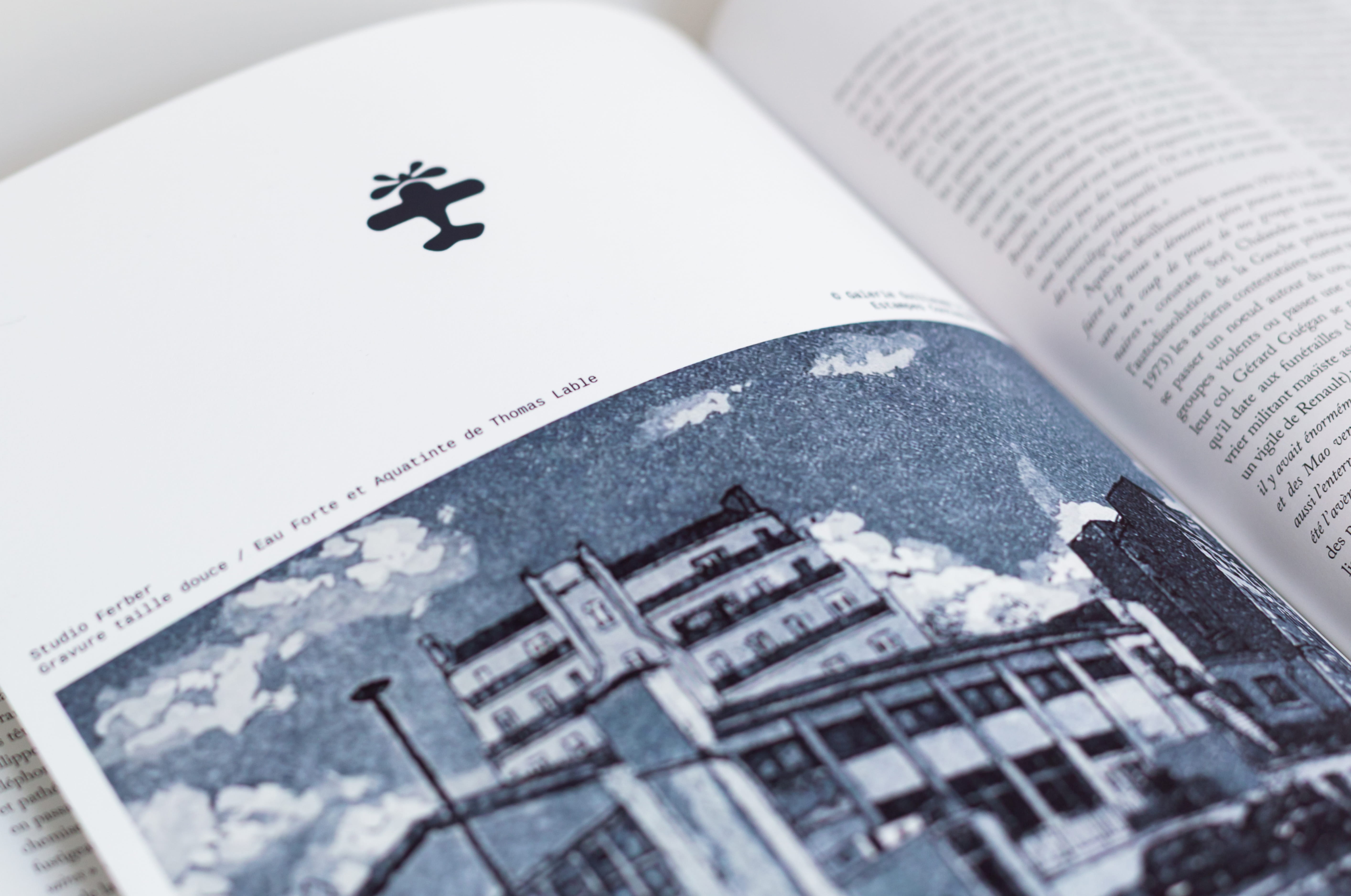
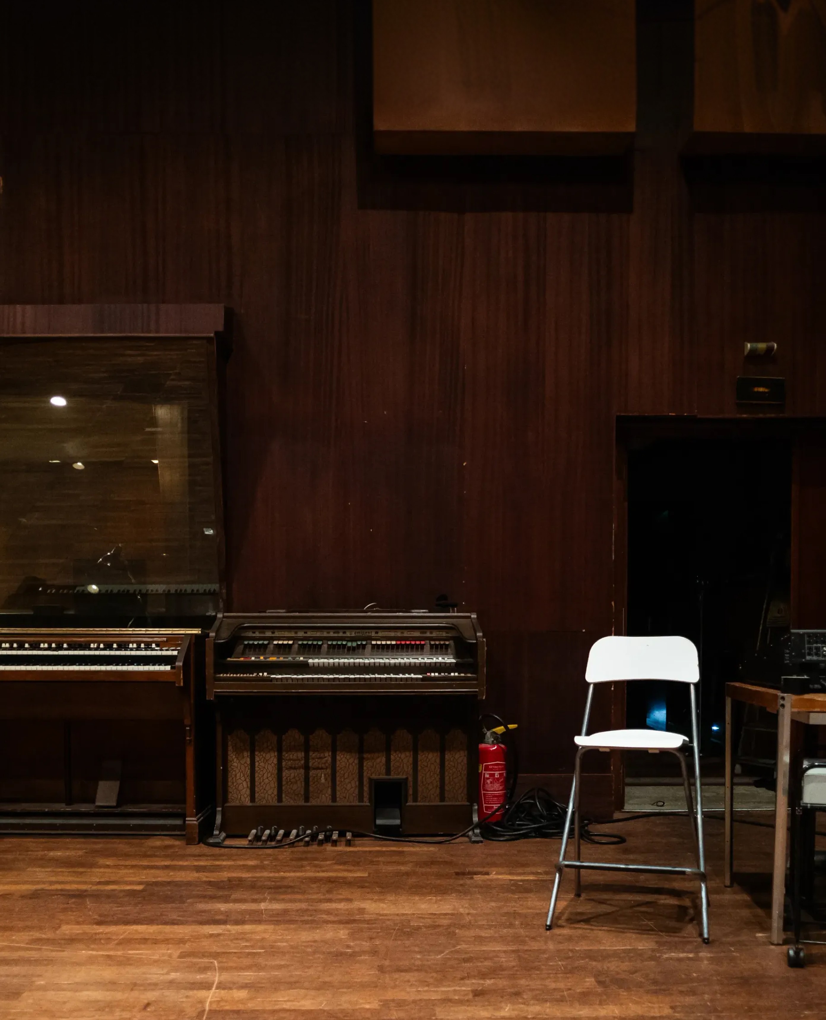
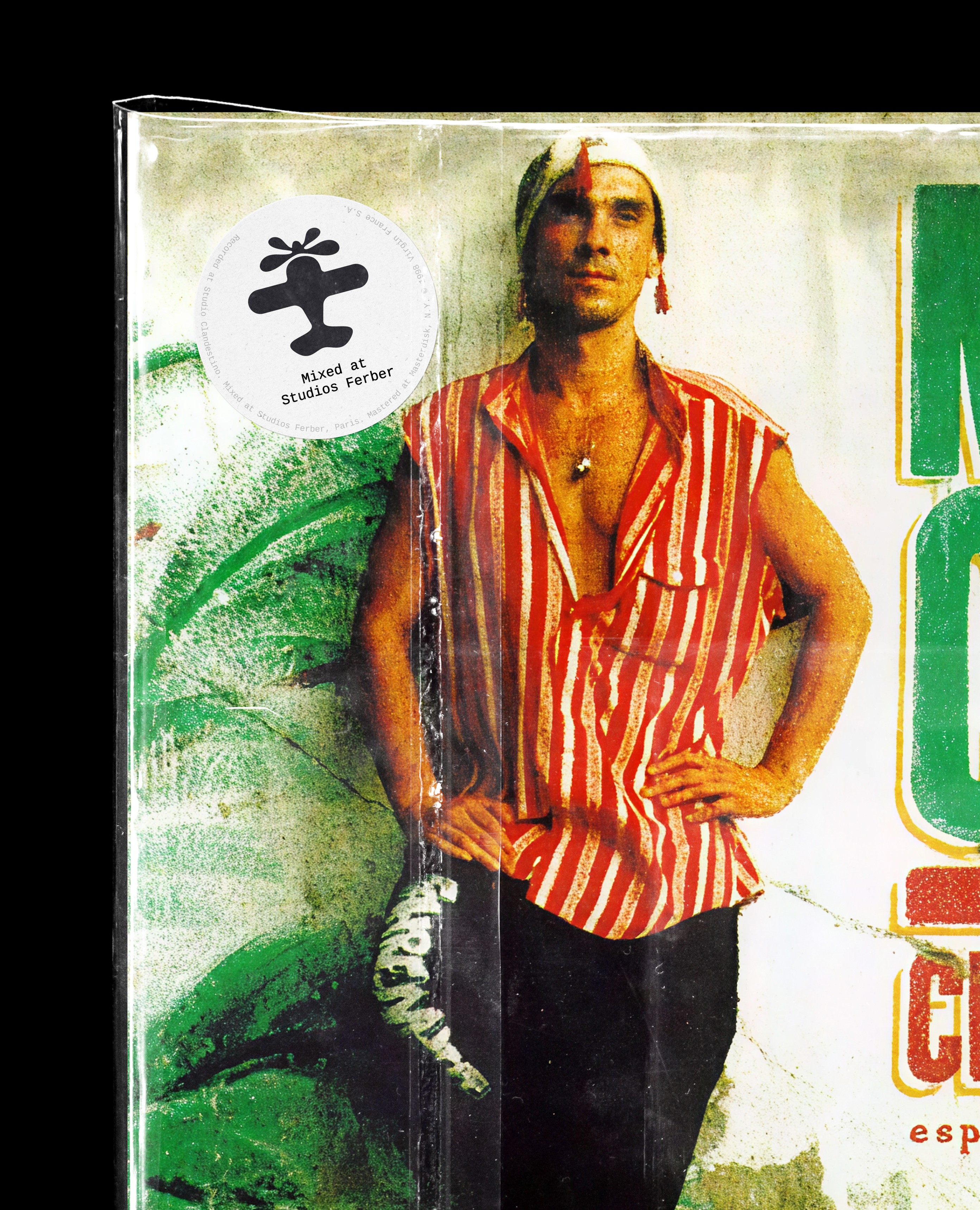
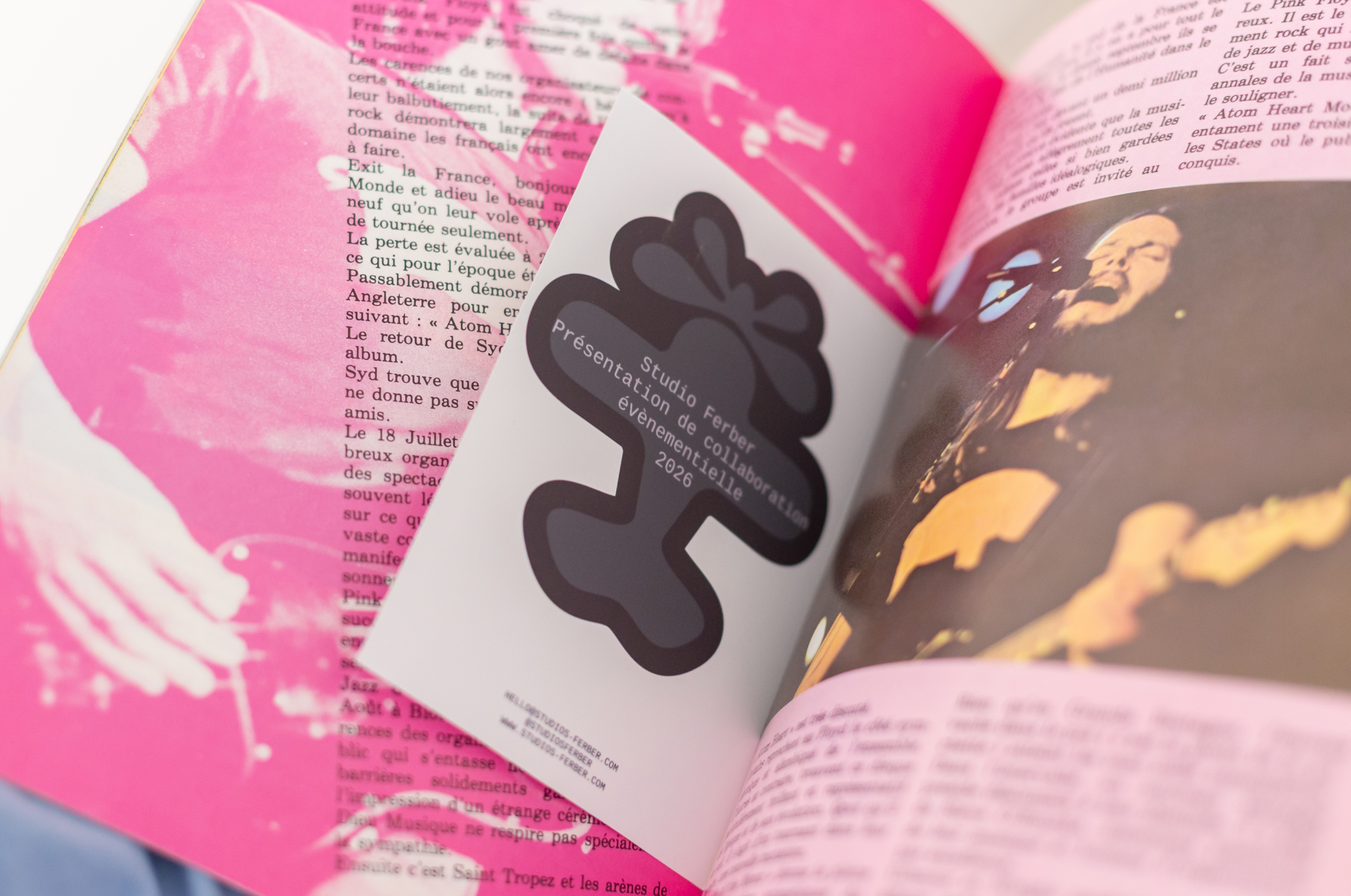
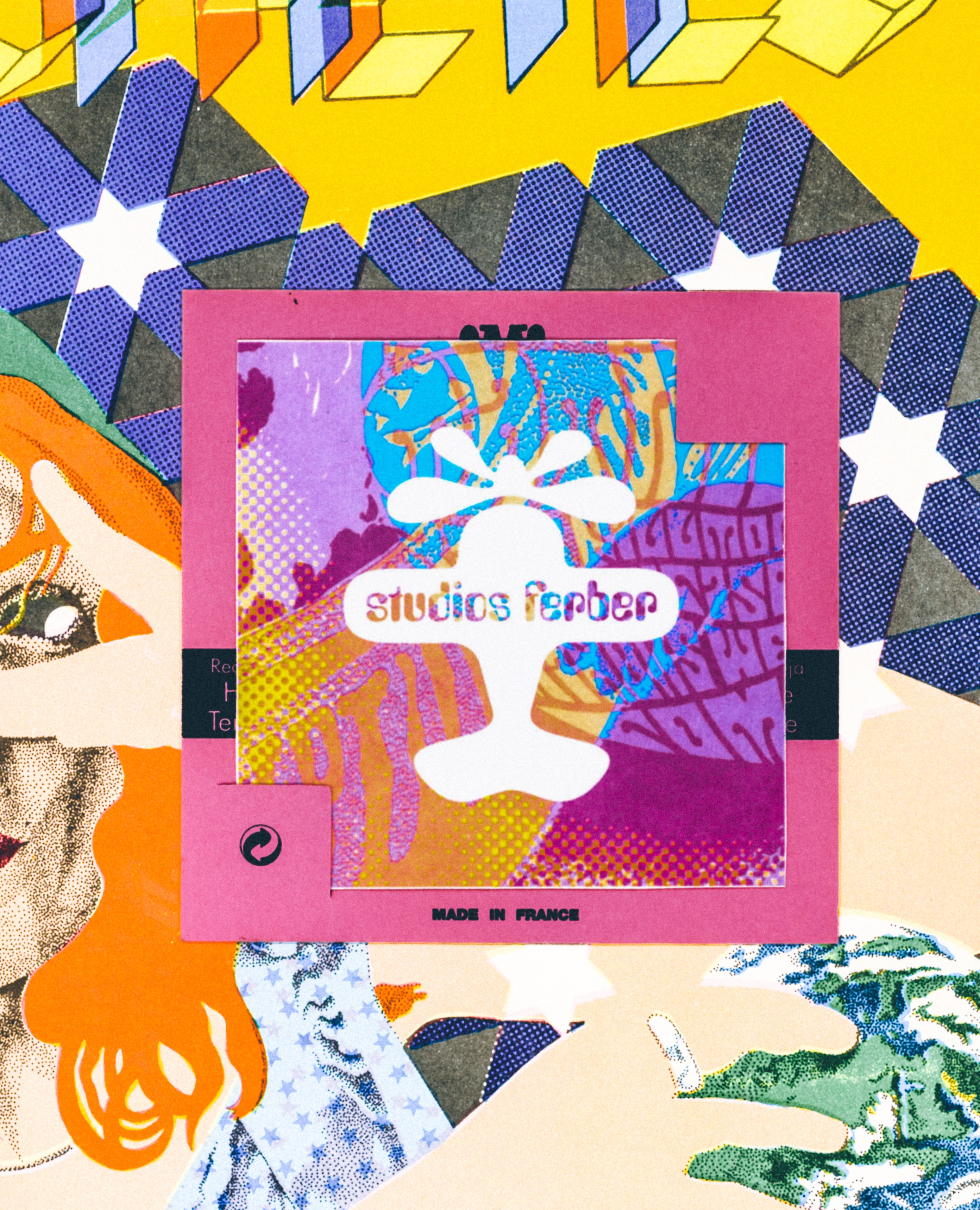
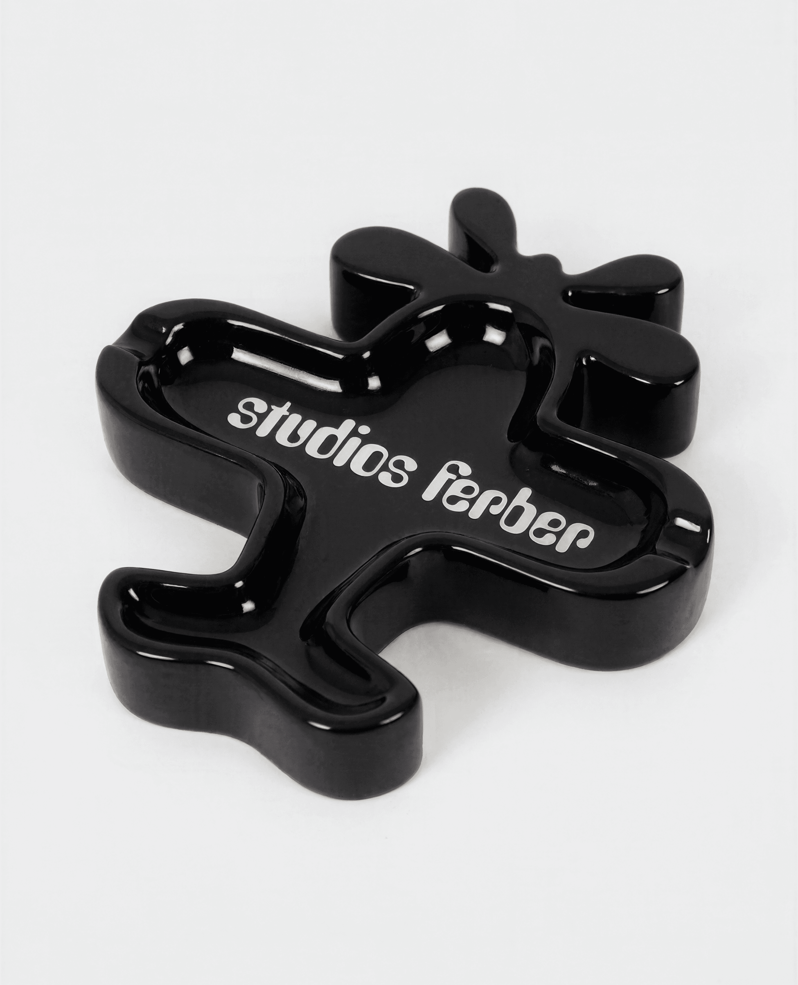
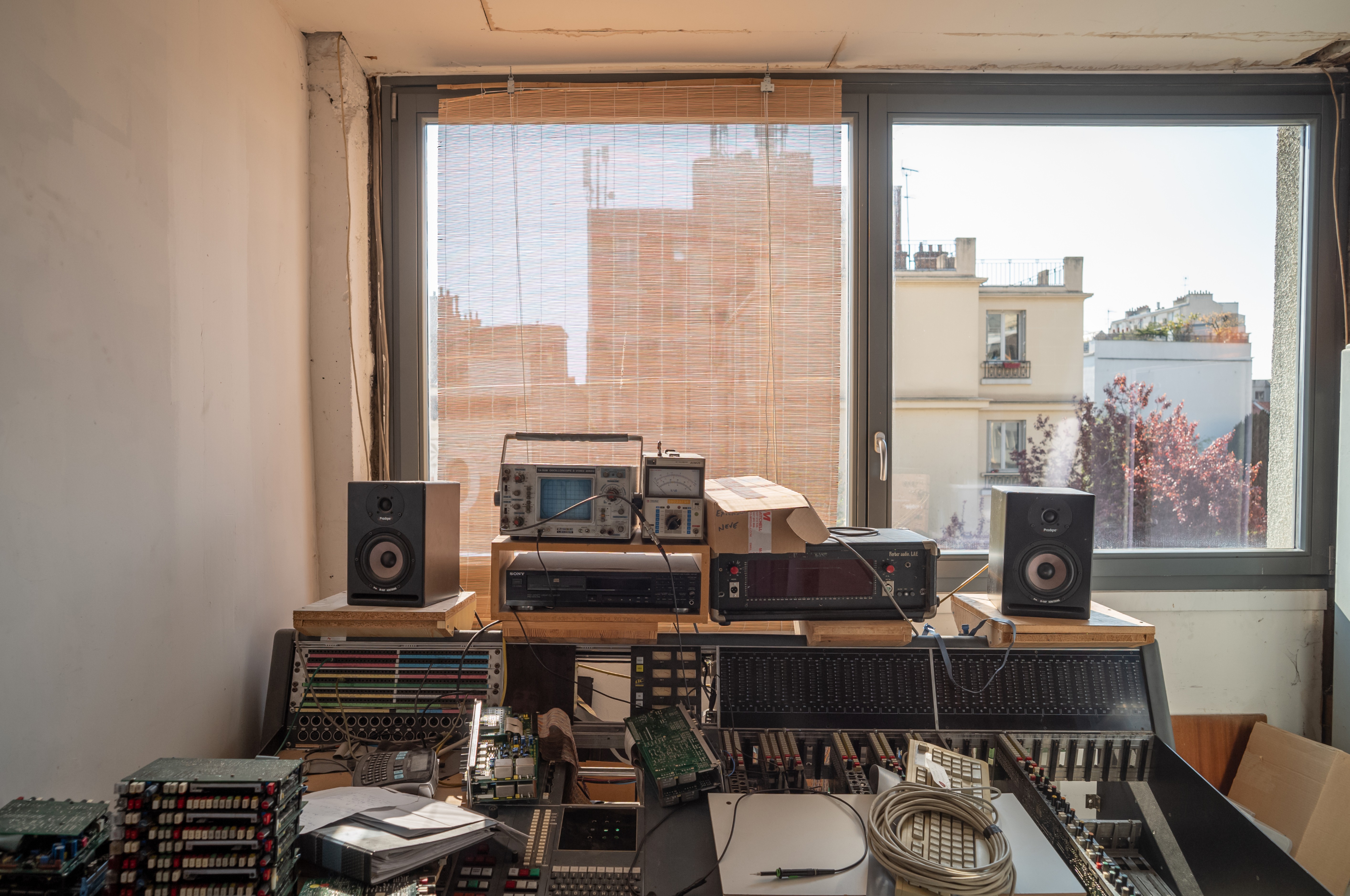
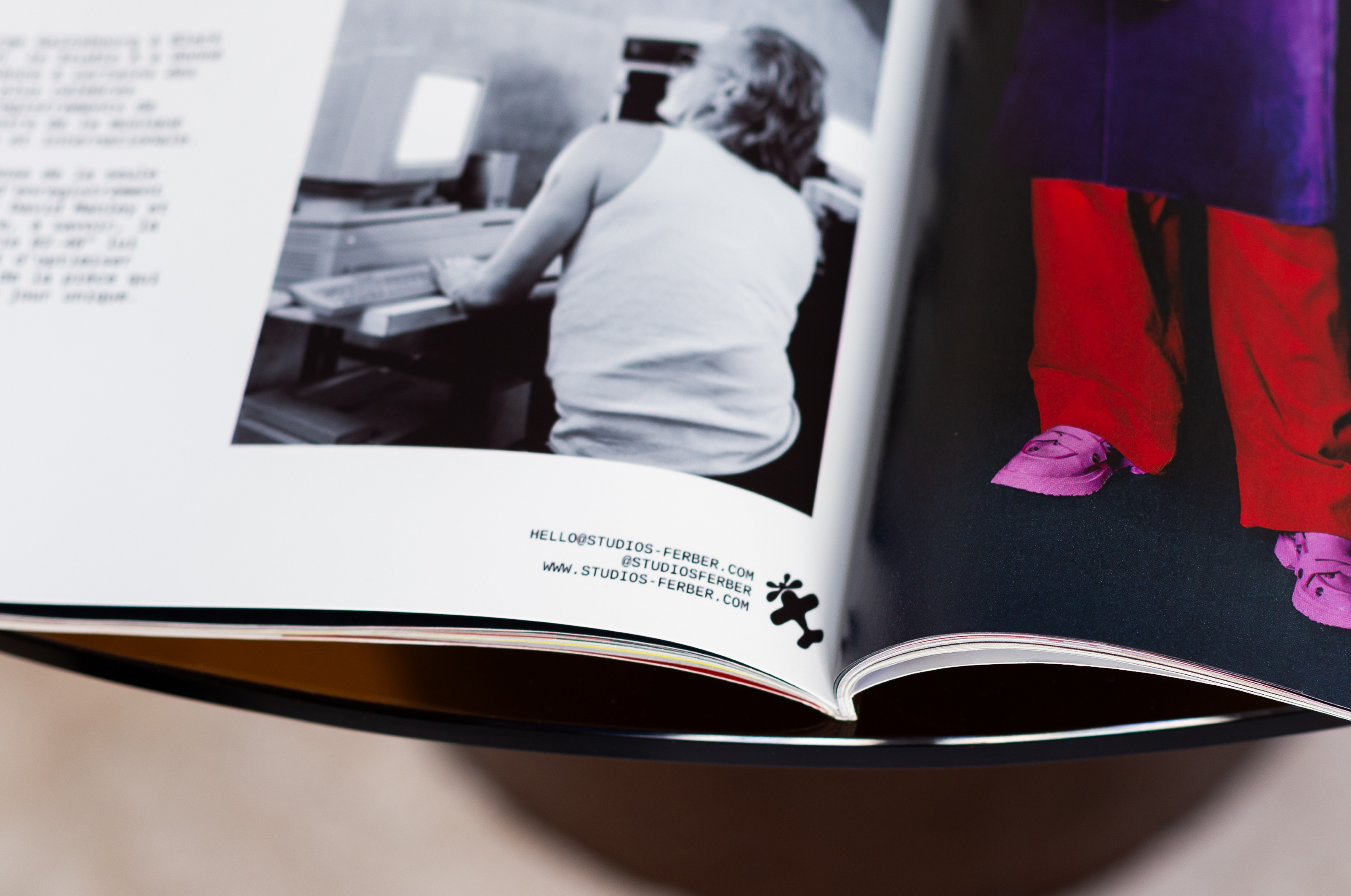
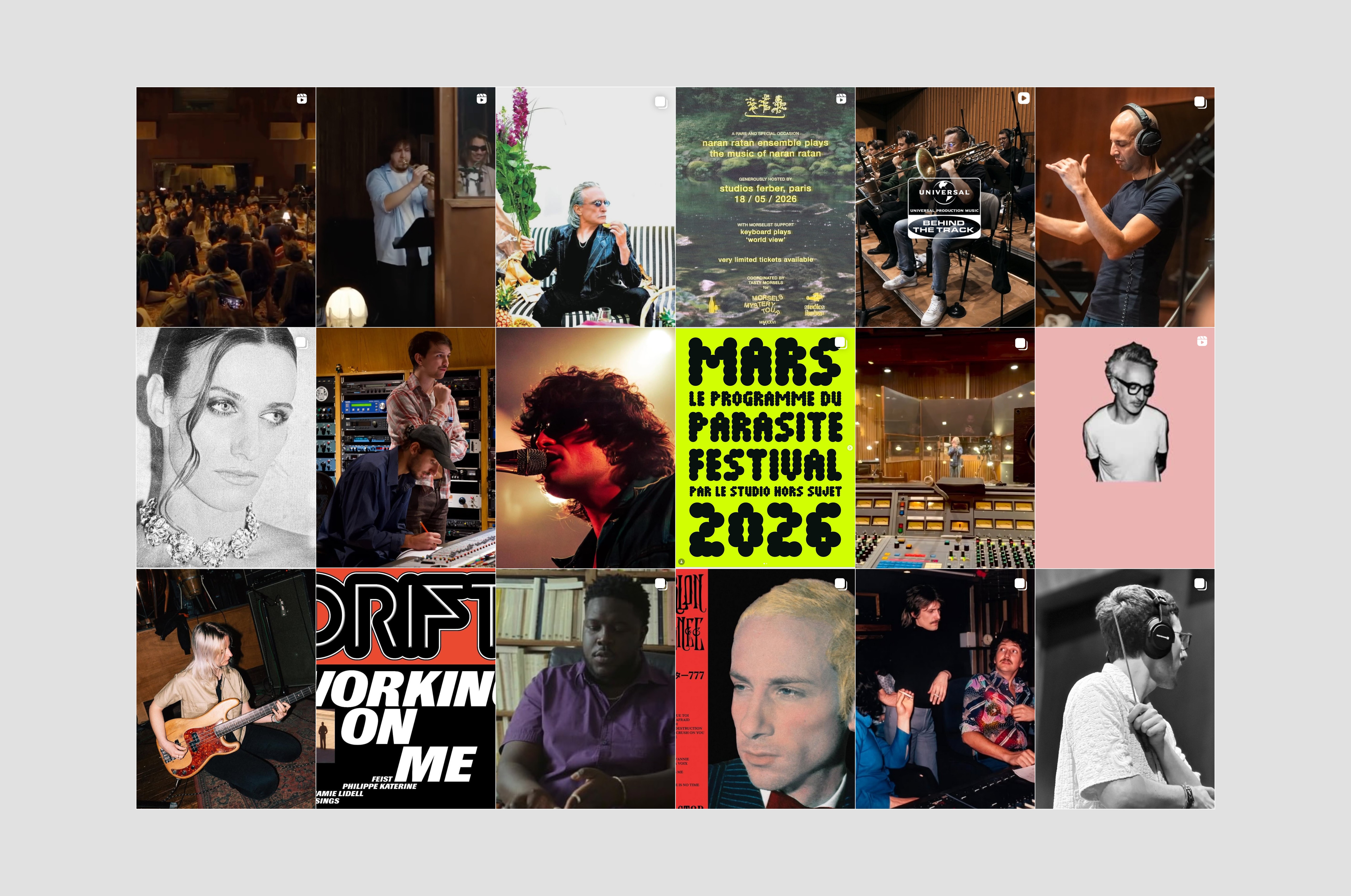
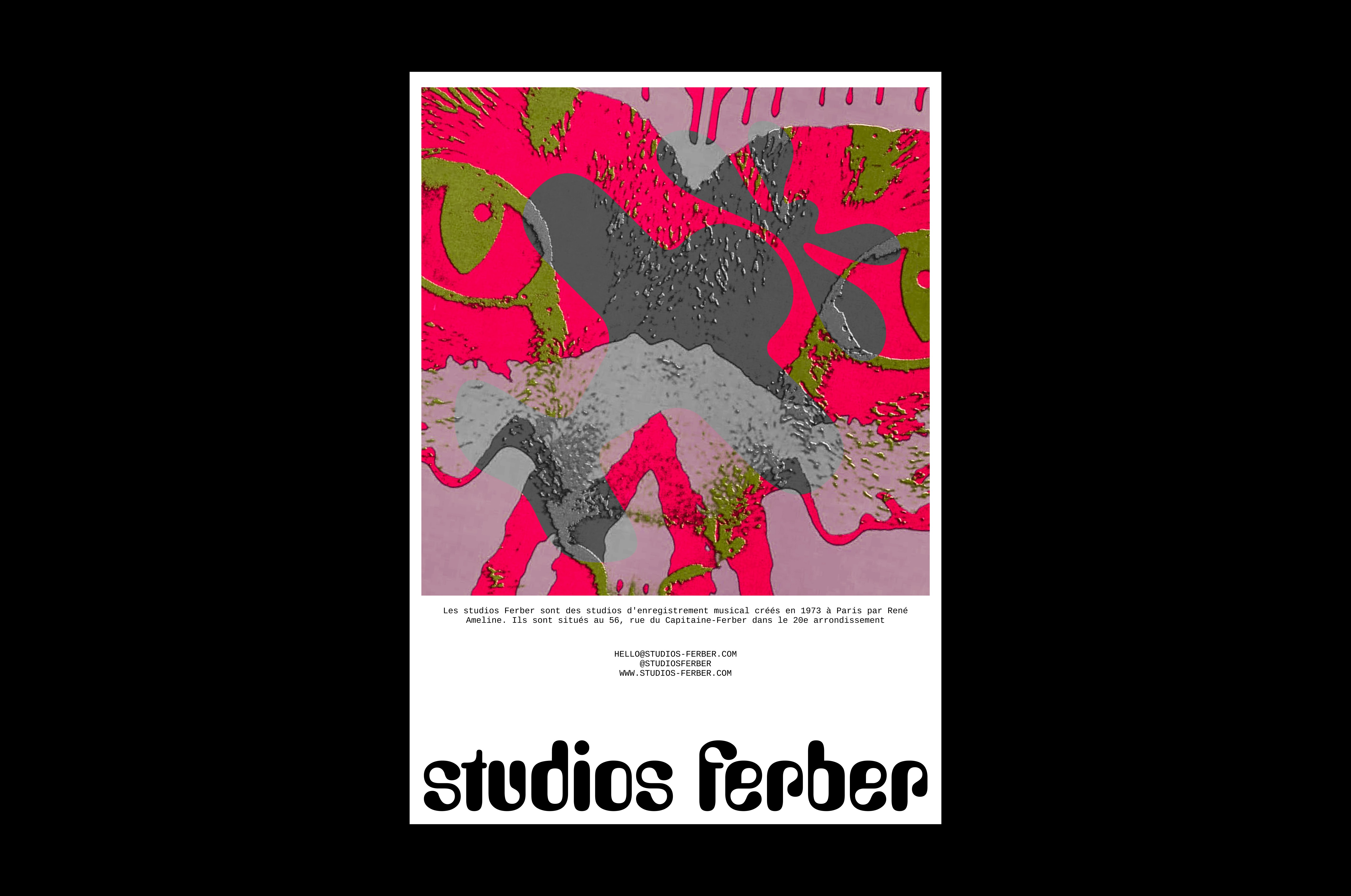
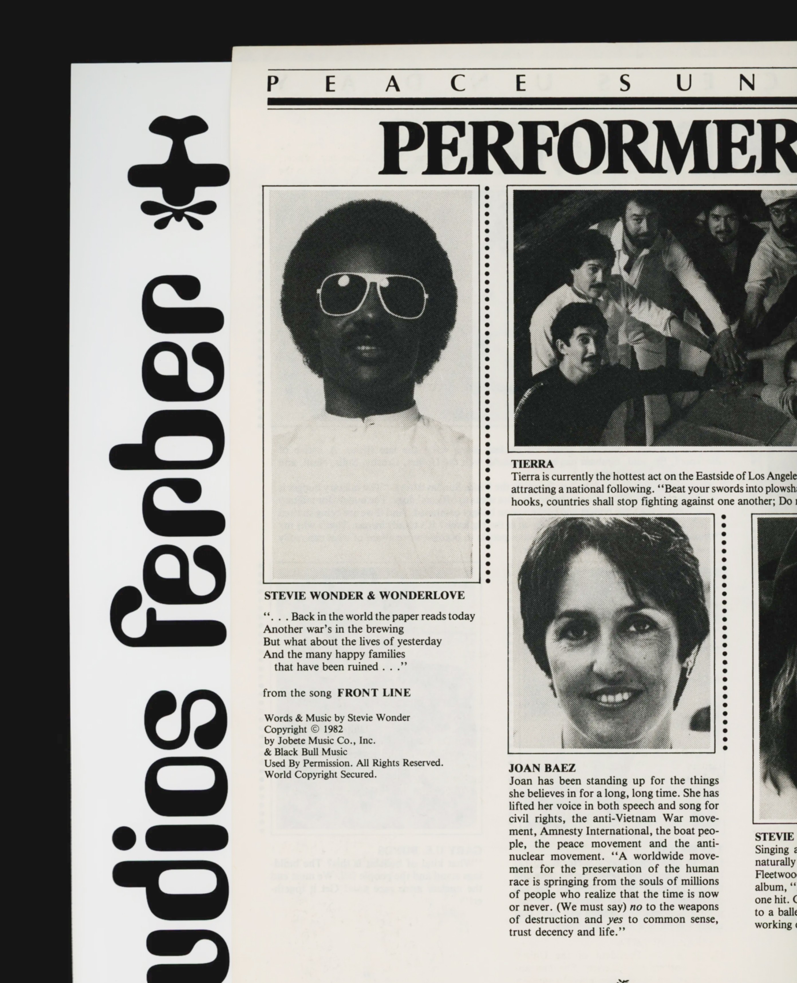
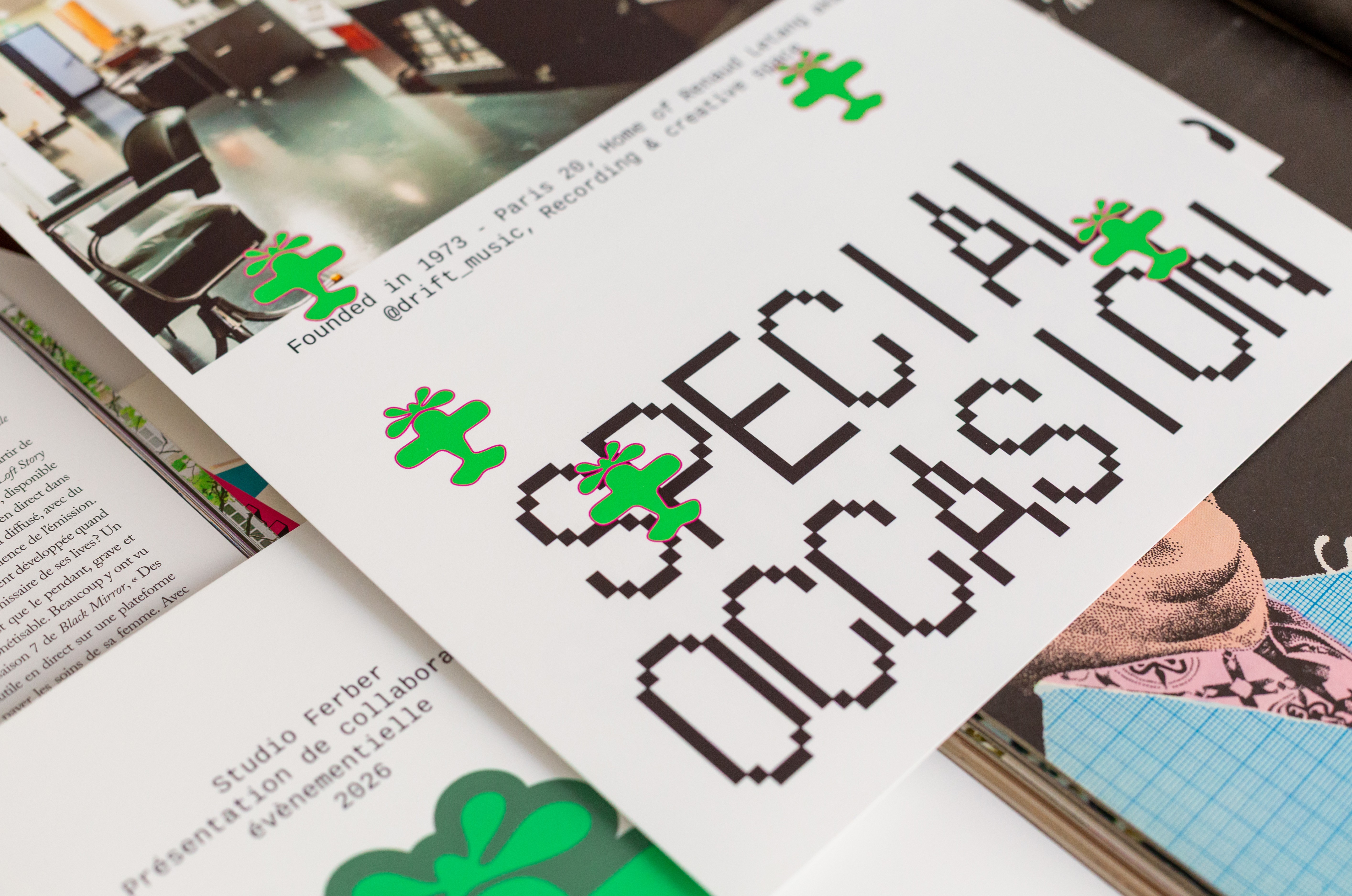
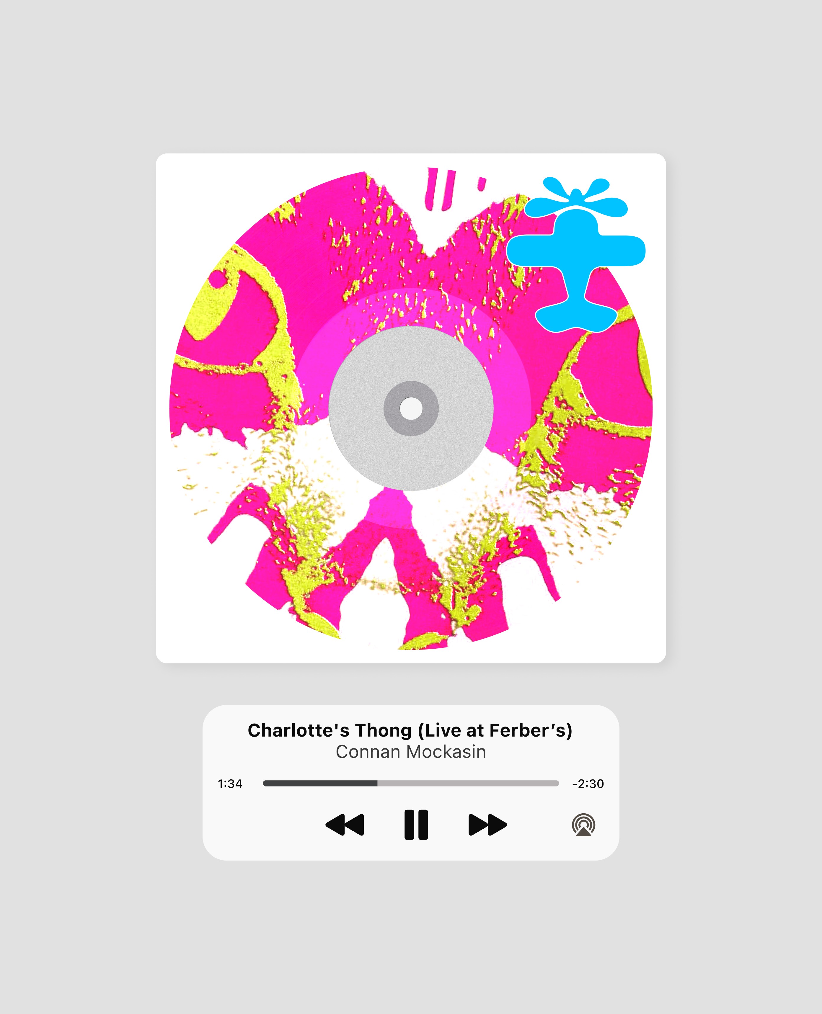
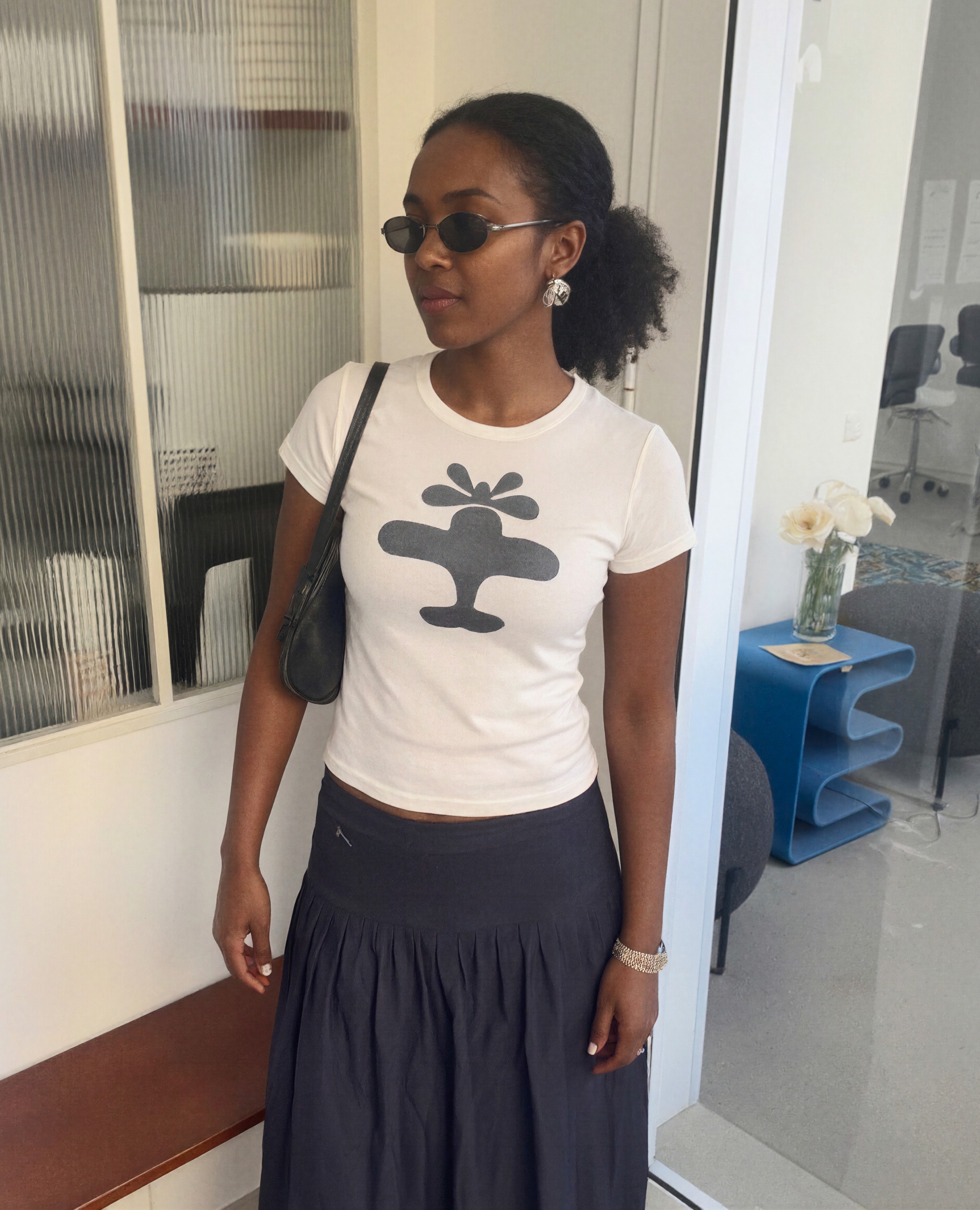
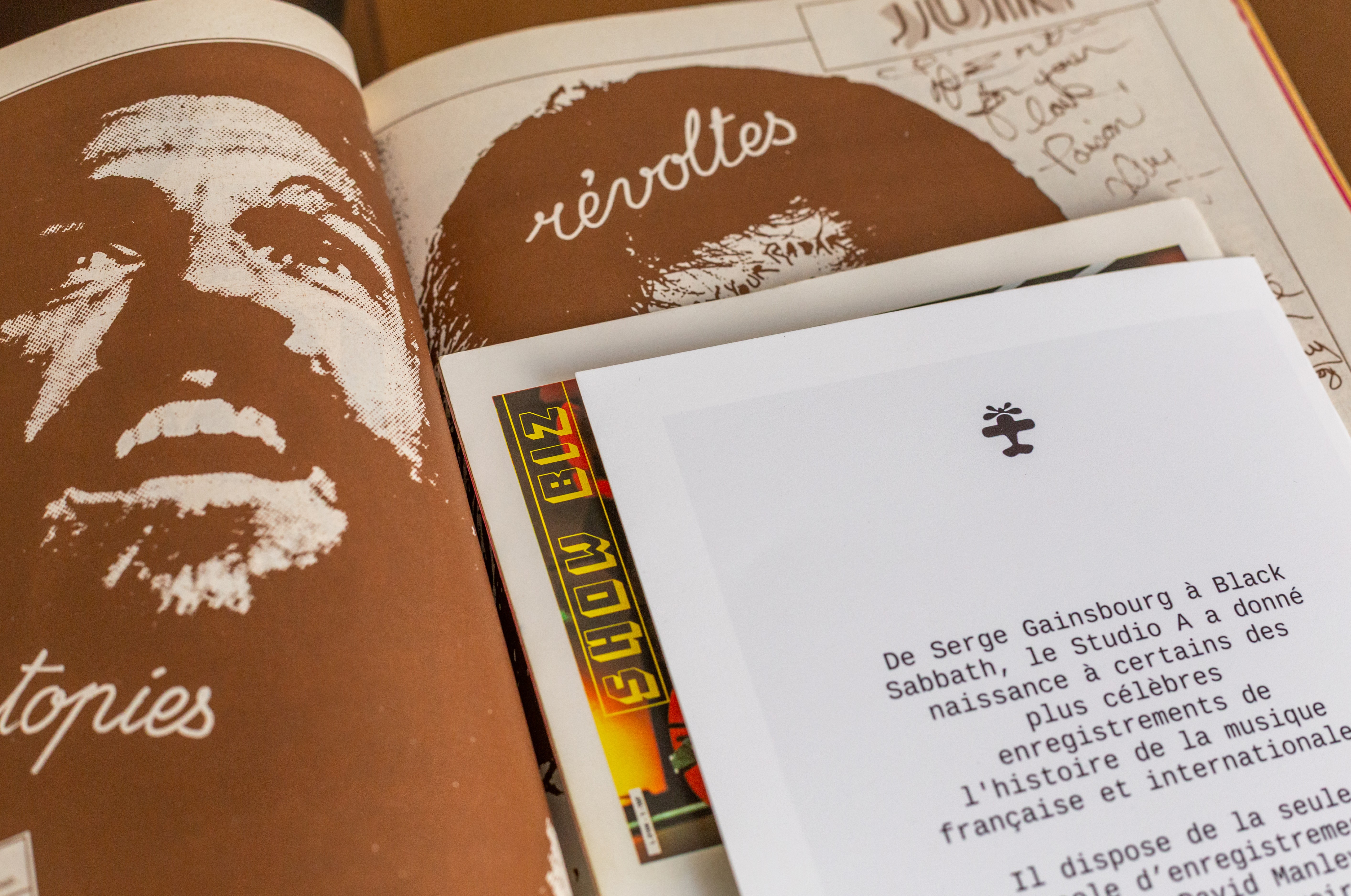
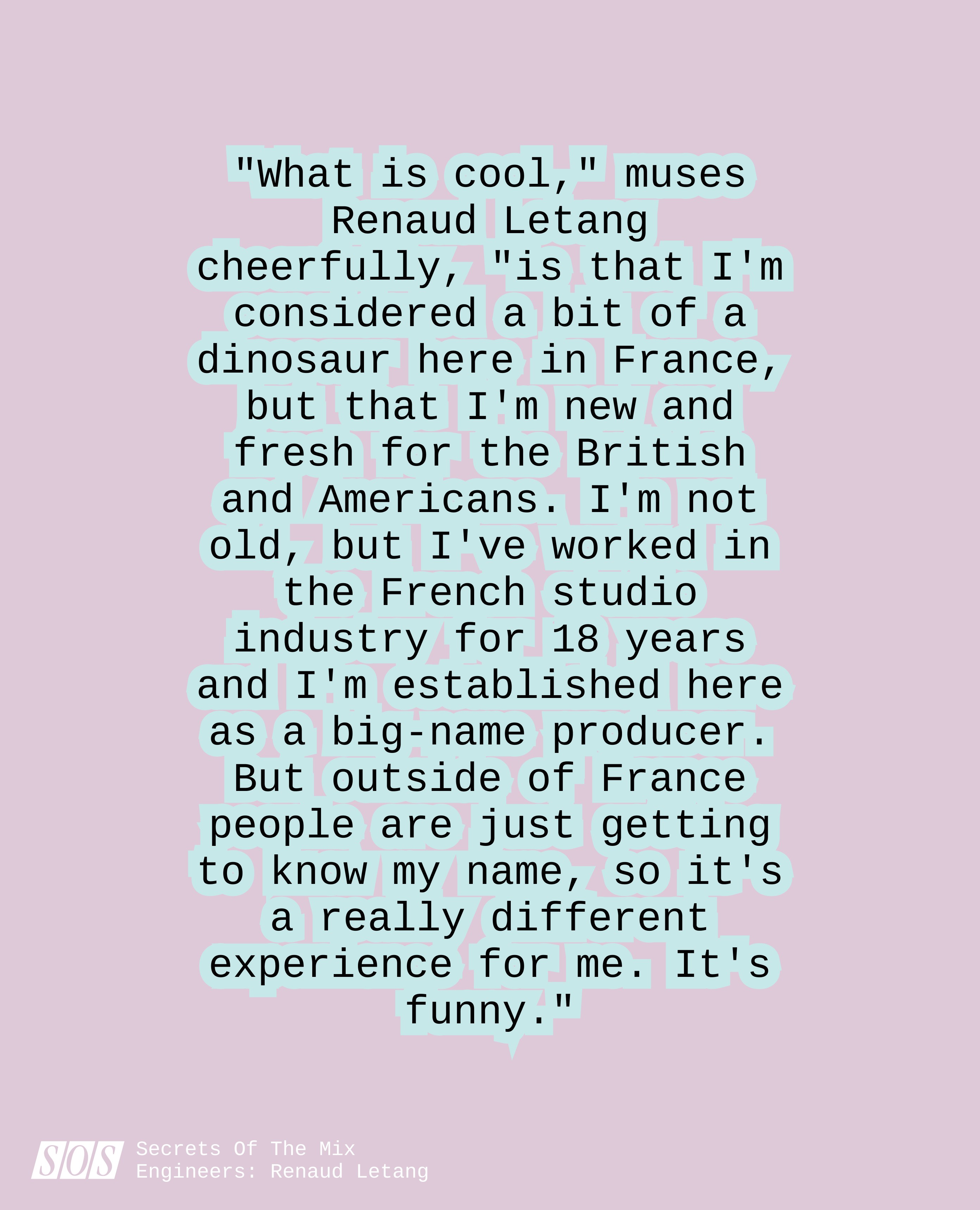
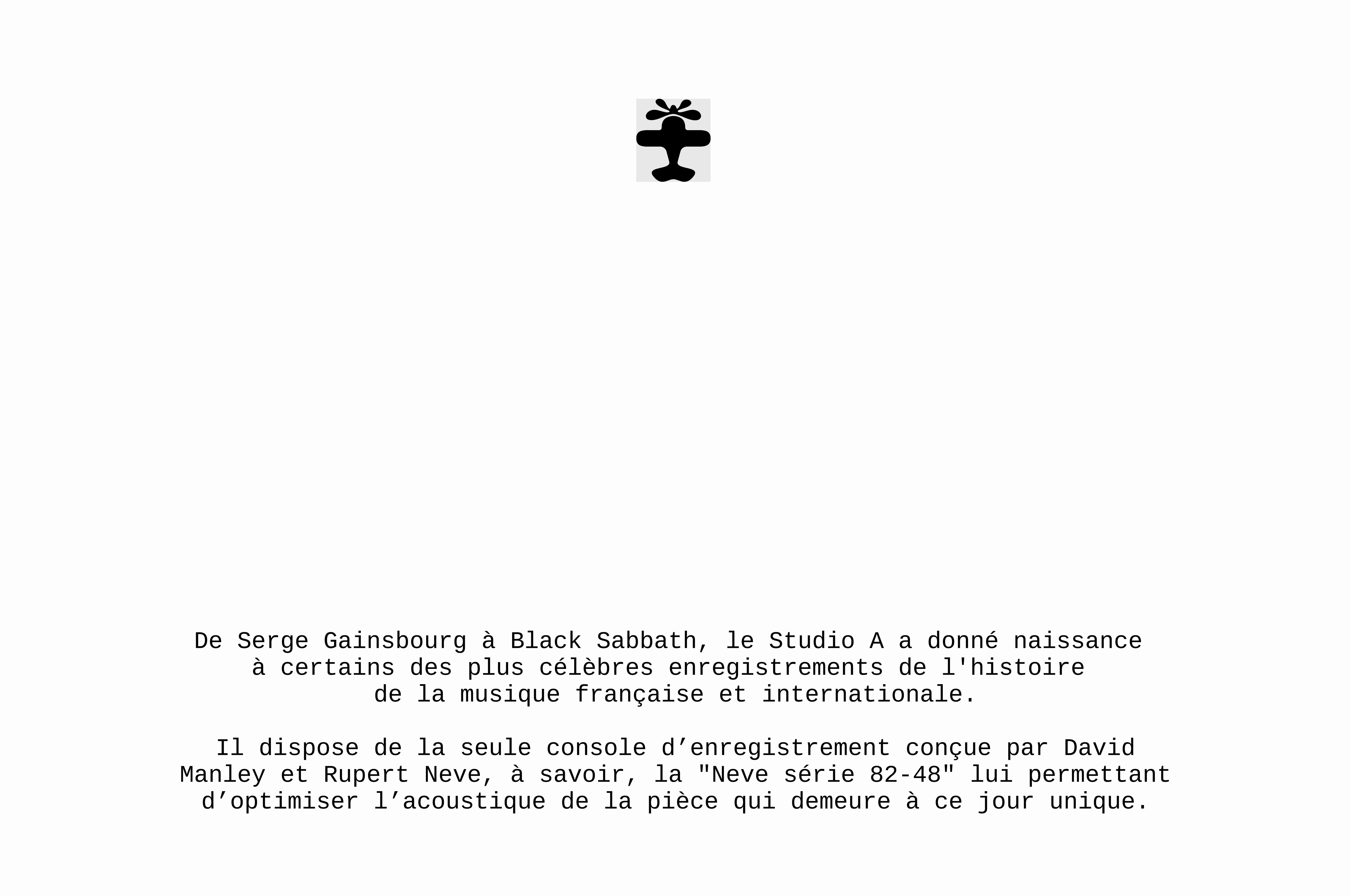
To step through the door at 56 rue du Capitaine-Ferber is to step into history. Studios Ferber is first and foremost René Ameline, the recording engineer behind "Pour un flirt" at Davout, who set up his own recording studios in the 1970s. It is also Black Sabbath, Cerrone, Nina Simone, Gainsbourg, Selena Gomez and Oxmo Puccino; it is the soundtracks for City of Angels and The Count of Monte Cristo; it is the Neve 82-48 series, a one-of-a-kind recording console coveted the world over; it is the hundreds of analogue tapes stored in the basement, precious vessels holding tracks that will never see the light of day; it is the old CRT monitor that Renaud Létang, René's successor, still uses to mix. For studios this legendary, word of mouth is enough to keep the business going, and Ferber could have left it at that. Beyond the oak-panelled walls, a world of possibilities awaits: brands eager to attach their name to this creative institution, culture lovers who would pay just to step inside, cult objects yet to be imagined. Ferber turned to Bruno to capitalise on an identity that had been left largely untapped and bring it into its own. The brand already had a powerful icon and wordmark. "Working with elements that haven't changed since the 70s is like playing a 150-year-old violin. You mustn't damage it," said Pierre Jeannelle, Creative Director. We reworked the aeroplane, a tribute to the aviator whose name the street bears, turning it into a clean, scalable icon at the heart of the art direction. The propeller stayed organic, almost liquid. As for the typography, the choice fell on a monospaced typeface that nods to Renaud's CRT monitor, of course. Beyond that, Studios Ferber doesn't need to court attention. It needs to embrace a creative brand identity, but one that can sit alongside the thousands of other identities it will frame: those of the artists. Colours will be chosen as instinct dictates, and the graphic compositions will follow no rule but that of the curious, the strange, the offbeat. The final but crucial step was to advise the team on a social media strategy that does justice to the stories Ferber has to tell.
Credits
Executive Direction
Barthélémy Chalvet
Creative Direction
Pierre Jeannelle
Project Management
Paul Matthieu-Colin
Categories
Visual identity
Mass market brands
Arts & Culture
Entertainment
Informations
Bringing a legendary place to life beyond its walls.
To step through the door at 56 rue du Capitaine-Ferber is to step into history. Studios Ferber is first and foremost René Ameline, the recording engineer behind "Pour un flirt" at Davout, who set up his own recording studios in the 1970s. It is also Black Sabbath, Cerrone, Nina Simone, Gainsbourg, Selena Gomez and Oxmo Puccino; it is the soundtracks for City of Angels and The Count of Monte Cristo; it is the Neve 82-48 series, a one-of-a-kind recording console coveted the world over; it is the hundreds of analogue tapes stored in the basement, precious vessels holding tracks that will never see the light of day; it is the old CRT monitor that Renaud Létang, René's successor, still uses to mix. For studios this legendary, word of mouth is enough to keep the business going, and Ferber could have left it at that. Beyond the oak-panelled walls, a world of possibilities awaits: brands eager to attach their name to this creative institution, culture lovers who would pay just to step inside, cult objects yet to be imagined. Ferber turned to Bruno to capitalise on an identity that had been left largely untapped and bring it into its own. The brand already had a powerful icon and wordmark. "Working with elements that haven't changed since the 70s is like playing a 150-year-old violin. You mustn't damage it," said Pierre Jeannelle, Creative Director. We reworked the aeroplane, a tribute to the aviator whose name the street bears, turning it into a clean, scalable icon at the heart of the art direction. The propeller stayed organic, almost liquid. As for the typography, the choice fell on a monospaced typeface that nods to Renaud's CRT monitor, of course. Beyond that, Studios Ferber doesn't need to court attention. It needs to embrace a creative brand identity, but one that can sit alongside the thousands of other identities it will frame: those of the artists. Colours will be chosen as instinct dictates, and the graphic compositions will follow no rule but that of the curious, the strange, the offbeat. The final but crucial step was to advise the team on a social media strategy that does justice to the stories Ferber has to tell.
Credits
Executive Direction
Barthélémy Chalvet
Creative Direction
Pierre Jeannelle
Project Management
Paul Matthieu-Colin
Categories
Visual identity
Mass market brands
Arts & Culture
Entertainment
" transform="translate(5.875 5.018)" width="5.625000000000001px"/><path d="M 3.375 6.75 L 1 6.75 C 0.448 6.75 0 6.302 0 5.75 L 0 1 C 0 0.448 0.448 0 1 0 L 3.375 0 M 18.08 1.065 L 13.58 5.565 M 18.08 5.565 L 13.58 1.065" fill="transparent" height="6.75px" id="tf38oZaKO" stroke-dasharray="" stroke-linecap="round" stroke-linejoin="round" stroke-width="1.5" stroke="rgb(50, 50, 50)" transform="translate(2.5 8.625)" width="18.079999923706055px"/></g></svg>)

Rebranding Varsity, a European VC fund, with a warm and human identity built around one idea: founders think better when they're backed by more than one mind.
Celeres designs, integrates and supports the software and systems that critical missions depend on across space, defence, transport and public services. We created a strategic, visual and verbal identity, along with a new website, to reveal its essential role in environments where failure is not an option.

Alaska State Archives is a public institution responsible for preserving the state’s records. We redesigned the entire interface while respecting the institutional constraints of working with a government body, and brought Alaska’s history to the forefront by turning archival materials into core design elements.
Uber called on Bruno for a new mobile application: the team from our web agency based in San Francisco worked closely with them to create the UX/UI design of the product.
Rebranding Varsity, a European VC fund, with a warm and human identity built around one idea: founders think better when they're backed by more than one mind.
Celeres designs, integrates and supports the software and systems that critical missions depend on across space, defence, transport and public services. We created a strategic, visual and verbal identity, along with a new website, to reveal its essential role in environments where failure is not an option.
Alaska State Archives is a public institution responsible for preserving the state’s records. We redesigned the entire interface while respecting the institutional constraints of working with a government body, and brought Alaska’s history to the forefront by turning archival materials into core design elements.
Uber called on Bruno for a new mobile application: the team from our web agency based in San Francisco worked closely with them to create the UX/UI design of the product.

The Artificial Intelligence Underwriting Company certifies and insures AI agents, enabling enterprises to adopt them with confidence. Bruno created a brand identity that embodies the rigour and authority of a standard set to shape the industry.
Rebranding Varsity, a European VC fund, with a warm and human identity built around one idea: founders think better when they're backed by more than one mind.
Celeres designs, integrates and supports the software and systems that critical missions depend on across space, defence, transport and public services. We created a strategic, visual and verbal identity, along with a new website, to reveal its essential role in environments where failure is not an option.
Alaska State Archives is a public institution responsible for preserving the state’s records. We redesigned the entire interface while respecting the institutional constraints of working with a government body, and brought Alaska’s history to the forefront by turning archival materials into core design elements.
Uber called on Bruno for a new mobile application: the team from our web agency based in San Francisco worked closely with them to create the UX/UI design of the product.
Rebranding Varsity, a European VC fund, with a warm and human identity built around one idea: founders think better when they're backed by more than one mind.
Celeres designs, integrates and supports the software and systems that critical missions depend on across space, defence, transport and public services. We created a strategic, visual and verbal identity, along with a new website, to reveal its essential role in environments where failure is not an option.
Alaska State Archives is a public institution responsible for preserving the state’s records. We redesigned the entire interface while respecting the institutional constraints of working with a government body, and brought Alaska’s history to the forefront by turning archival materials into core design elements.
Uber called on Bruno for a new mobile application: the team from our web agency based in San Francisco worked closely with them to create the UX/UI design of the product.