
Varsity
Rebranding Varsity, a European VC fund, with a warm and human identity built around one idea: founders think better when they're backed by more than one mind.
Informations
Forget the interface, reconnect with what matters.
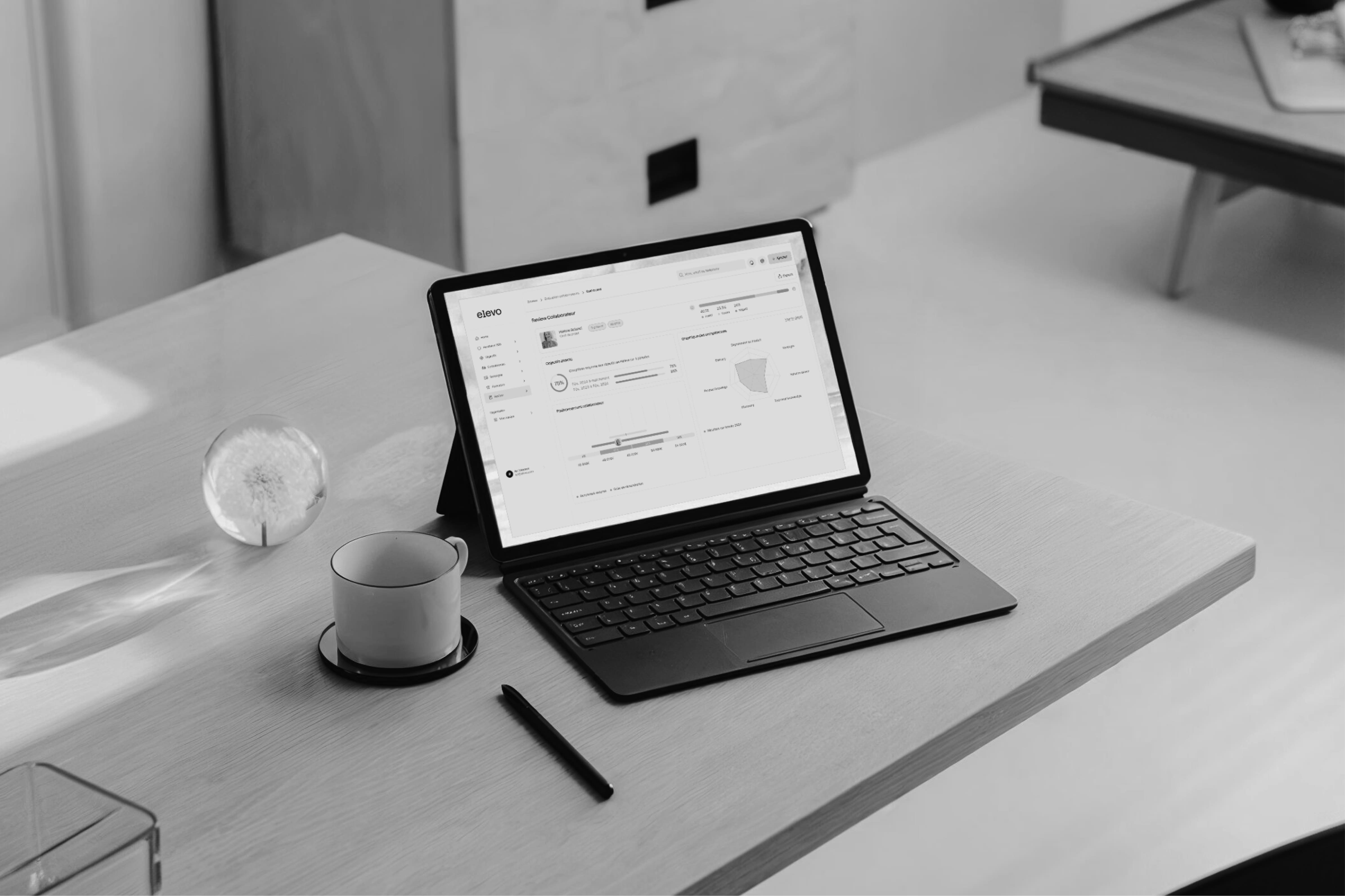
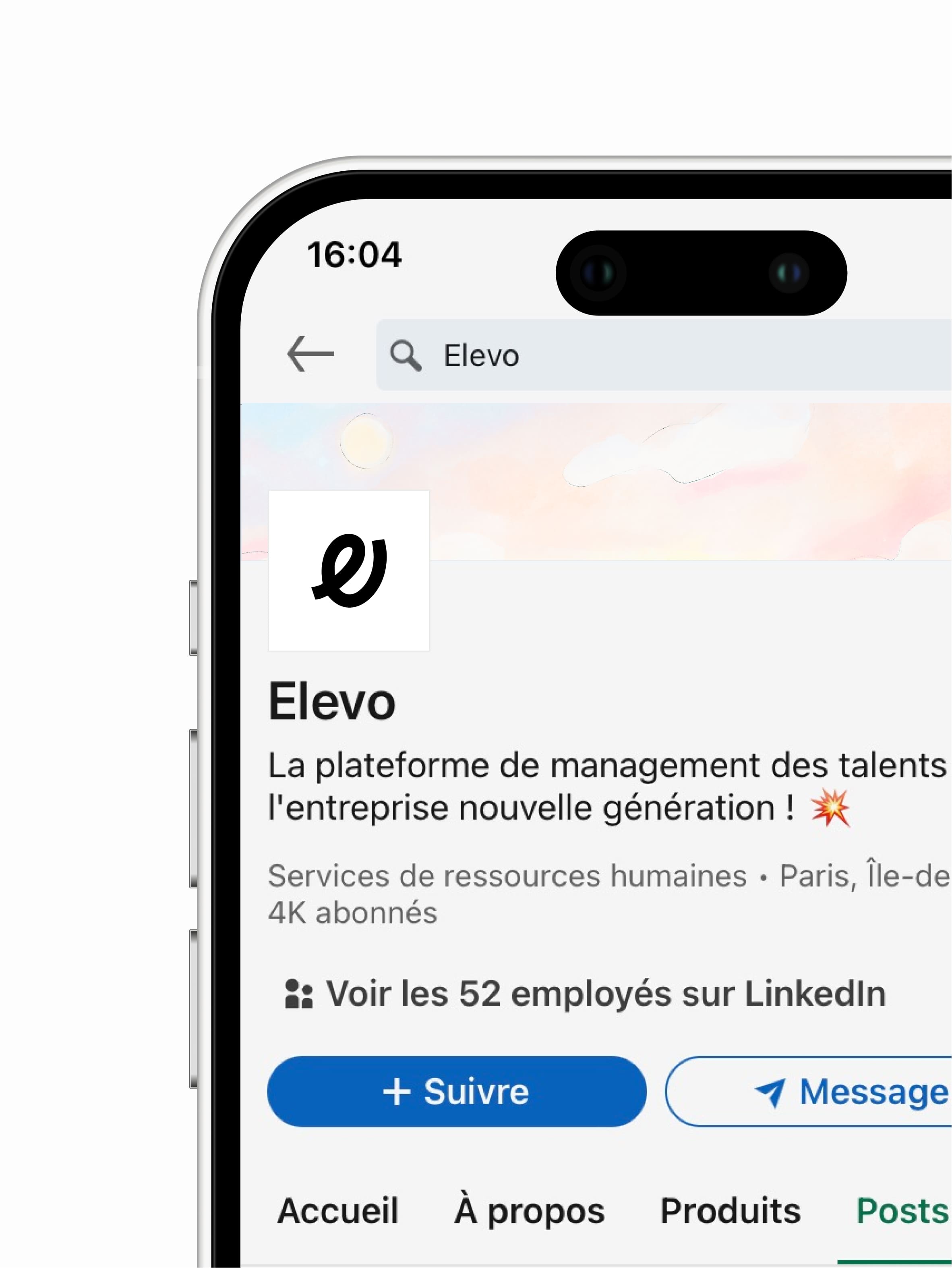
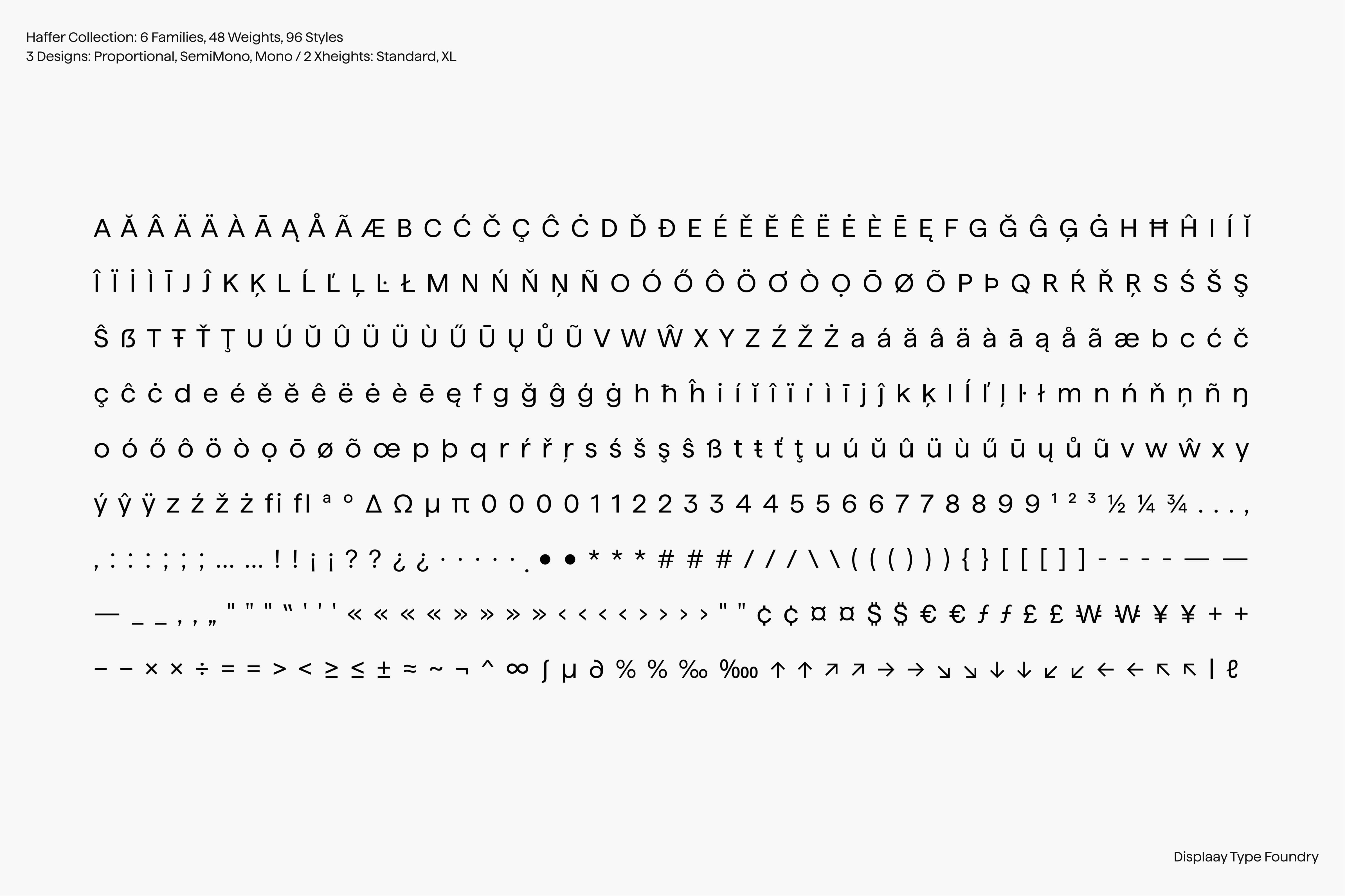
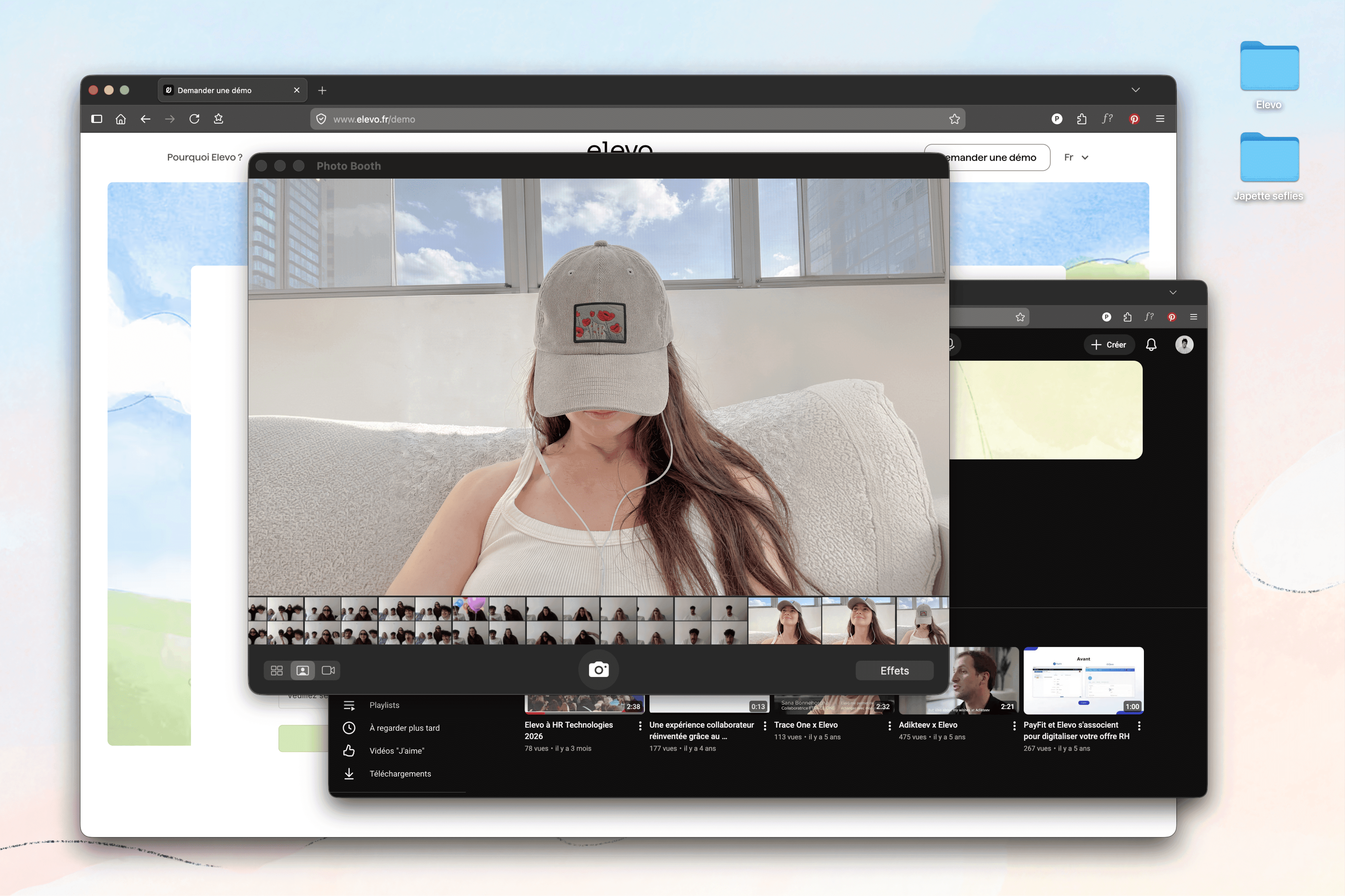
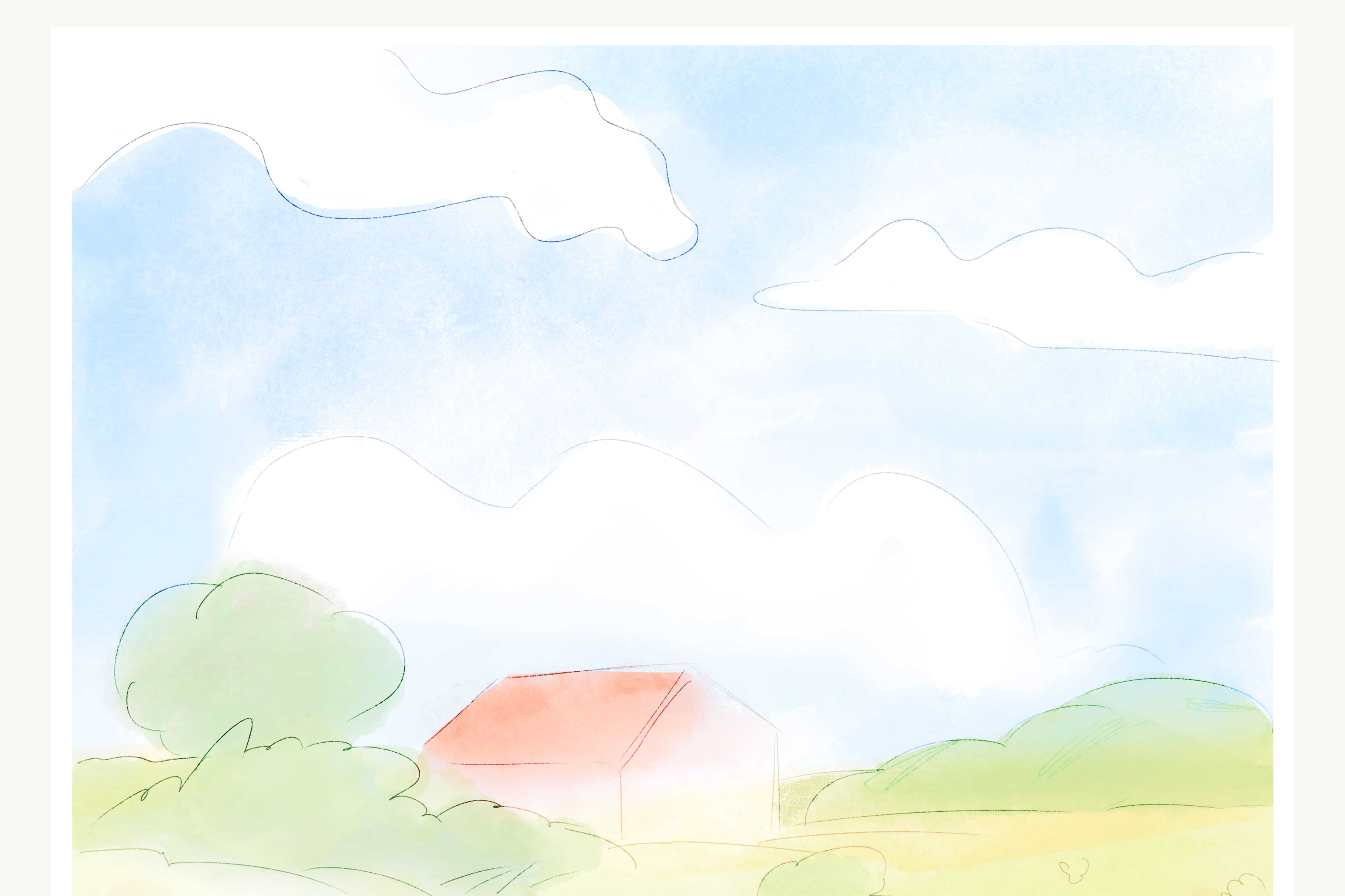
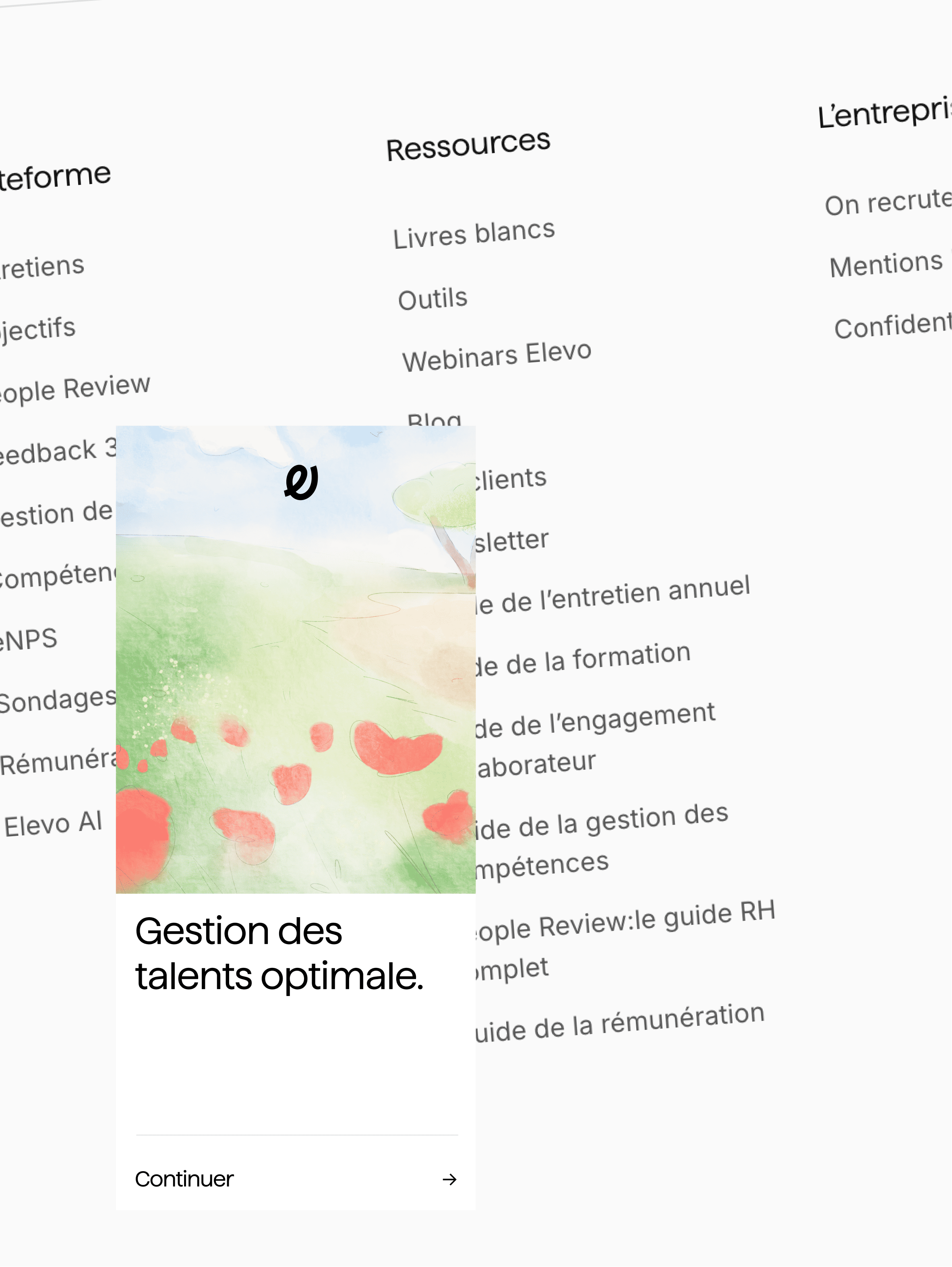
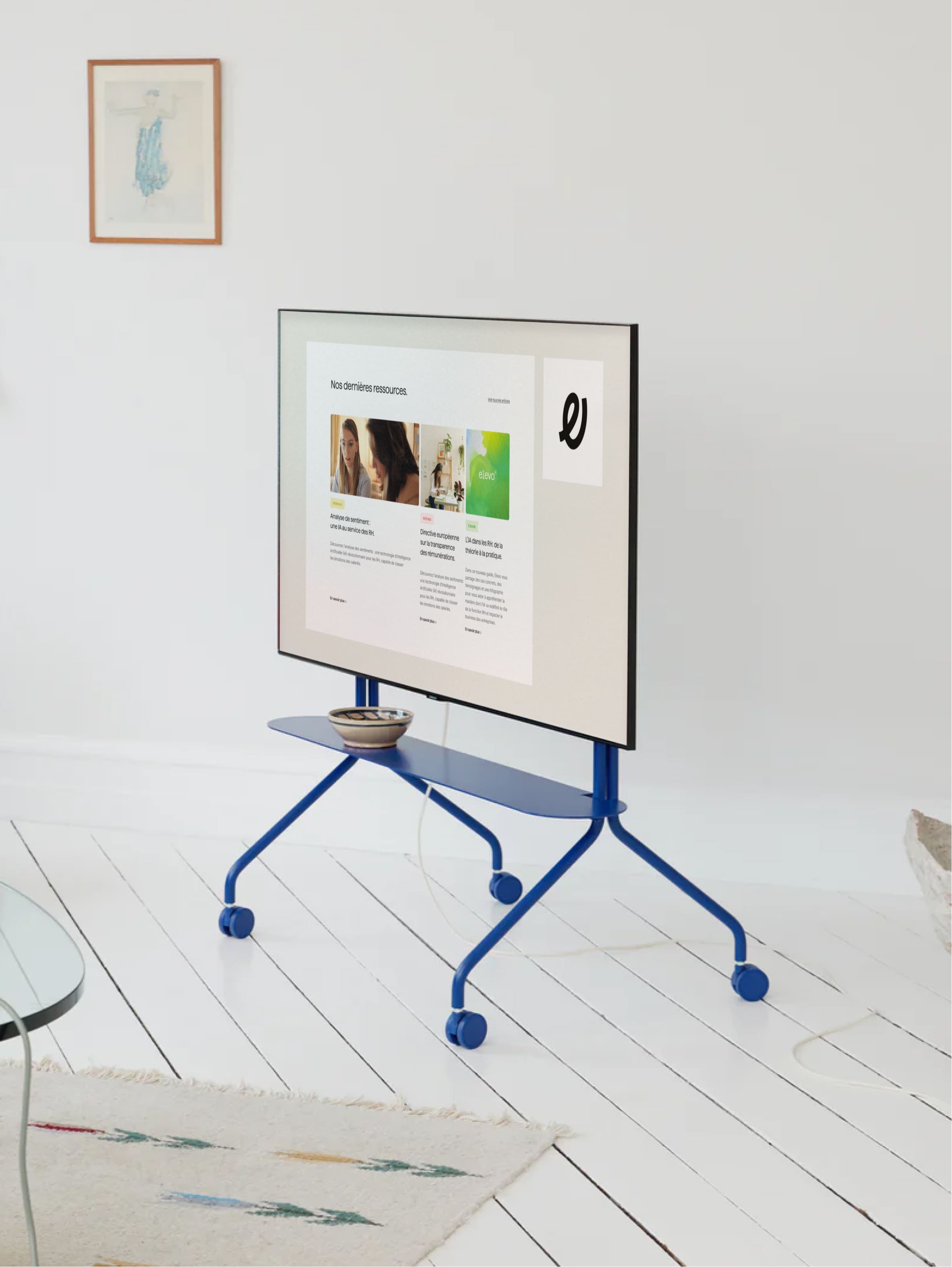
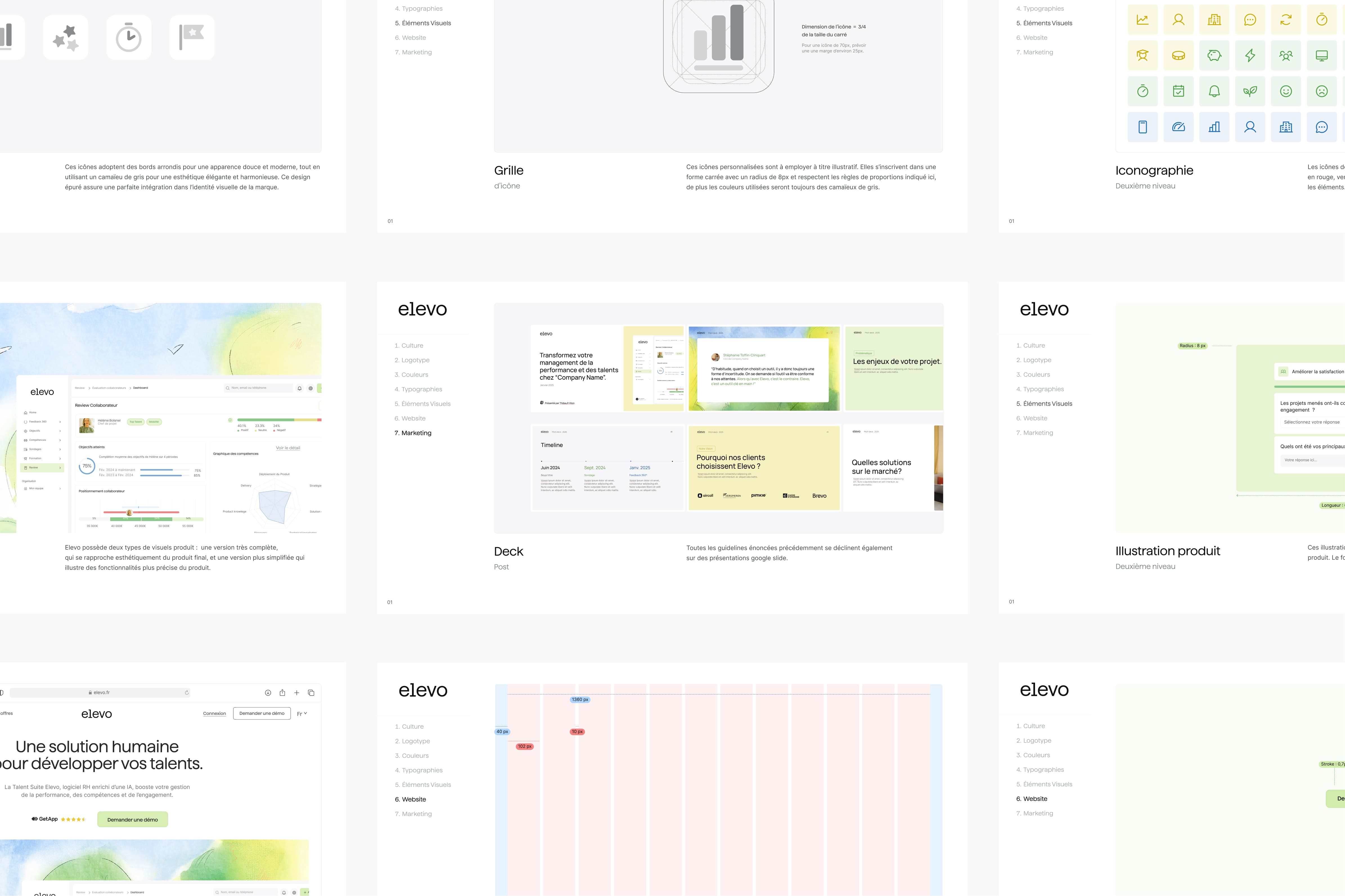
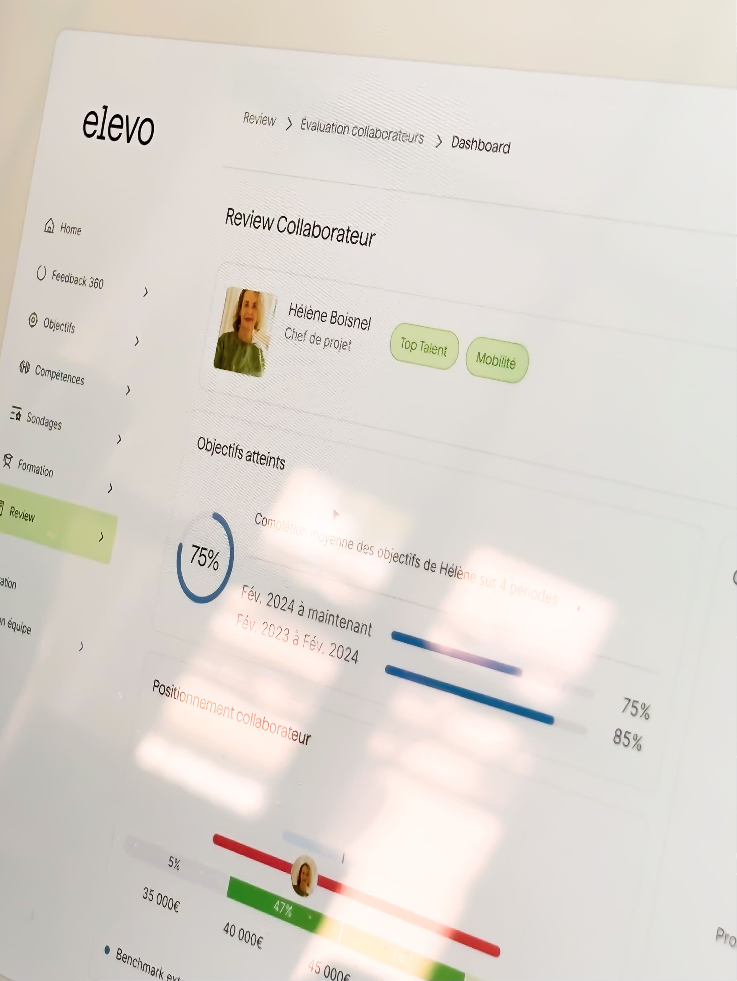
From purple gradients to the relentless hype around AI, the HR and talent management SaaS market has become saturated with futuristic promises, to the point of forgetting the most important one: human relationships should remain at the centre of everything. Elevo’s founder, however, always kept this conviction as a guiding principle. One client even reported that Elevo had given back a considerable amount of time to real conversations between HR teams, managers and employees, to the extent that they almost forgot they were dealing with a product at all. There lay Elevo’s singularity: “A talent management platform where technology steps aside for conversation.” Our role was to build an identity capable of establishing Elevo as a mature, reliable and established company, while affirming its position as a new-generation talent suite. A brand that feels more structured, more coherent and more recognisable. The strategy developed alongside the Bruno teams crystallised around a simple idea: turning Elevo into a professional safe place. Elevo had to become a window onto a more human world of work, for the benefit of everyone. The artistic direction deliberately moves away from dominant tech aesthetics in favour of a more timeless system. Interfaces are spacious, compositions structured yet warm, and fresh colours are used sparingly as navigational cues. Haffer was chosen for its softness and humanist stability, while the illustrations, inspired by the work of Sempé, introduce breathing space and closeness into a category often overwhelmed by technicality. Every element until UX and web design was conceived to create the conditions for a calm and legible experience. Technology simply focuses on doing its job.
Credits
Executive Direction
Léonard Chalvet
Strategic Planning
Léa Texier
Creative Direction
Pierre Jeannelle
Art Direction
Maëlle Dubois
Graphic Design
Maëlle Dubois
Copywriting
Léa Texier
Web Design
Tony Lixivel
Web Development
Thomas Sanouiller
Motion design
Maël Masson, Shayan Fabre
Illustration
Maëlle Dubois
Project Management
Grégoire Dehem
Categories
Visual identity
Development
Motion Design
Illustration
Web design
Technology
AI
Tech
" transform="translate(5.875 5.018)" width="5.625000000000001px"/><path d="M 3.375 6.75 L 1 6.75 C 0.448 6.75 0 6.302 0 5.75 L 0 1 C 0 0.448 0.448 0 1 0 L 3.375 0 M 18.08 1.065 L 13.58 5.565 M 18.08 5.565 L 13.58 1.065" fill="transparent" height="6.75px" id="tf38oZaKO" stroke-dasharray="" stroke-linecap="round" stroke-linejoin="round" stroke-width="1.5" stroke="rgb(50, 50, 50)" transform="translate(2.5 8.625)" width="18.079999923706055px"/></g></svg>)


Rebranding Varsity, a European VC fund, with a warm and human identity built around one idea: founders think better when they're backed by more than one mind.
Celeres designs, integrates and supports the software and systems that critical missions depend on across space, defence, transport and public services. We created a strategic, visual and verbal identity, along with a new website, to reveal its essential role in environments where failure is not an option.

Alaska State Archives is a public institution responsible for preserving the state’s records. We redesigned the entire interface while respecting the institutional constraints of working with a government body, and brought Alaska’s history to the forefront by turning archival materials into core design elements.

For Pokémon’s 30th anniversary, Rimowa wanted more than a simple collaboration. Bruno reinterpreted its iconic aluminium suitcase through the visual language of Pokémon, creating an object where both worlds feel naturally connected.
Rebranding Varsity, a European VC fund, with a warm and human identity built around one idea: founders think better when they're backed by more than one mind.
Celeres designs, integrates and supports the software and systems that critical missions depend on across space, defence, transport and public services. We created a strategic, visual and verbal identity, along with a new website, to reveal its essential role in environments where failure is not an option.
Alaska State Archives is a public institution responsible for preserving the state’s records. We redesigned the entire interface while respecting the institutional constraints of working with a government body, and brought Alaska’s history to the forefront by turning archival materials into core design elements.
For Pokémon’s 30th anniversary, Rimowa wanted more than a simple collaboration. Bruno reinterpreted its iconic aluminium suitcase through the visual language of Pokémon, creating an object where both worlds feel naturally connected.
Uber called on Bruno for a new mobile application: the team from our web agency based in San Francisco worked closely with them to create the UX/UI design of the product.
Rebranding Varsity, a European VC fund, with a warm and human identity built around one idea: founders think better when they're backed by more than one mind.
Celeres designs, integrates and supports the software and systems that critical missions depend on across space, defence, transport and public services. We created a strategic, visual and verbal identity, along with a new website, to reveal its essential role in environments where failure is not an option.
Alaska State Archives is a public institution responsible for preserving the state’s records. We redesigned the entire interface while respecting the institutional constraints of working with a government body, and brought Alaska’s history to the forefront by turning archival materials into core design elements.
For Pokémon’s 30th anniversary, Rimowa wanted more than a simple collaboration. Bruno reinterpreted its iconic aluminium suitcase through the visual language of Pokémon, creating an object where both worlds feel naturally connected.