Bruno was a lovely grandfather.
Today, it's a branding agency.

Work

Services

About

Careers

Contact

Bruno was a lovely grandfather.
Today, it's a branding agency.

Work

Services

About

Careers

Contact

Bruno was a lovely grandfather.
Today, it's a branding agency.

Contact

Menu

Informations

Three founders, one rope.

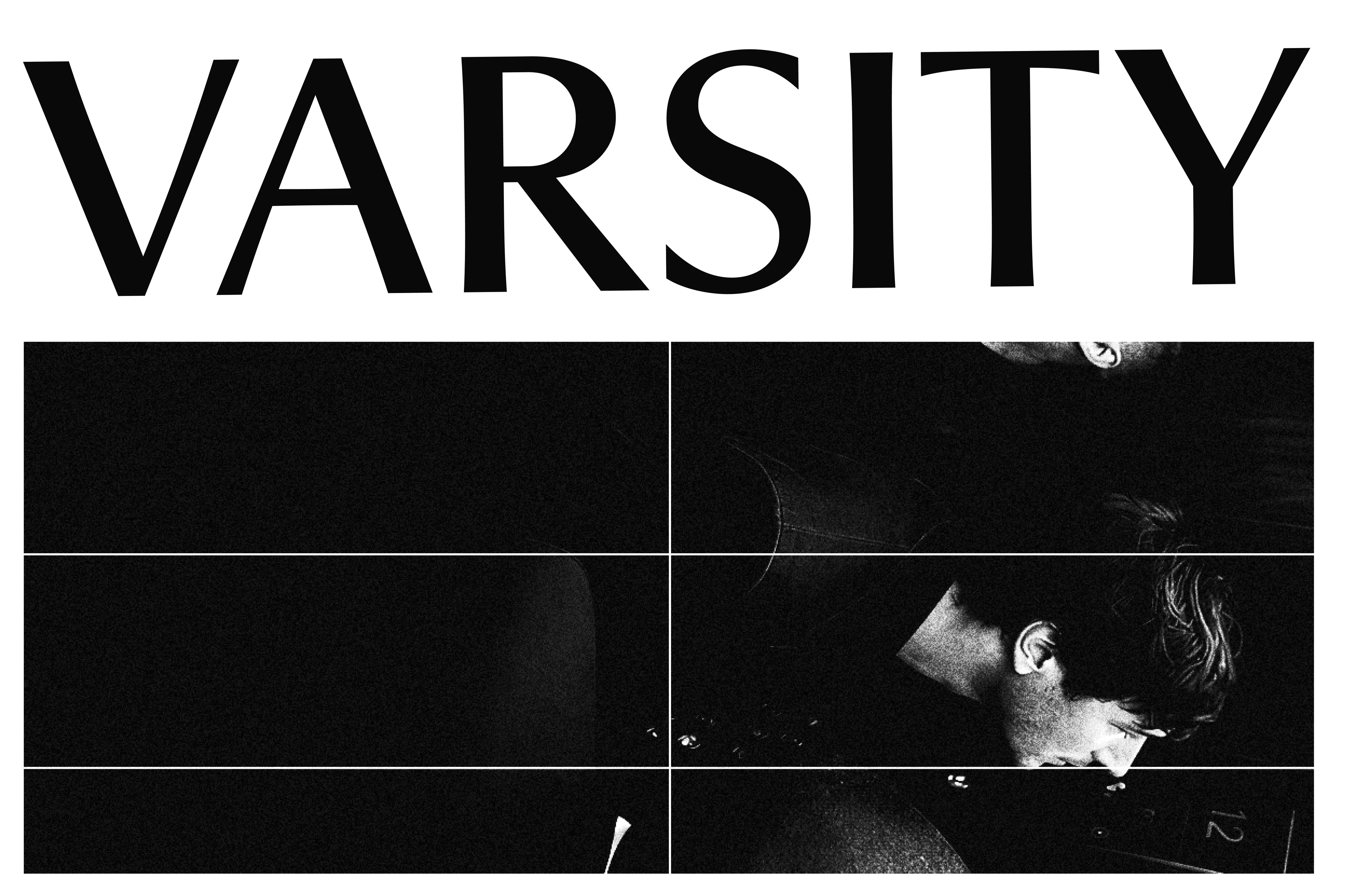
A good VC does more than invest money. The best ones invest themselves, stay close, bring perspective by helping founders build something that lasts. That belief sits at the centre of everything we did for Varsity. Varsity is a European VC fund built by three people from very different sides of finance. As the market standardised, a lot of funds started to sound the same: loud, fast, and wrapped in the same entrepreneurial in-crowd language. Varsity wanted something warmer and more honest, a brand that is useful to the people it backs. Everything starts from one conviction. A founder backed by three minds sees further than a founder backed by one. The art direction brings that idea to life through climbing. Every founder is on their own route, with their own wall and their own pace. But no one climbs alone. Each is tied to the same rope, held by a network of peers, partners, and people who've made the climb before. It turns personal support into collective strength, no founder is ever really on their own. We built all of it: brand strategy, tone of voice, art direction, website, motion, and a new signature line. A brand shaped like a rope: steady, collective, and built to hold.

Credits

Executive Direction

Barthélémy Chalvet, Léonard Chalvet

Strategic Planning

Lisa Crespi

Creative Direction

Pierre Jeannelle

Art Direction

Nicolas Le Gall

Copywriting

Victor Brami, Juliette Laporte

Web Design

Nicolas Le Gall

Web Development

Jim Zona

Motion design

Shayan Fabre

Project Management

Julie Comandu

Categories

Verbal Identity

Visual Identity

Strategic identity

Development

Motion Design

Web design

Branding

Investment

Finance

Tech

varsity.vc

Informations

Three founders, one rope.

A good VC does more than invest money. The best ones invest themselves, stay close, bring perspective by helping founders build something that lasts. That belief sits at the centre of everything we did for Varsity. Varsity is a European VC fund built by three people from very different sides of finance. As the market standardised, a lot of funds started to sound the same: loud, fast, and wrapped in the same entrepreneurial in-crowd language. Varsity wanted something warmer and more honest, a brand that is useful to the people it backs. Everything starts from one conviction. A founder backed by three minds sees further than a founder backed by one. The art direction brings that idea to life through climbing. Every founder is on their own route, with their own wall and their own pace. But no one climbs alone. Each is tied to the same rope, held by a network of peers, partners, and people who've made the climb before. It turns personal support into collective strength, no founder is ever really on their own. We built all of it: brand strategy, tone of voice, art direction, website, motion, and a new signature line. A brand shaped like a rope: steady, collective, and built to hold.

Credits

Executive Direction

Barthélémy Chalvet, Léonard Chalvet

Strategic Planning

Lisa Crespi

Creative Direction

Pierre Jeannelle

Art Direction

Nicolas Le Gall

Copywriting

Victor Brami, Juliette Laporte

Web Design

Nicolas Le Gall

Web Development

Jim Zona

Motion design

Shayan Fabre

Project Management

Julie Comandu

Categories

Verbal Identity

Visual Identity

Strategic identity

Development

Motion Design

Web design

Branding

Investment

Finance

Tech

varsity.vc

More projects

Celeres

Celeres designs, integrates and supports the software and systems that critical missions depend on across space, defence, transport and public services. We created a strategic, visual and verbal identity, along with a new website, to reveal its essential role in environments where failure is not an option.

Alaska State Archives — web design, visual identity and branding, a project by BRUNO branding agency

Alaska State Archives

Alaska State Archives is a public institution responsible for preserving the state’s records. We redesigned the entire interface while respecting the institutional constraints of working with a government body, and brought Alaska’s history to the forefront by turning archival materials into core design elements.

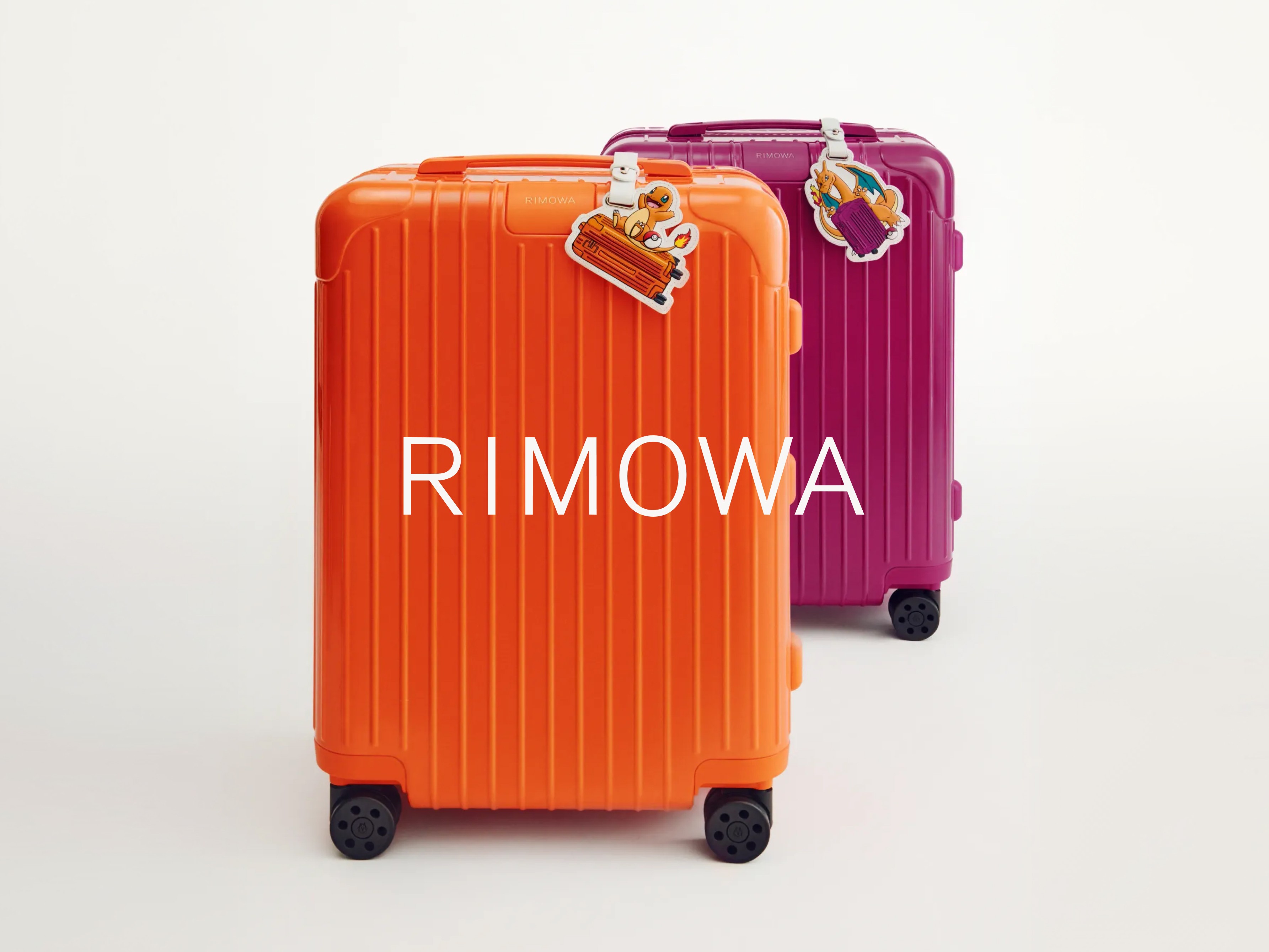
Rimowa x Pokemon 30 years anniversary — illustration, a project by BRUNO branding agency

Rimowa x Pokemon 30 years anniversary

For Pokémon’s 30th anniversary, Rimowa wanted more than a simple collaboration. Bruno reinterpreted its iconic aluminium suitcase through the visual language of Pokémon, creating an object where both worlds feel naturally connected.

Qonto

Qonto turned to the agency to lay the foundations of its brand universe. From digital design to web development, including the credit card design, the goal was to inject energy into a fast-growing brand.

More projects

Celeres

Celeres designs, integrates and supports the software and systems that critical missions depend on across space, defence, transport and public services. We created a strategic, visual and verbal identity, along with a new website, to reveal its essential role in environments where failure is not an option.

Alaska State Archives — web design, visual identity and branding, a project by BRUNO branding agency

Alaska State Archives

Alaska State Archives is a public institution responsible for preserving the state’s records. We redesigned the entire interface while respecting the institutional constraints of working with a government body, and brought Alaska’s history to the forefront by turning archival materials into core design elements.

Rimowa x Pokemon 30 years anniversary — illustration, a project by BRUNO branding agency

Rimowa x Pokemon 30 years anniversary

For Pokémon’s 30th anniversary, Rimowa wanted more than a simple collaboration. Bruno reinterpreted its iconic aluminium suitcase through the visual language of Pokémon, creating an object where both worlds feel naturally connected.

Qonto

Qonto turned to the agency to lay the foundations of its brand universe. From digital design to web development, including the credit card design, the goal was to inject energy into a fast-growing brand.

Uber

Uber called on Bruno for a new mobile application: the team from our web agency based in San Francisco worked closely with them to create the UX/UI design of the product.

More projects

Celeres

Celeres designs, integrates and supports the software and systems that critical missions depend on across space, defence, transport and public services. We created a strategic, visual and verbal identity, along with a new website, to reveal its essential role in environments where failure is not an option.

Alaska State Archives — web design, visual identity and branding, a project by BRUNO branding agency

Alaska State Archives

Alaska State Archives is a public institution responsible for preserving the state’s records. We redesigned the entire interface while respecting the institutional constraints of working with a government body, and brought Alaska’s history to the forefront by turning archival materials into core design elements.

Rimowa x Pokemon 30 years anniversary — illustration, a project by BRUNO branding agency

Rimowa x Pokemon 30 years anniversary

For Pokémon’s 30th anniversary, Rimowa wanted more than a simple collaboration. Bruno reinterpreted its iconic aluminium suitcase through the visual language of Pokémon, creating an object where both worlds feel naturally connected.

Qonto

Qonto turned to the agency to lay the foundations of its brand universe. From digital design to web development, including the credit card design, the goal was to inject energy into a fast-growing brand.

More projects

Celeres

Celeres designs, integrates and supports the software and systems that critical missions depend on across space, defence, transport and public services. We created a strategic, visual and verbal identity, along with a new website, to reveal its essential role in environments where failure is not an option.

Alaska State Archives — web design, visual identity and branding, a project by BRUNO branding agency

Alaska State Archives

Alaska State Archives is a public institution responsible for preserving the state’s records. We redesigned the entire interface while respecting the institutional constraints of working with a government body, and brought Alaska’s history to the forefront by turning archival materials into core design elements.

Rimowa x Pokemon 30 years anniversary — illustration, a project by BRUNO branding agency

Rimowa x Pokemon 30 years anniversary

For Pokémon’s 30th anniversary, Rimowa wanted more than a simple collaboration. Bruno reinterpreted its iconic aluminium suitcase through the visual language of Pokémon, creating an object where both worlds feel naturally connected.

Qonto

Qonto turned to the agency to lay the foundations of its brand universe. From digital design to web development, including the credit card design, the goal was to inject energy into a fast-growing brand.

Paris

Barthélémy Chalvet

Co-founder & CEO

27 Rue de Liège, 75008 Paris

+33 6 22 25 78 97

barthelemy@bruno.co

London

Léonard Chalvet

Co-founder & COO

32 Blackfriars Road, London SE1 8PB

+44 7488 812915

leonard@bruno.co

© 2026

Strategic Identity

Visual identity

Verbal identity

Production

Marketing

Digital

Projects

Services

About

Site map

Les Goûts Les Couleurs

Are.na

Instagram,

LinkedIn,

Pinterest

FR,US,UK