AIUC
The Artificial Intelligence Underwriting Company certifies and insures AI agents, enabling enterprises to adopt them with confidence. Bruno created a brand identity that embodies the rigour and authority of a standard set to shape the industry.
Informations
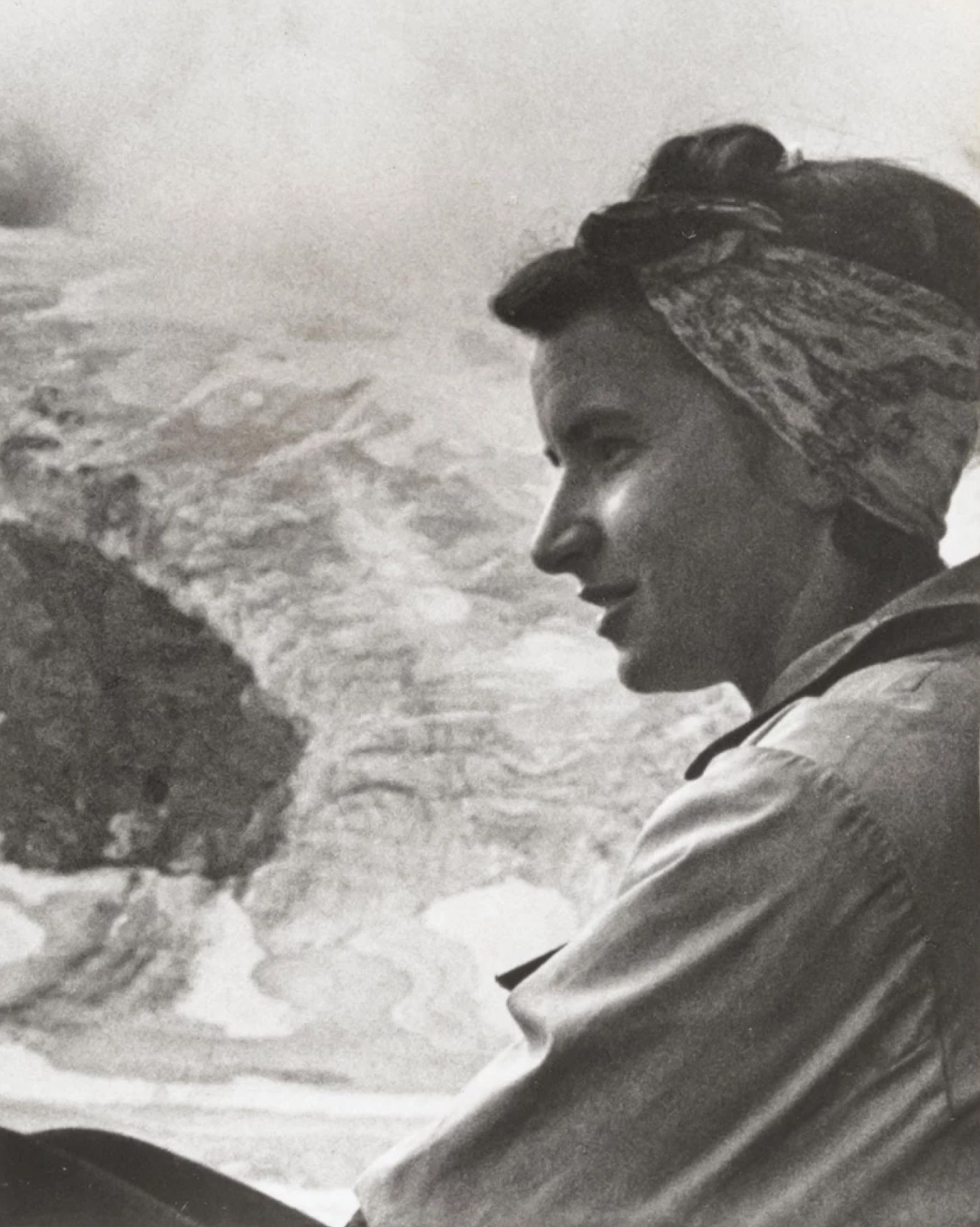
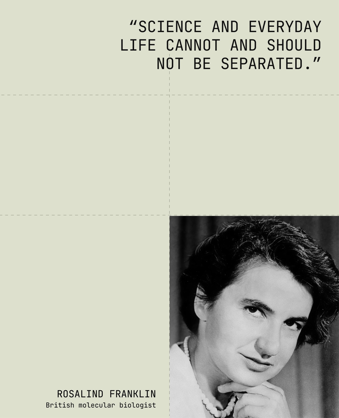
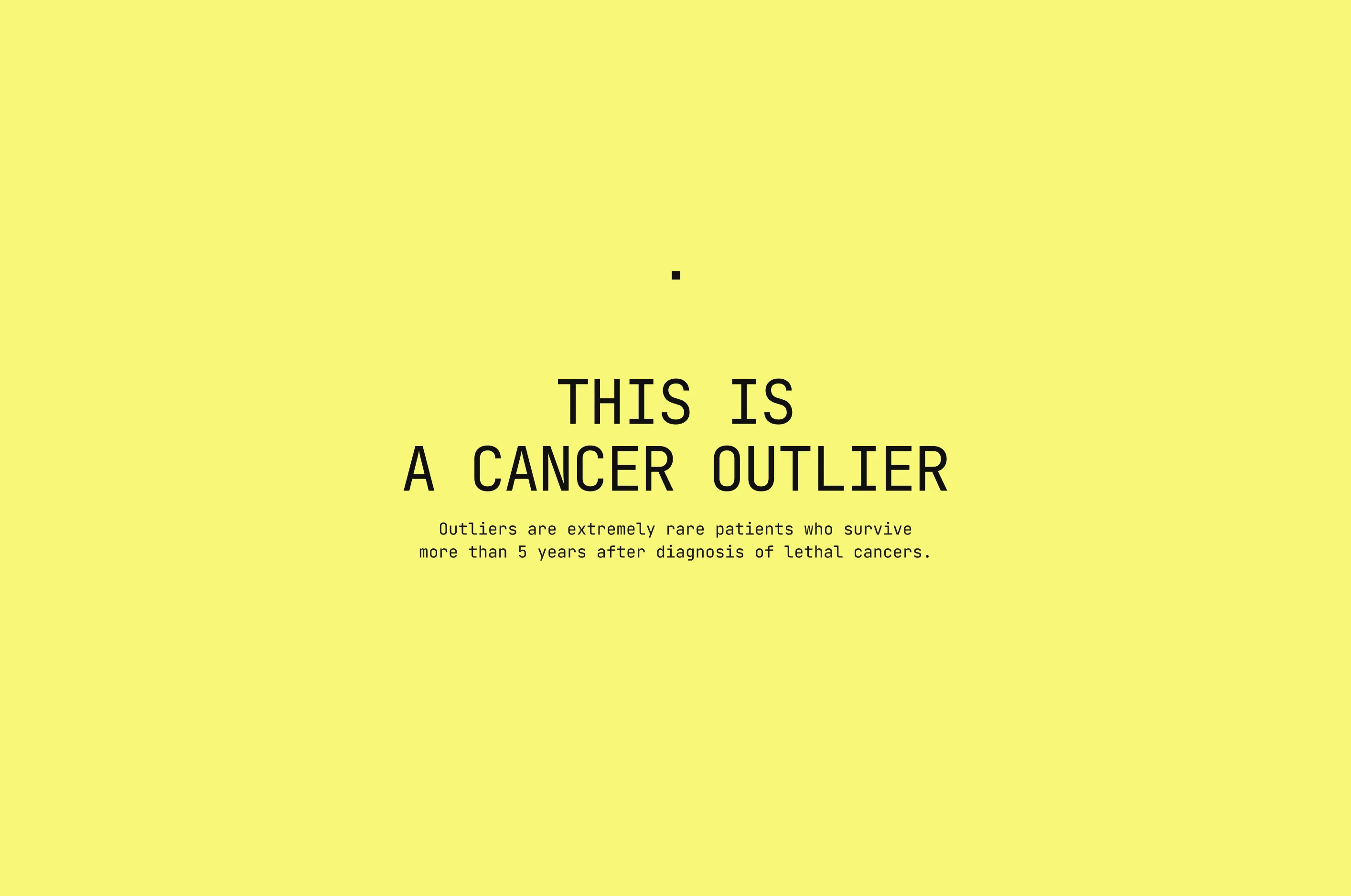
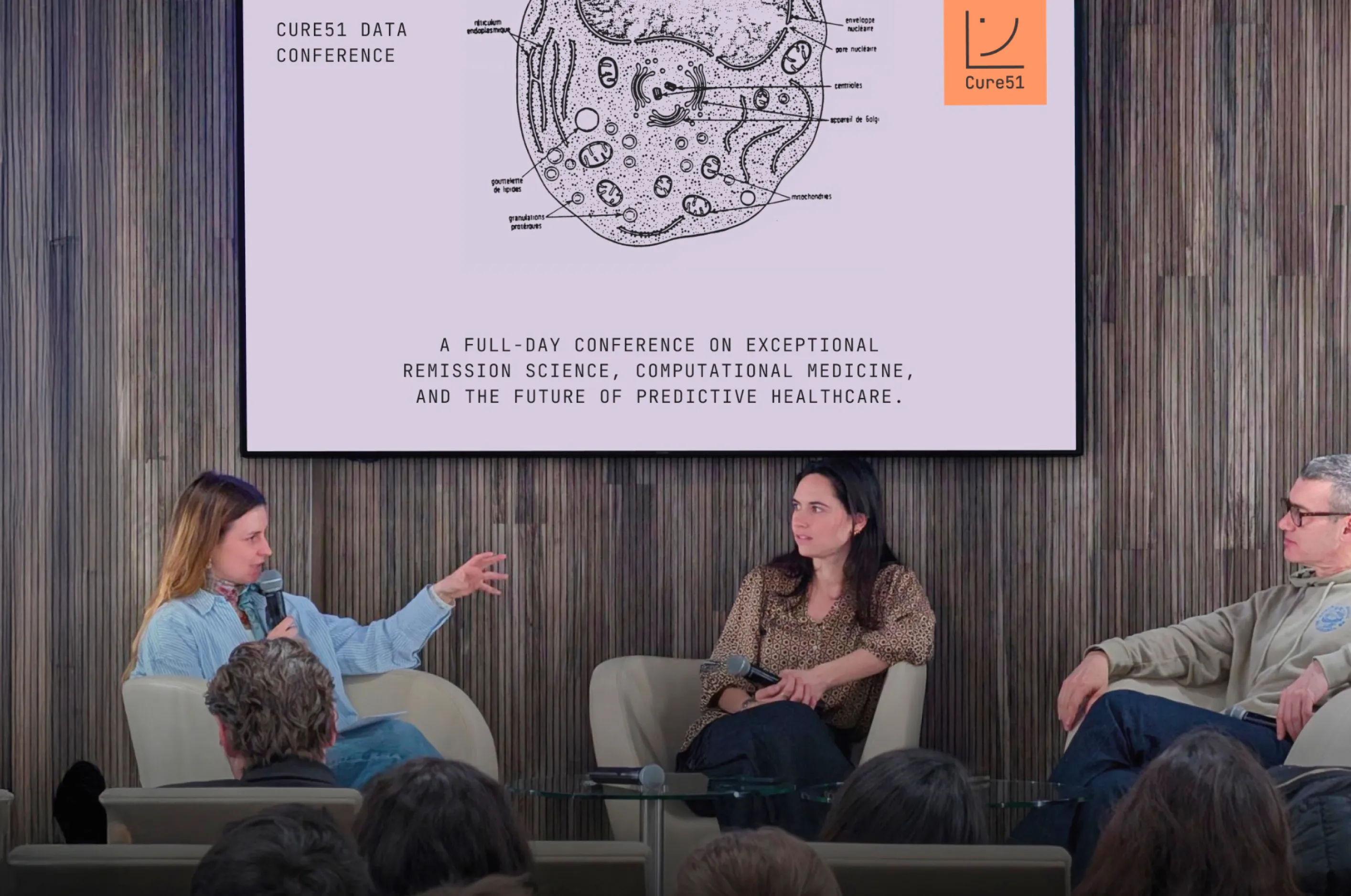
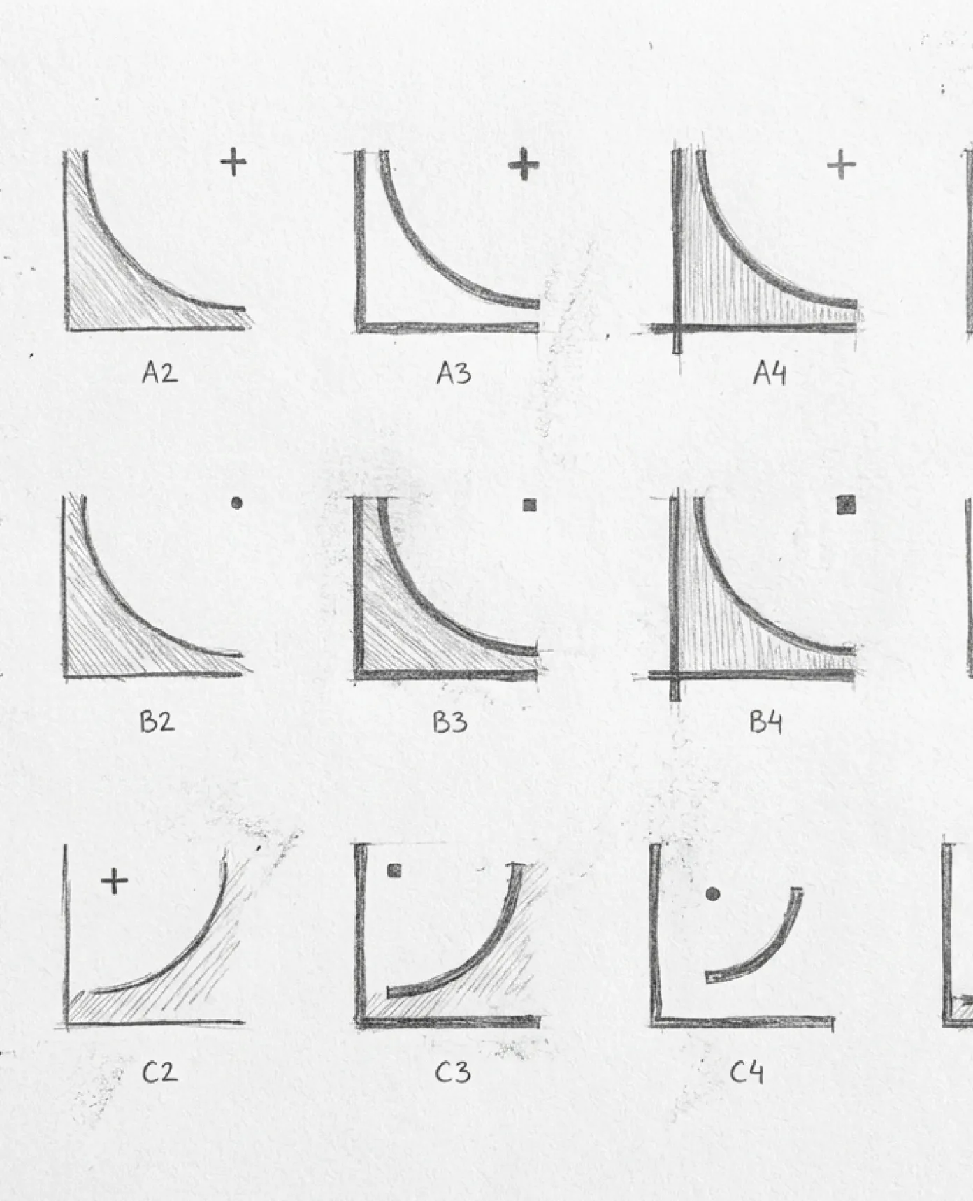
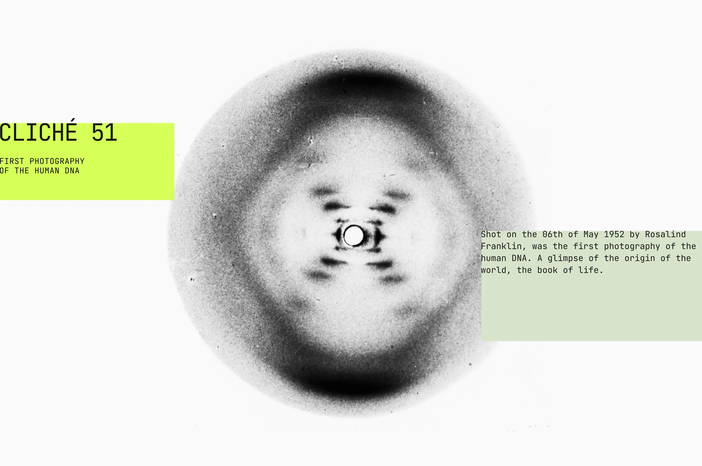
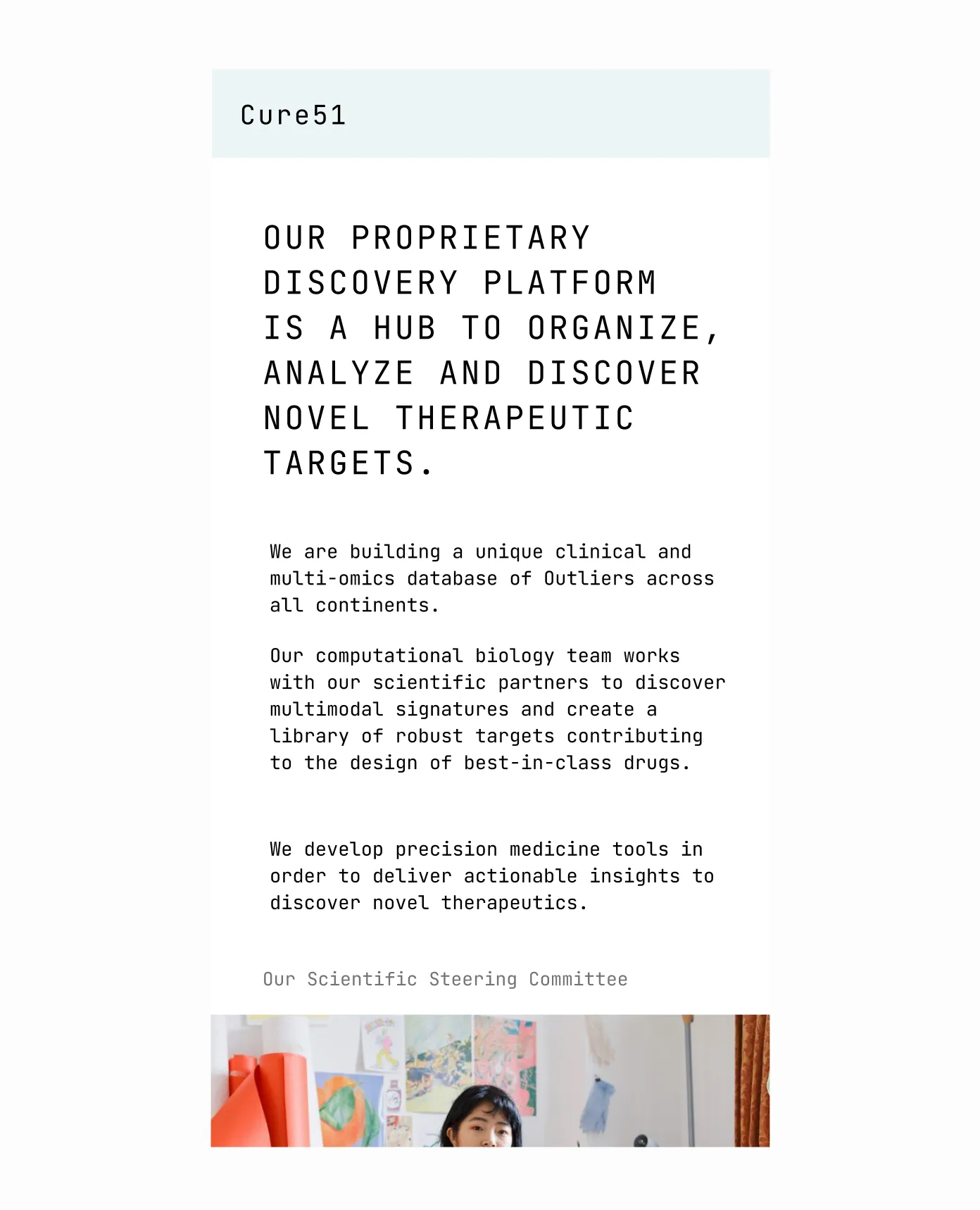
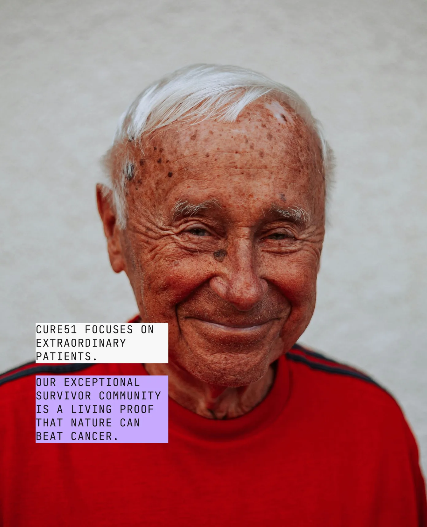
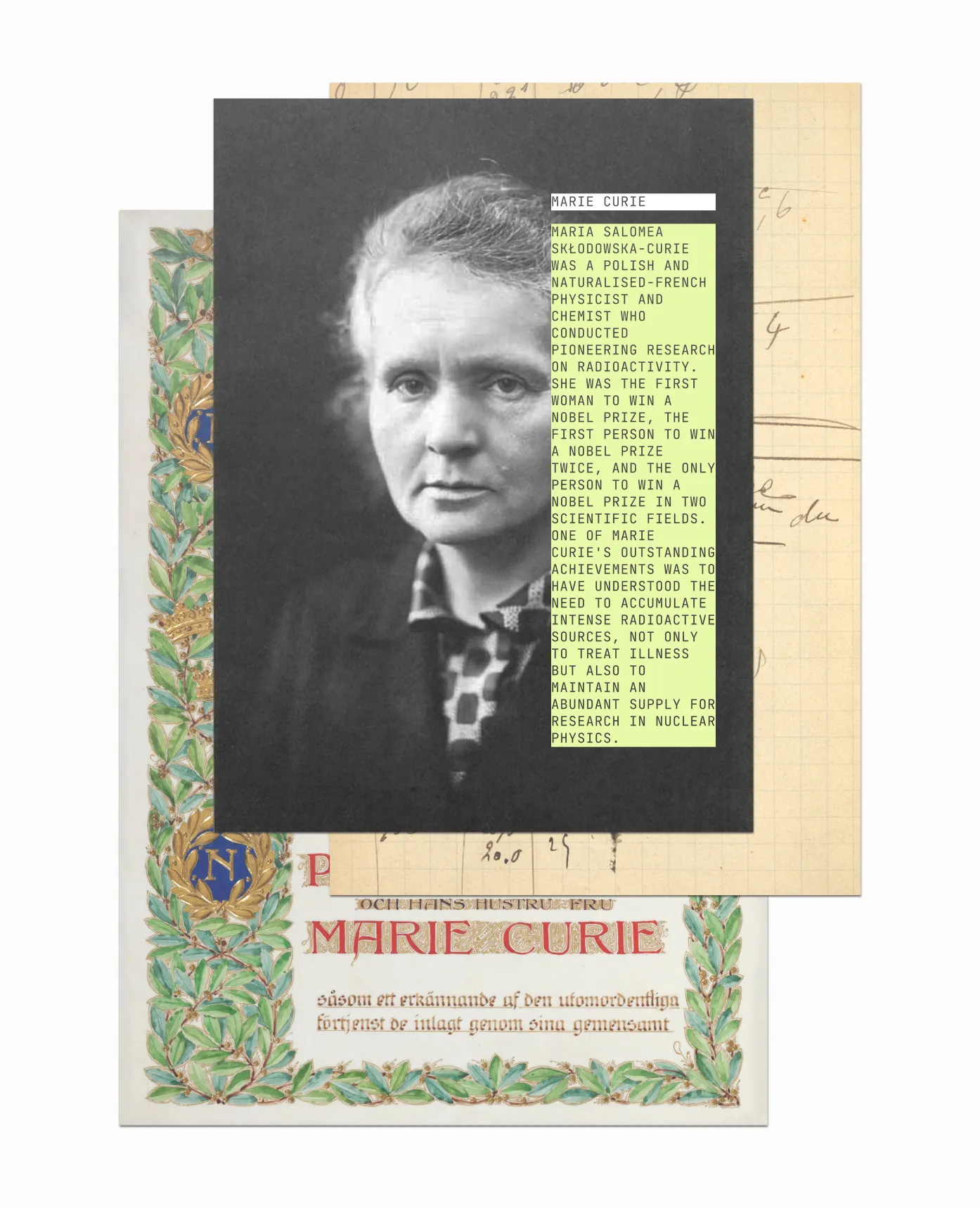
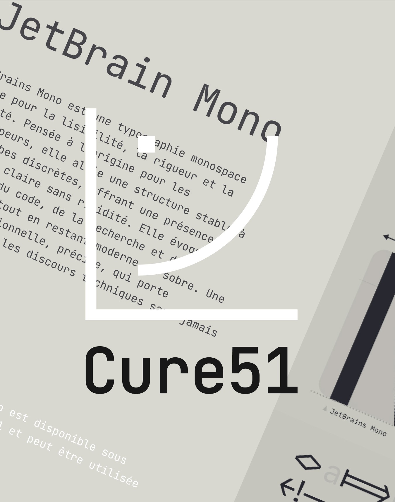
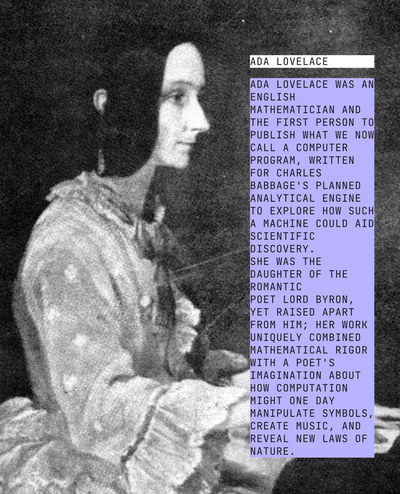
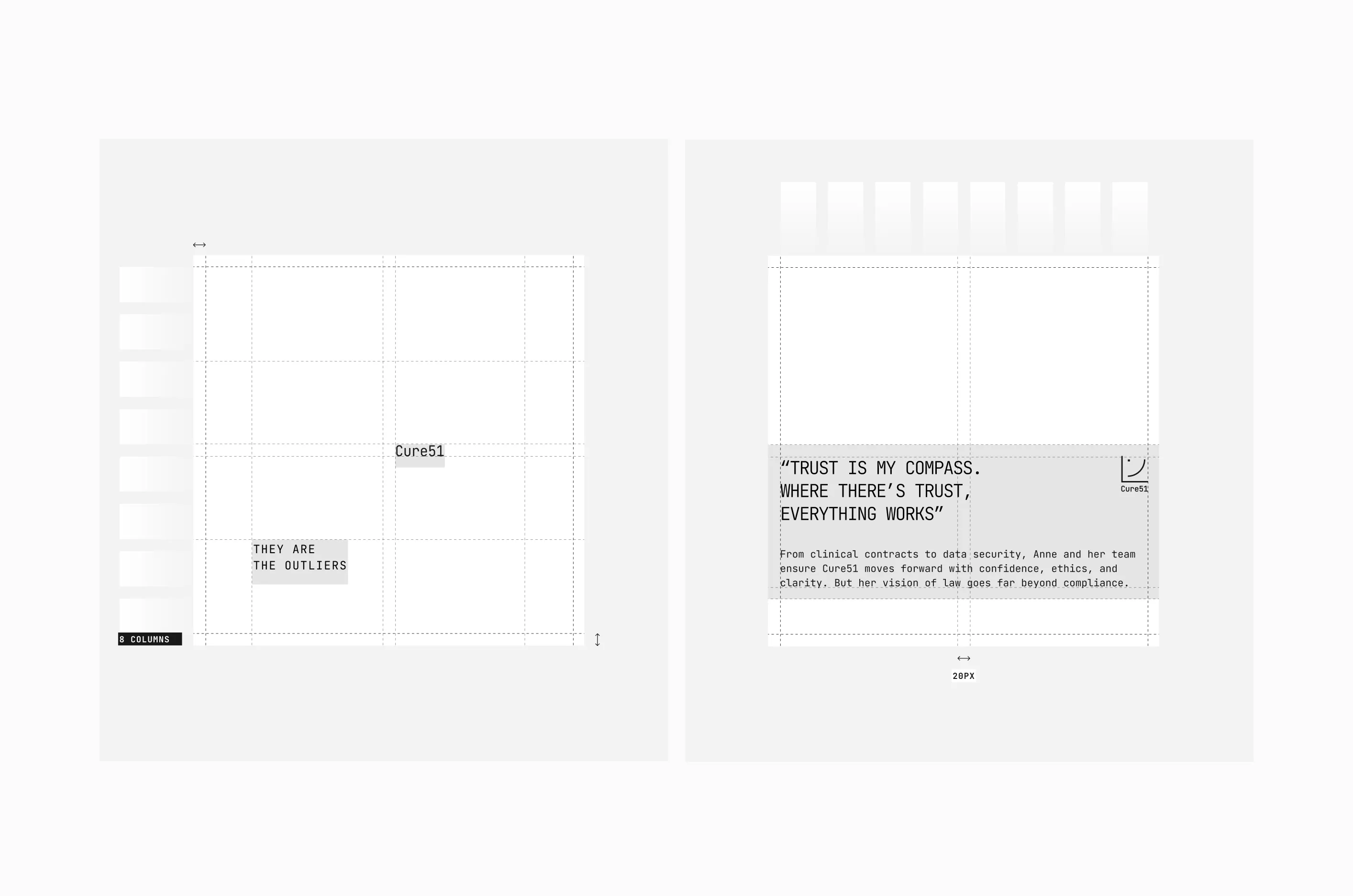
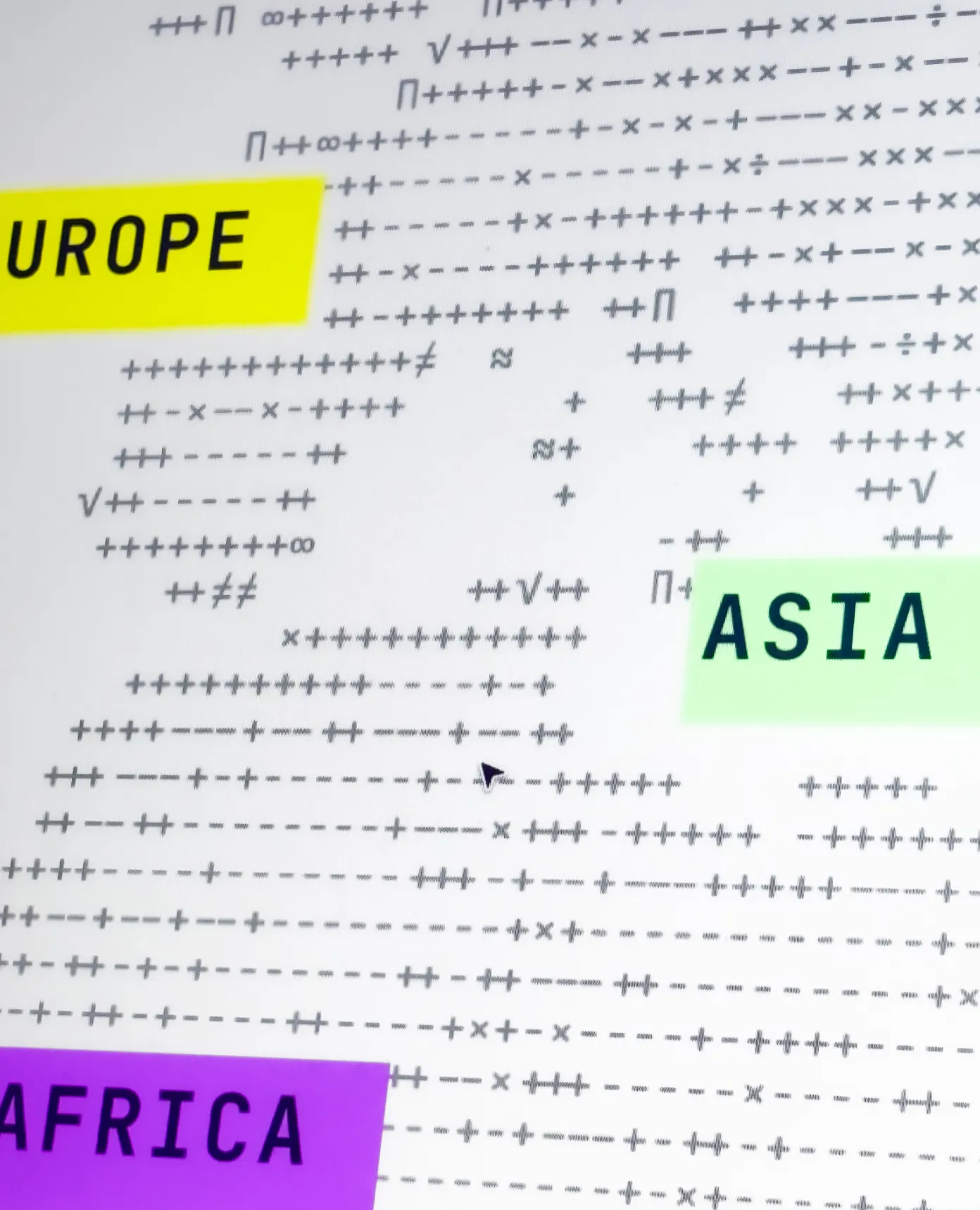
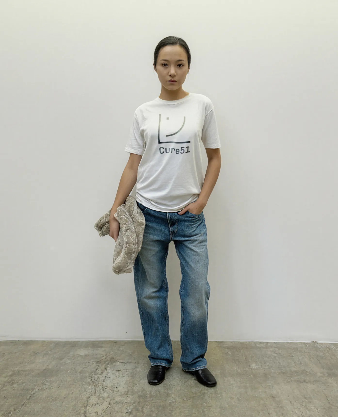
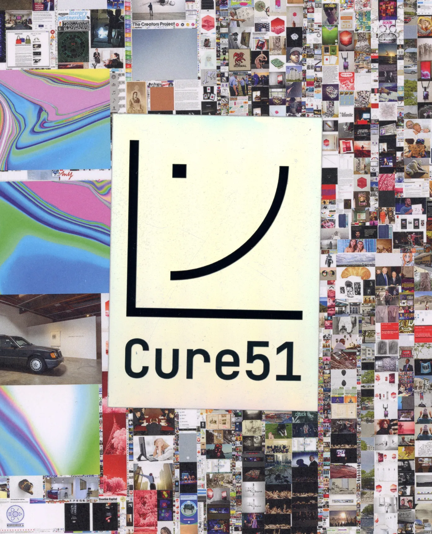
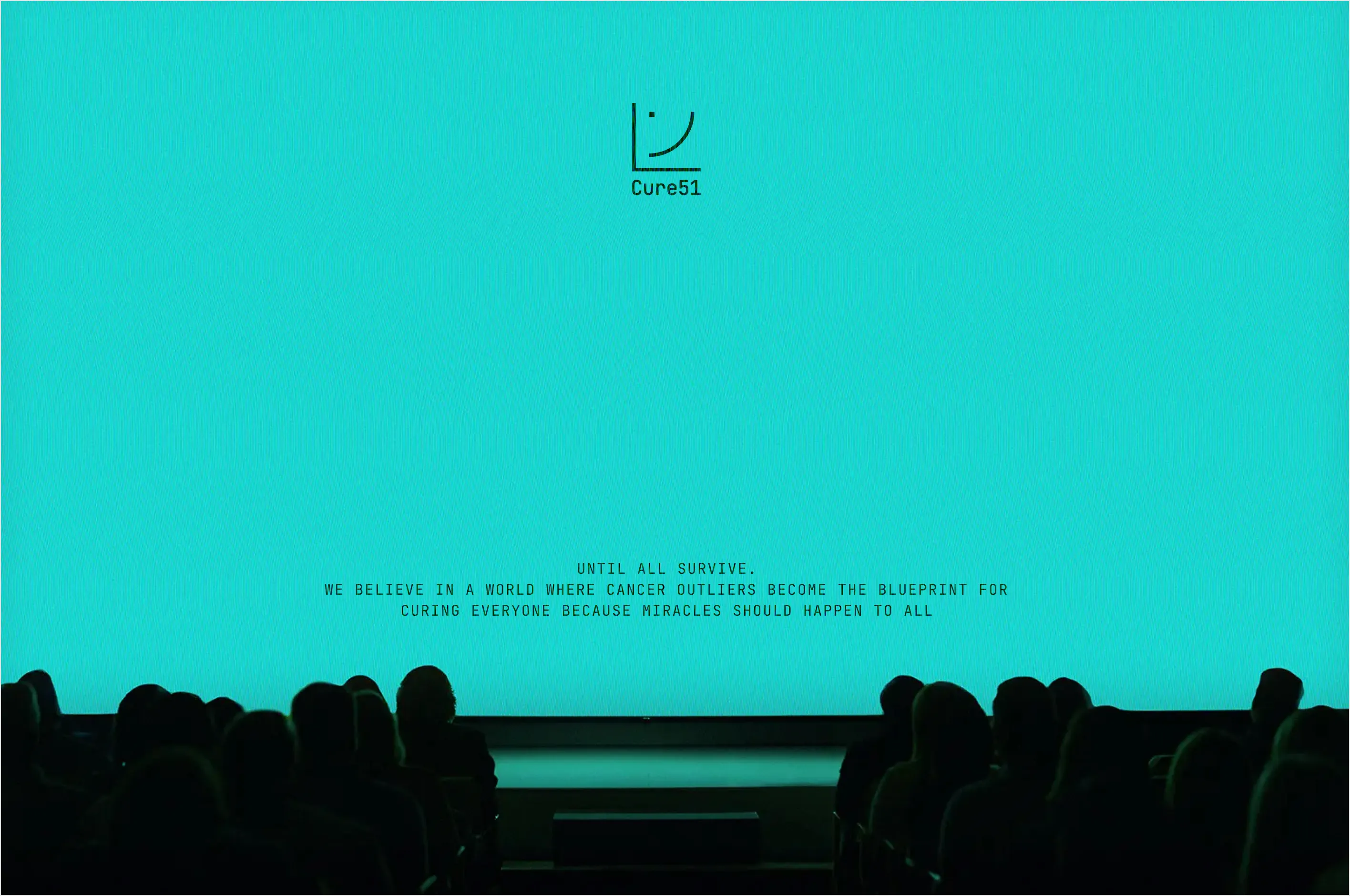
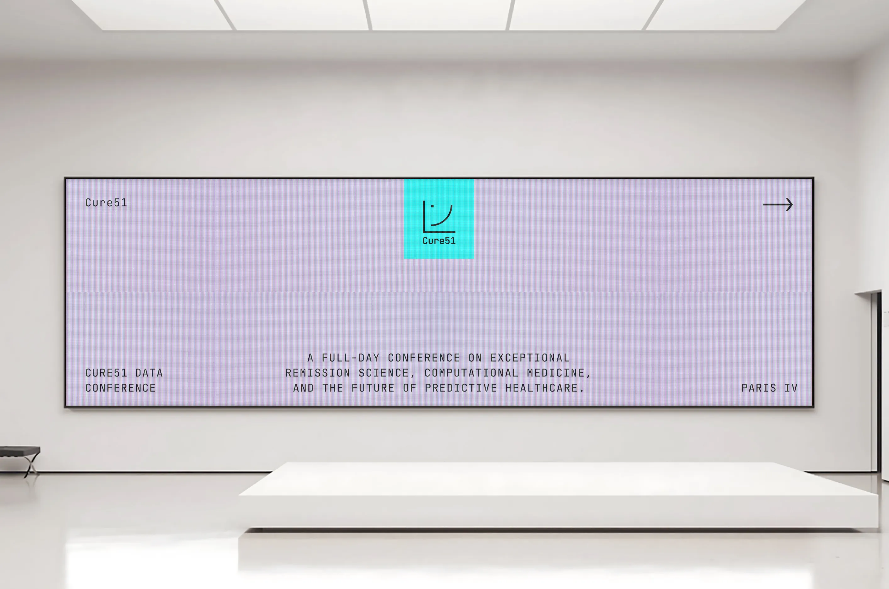
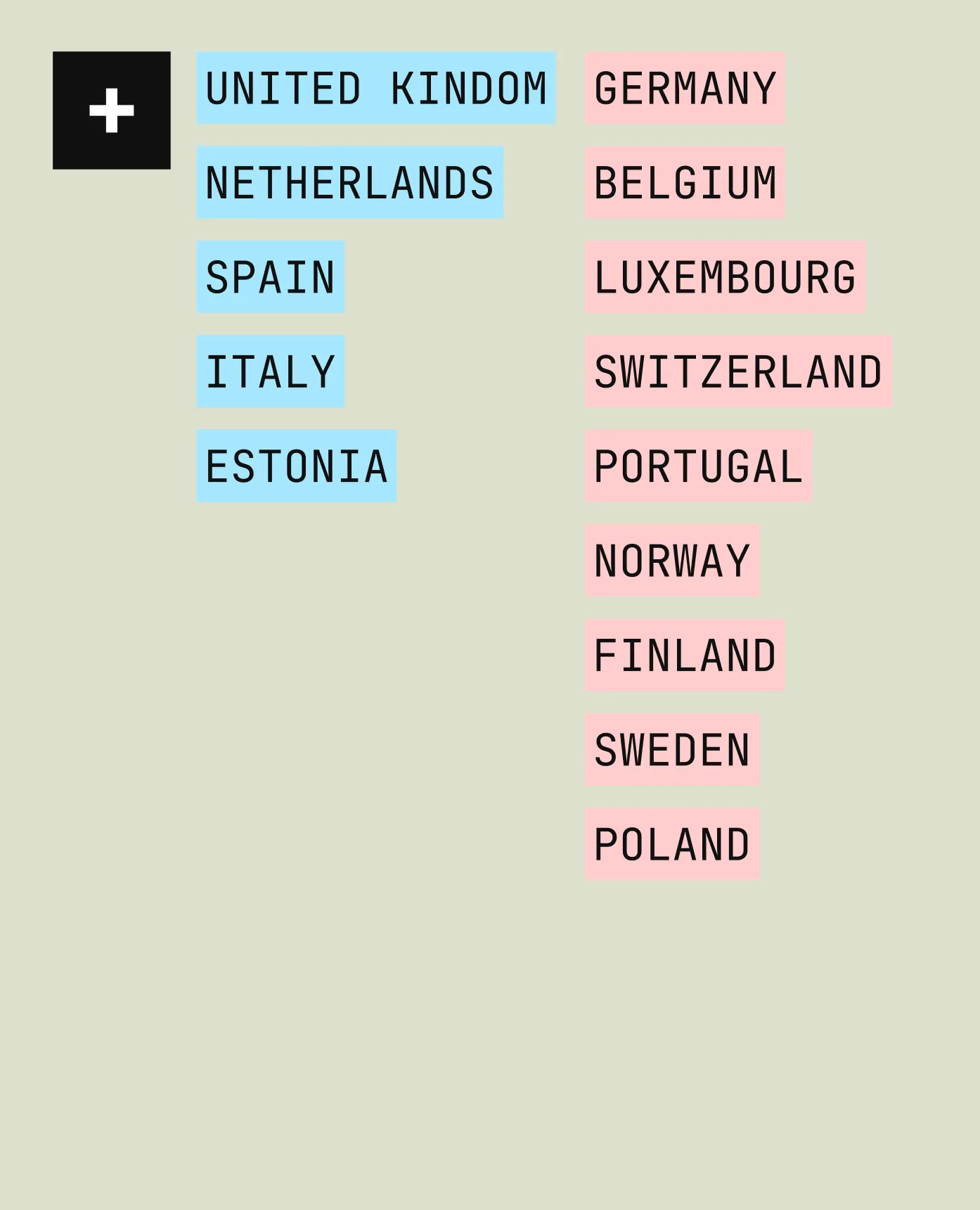
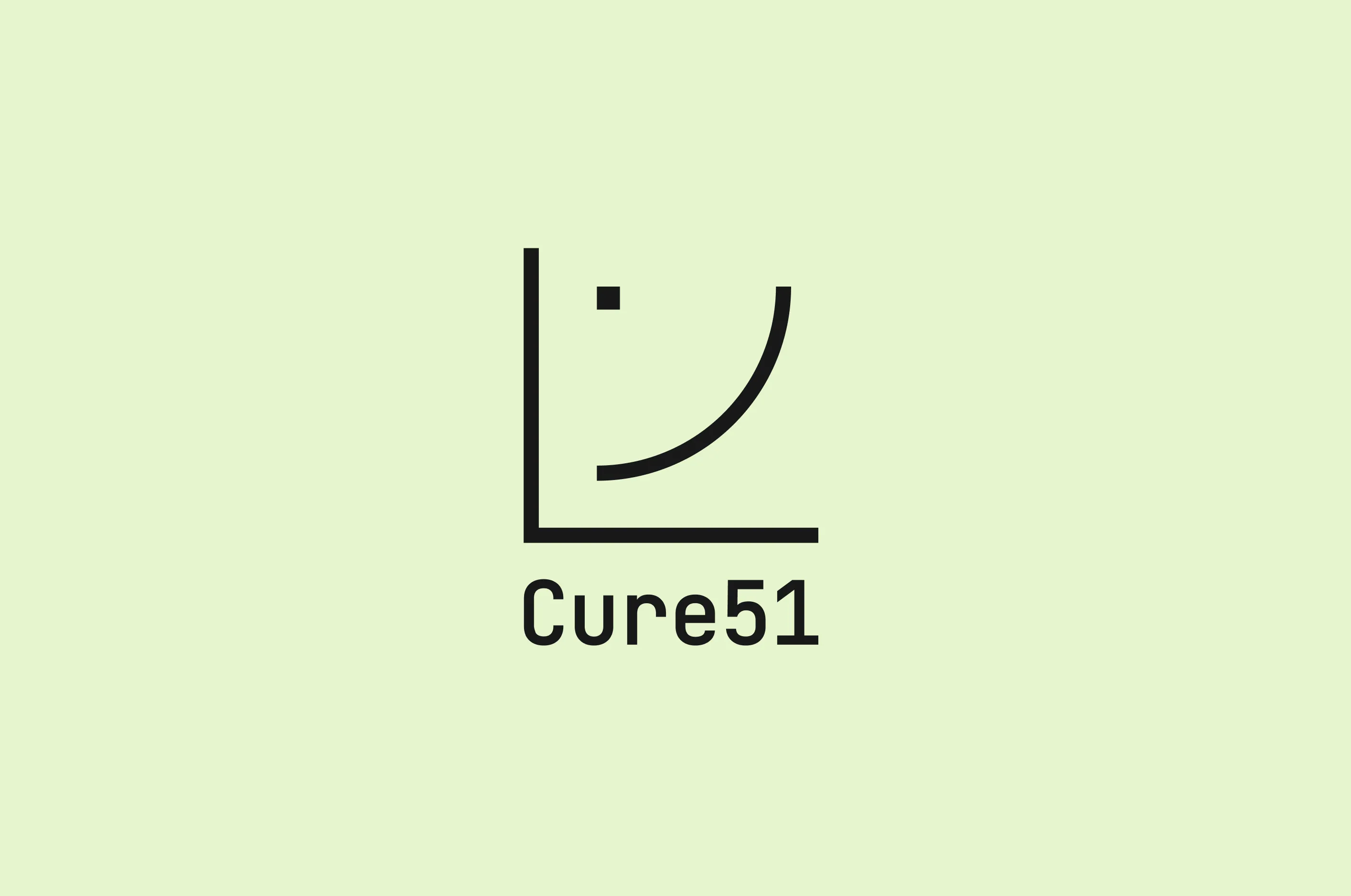
There is a unwavering determination in Nicolas Wolikow and Simon Istolainen that we had never encountered before, the kind you find in elite athletes, leaving no room for failure. And for good reason: eradicating cancer is a mission that allows no hesitation. Cure51 is a French TechBio company dedicated to discovering new cancer treatments, with three defining characteristics. First, the radical mindset we observed in the founders runs through the entire way they work. It responds to a need for extreme efficiency. Second, while research usually focuses on the biology of the 97% of patients who die from the deadliest cancers, Cure51 focuses on the 3% who survive: the Outliers. They are the first to use life to treat death. This singular approach places the company on a fundamentally different path. Finally, Cure51 is built as a collective effort. Beyond patients and survivors, the project brings together, in an unprecedented way, both the private and public sectors: experts in computing, medicine and biology, more than 50 leading oncology centres, doctors and hospitals, across the world. Following life means taking a step back and accepting a simple truth: the company is not the centre. The identity we created for Cure51 could therefore only be radical, distinctive and alive. - The symbol is inspired by a scientific survival curve used in the company’s research. It represents both the journey of scientific discovery and human resilience, with a single dot marking the cancer survivor. - The typeface, JetBrains Mono, originally designed for coding and data environments, reflects the brand’s scientific precision and analytical mindset. - We chose not to define a colour palette, giving teams the freedom to use any colour across the spectrum. - The multitude of circles, each representing a patient, forms a visual language. - The photography is human, raw and highly realistic. It does not embellish but shows life as it is. A new strategic, visual and verbal identity, along with a new website, now supports Cure51 in their fight against cancer.
Credits
Executive Direction
Barthélémy Chalvet
Strategic Planning
Camille Perez
Creative Direction
Pierre Jeannelle
Art Direction
Maëlle Dubois
Graphic Design
Maëlle Dubois, Tanguy Caruel, Louis Prochwicz
Copywriting
Léa Texier
Web Design
Maëlle Dubois
Web Development
Tanguy Caruel, Louis Prochwicz
Motion design
Maël Masson
Project Management
Éléonore Biberon
Categories
Verbal Identity
Visual Identity
Marketing
Fashion & Beauty
Mass market brands
Arts & Culture
Finance
Informations
There is a unwavering determination in Nicolas Wolikow and Simon Istolainen that we had never encountered before, the kind you find in elite athletes, leaving no room for failure. And for good reason: eradicating cancer is a mission that allows no hesitation. Cure51 is a French TechBio company dedicated to discovering new cancer treatments, with three defining characteristics. First, the radical mindset we observed in the founders runs through the entire way they work. It responds to a need for extreme efficiency. Second, while research usually focuses on the biology of the 97% of patients who die from the deadliest cancers, Cure51 focuses on the 3% who survive: the Outliers. They are the first to use life to treat death. This singular approach places the company on a fundamentally different path. Finally, Cure51 is built as a collective effort. Beyond patients and survivors, the project brings together, in an unprecedented way, both the private and public sectors: experts in computing, medicine and biology, more than 50 leading oncology centres, doctors and hospitals, across the world. Following life means taking a step back and accepting a simple truth: the company is not the centre. The identity we created for Cure51 could therefore only be radical, distinctive and alive. - The symbol is inspired by a scientific survival curve used in the company’s research. It represents both the journey of scientific discovery and human resilience, with a single dot marking the cancer survivor. - The typeface, JetBrains Mono, originally designed for coding and data environments, reflects the brand’s scientific precision and analytical mindset. - We chose not to define a colour palette, giving teams the freedom to use any colour across the spectrum. - The multitude of circles, each representing a patient, forms a visual language. - The photography is human, raw and highly realistic. It does not embellish but shows life as it is. A new strategic, visual and verbal identity, along with a new website, now supports Cure51 in their fight against cancer.
Credits
Executive Direction
Barthélémy Chalvet
Strategic Planning
Camille Perez
Creative Direction
Pierre Jeannelle
Art Direction
Maëlle Dubois
Graphic Design
Maëlle Dubois, Tanguy Caruel, Louis Prochwicz
Copywriting
Léa Texier
Web Design
Maëlle Dubois
Web Development
Tanguy Caruel, Louis Prochwicz
Motion design
Maël Masson
Project Management
Éléonore Biberon
Categories
Verbal Identity
Visual Identity
Marketing
Fashion & Beauty
Mass market brands
Arts & Culture
Finance


The Cure51 brand color palette encompasses the full color spectrum.
000000


The Artificial Intelligence Underwriting Company certifies and insures AI agents, enabling enterprises to adopt them with confidence. Bruno created a brand identity that embodies the rigour and authority of a standard set to shape the industry.

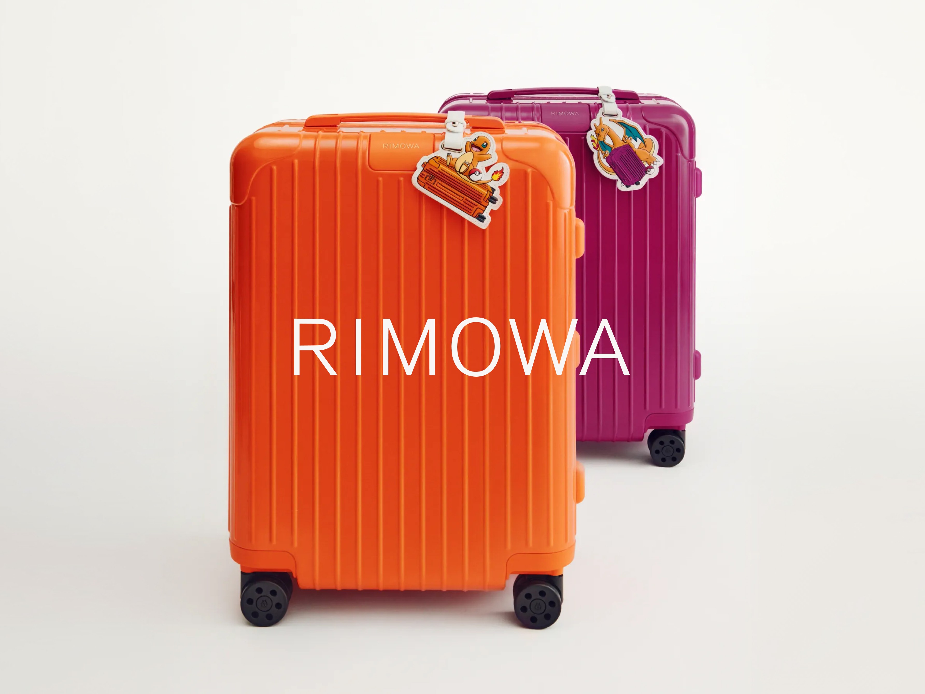
For Pokémon’s 30th anniversary, Rimowa wanted more than a simple collaboration. Bruno reinterpreted its iconic aluminium suitcase through the visual language of Pokémon, creating an object where both worlds feel naturally connected.
Bringing a legendary place to life beyond its walls. Studios Ferber is one of France’s most legendary recording studios, welcoming artists from around the world since the 1970s. Bruno worked with the teams to create a brand identity capable of celebrating this cultural legacy while opening the studios up to new audiences and possibilities.

Elevo is a talent management platform built around human relationships. Bruno designed its brand identity and website to express a calmer, more human vision of technology.

The Artificial Intelligence Underwriting Company certifies and insures AI agents, enabling enterprises to adopt them with confidence. Bruno created a brand identity that embodies the rigour and authority of a standard set to shape the industry.

For Pokémon’s 30th anniversary, Rimowa wanted more than a simple collaboration. Bruno reinterpreted its iconic aluminium suitcase through the visual language of Pokémon, creating an object where both worlds feel naturally connected.
Bringing a legendary place to life beyond its walls. Studios Ferber is one of France’s most legendary recording studios, welcoming artists from around the world since the 1970s. Bruno worked with the teams to create a brand identity capable of celebrating this cultural legacy while opening the studios up to new audiences and possibilities.

Elevo is a talent management platform built around human relationships. Bruno designed its brand identity and website to express a calmer, more human vision of technology.
Audion is a digital audio advertising platform enabling brands to plan and run campaigns across podcasts, streaming and digital radio. Despite its leading position, its brand lacked distinctiveness. We built a bold identity rooted in a physical representation of sound.

The Artificial Intelligence Underwriting Company certifies and insures AI agents, enabling enterprises to adopt them with confidence. Bruno created a brand identity that embodies the rigour and authority of a standard set to shape the industry.

For Pokémon’s 30th anniversary, Rimowa wanted more than a simple collaboration. Bruno reinterpreted its iconic aluminium suitcase through the visual language of Pokémon, creating an object where both worlds feel naturally connected.
Bringing a legendary place to life beyond its walls. Studios Ferber is one of France’s most legendary recording studios, welcoming artists from around the world since the 1970s. Bruno worked with the teams to create a brand identity capable of celebrating this cultural legacy while opening the studios up to new audiences and possibilities.

Elevo is a talent management platform built around human relationships. Bruno designed its brand identity and website to express a calmer, more human vision of technology.

The Artificial Intelligence Underwriting Company certifies and insures AI agents, enabling enterprises to adopt them with confidence. Bruno created a brand identity that embodies the rigour and authority of a standard set to shape the industry.

For Pokémon’s 30th anniversary, Rimowa wanted more than a simple collaboration. Bruno reinterpreted its iconic aluminium suitcase through the visual language of Pokémon, creating an object where both worlds feel naturally connected.
Bringing a legendary place to life beyond its walls. Studios Ferber is one of France’s most legendary recording studios, welcoming artists from around the world since the 1970s. Bruno worked with the teams to create a brand identity capable of celebrating this cultural legacy while opening the studios up to new audiences and possibilities.

Elevo is a talent management platform built around human relationships. Bruno designed its brand identity and website to express a calmer, more human vision of technology.