
Varsity
Rebranding Varsity, a European VC fund, with a warm and human identity built around one idea: founders think better when they're backed by more than one mind.
Informations
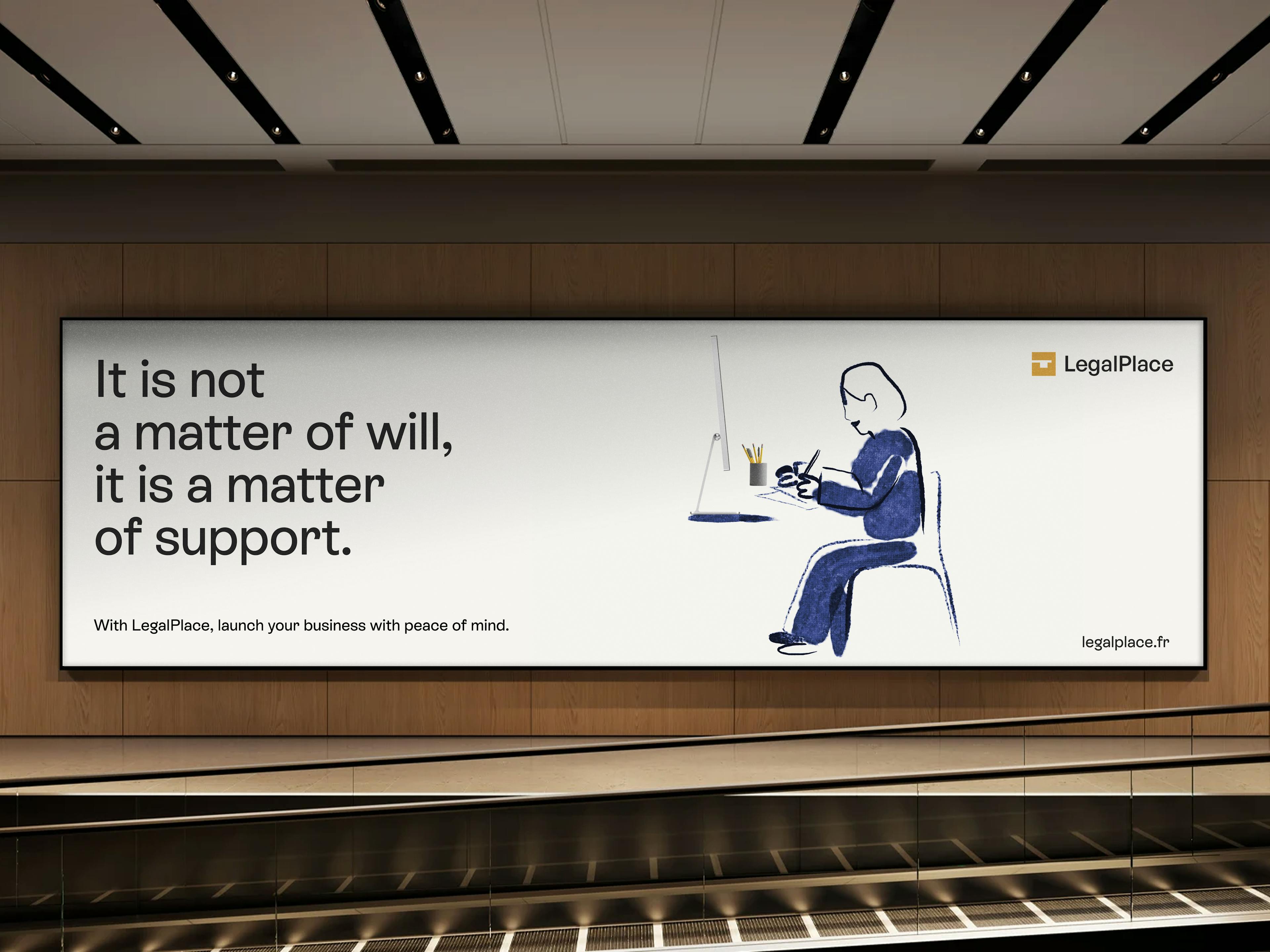
Starting a business shouldn't be a headache.
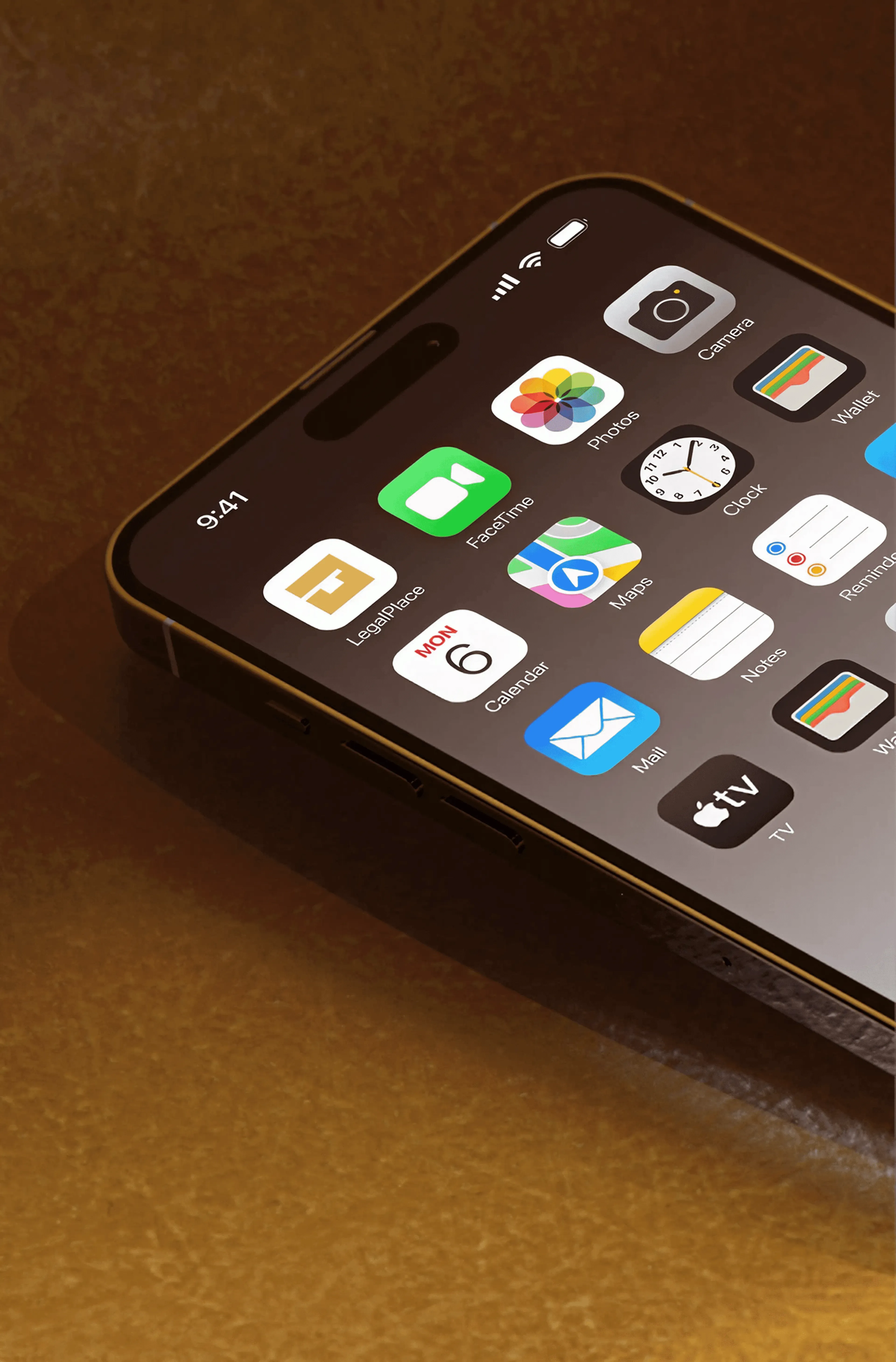
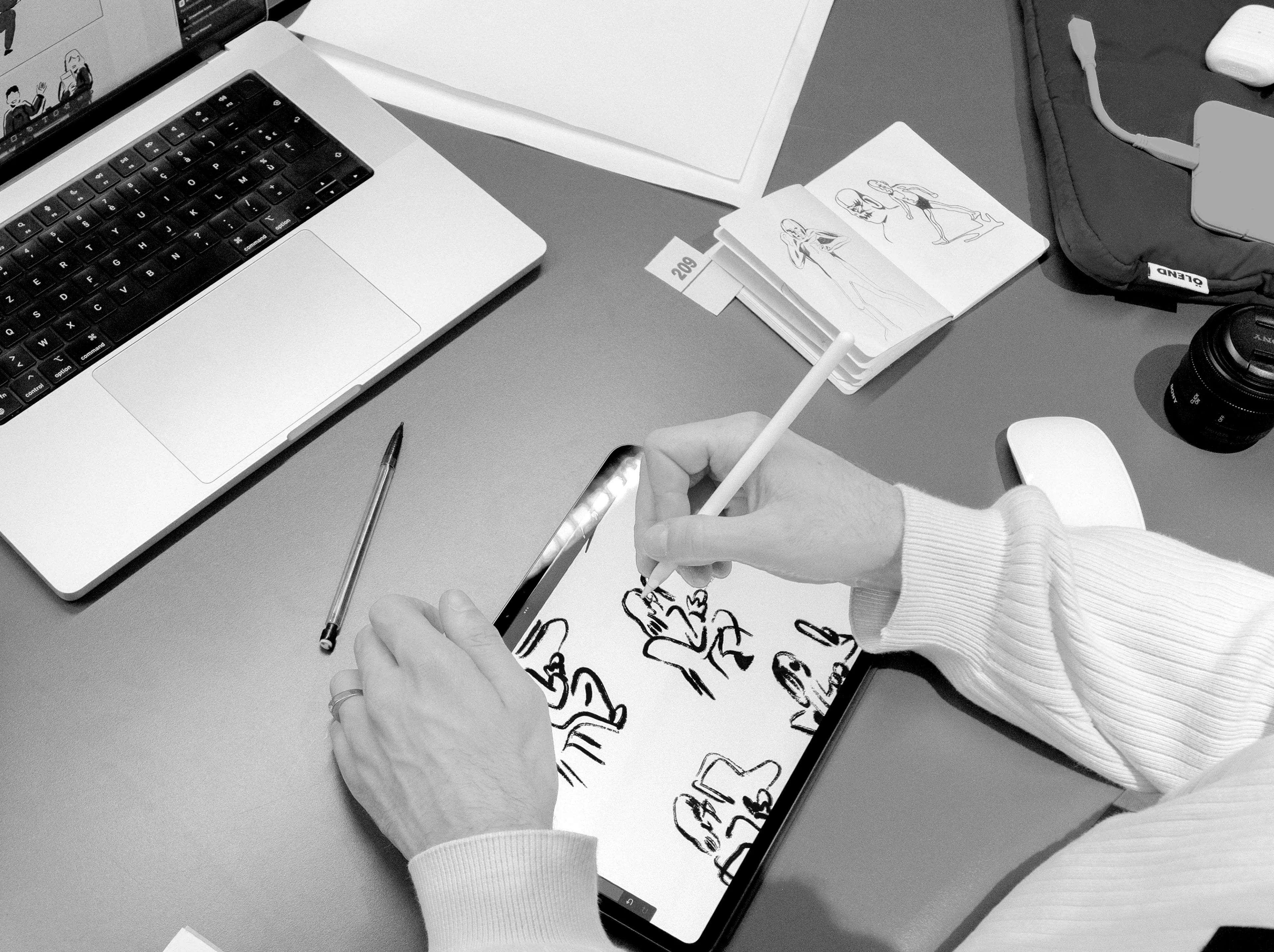
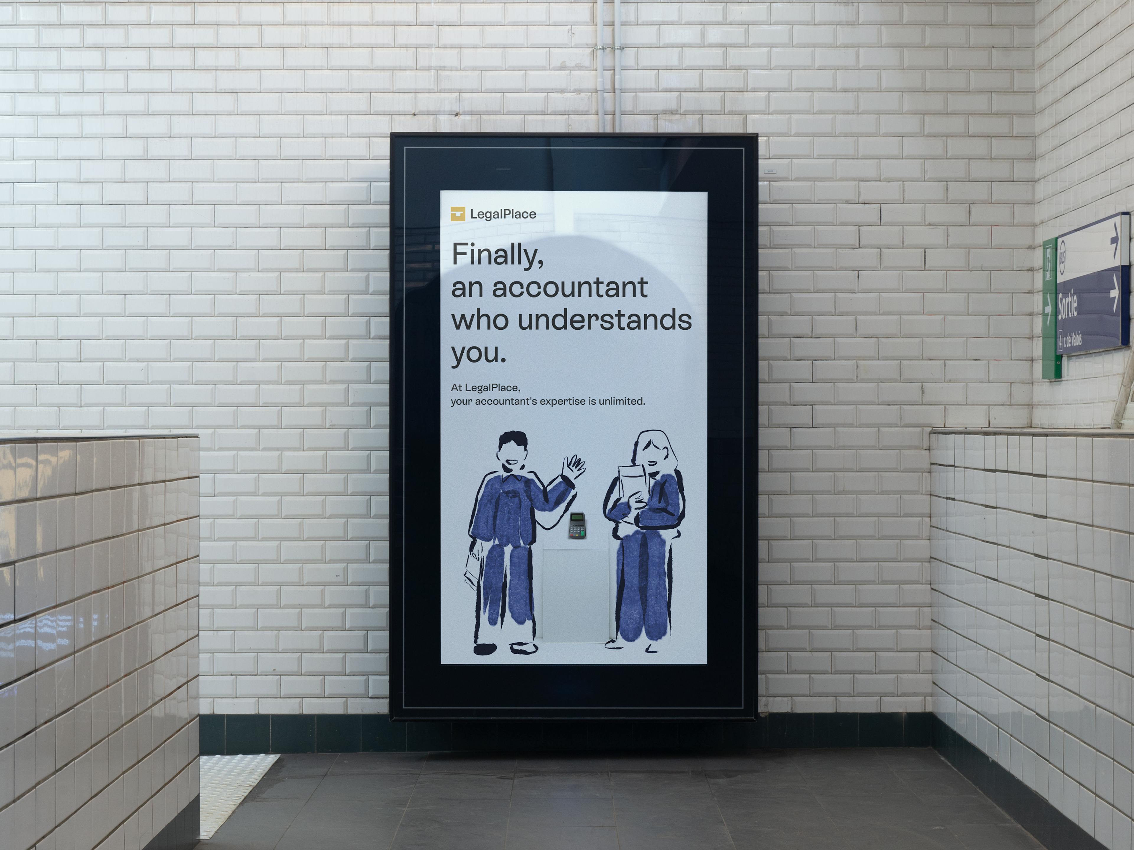
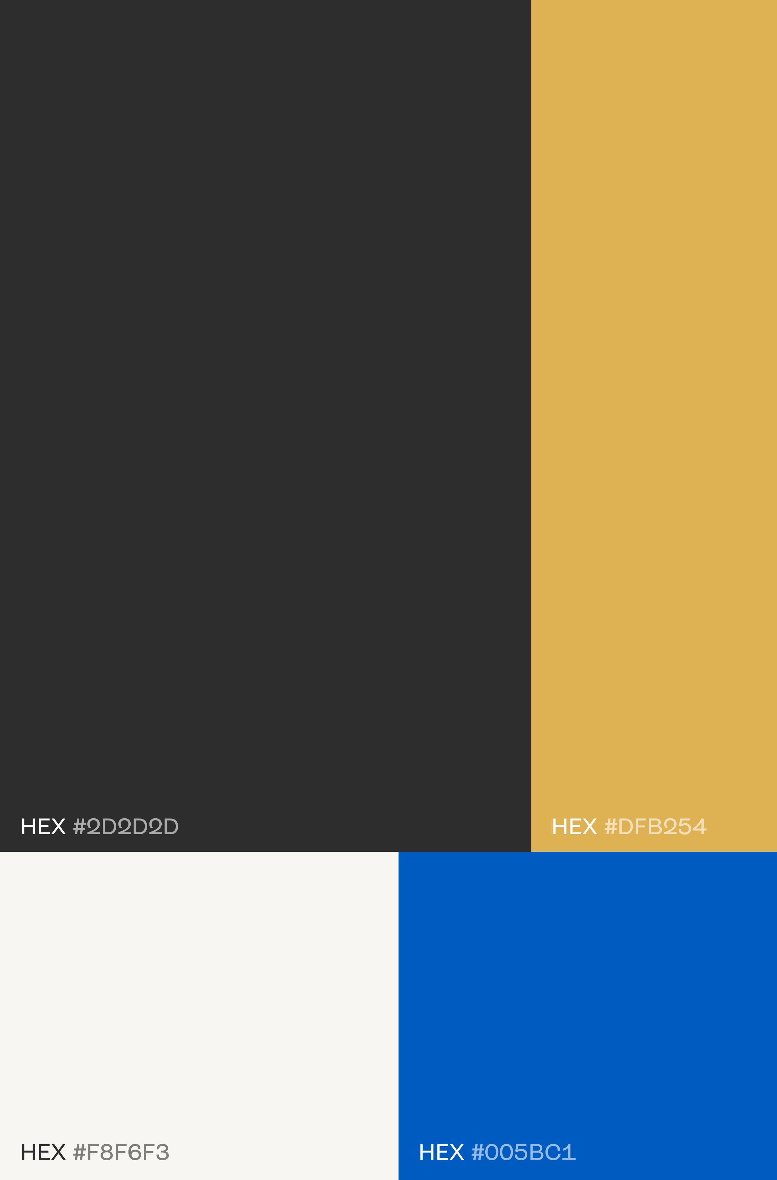
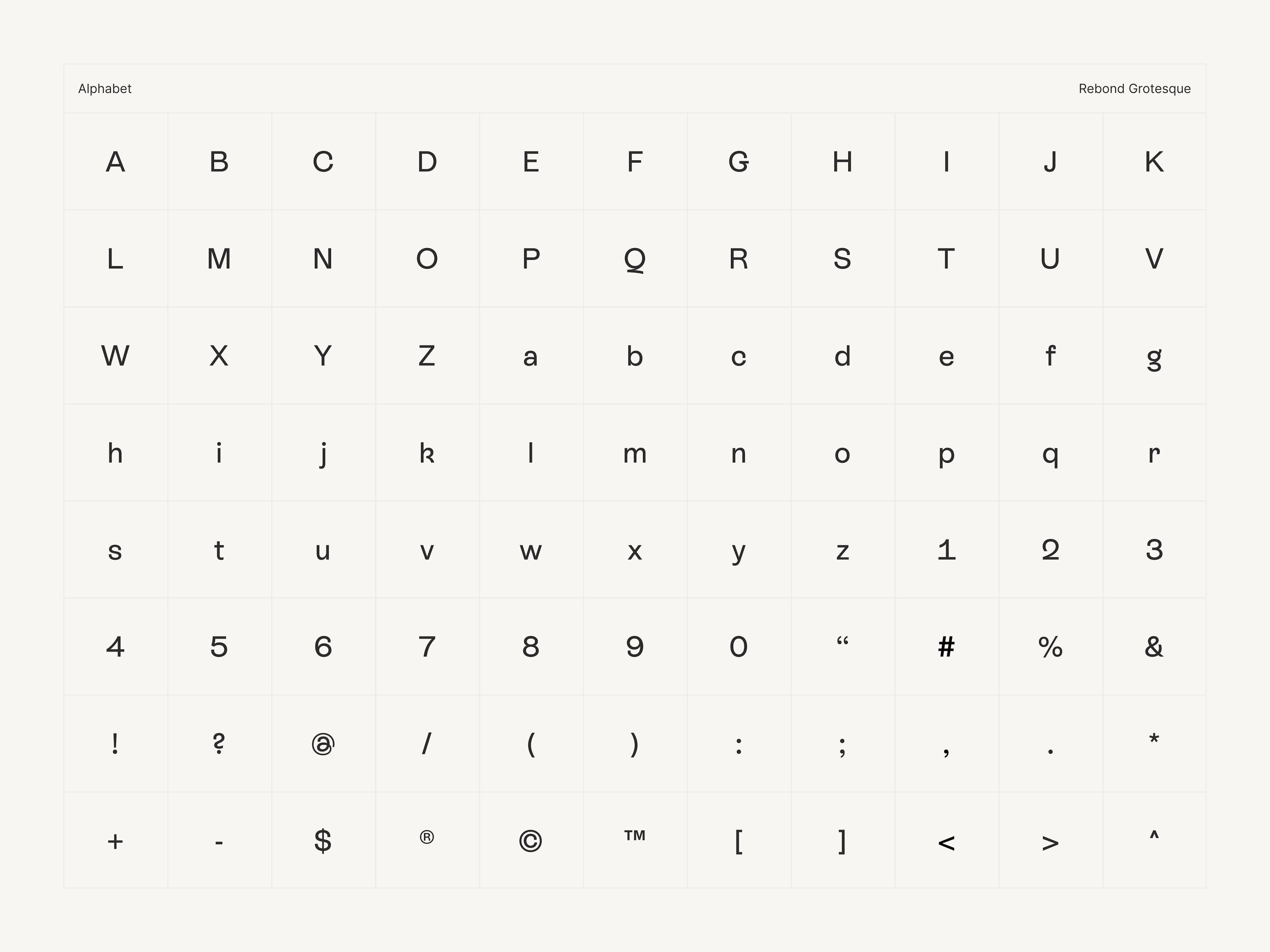
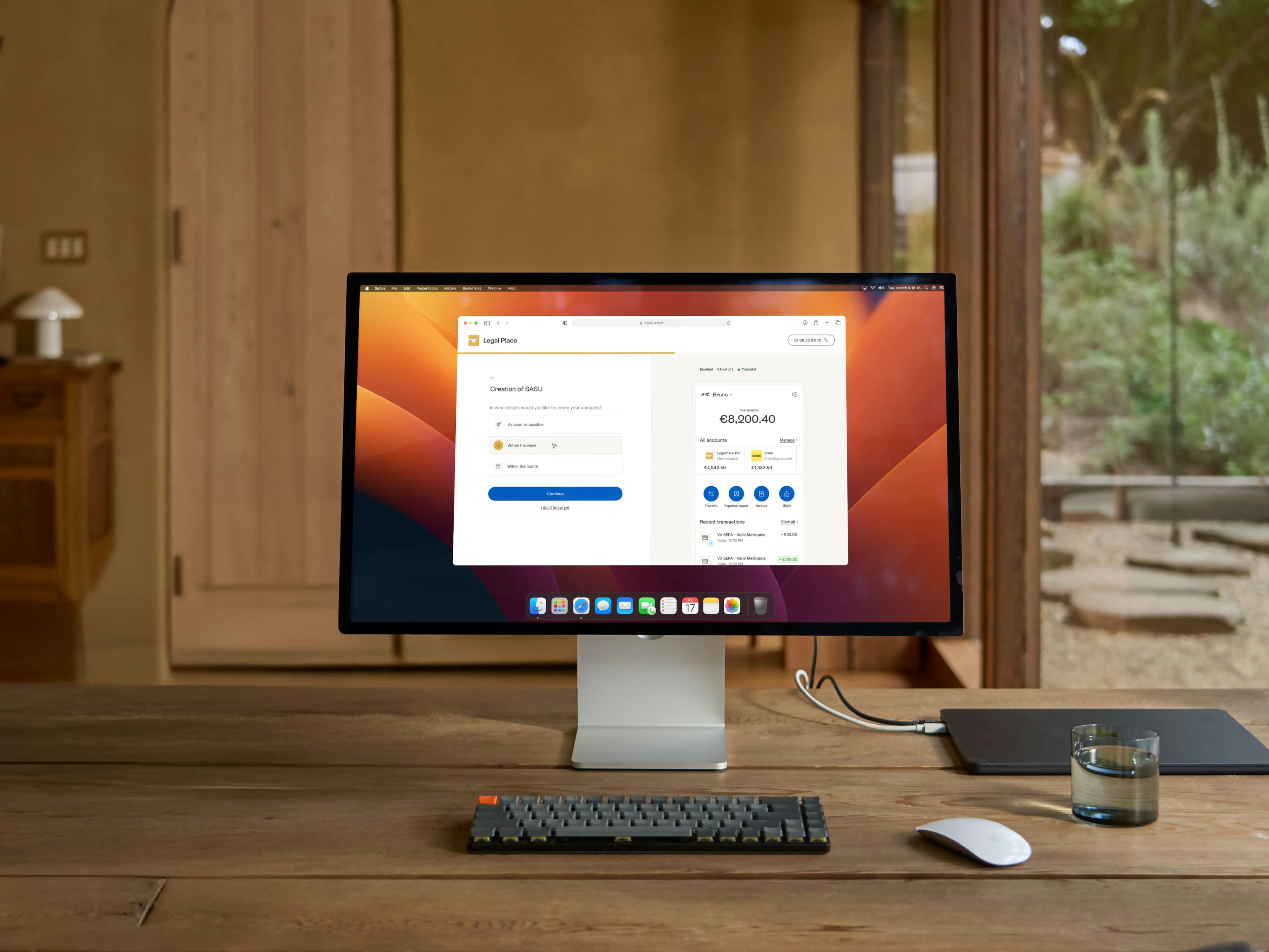
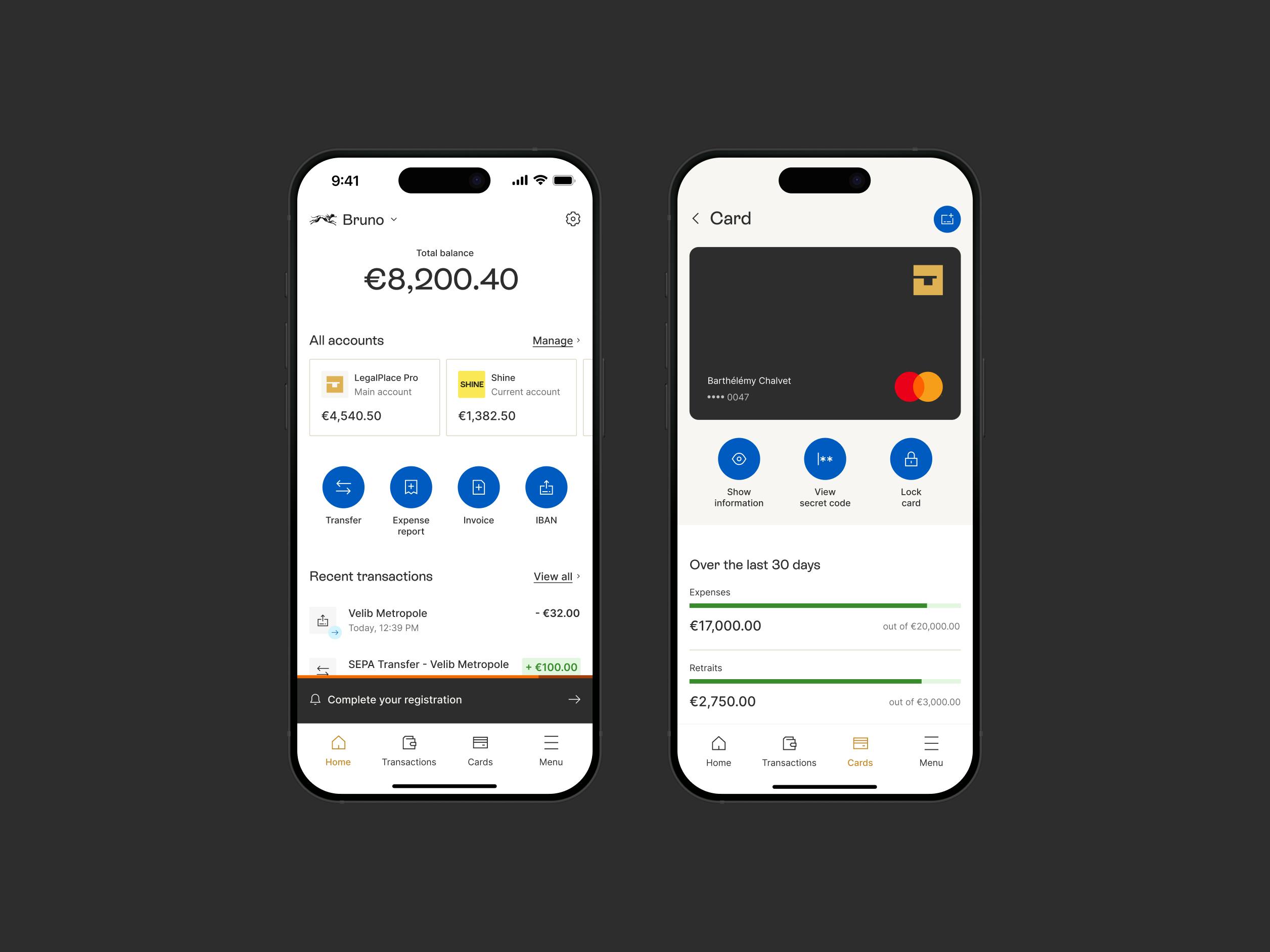
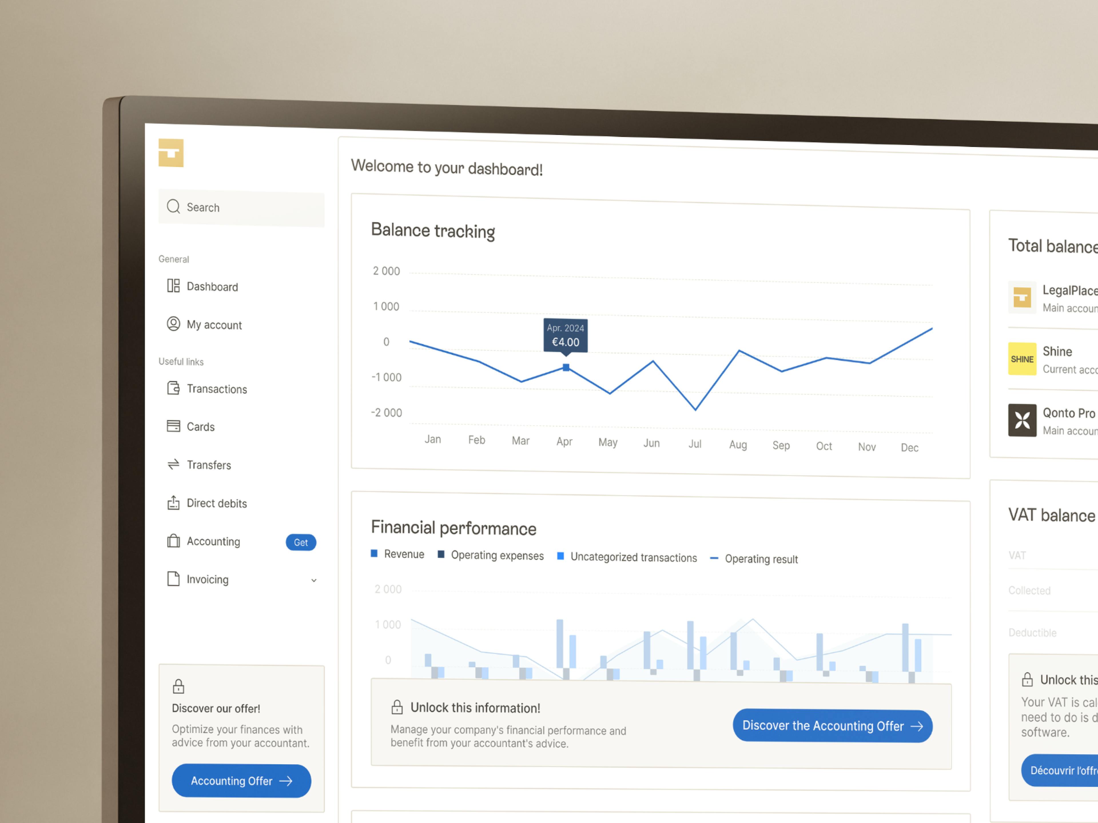
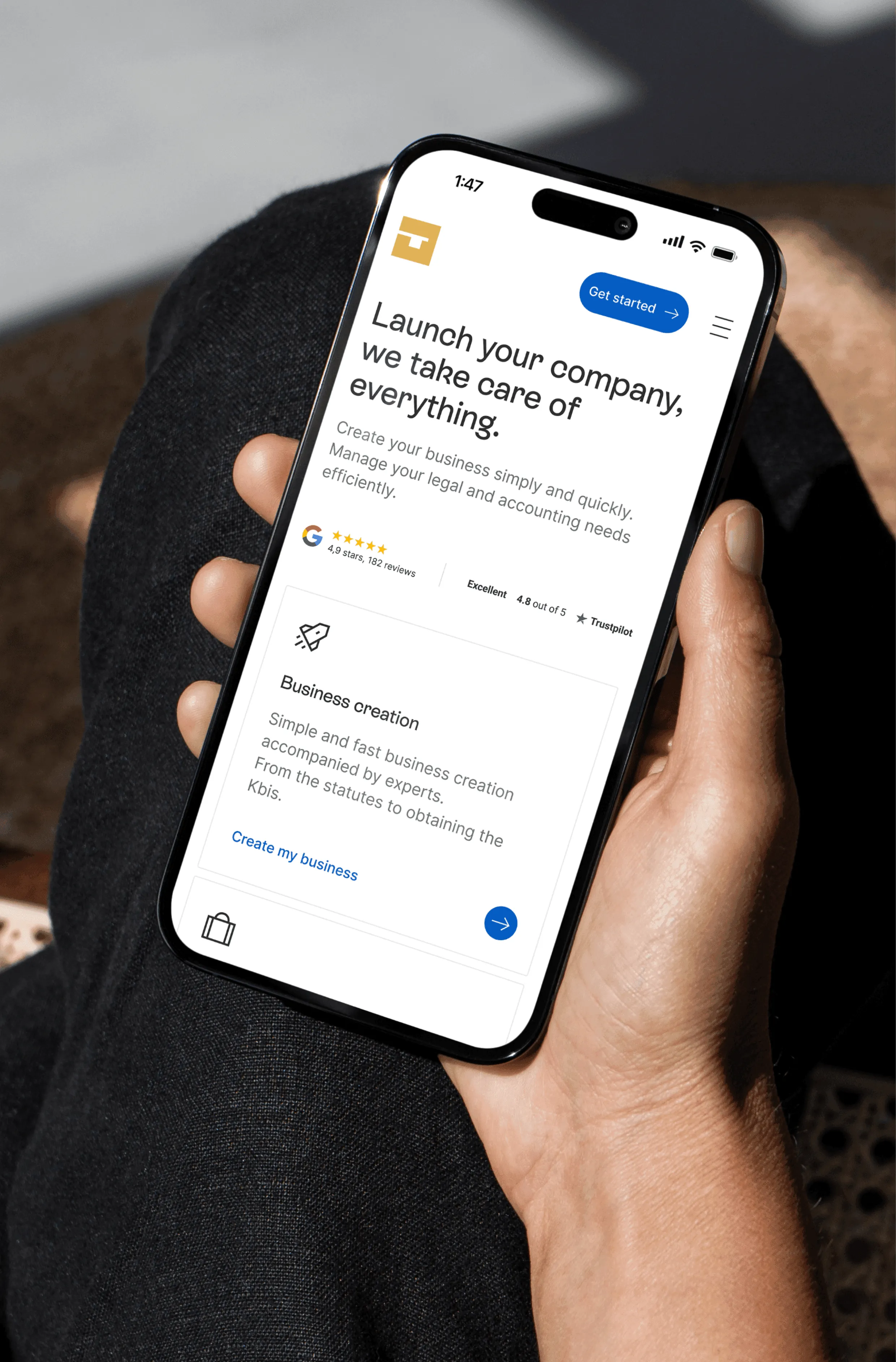
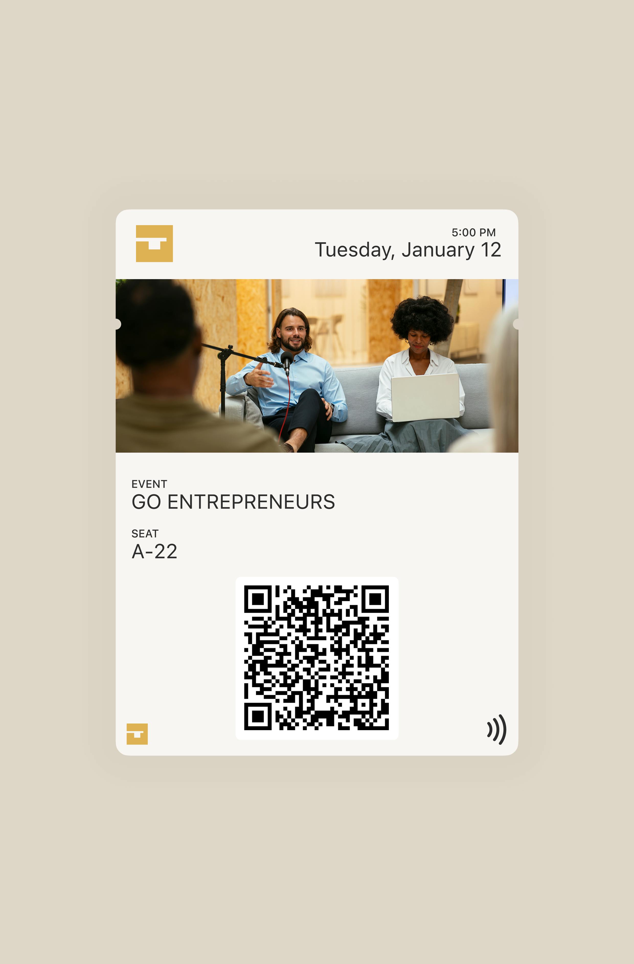
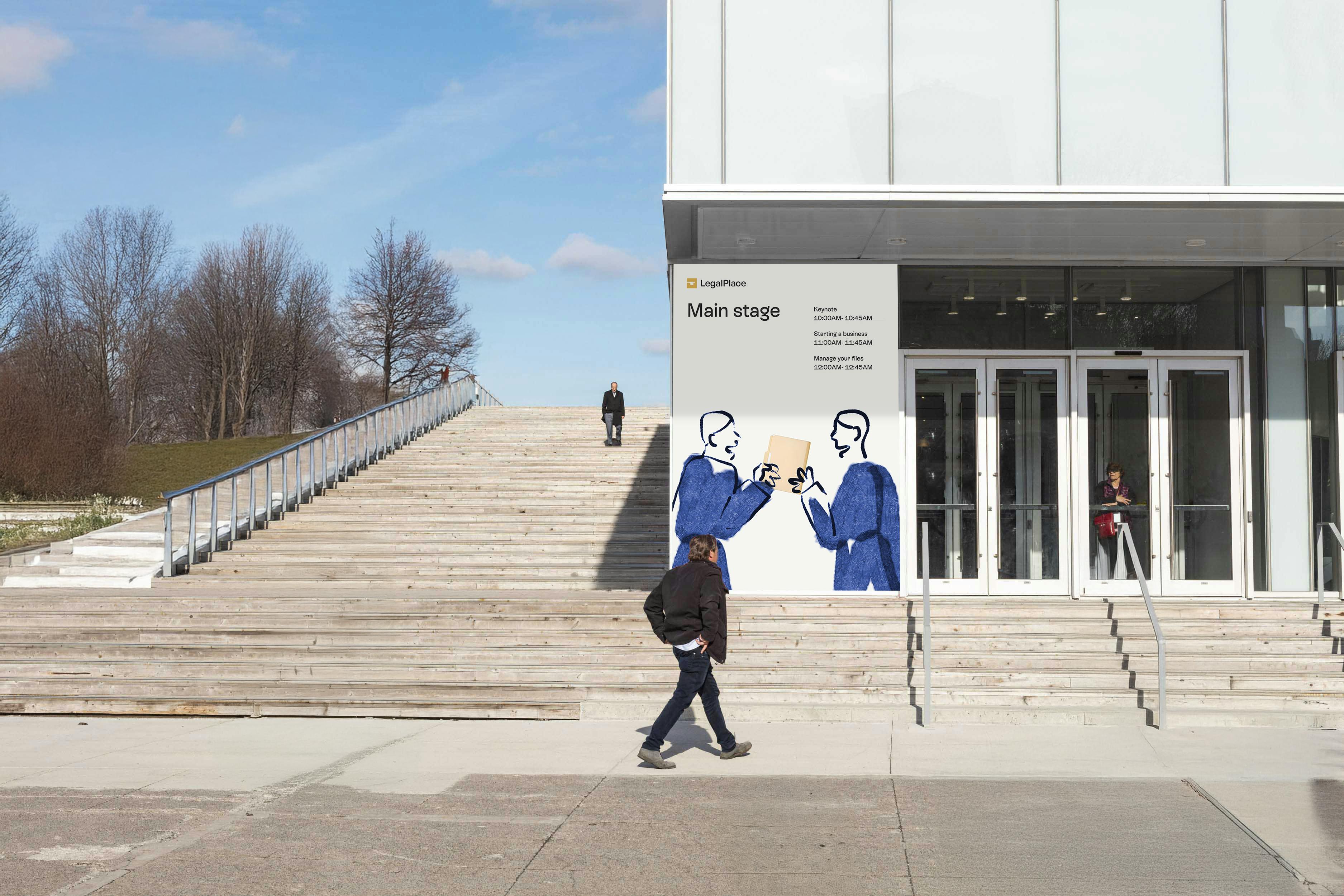
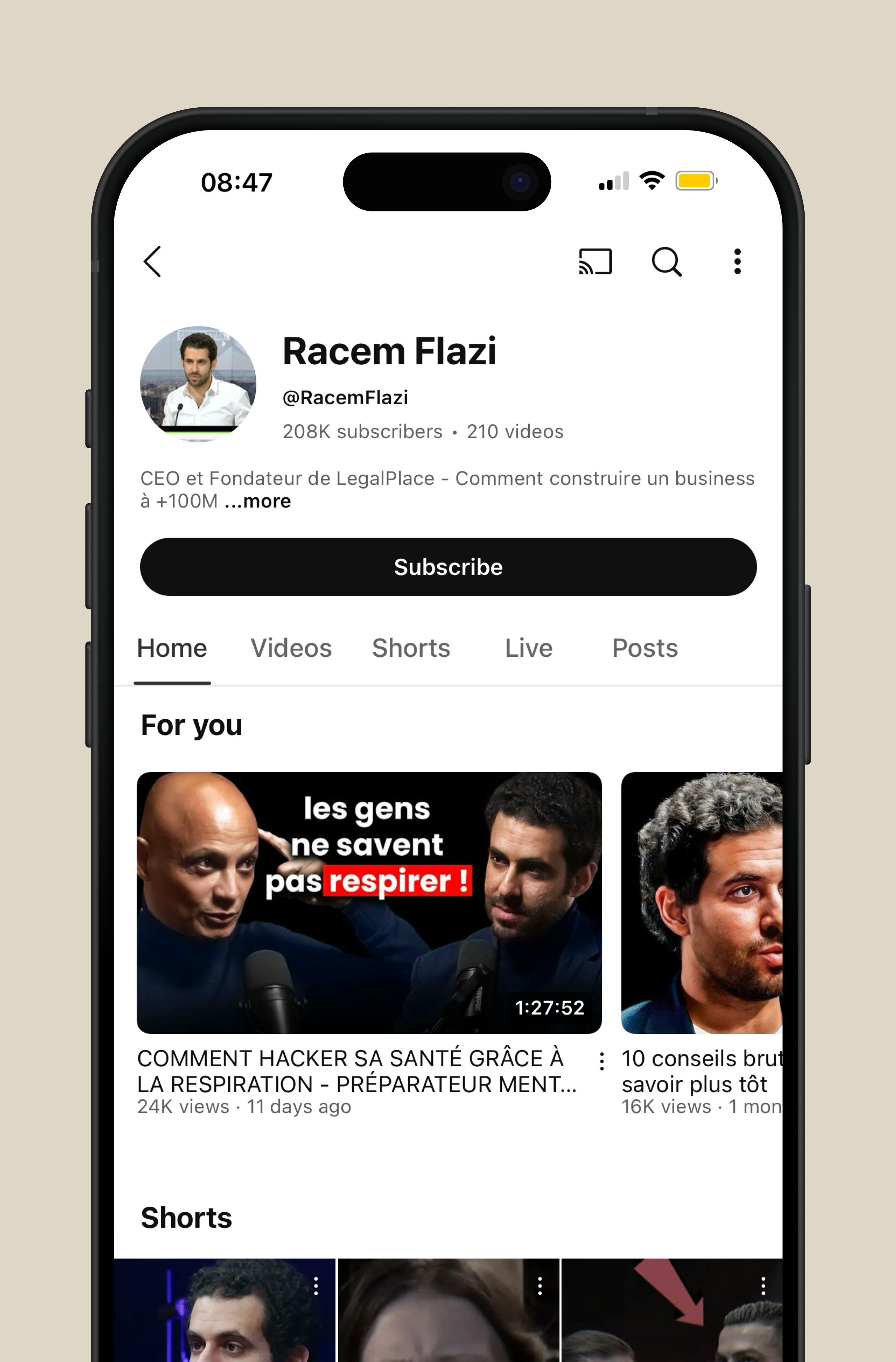
LegalPlace is a SaaS that centralizes all the needs of entrepreneurs - from banking to domiciliation, including the management of contracts and administrative obligations. A universal tool that combines accessibility and technology to support people. Our collaboration has resulted in a complete rebranding - web design, art direction, tone of voice, logo, UI/UX and product design - to establish LegalPlace as the benchmark for entrepreneurs. The design is inspired by the concept of the guide, striking a balance between expertise and accessibility. The key-shaped logo embodies openness. The color palette reinforces this identity: black and white for rigor, yellow for administration and blue for digital trust. Beige softens the whole for a more human approach. The UX/UI combines modernity and simplicity with a premium, fluid and intuitive design. The technology is at the service of the user to offer clear navigation and tailor-made support.
Credits
Executive Direction
Barthélémy Chalvet
Creative Direction
Pierre Jeannelle
Art Direction
Agathe Leroux, Florian Serre
Copywriting
Léa Texier
Motion design
Shayan Fabre
Illustration
Baptiste Boutin
Project Management
Paul Mathieu-Collin
Categories
Digital
Verbal identity
Visual identity
Civic & Public Services
Professional Services
Finance



" transform="translate(5.875 5.018)" width="5.625000000000001px"/><path d="M 3.375 6.75 L 1 6.75 C 0.448 6.75 0 6.302 0 5.75 L 0 1 C 0 0.448 0.448 0 1 0 L 3.375 0 M 18.08 1.065 L 13.58 5.565 M 18.08 5.565 L 13.58 1.065" fill="transparent" height="6.75px" id="tf38oZaKO" stroke-dasharray="" stroke-linecap="round" stroke-linejoin="round" stroke-width="1.5" stroke="rgb(50, 50, 50)" transform="translate(2.5 8.625)" width="18.079999923706055px"/></g></svg>)

Rebranding Varsity, a European VC fund, with a warm and human identity built around one idea: founders think better when they're backed by more than one mind.
Celeres designs, integrates and supports the software and systems that critical missions depend on across space, defence, transport and public services. We created a strategic, visual and verbal identity, along with a new website, to reveal its essential role in environments where failure is not an option.

Alaska State Archives is a public institution responsible for preserving the state’s records. We redesigned the entire interface while respecting the institutional constraints of working with a government body, and brought Alaska’s history to the forefront by turning archival materials into core design elements.

For Pokémon’s 30th anniversary, Rimowa wanted more than a simple collaboration. Bruno reinterpreted its iconic aluminium suitcase through the visual language of Pokémon, creating an object where both worlds feel naturally connected.
Rebranding Varsity, a European VC fund, with a warm and human identity built around one idea: founders think better when they're backed by more than one mind.
Celeres designs, integrates and supports the software and systems that critical missions depend on across space, defence, transport and public services. We created a strategic, visual and verbal identity, along with a new website, to reveal its essential role in environments where failure is not an option.
Alaska State Archives is a public institution responsible for preserving the state’s records. We redesigned the entire interface while respecting the institutional constraints of working with a government body, and brought Alaska’s history to the forefront by turning archival materials into core design elements.
For Pokémon’s 30th anniversary, Rimowa wanted more than a simple collaboration. Bruno reinterpreted its iconic aluminium suitcase through the visual language of Pokémon, creating an object where both worlds feel naturally connected.
Qonto turned to the agency to lay the foundations of its brand universe. From digital design to web development, including the credit card design, the goal was to inject energy into a fast-growing brand.
Rebranding Varsity, a European VC fund, with a warm and human identity built around one idea: founders think better when they're backed by more than one mind.
Celeres designs, integrates and supports the software and systems that critical missions depend on across space, defence, transport and public services. We created a strategic, visual and verbal identity, along with a new website, to reveal its essential role in environments where failure is not an option.
Alaska State Archives is a public institution responsible for preserving the state’s records. We redesigned the entire interface while respecting the institutional constraints of working with a government body, and brought Alaska’s history to the forefront by turning archival materials into core design elements.
For Pokémon’s 30th anniversary, Rimowa wanted more than a simple collaboration. Bruno reinterpreted its iconic aluminium suitcase through the visual language of Pokémon, creating an object where both worlds feel naturally connected.