
Varsity
Rebranding Varsity, a European VC fund, with a warm and human identity built around one idea: founders think better when they're backed by more than one mind.
Informations
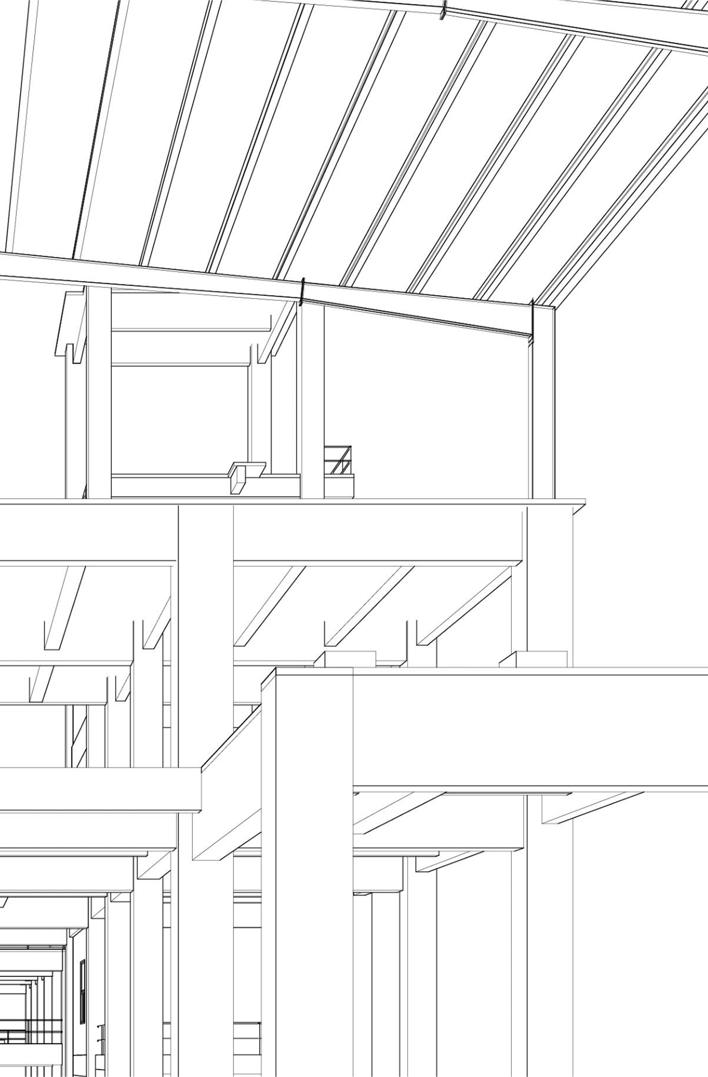
Vanishing lines and lines of code.
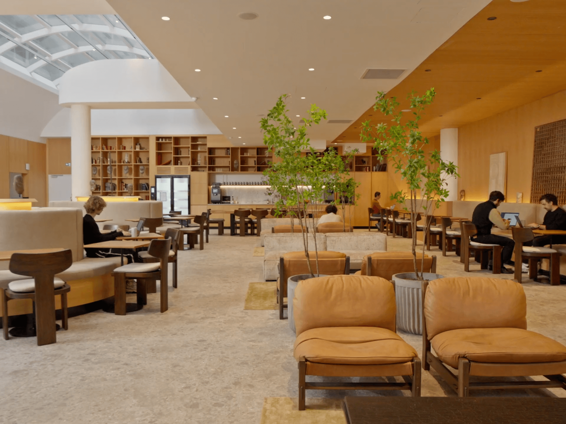
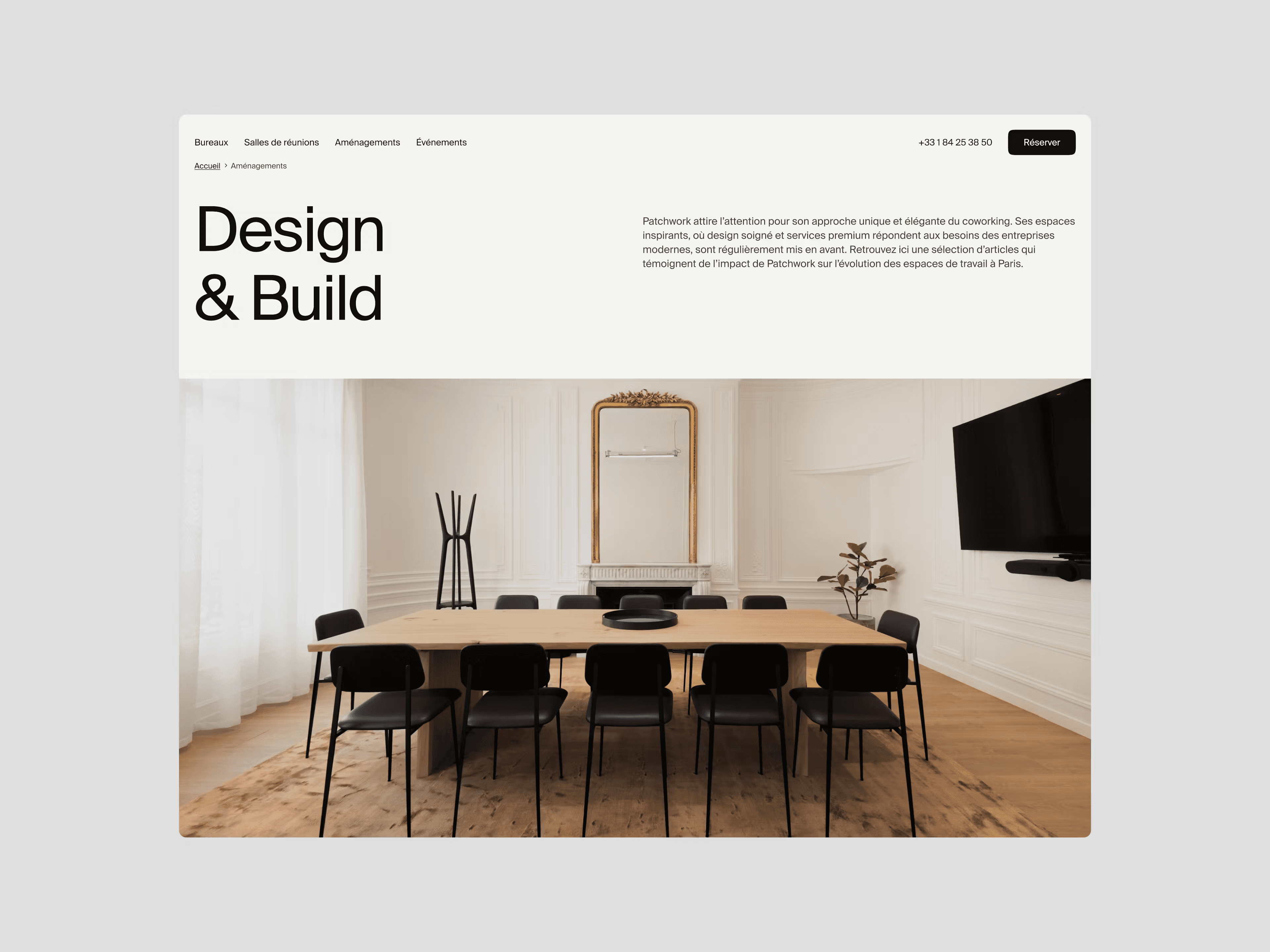
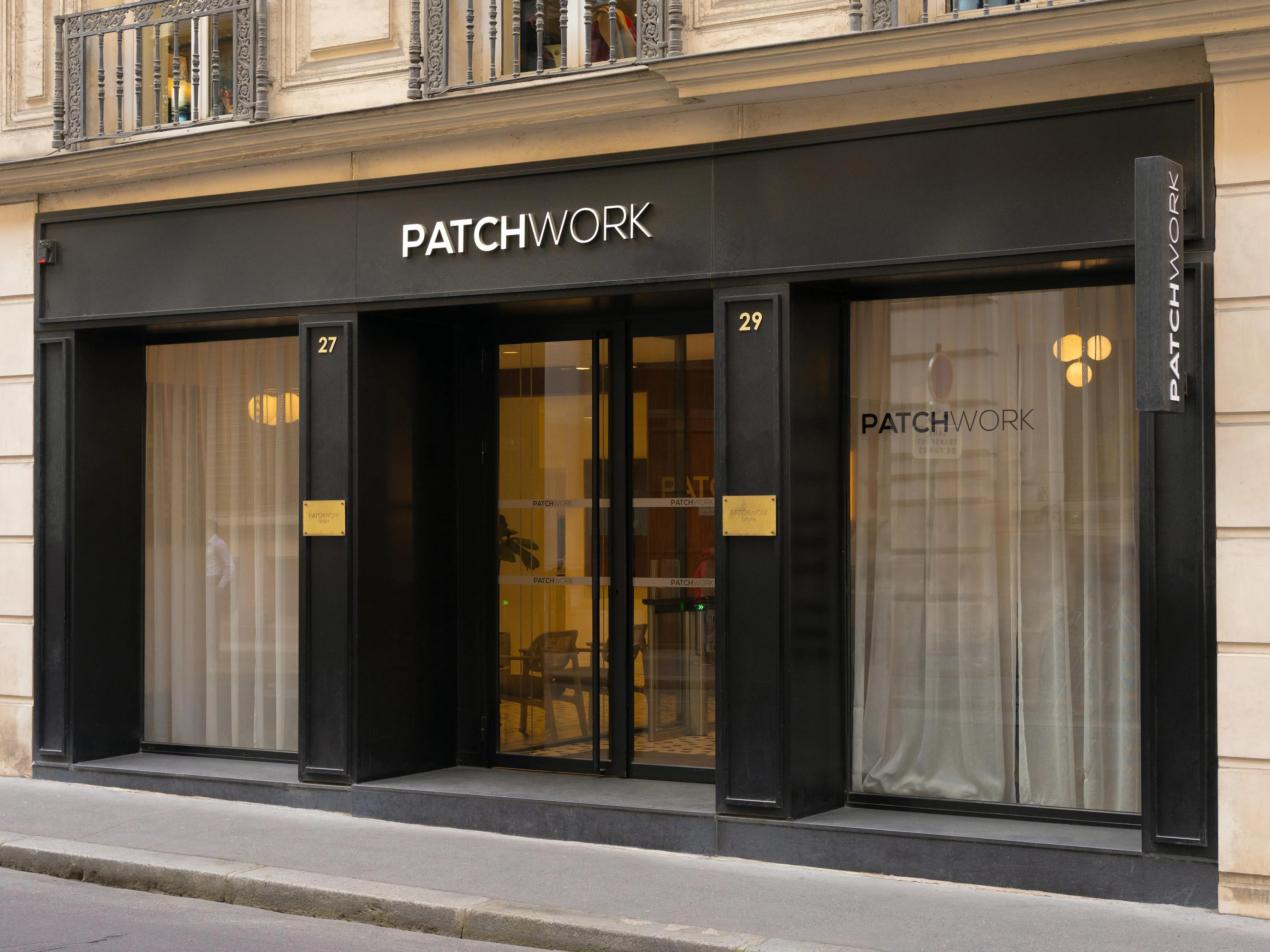
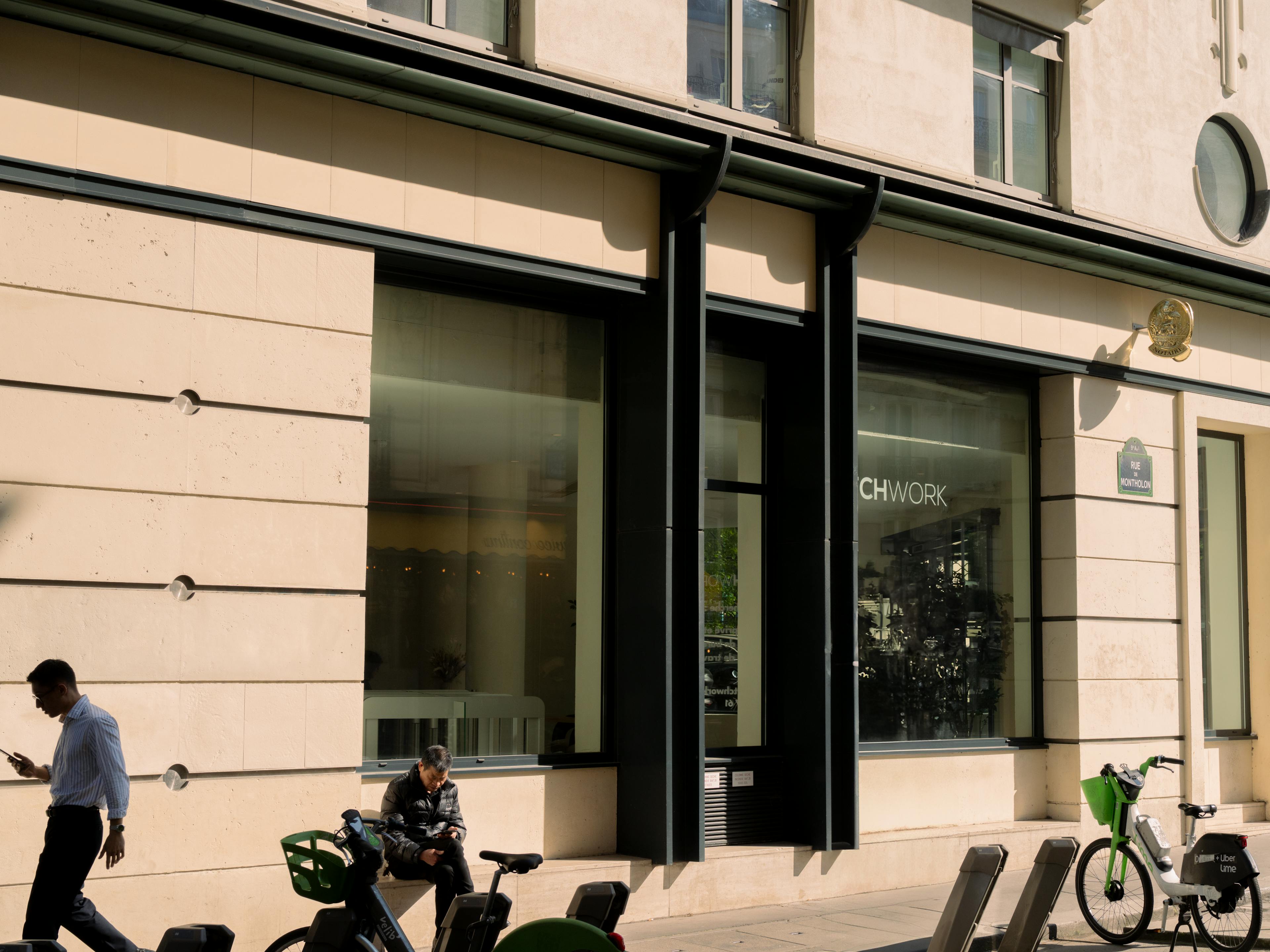
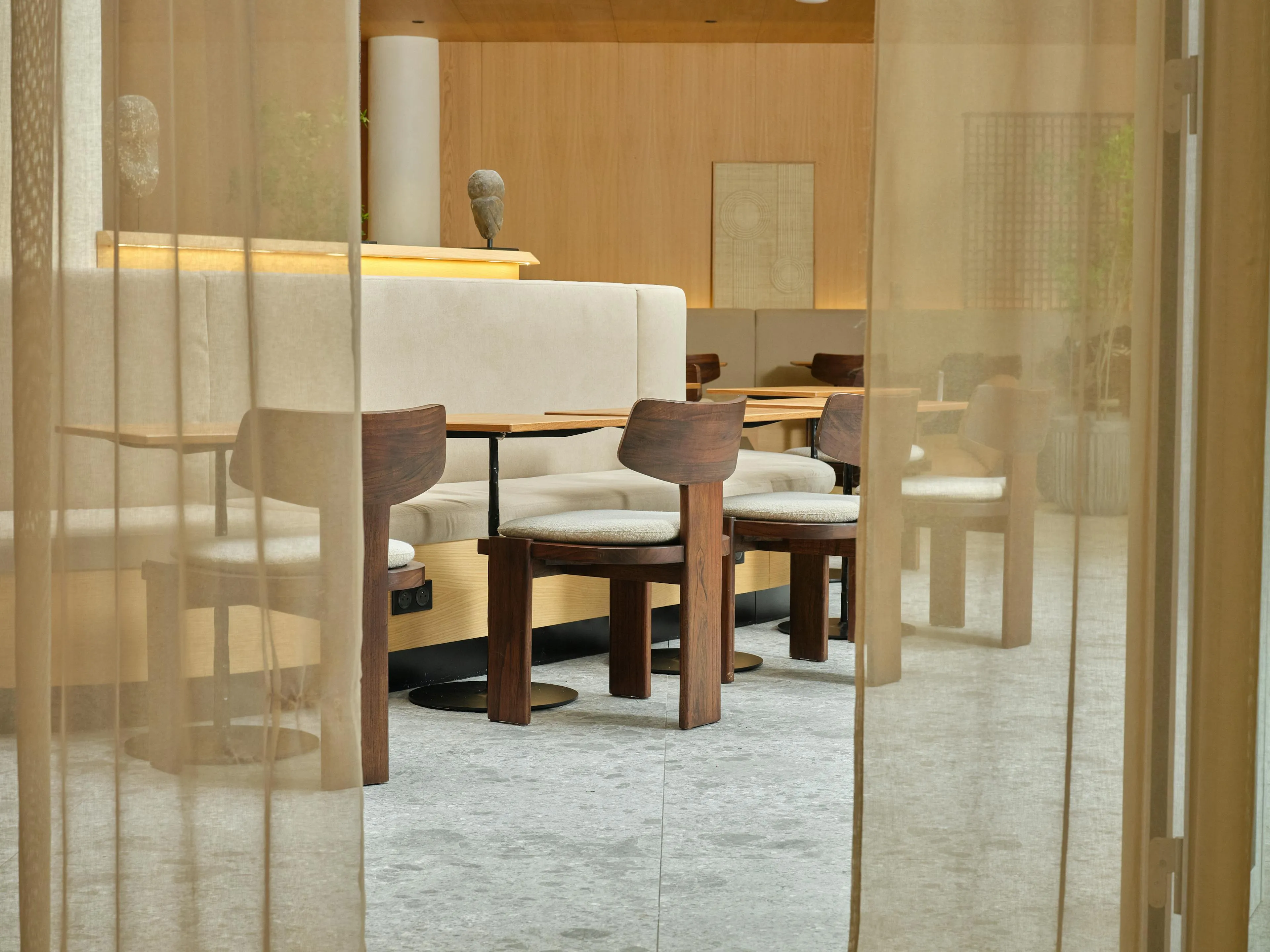
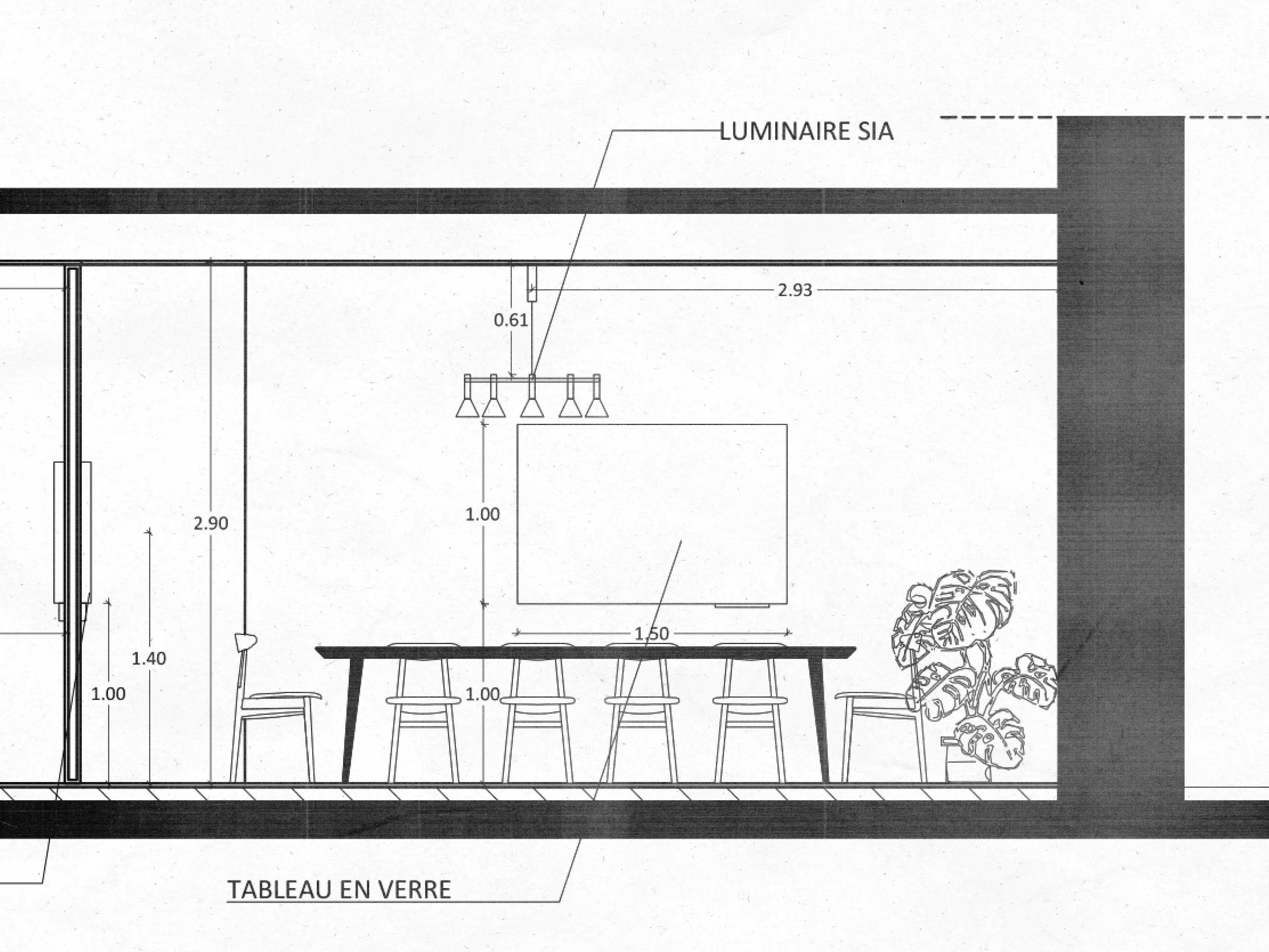
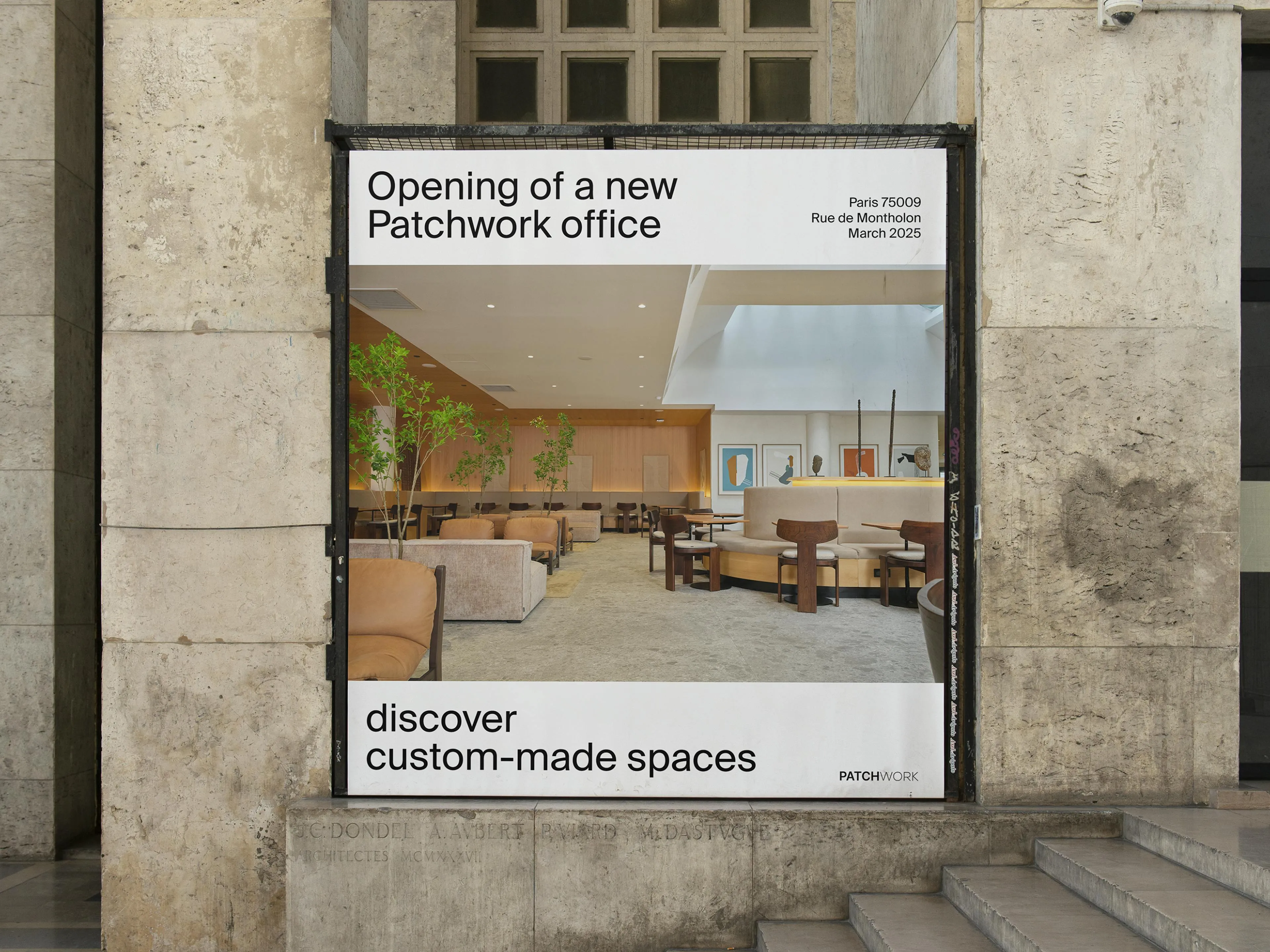
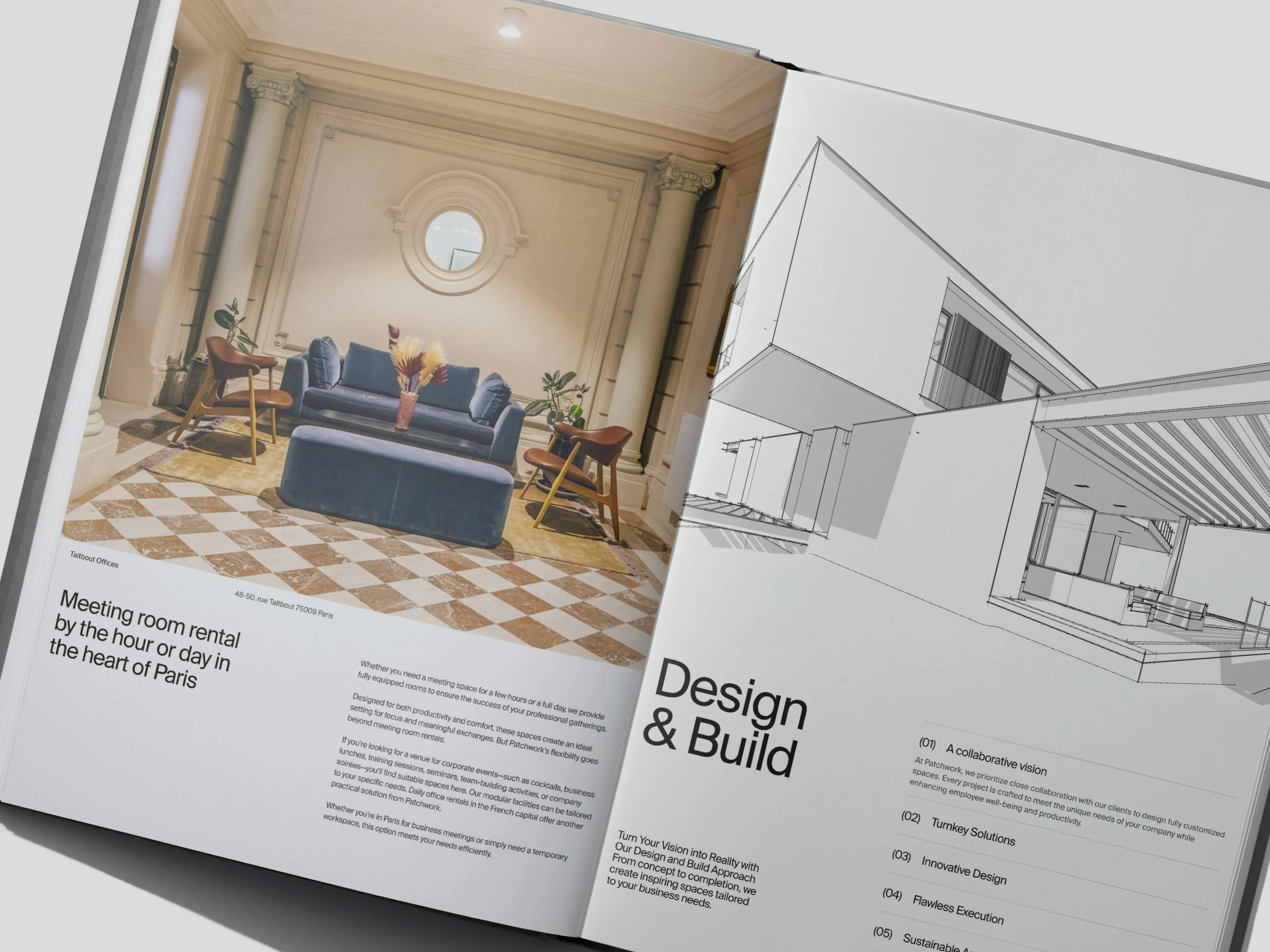
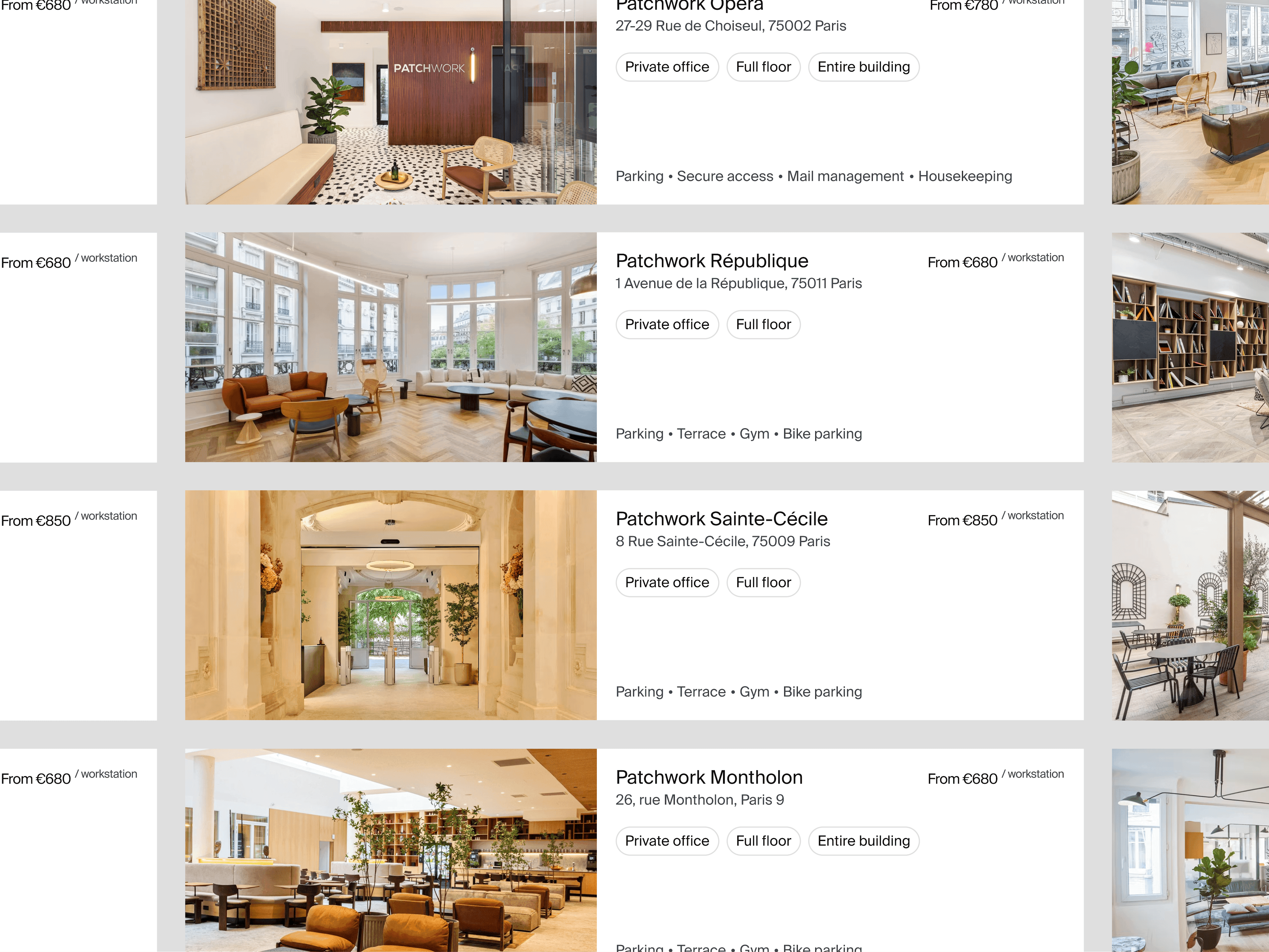
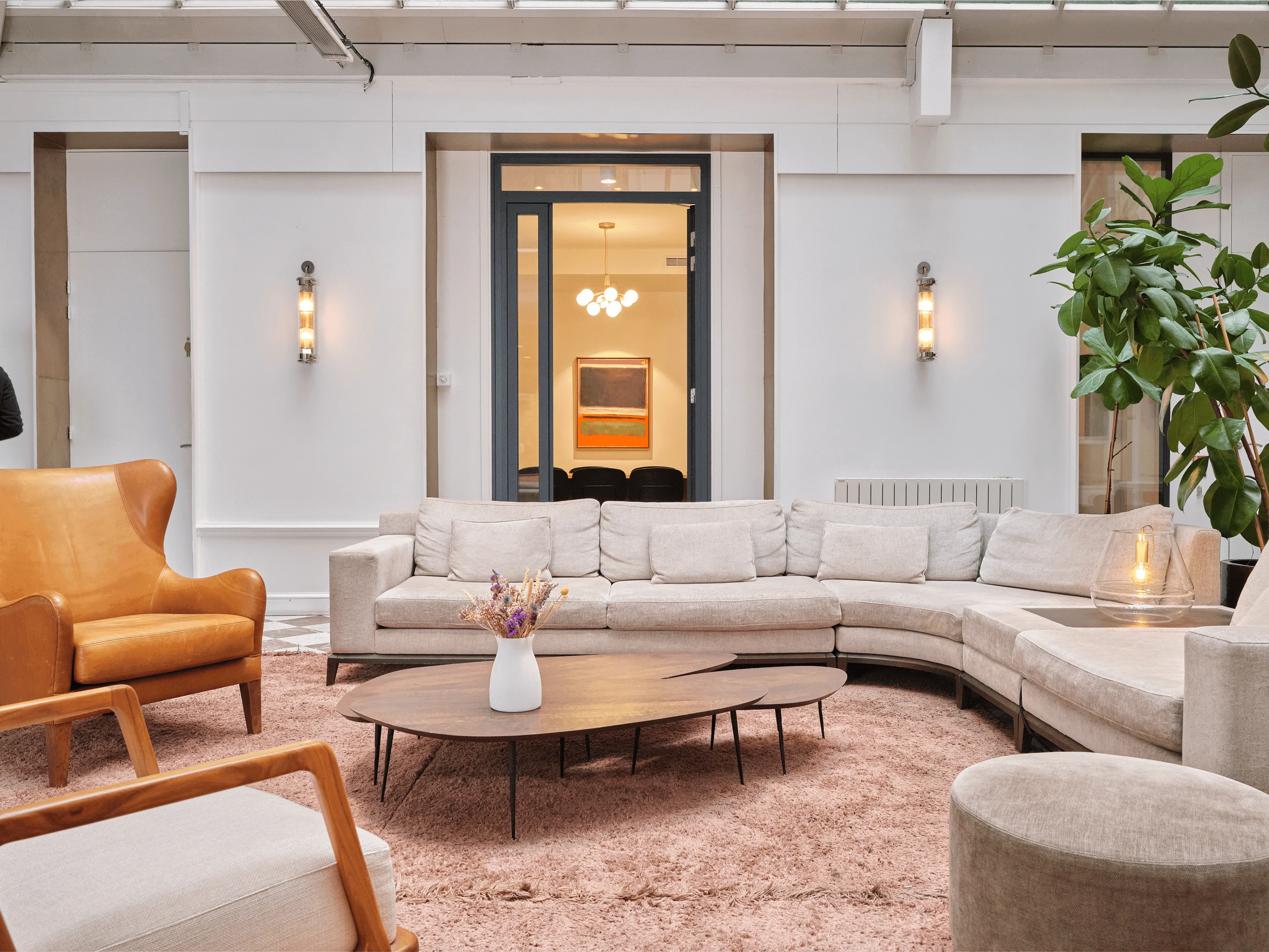
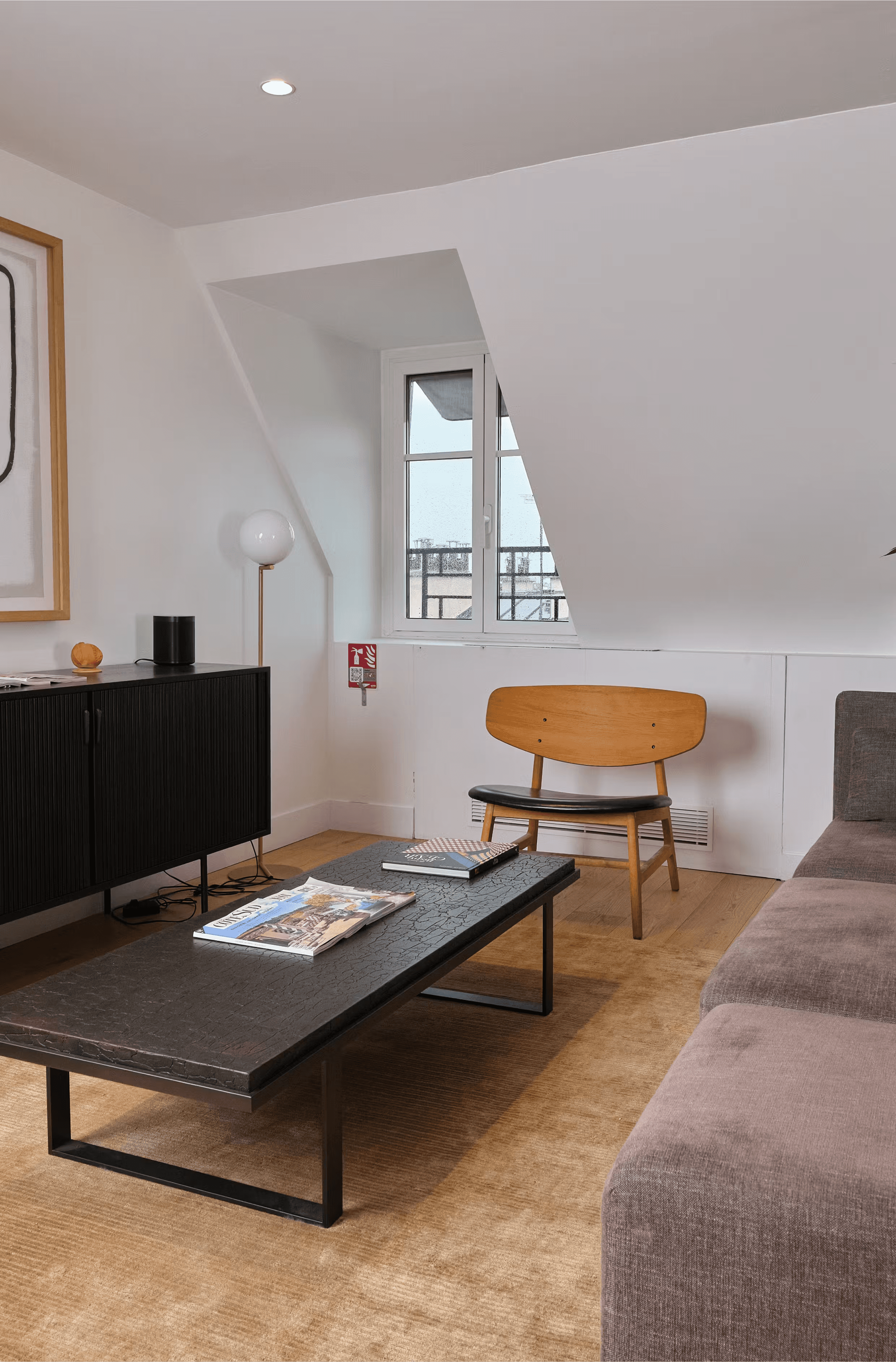
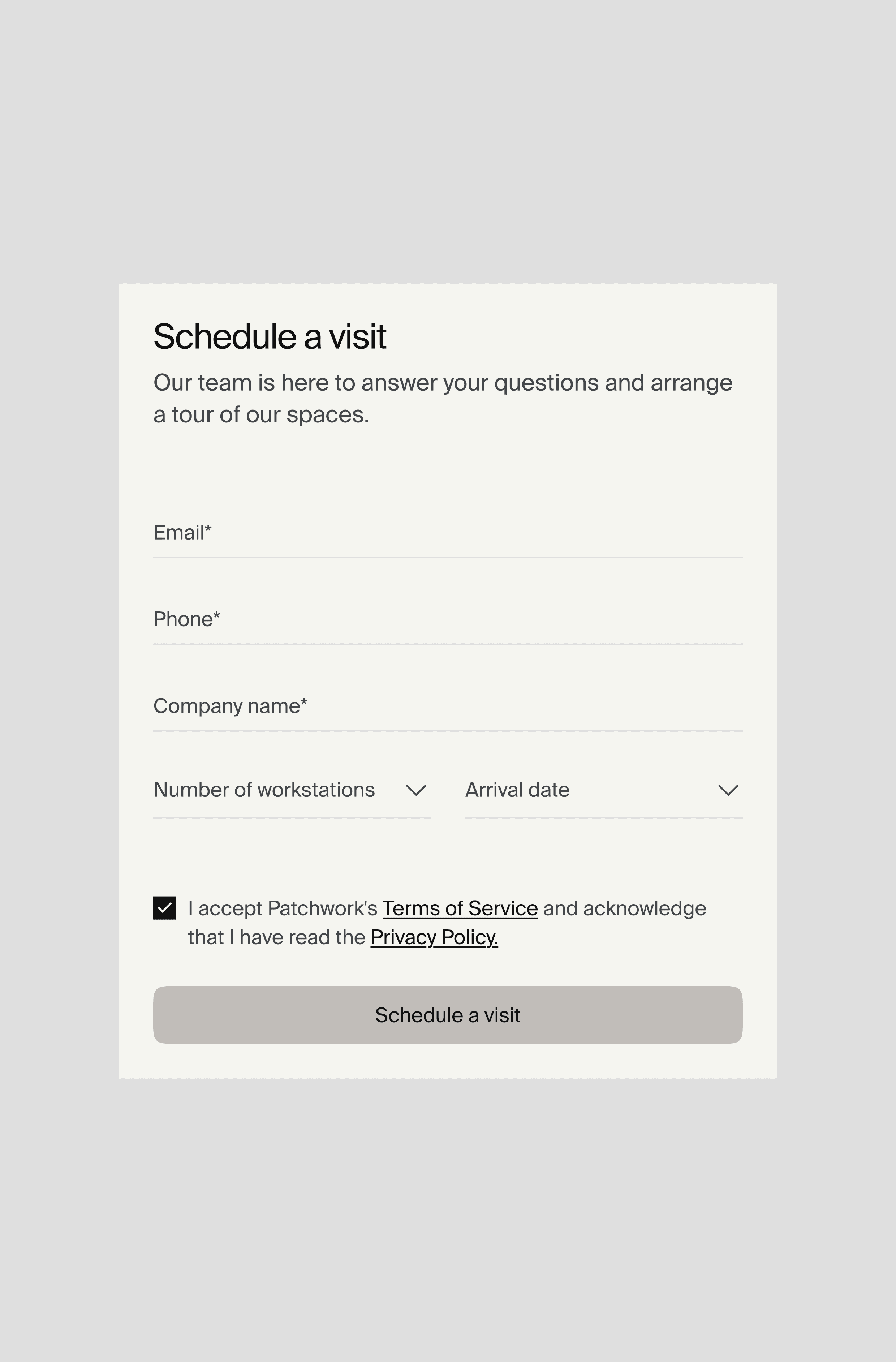
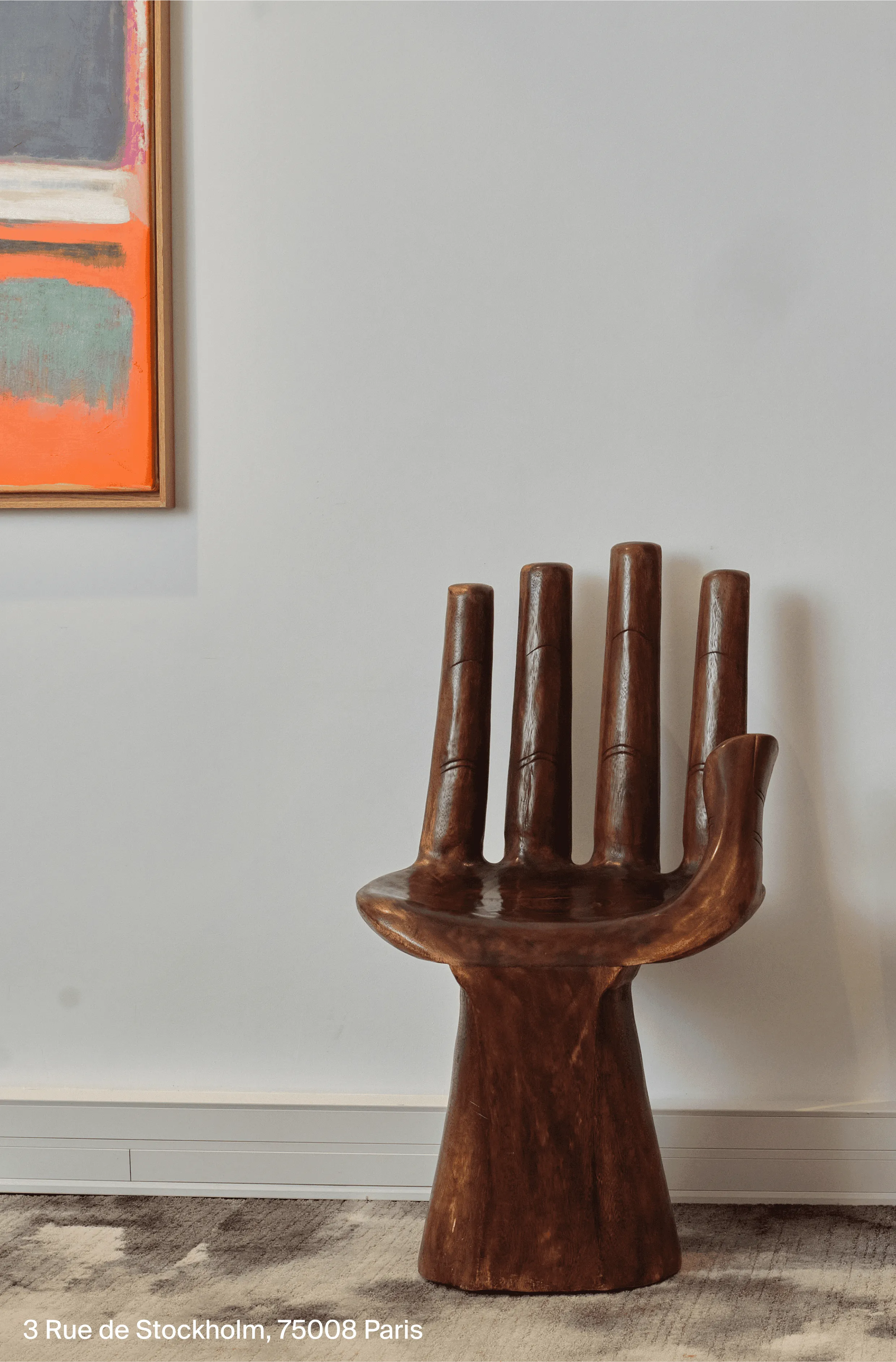
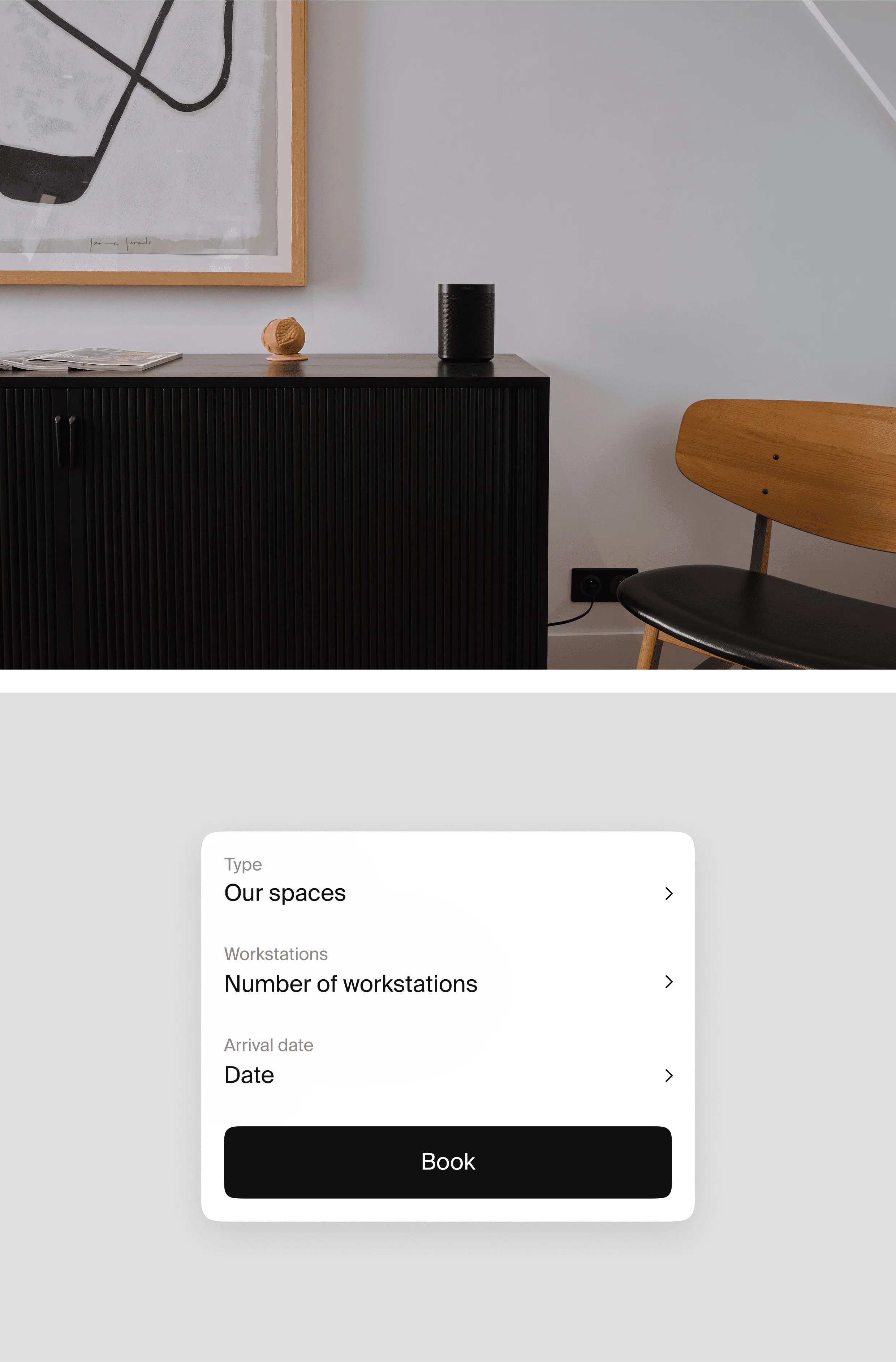
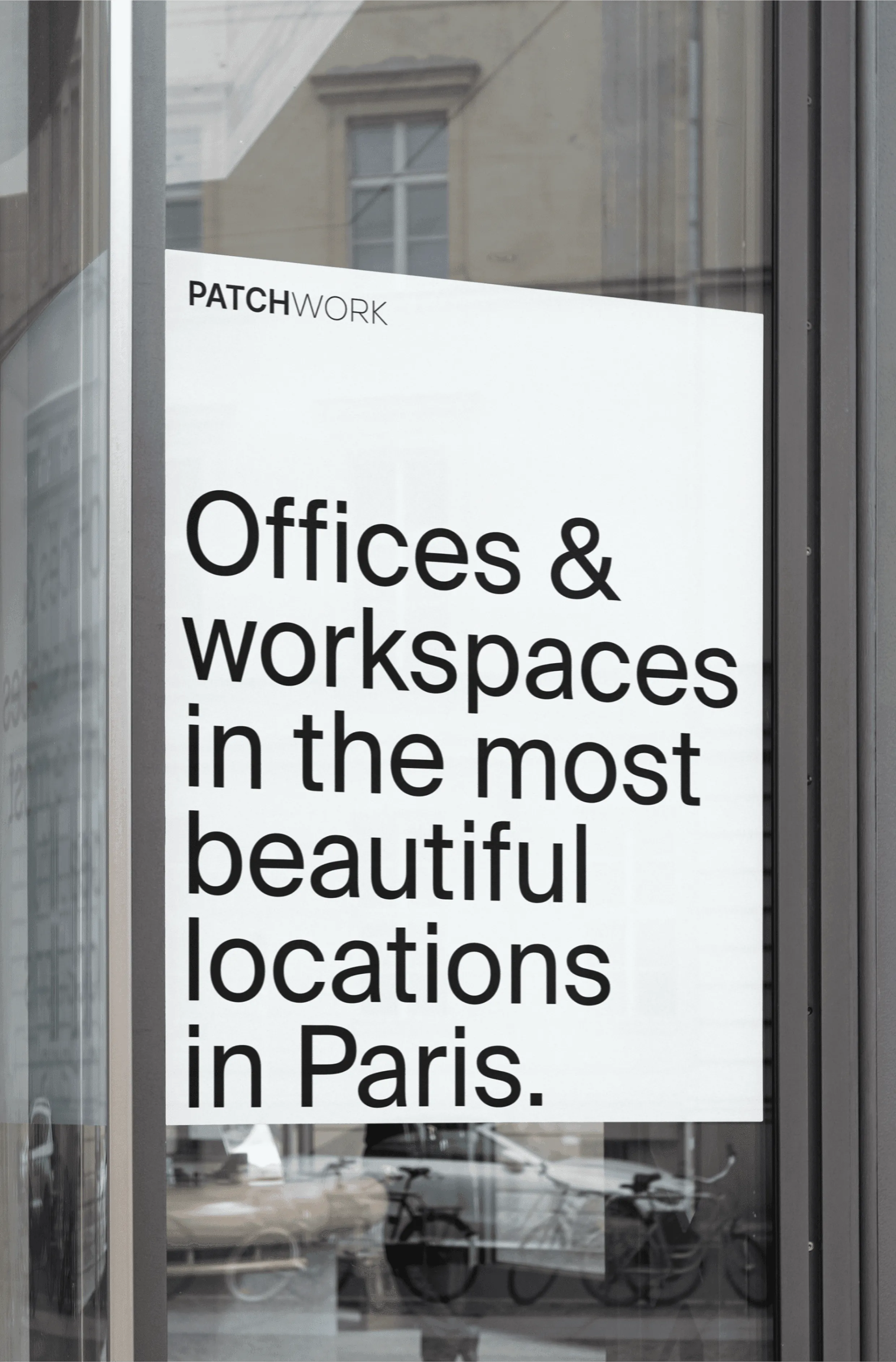
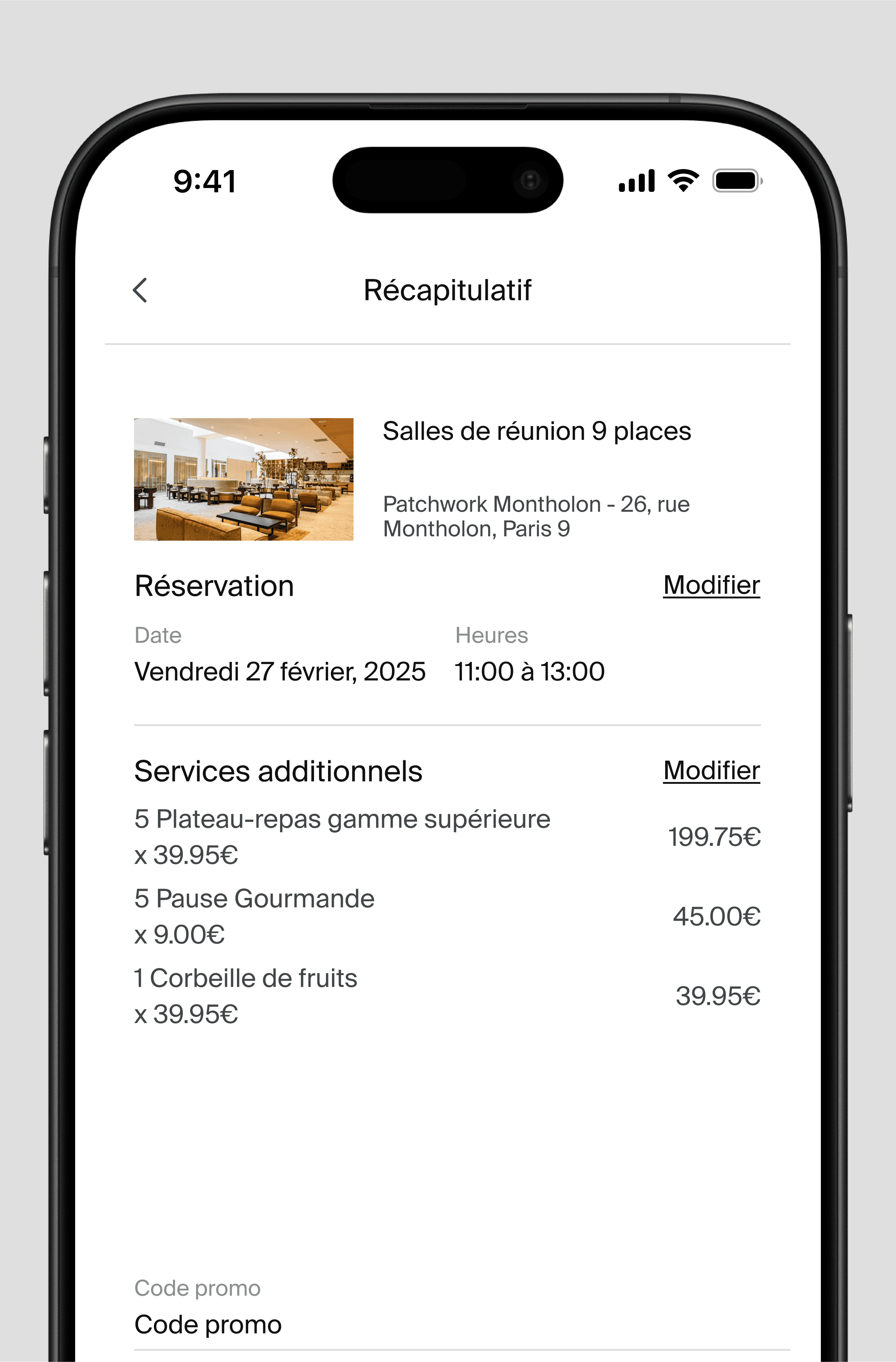
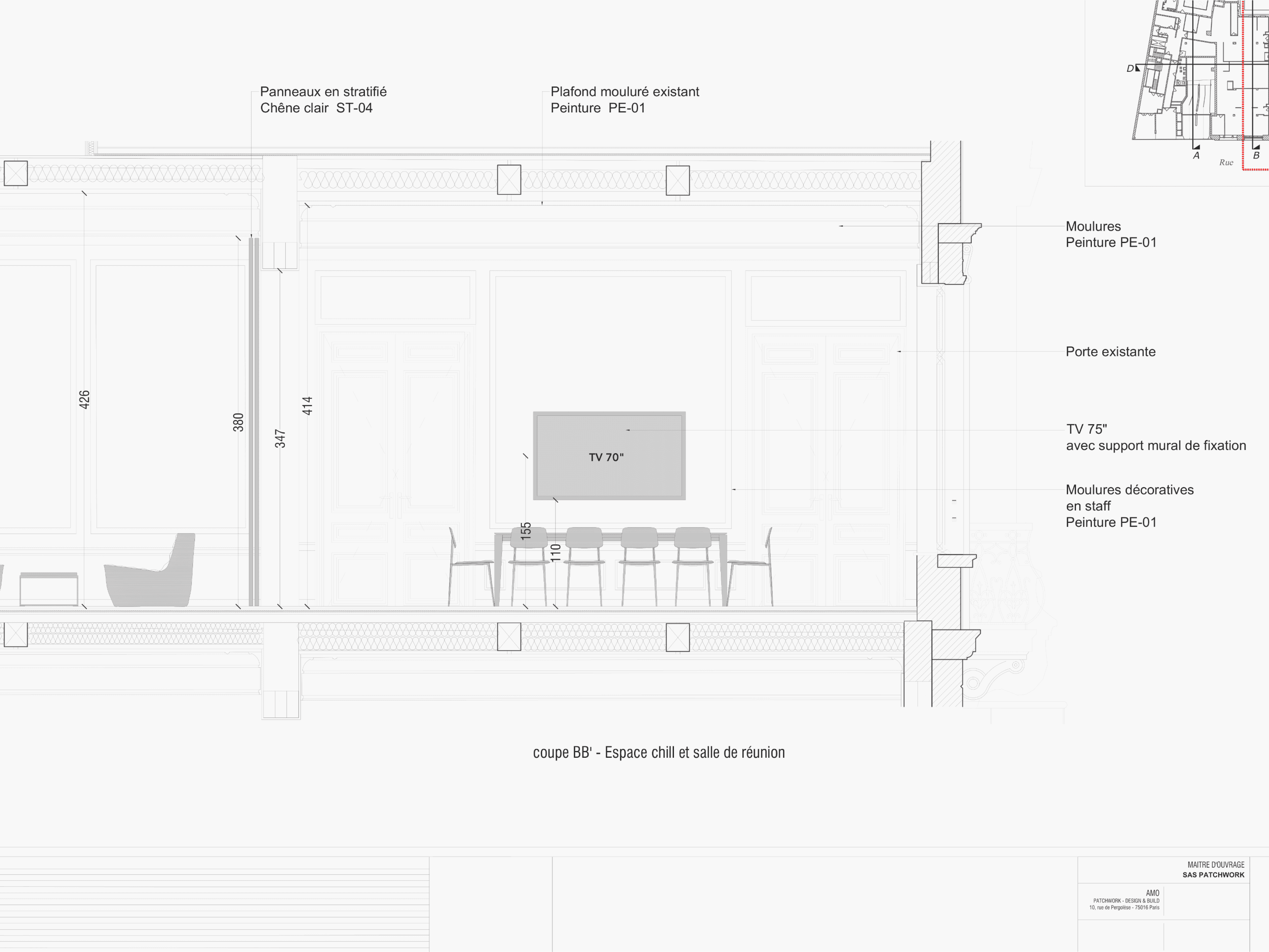
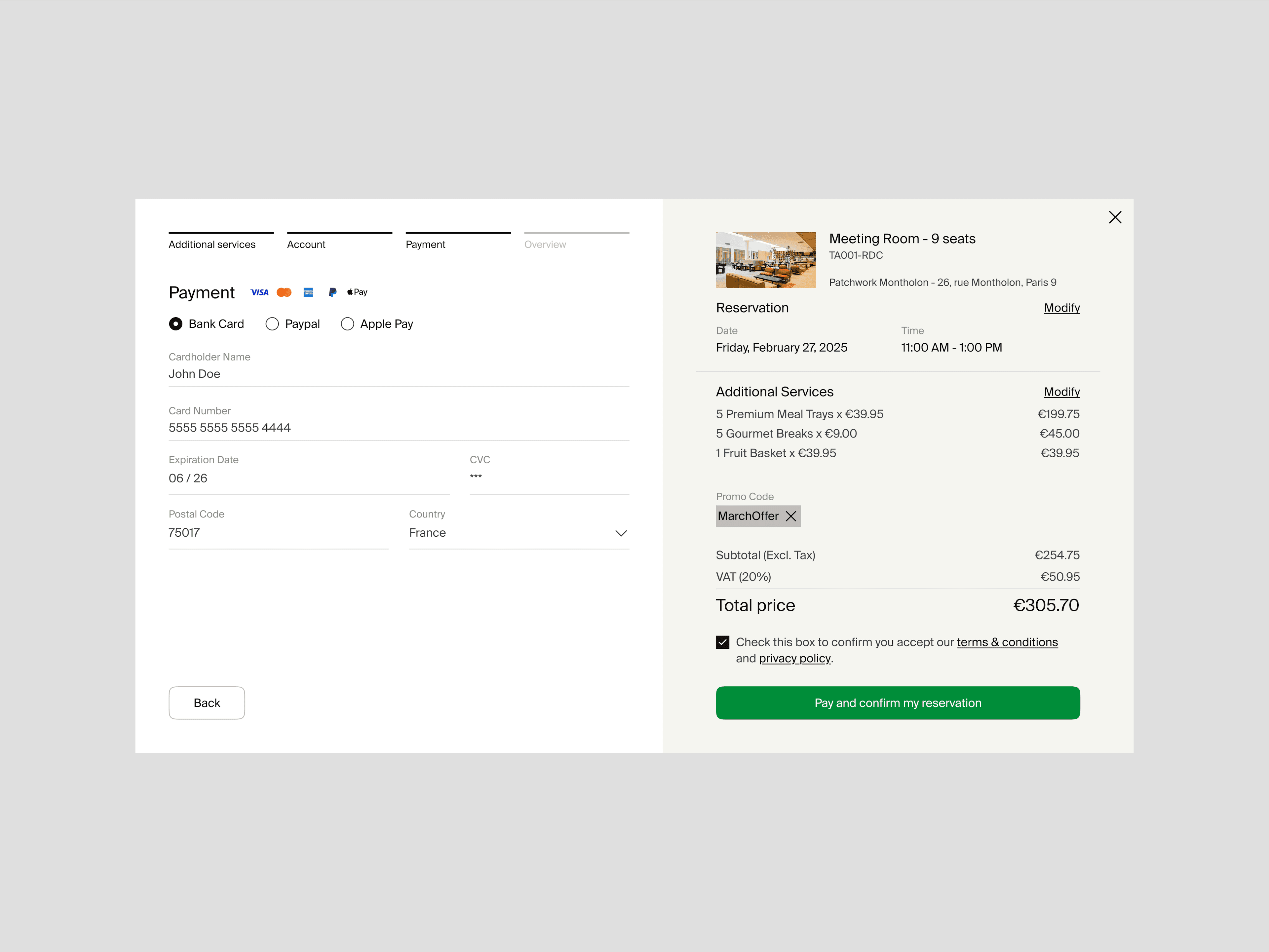
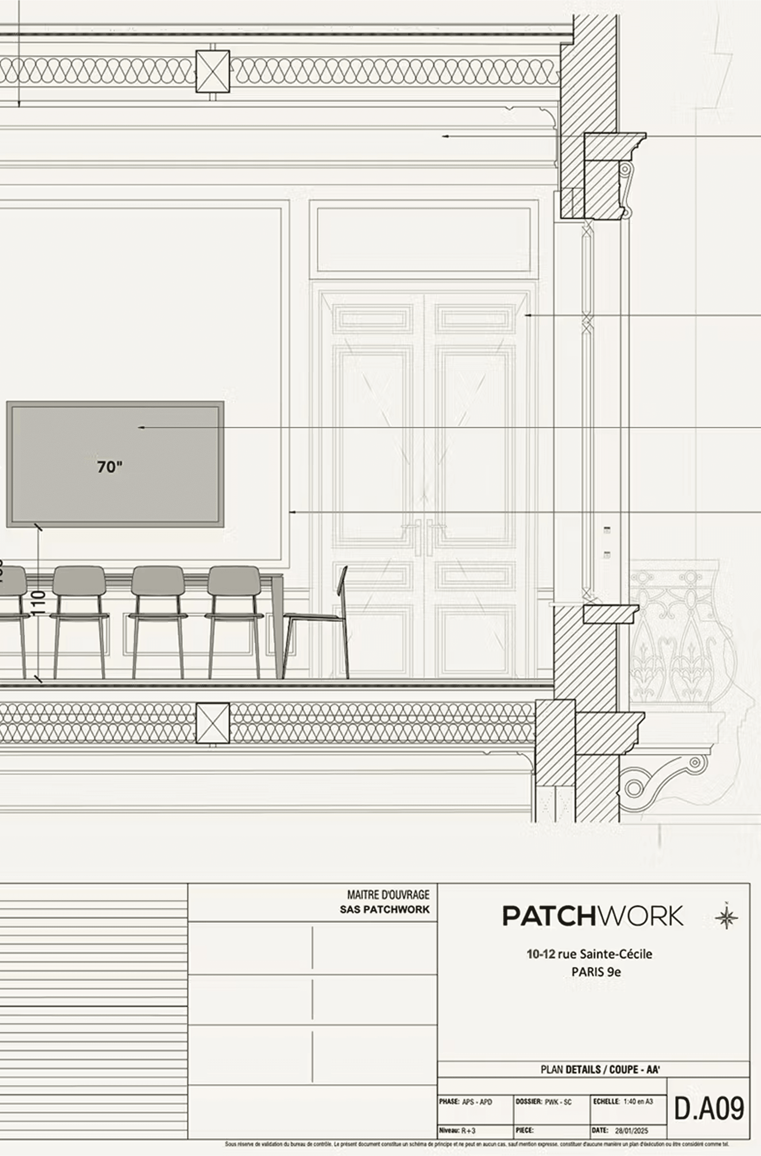
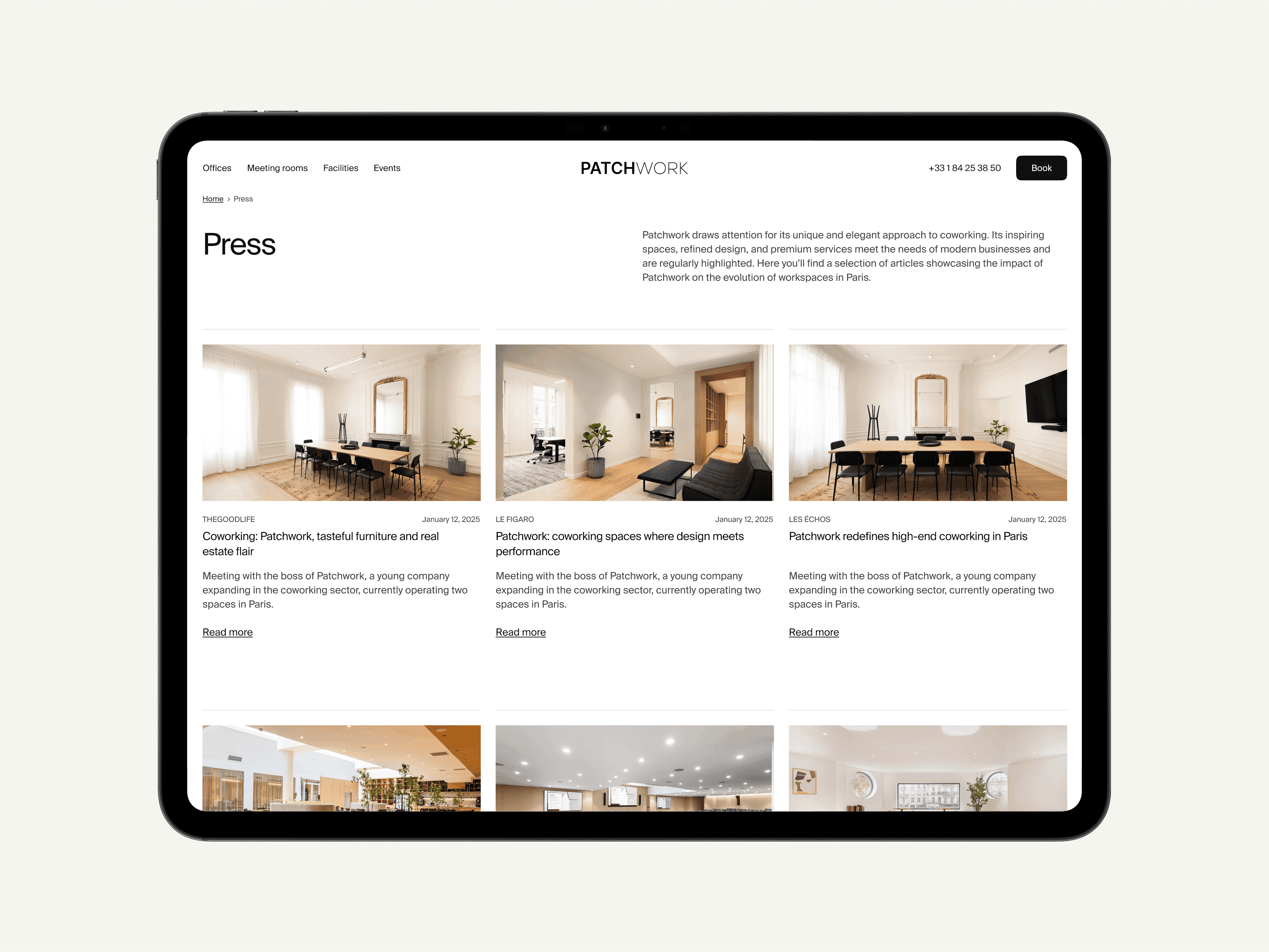
Patchwork offers workspaces of rare elegance, but their visual identity did not live up to the experience on site. The challenge was therefore to transcribe, in digital form, this impression of grandeur and beauty that one feels as soon as one pushes open the door of the spaces offered by the brand. We rethought their entire brand image - branding, design, website, UX and UI - to reveal the richness of their offer and assert a clear positioning. Patchwork does more than just rent workspaces: they design, furnish and offer tailor-made offices. We needed a platform that could match their standards, where reserving a space is as simple as it is attractive. The rebranding work is inspired by the interior architecture: rigorous Swiss typography, colors derived from the materials present in their premises (leather, wood, carpet, stone), and a fluid interface designed to maximize conversion. The user experience emphasizes space, light and clarity - everything that makes Patchwork unique. Here, the brand becomes a place in its own right: elegant, structured, inspiring.
Credits
Executive Direction
Barthélémy Chalvet
Creative Direction
Pierre Jeannelle
Art Direction
Tony Lixivel, Yoann Verzeletti
Copywriting
Victor Brami
Web Design
Tony Lixivel, Yoann Verzeletti
Web Development
Charles Boudrant, Théo Dos Santos
Motion design
Maël Masson
Project Management
Paul Mathieu-Colin
Categories
Digital
Verbal identity
Visual identity
Strategic identity
Development
Marketing
Health
Mass market brands
Entertainment
" transform="translate(5.875 5.018)" width="5.625000000000001px"/><path d="M 3.375 6.75 L 1 6.75 C 0.448 6.75 0 6.302 0 5.75 L 0 1 C 0 0.448 0.448 0 1 0 L 3.375 0 M 18.08 1.065 L 13.58 5.565 M 18.08 5.565 L 13.58 1.065" fill="transparent" height="6.75px" id="tf38oZaKO" stroke-dasharray="" stroke-linecap="round" stroke-linejoin="round" stroke-width="1.5" stroke="rgb(50, 50, 50)" transform="translate(2.5 8.625)" width="18.079999923706055px"/></g></svg>)

Rebranding Varsity, a European VC fund, with a warm and human identity built around one idea: founders think better when they're backed by more than one mind.
Celeres designs, integrates and supports the software and systems that critical missions depend on across space, defence, transport and public services. We created a strategic, visual and verbal identity, along with a new website, to reveal its essential role in environments where failure is not an option.

Alaska State Archives is a public institution responsible for preserving the state’s records. We redesigned the entire interface while respecting the institutional constraints of working with a government body, and brought Alaska’s history to the forefront by turning archival materials into core design elements.

For Pokémon’s 30th anniversary, Rimowa wanted more than a simple collaboration. Bruno reinterpreted its iconic aluminium suitcase through the visual language of Pokémon, creating an object where both worlds feel naturally connected.
Rebranding Varsity, a European VC fund, with a warm and human identity built around one idea: founders think better when they're backed by more than one mind.
Celeres designs, integrates and supports the software and systems that critical missions depend on across space, defence, transport and public services. We created a strategic, visual and verbal identity, along with a new website, to reveal its essential role in environments where failure is not an option.
Alaska State Archives is a public institution responsible for preserving the state’s records. We redesigned the entire interface while respecting the institutional constraints of working with a government body, and brought Alaska’s history to the forefront by turning archival materials into core design elements.
For Pokémon’s 30th anniversary, Rimowa wanted more than a simple collaboration. Bruno reinterpreted its iconic aluminium suitcase through the visual language of Pokémon, creating an object where both worlds feel naturally connected.
Qonto turned to the agency to lay the foundations of its brand universe. From digital design to web development, including the credit card design, the goal was to inject energy into a fast-growing brand.
Rebranding Varsity, a European VC fund, with a warm and human identity built around one idea: founders think better when they're backed by more than one mind.
Celeres designs, integrates and supports the software and systems that critical missions depend on across space, defence, transport and public services. We created a strategic, visual and verbal identity, along with a new website, to reveal its essential role in environments where failure is not an option.
Alaska State Archives is a public institution responsible for preserving the state’s records. We redesigned the entire interface while respecting the institutional constraints of working with a government body, and brought Alaska’s history to the forefront by turning archival materials into core design elements.
For Pokémon’s 30th anniversary, Rimowa wanted more than a simple collaboration. Bruno reinterpreted its iconic aluminium suitcase through the visual language of Pokémon, creating an object where both worlds feel naturally connected.