
Varsity
Rebranding Varsity, a European VC fund, with a warm and human identity built around one idea: founders think better when they're backed by more than one mind.
Informations
Reinventing the family doctor
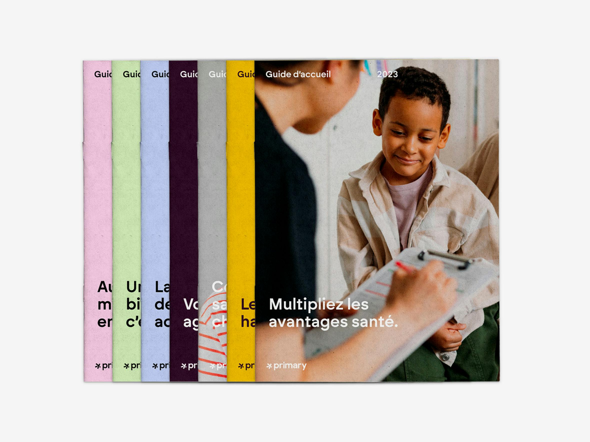
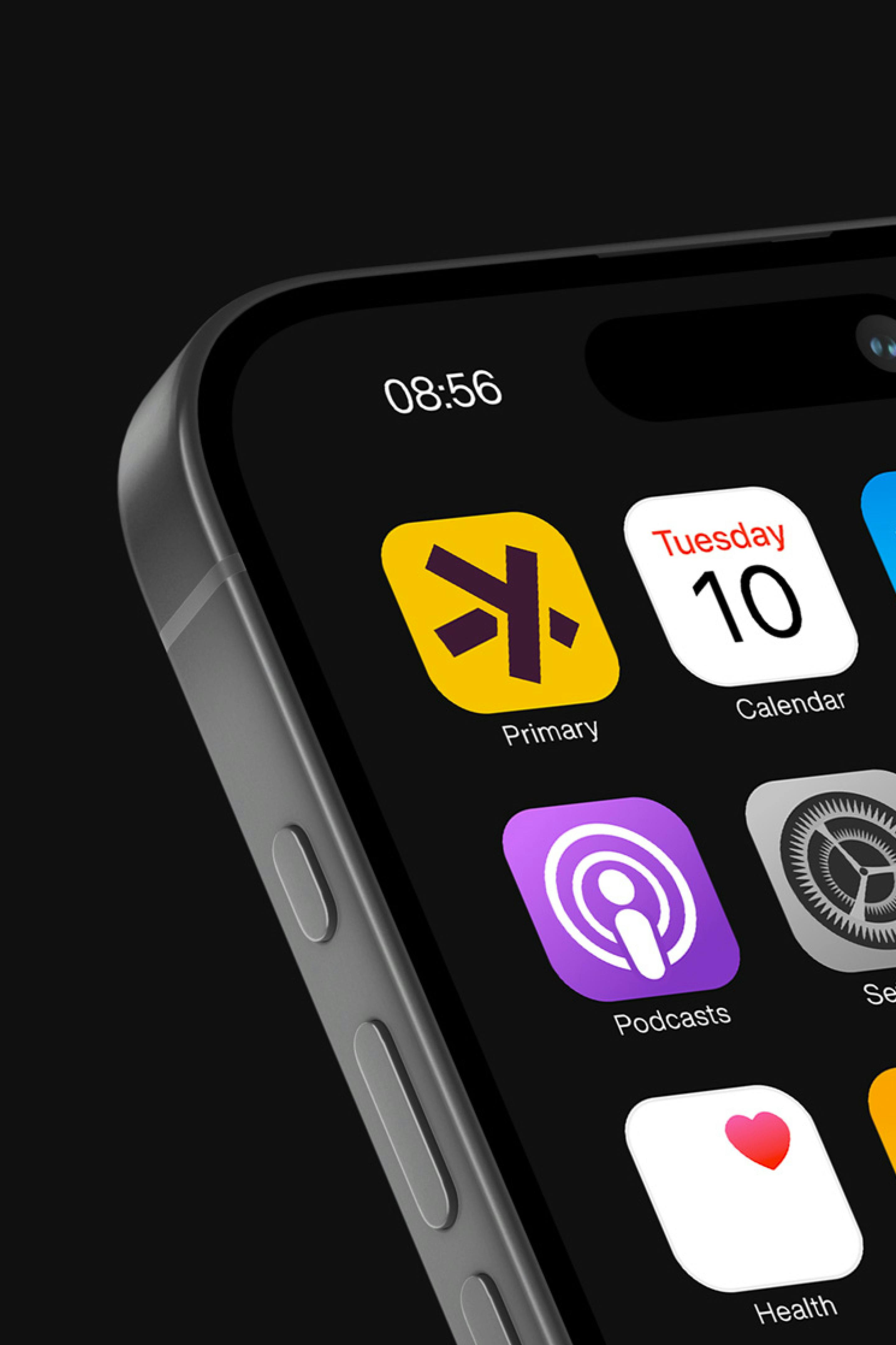
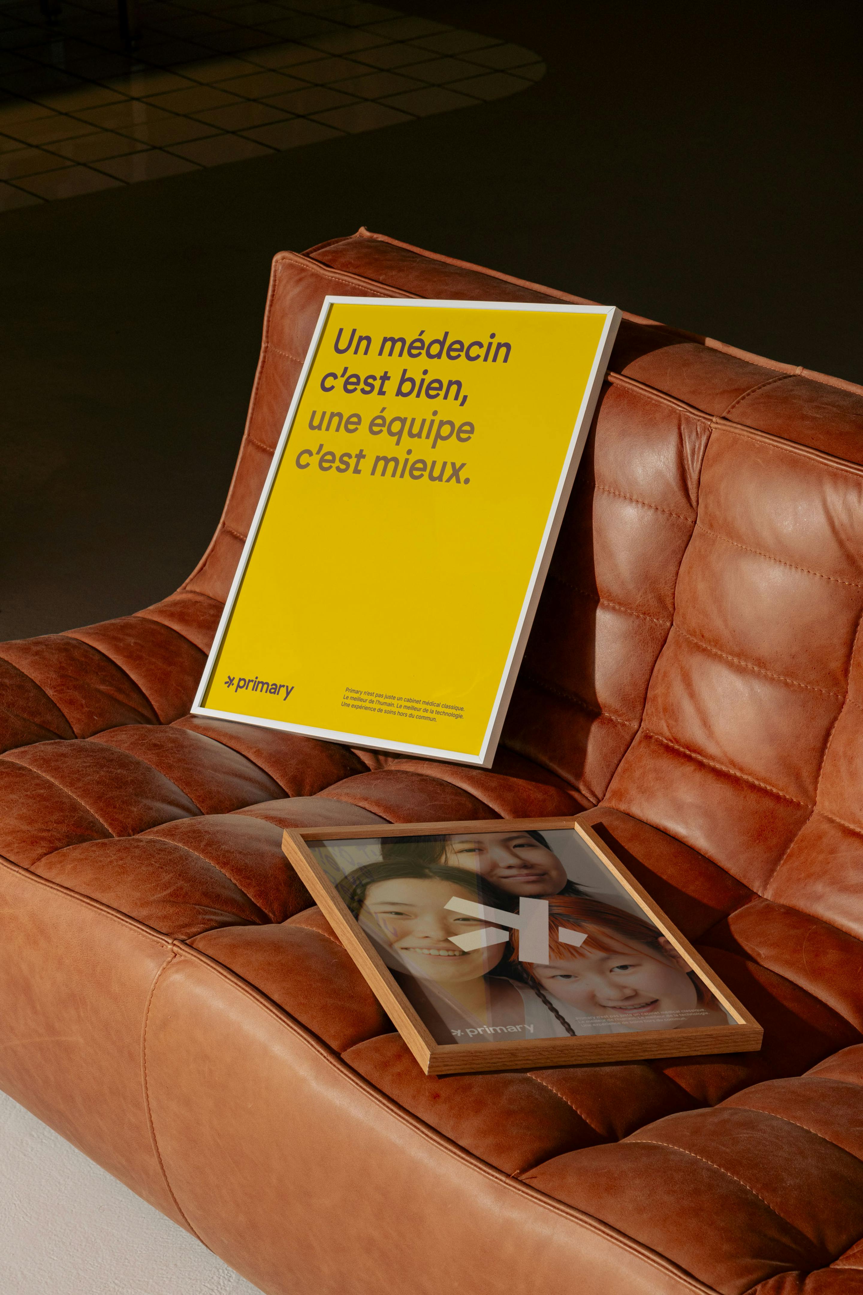
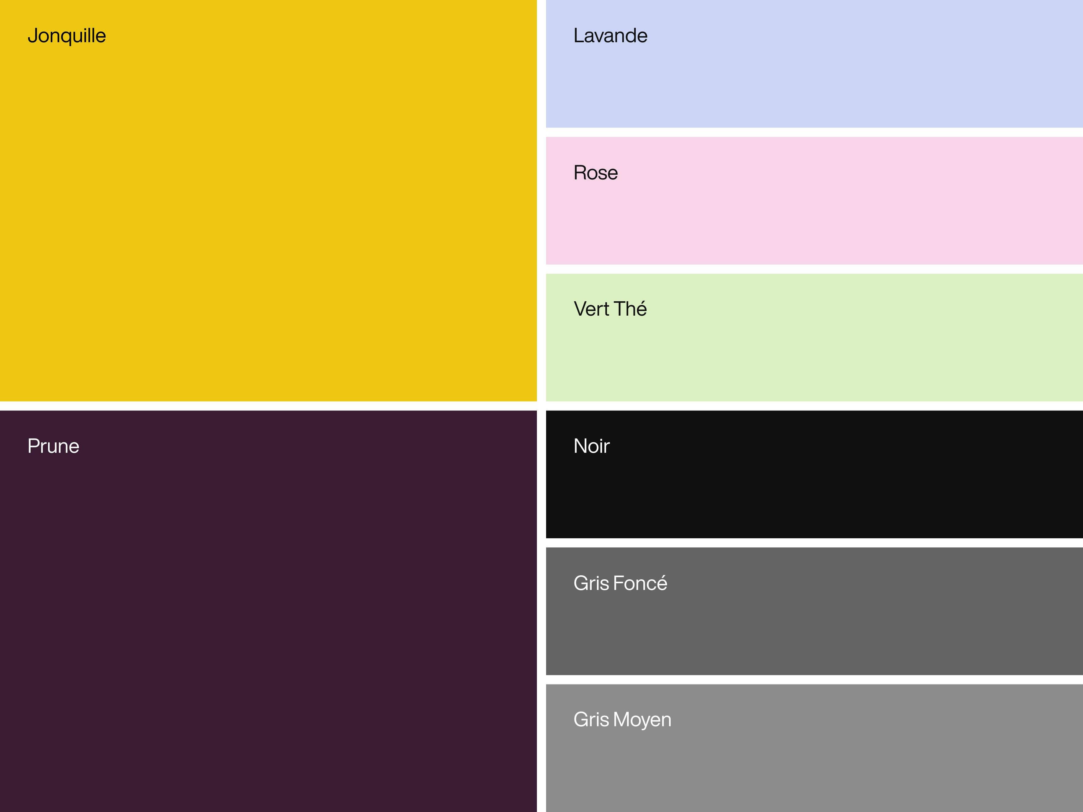
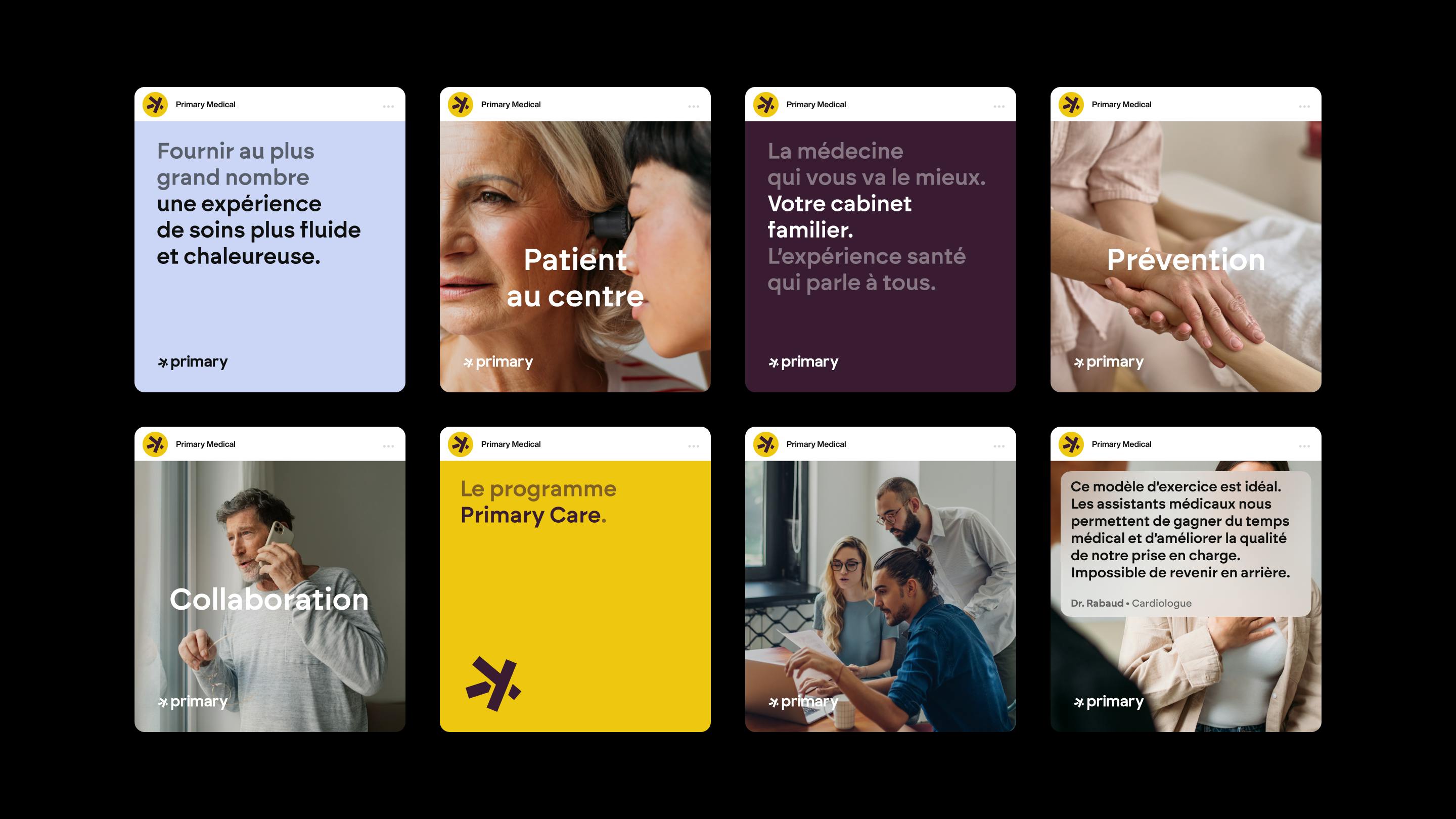
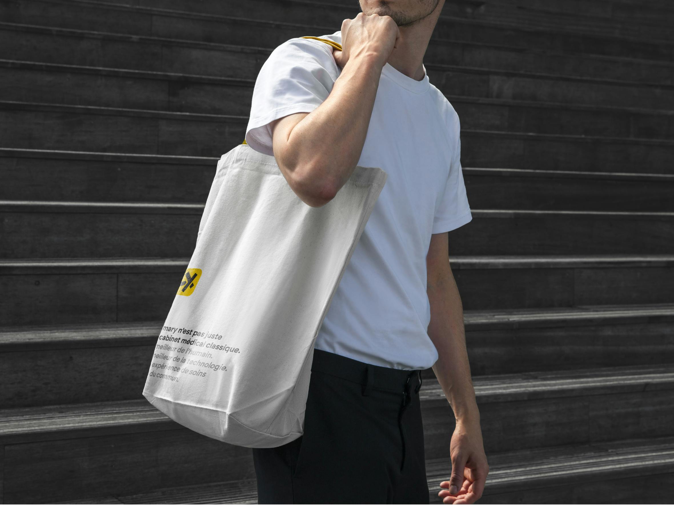
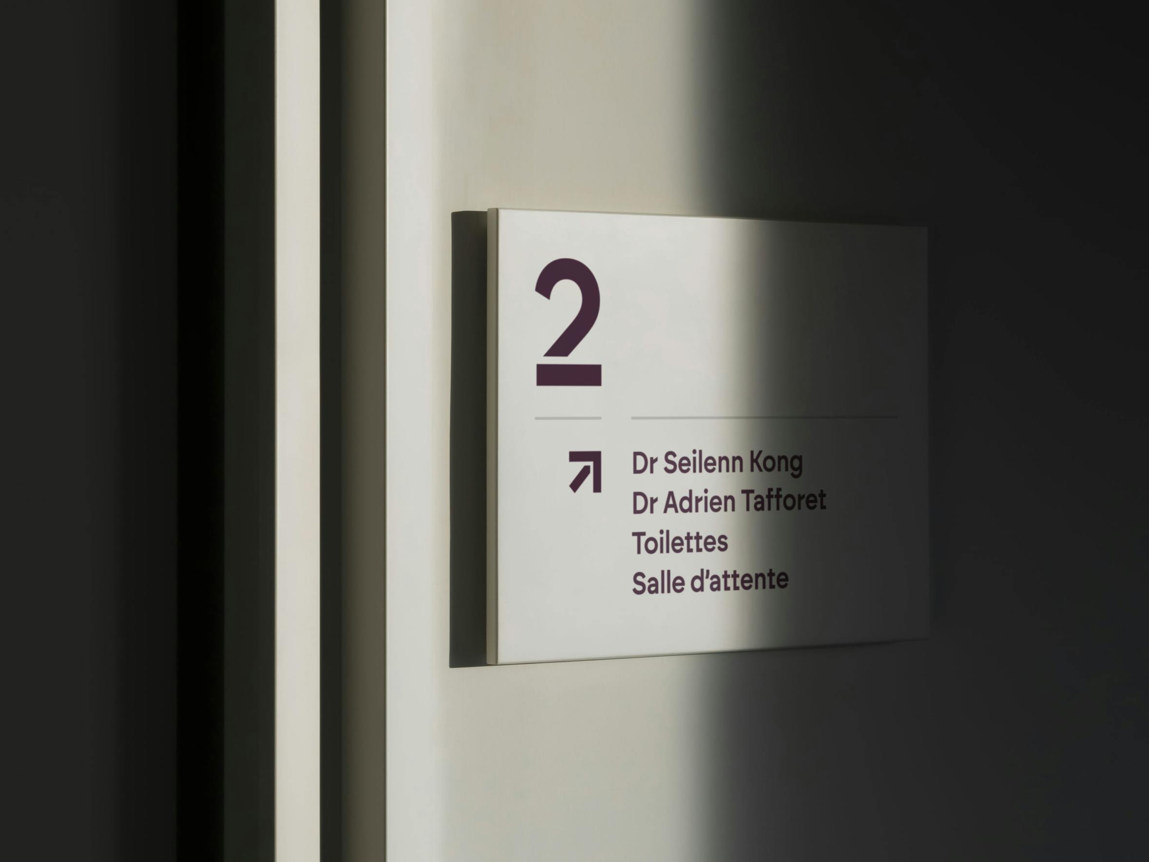
Primary revolutionizes medical practices by combining the best of human touch and technology. We designed a brand identity for them that is as warm as it is modern, bringing together two worlds: the IRL and the virtual. The logo, with its unique typography, incorporates the XY symbols of medicine and the five branches of primary care, reflecting the ease of use of the service. To build trust, forget the magazines published 10 years ago in the dark waiting room of your GP. The art direction focuses on a warm yellow palette, softs rounded edges and illustrations combining drawing and 3D. The photography emphasizes the human touch, reinforcing the bond between patient and practitioner. The branding extends to the practitioner's gowns and practice decorations, designed for Primary's interior designers. Medicine is an exact science, and so is design.
Credits
Executive Direction
Barthélémy Chalvet
Art Direction
Lou Bontemps, Maxime Brémond
Copywriting
Lou Bontemps
Web Development
Alexis Prévost-Maynen
Motion design
Christophe Zidler
Project Management
Jewel Annerose
Categories
Digital
Verbal identity
Visual identity
Development
Mass market brands
Civic & Public Services
Professional Services
Testimonial


Rebranding Varsity, a European VC fund, with a warm and human identity built around one idea: founders think better when they're backed by more than one mind.
Celeres designs, integrates and supports the software and systems that critical missions depend on across space, defence, transport and public services. We created a strategic, visual and verbal identity, along with a new website, to reveal its essential role in environments where failure is not an option.

Alaska State Archives is a public institution responsible for preserving the state’s records. We redesigned the entire interface while respecting the institutional constraints of working with a government body, and brought Alaska’s history to the forefront by turning archival materials into core design elements.

For Pokémon’s 30th anniversary, Rimowa wanted more than a simple collaboration. Bruno reinterpreted its iconic aluminium suitcase through the visual language of Pokémon, creating an object where both worlds feel naturally connected.
Rebranding Varsity, a European VC fund, with a warm and human identity built around one idea: founders think better when they're backed by more than one mind.
Celeres designs, integrates and supports the software and systems that critical missions depend on across space, defence, transport and public services. We created a strategic, visual and verbal identity, along with a new website, to reveal its essential role in environments where failure is not an option.
Alaska State Archives is a public institution responsible for preserving the state’s records. We redesigned the entire interface while respecting the institutional constraints of working with a government body, and brought Alaska’s history to the forefront by turning archival materials into core design elements.
For Pokémon’s 30th anniversary, Rimowa wanted more than a simple collaboration. Bruno reinterpreted its iconic aluminium suitcase through the visual language of Pokémon, creating an object where both worlds feel naturally connected.
Qonto turned to the agency to lay the foundations of its brand universe. From digital design to web development, including the credit card design, the goal was to inject energy into a fast-growing brand.
Rebranding Varsity, a European VC fund, with a warm and human identity built around one idea: founders think better when they're backed by more than one mind.
Celeres designs, integrates and supports the software and systems that critical missions depend on across space, defence, transport and public services. We created a strategic, visual and verbal identity, along with a new website, to reveal its essential role in environments where failure is not an option.
Alaska State Archives is a public institution responsible for preserving the state’s records. We redesigned the entire interface while respecting the institutional constraints of working with a government body, and brought Alaska’s history to the forefront by turning archival materials into core design elements.
For Pokémon’s 30th anniversary, Rimowa wanted more than a simple collaboration. Bruno reinterpreted its iconic aluminium suitcase through the visual language of Pokémon, creating an object where both worlds feel naturally connected.