
Varsity
Rebranding Varsity, a European VC fund, with a warm and human identity built around one idea: founders think better when they're backed by more than one mind.
Informations
Finding work shouldn’t be a job.
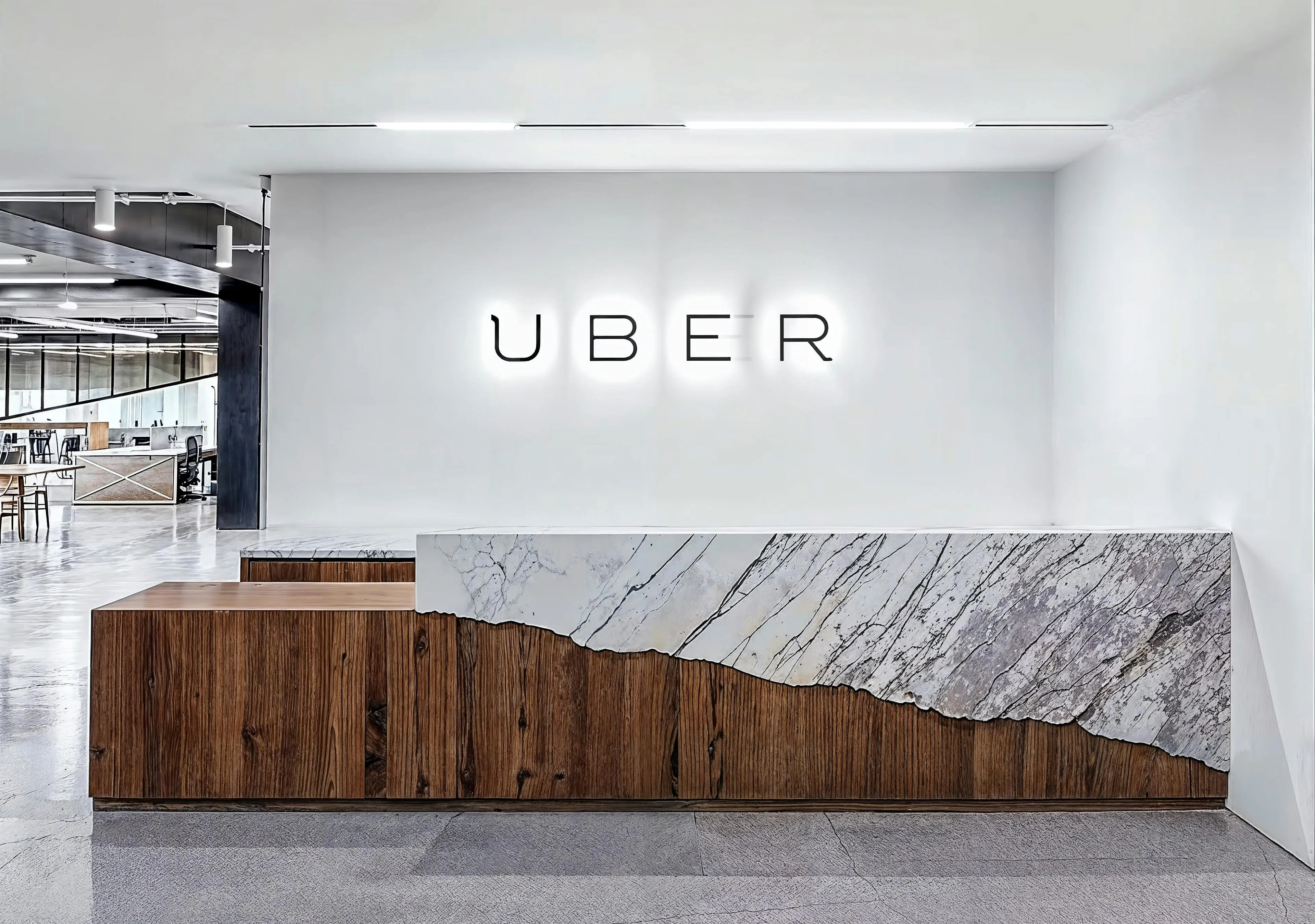
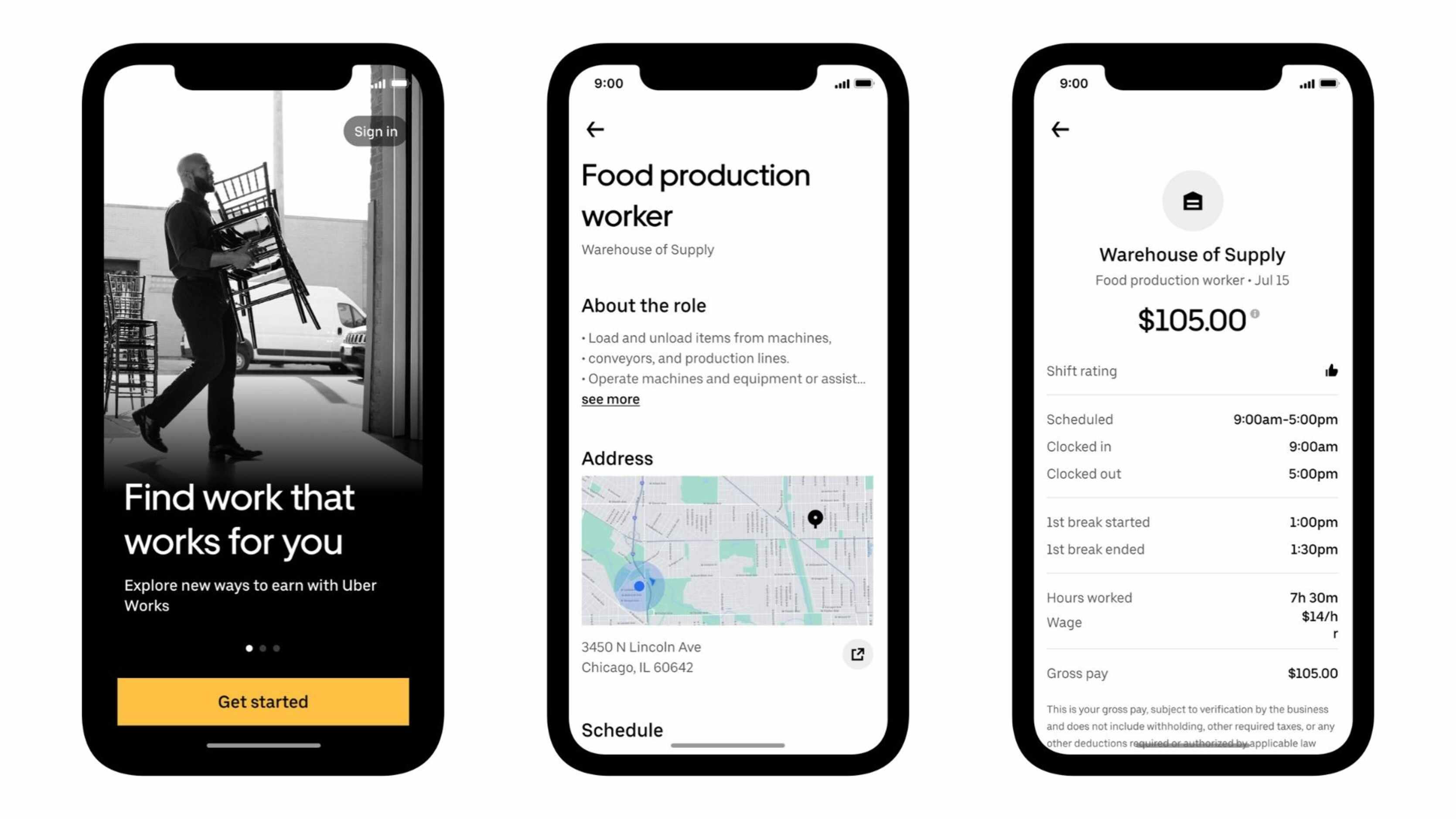
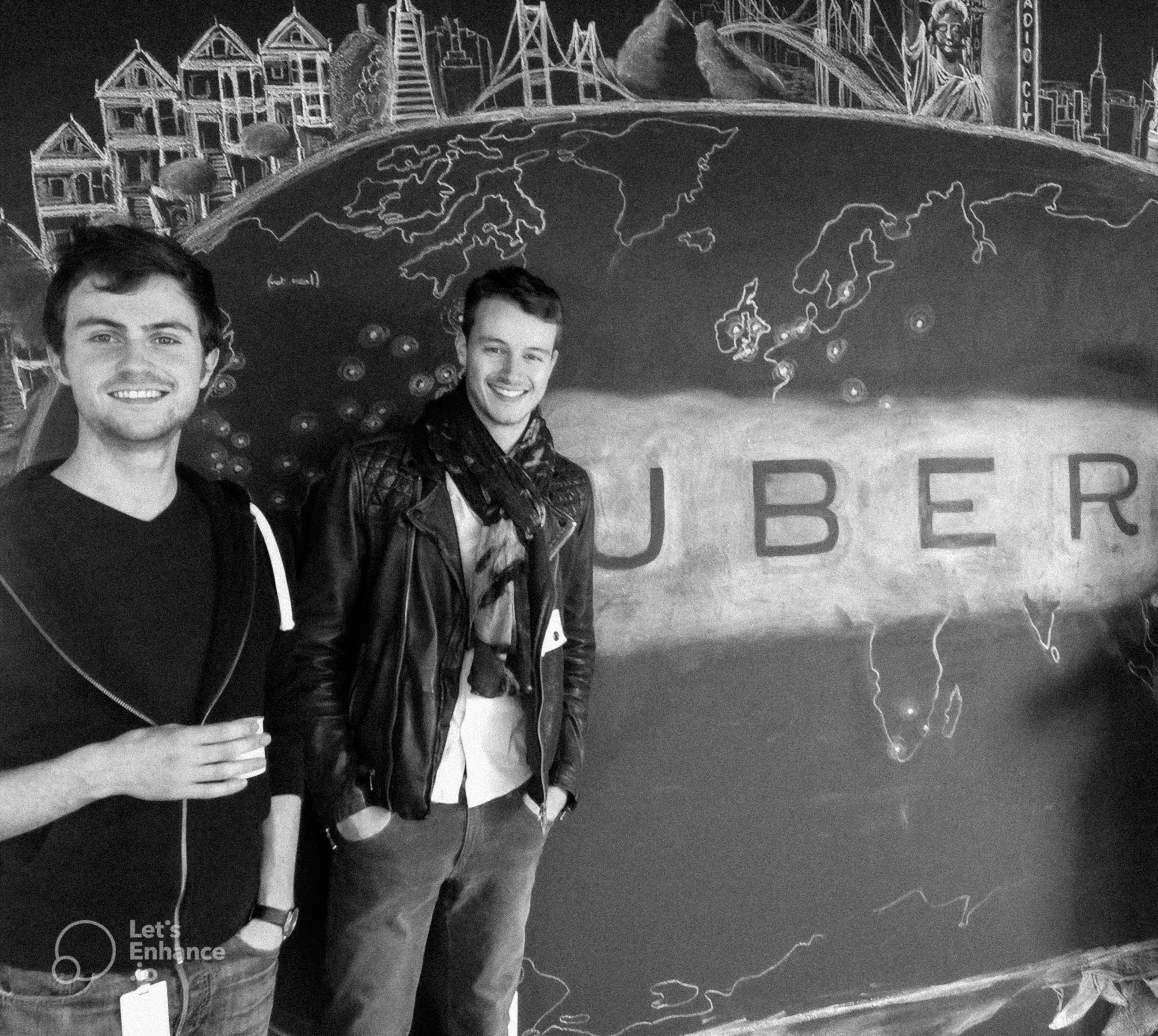
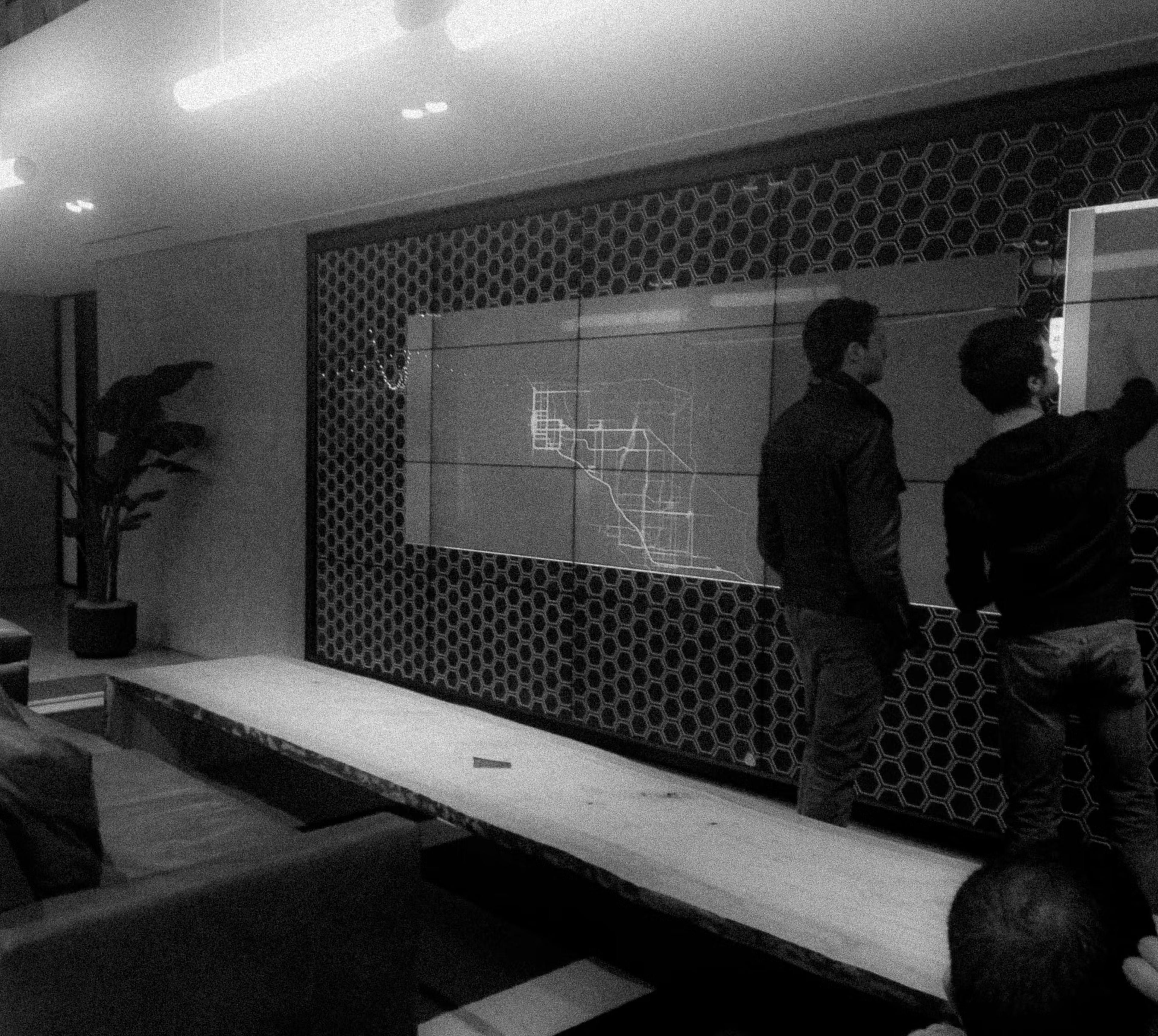
In the San Francisco of the late 2010s, at the heart of the technological and design effervescence, Uber decided to transform the job market with the launch of a new platform, Uber Works. Their ambition: to make it as easy as possible for employers and employees to get in touch, by optimizing the process. To achieve this goal, they called on us to design the UX for their mobile application. Revolutionizing the U.S. job market required a clear set of challenges to be met: to offer a fast, simple experience for finding a job or staff in a matter of seconds, with no concessions on working conditions, and maximum transparency on prices, dates and schedules. To design a tailor-made interface, we adopted an iterative approach centered on user testing. This process, both rapid and precise, enabled the application to evolve efficiently. Barthélémy first joined the product team at Uber's headquarters in San Francisco, before continuing the collaboration remotely from France. This dynamic was facilitated by the arrival of Figma on the market, a revolutionary tool that proved indispensable for a project of this scale. The launch of Uber Works in the Chicago market marked a key milestone. Members of the Uber team spent several months on site for intensive test phases with local employers, particularly restaurant owners, who were the first to be affected by recruitment challenges. The feedback loop was designed to maximize efficiency: Uber collected user feedback and passed it on to us, often during our night. In turn, we listened to restaurant owners' voices, implemented adjustments and new design features the next day, and then held daily Q&A sessions to fine-tune each iteration. This iterative cycle continued until we had an application perfectly adapted to the needs of the market.
Credits
Executive Direction
Barthélémy Chalvet
Web Design
Marine Chalvet
Categories
Visual identity
Mass market brands
Civic & Public Services
Professional Services
Finance
Testimonial

Rebranding Varsity, a European VC fund, with a warm and human identity built around one idea: founders think better when they're backed by more than one mind.
Celeres designs, integrates and supports the software and systems that critical missions depend on across space, defence, transport and public services. We created a strategic, visual and verbal identity, along with a new website, to reveal its essential role in environments where failure is not an option.

Alaska State Archives is a public institution responsible for preserving the state’s records. We redesigned the entire interface while respecting the institutional constraints of working with a government body, and brought Alaska’s history to the forefront by turning archival materials into core design elements.

For Pokémon’s 30th anniversary, Rimowa wanted more than a simple collaboration. Bruno reinterpreted its iconic aluminium suitcase through the visual language of Pokémon, creating an object where both worlds feel naturally connected.
Rebranding Varsity, a European VC fund, with a warm and human identity built around one idea: founders think better when they're backed by more than one mind.
Celeres designs, integrates and supports the software and systems that critical missions depend on across space, defence, transport and public services. We created a strategic, visual and verbal identity, along with a new website, to reveal its essential role in environments where failure is not an option.
Alaska State Archives is a public institution responsible for preserving the state’s records. We redesigned the entire interface while respecting the institutional constraints of working with a government body, and brought Alaska’s history to the forefront by turning archival materials into core design elements.
For Pokémon’s 30th anniversary, Rimowa wanted more than a simple collaboration. Bruno reinterpreted its iconic aluminium suitcase through the visual language of Pokémon, creating an object where both worlds feel naturally connected.
Qonto turned to the agency to lay the foundations of its brand universe. From digital design to web development, including the credit card design, the goal was to inject energy into a fast-growing brand.
Rebranding Varsity, a European VC fund, with a warm and human identity built around one idea: founders think better when they're backed by more than one mind.
Celeres designs, integrates and supports the software and systems that critical missions depend on across space, defence, transport and public services. We created a strategic, visual and verbal identity, along with a new website, to reveal its essential role in environments where failure is not an option.
Alaska State Archives is a public institution responsible for preserving the state’s records. We redesigned the entire interface while respecting the institutional constraints of working with a government body, and brought Alaska’s history to the forefront by turning archival materials into core design elements.
For Pokémon’s 30th anniversary, Rimowa wanted more than a simple collaboration. Bruno reinterpreted its iconic aluminium suitcase through the visual language of Pokémon, creating an object where both worlds feel naturally connected.