
Varsity
Rebranding Varsity, a European VC fund, with a warm and human identity built around one idea: founders think better when they're backed by more than one mind.
Informations
For work, and everything else
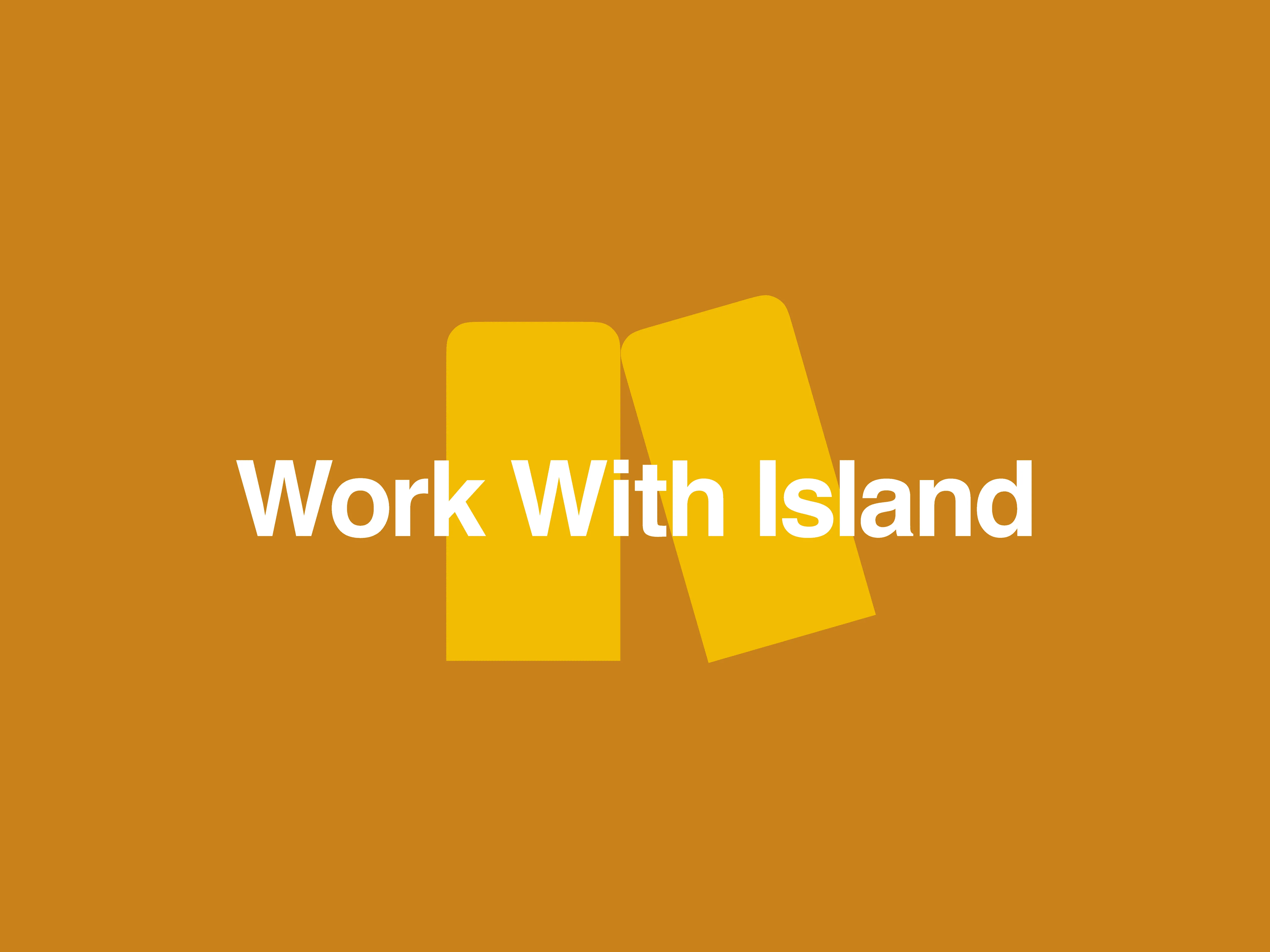
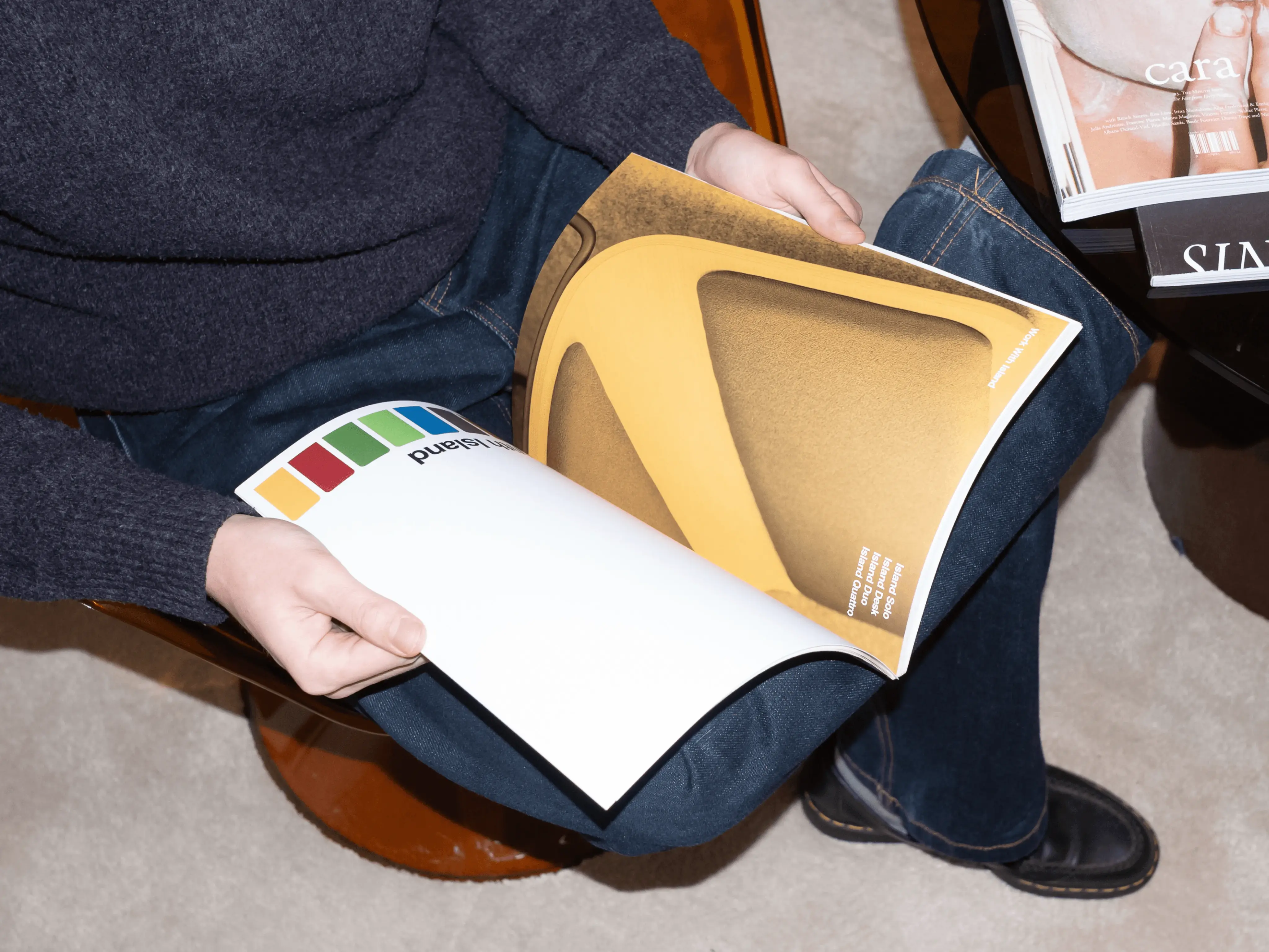
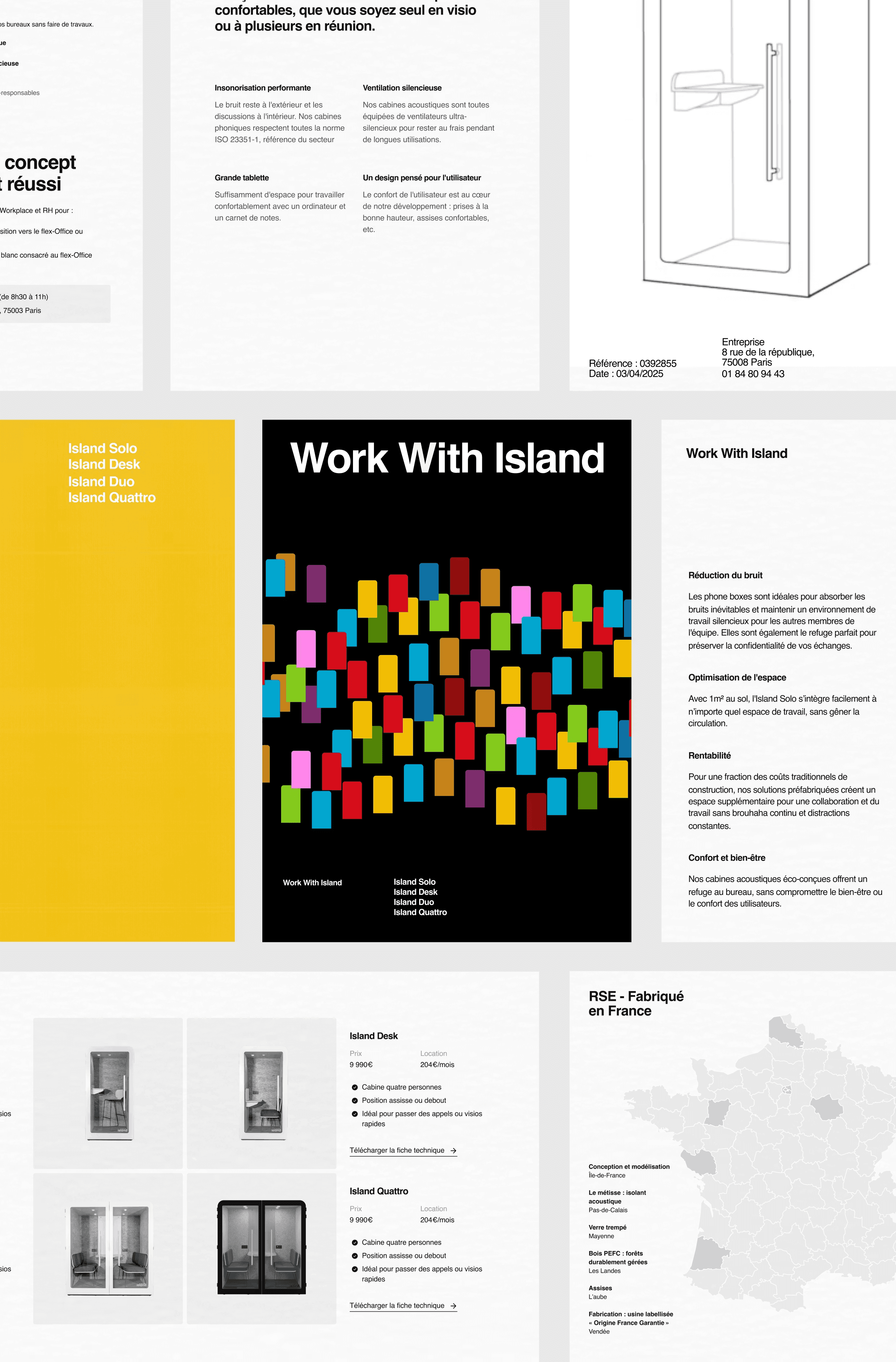
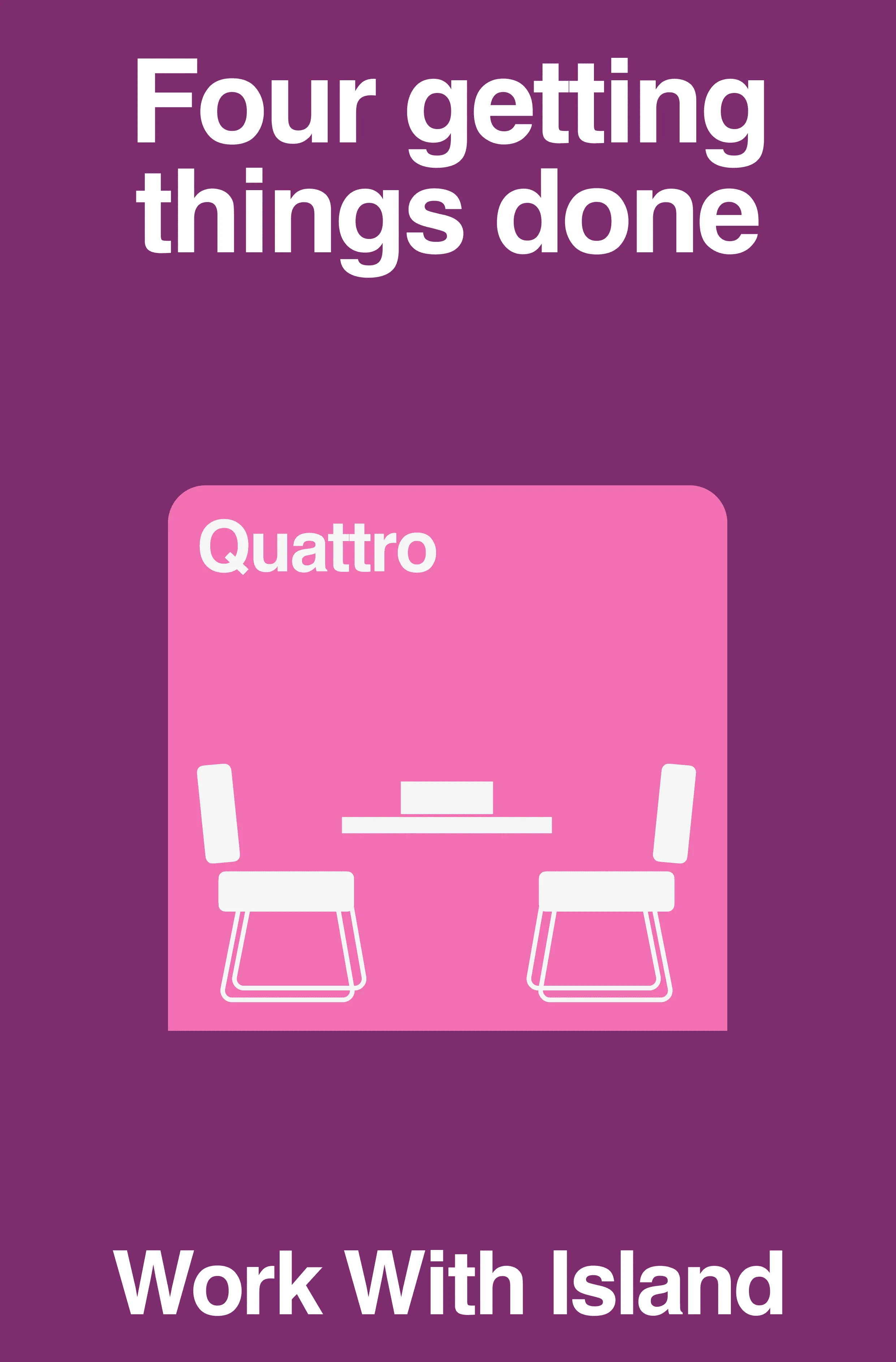
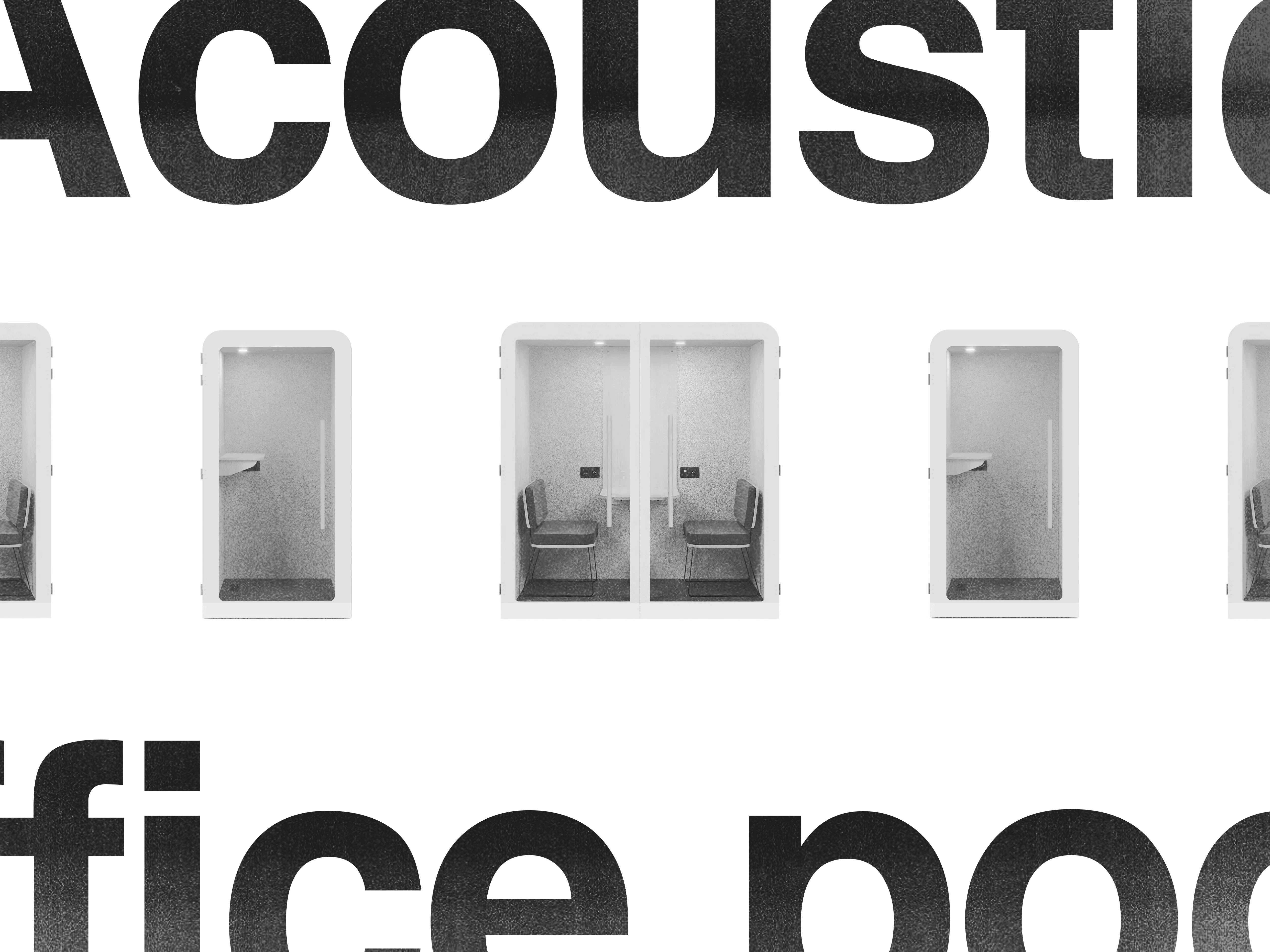
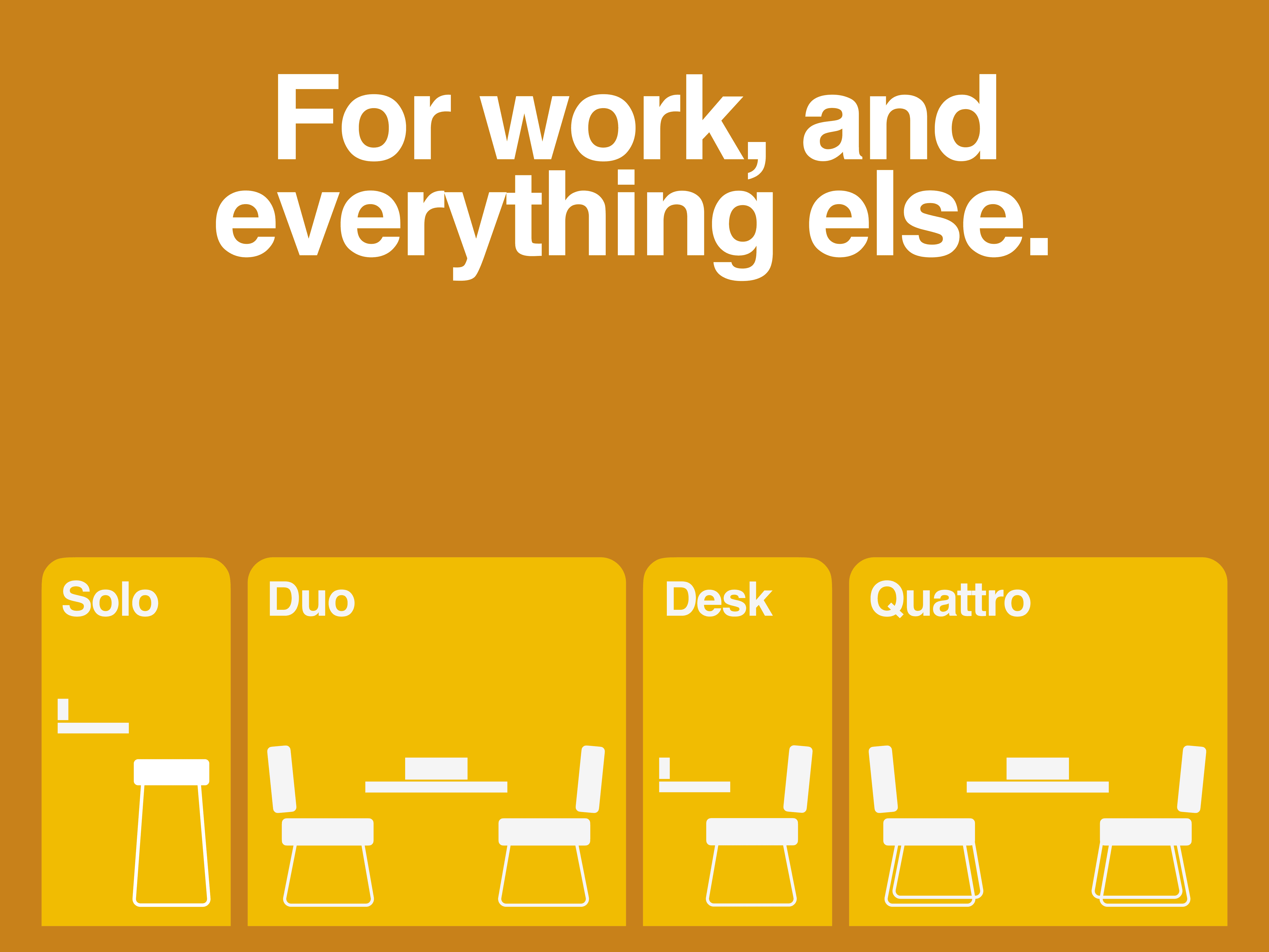
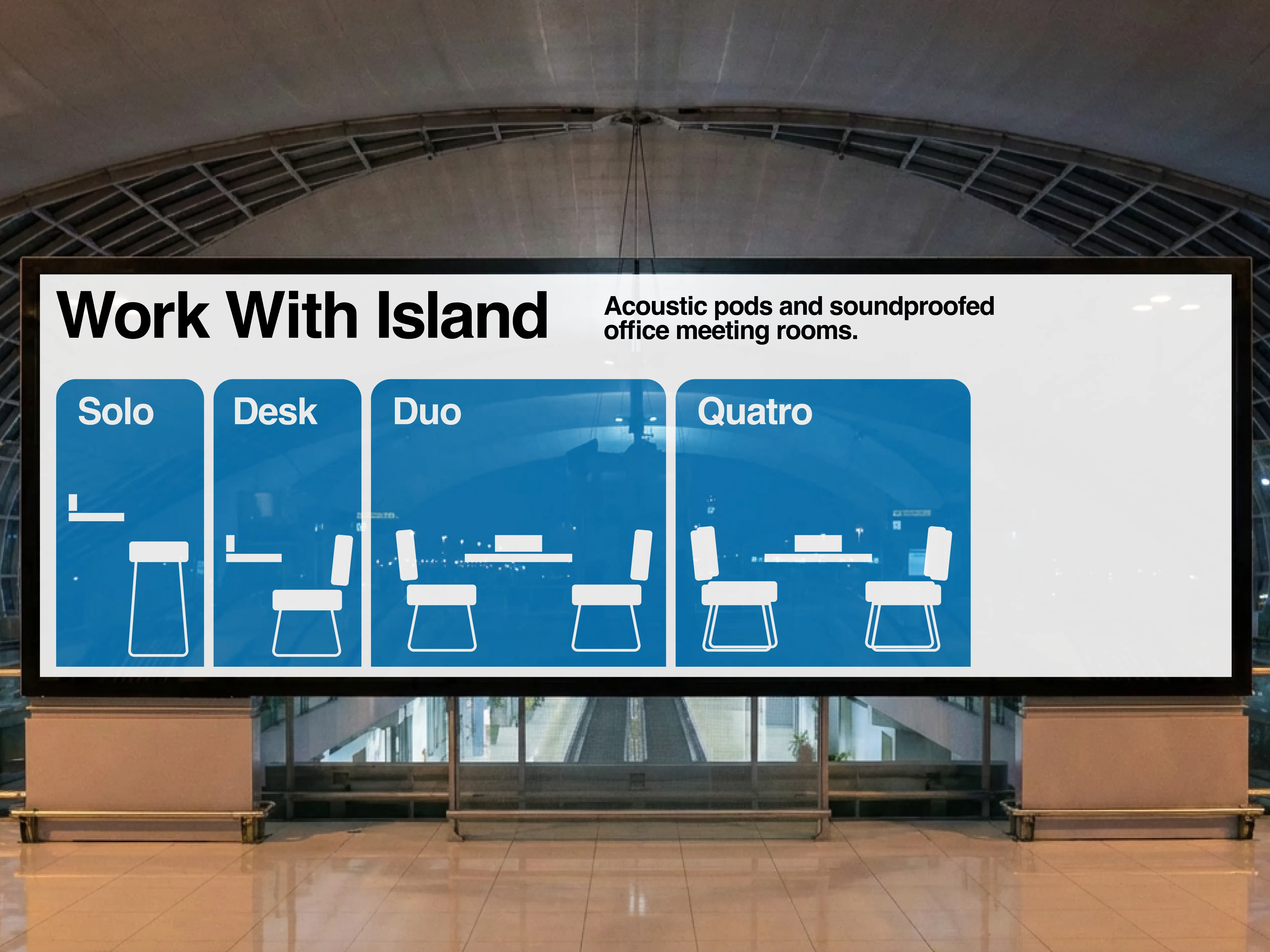
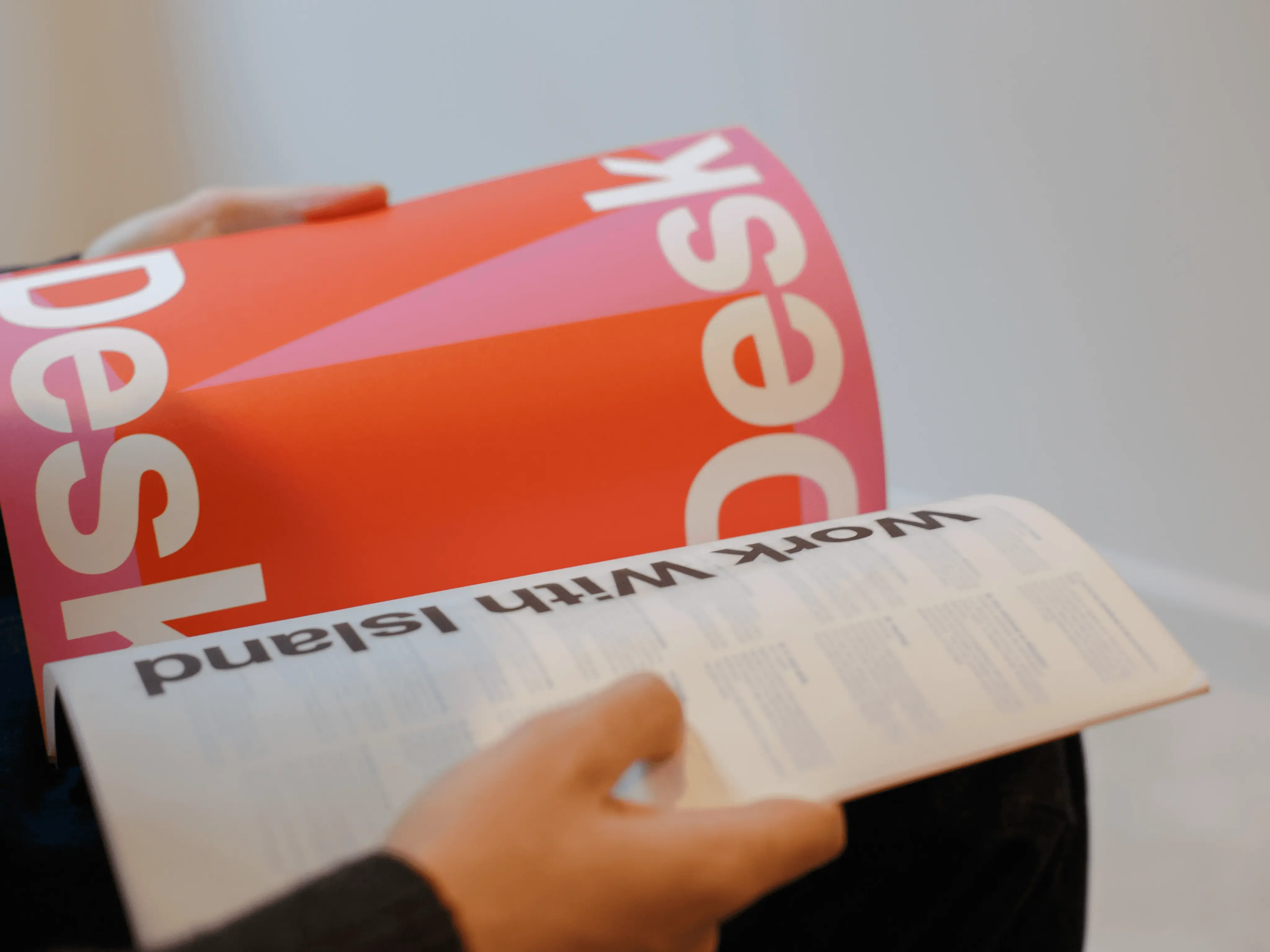
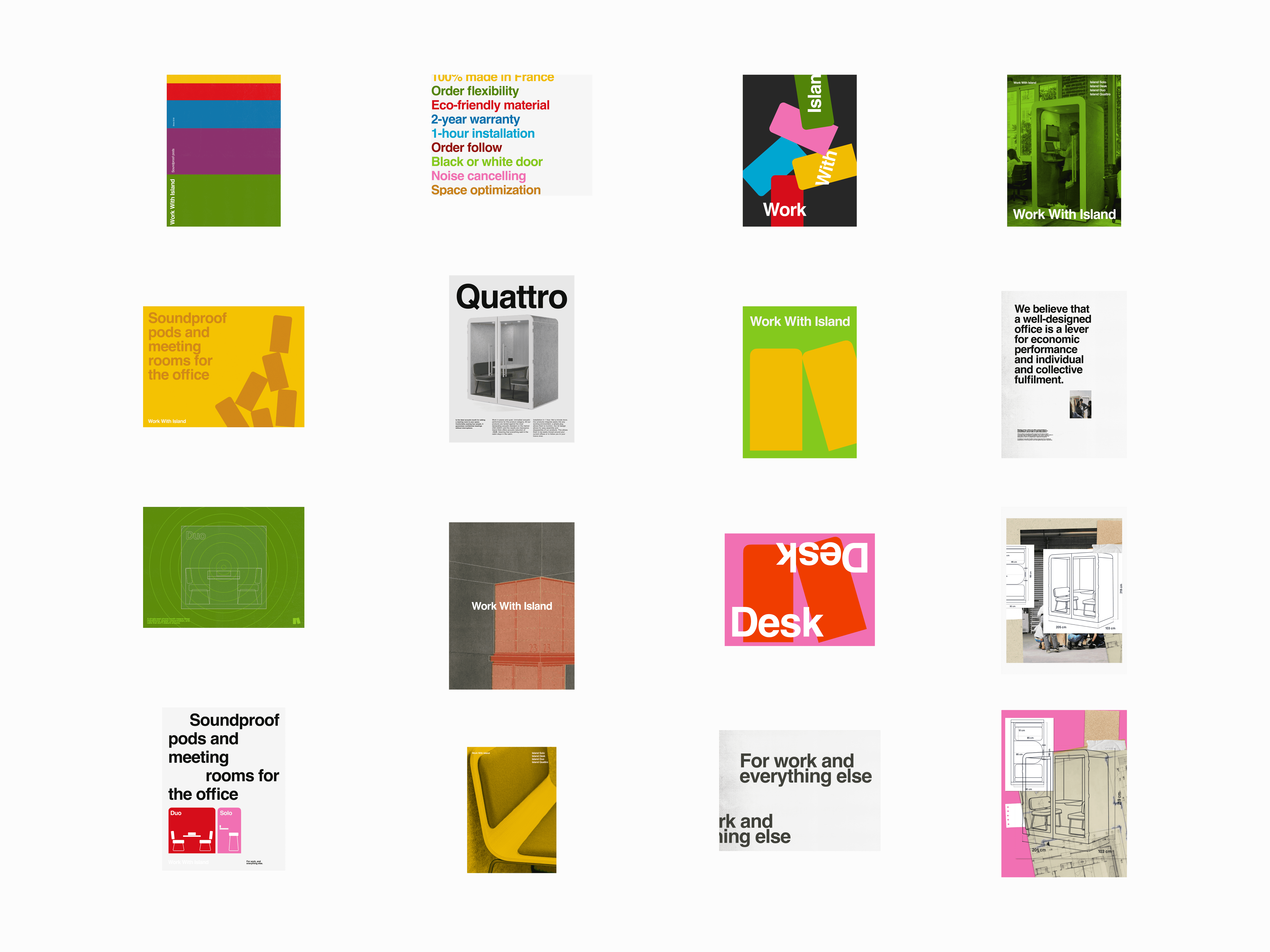
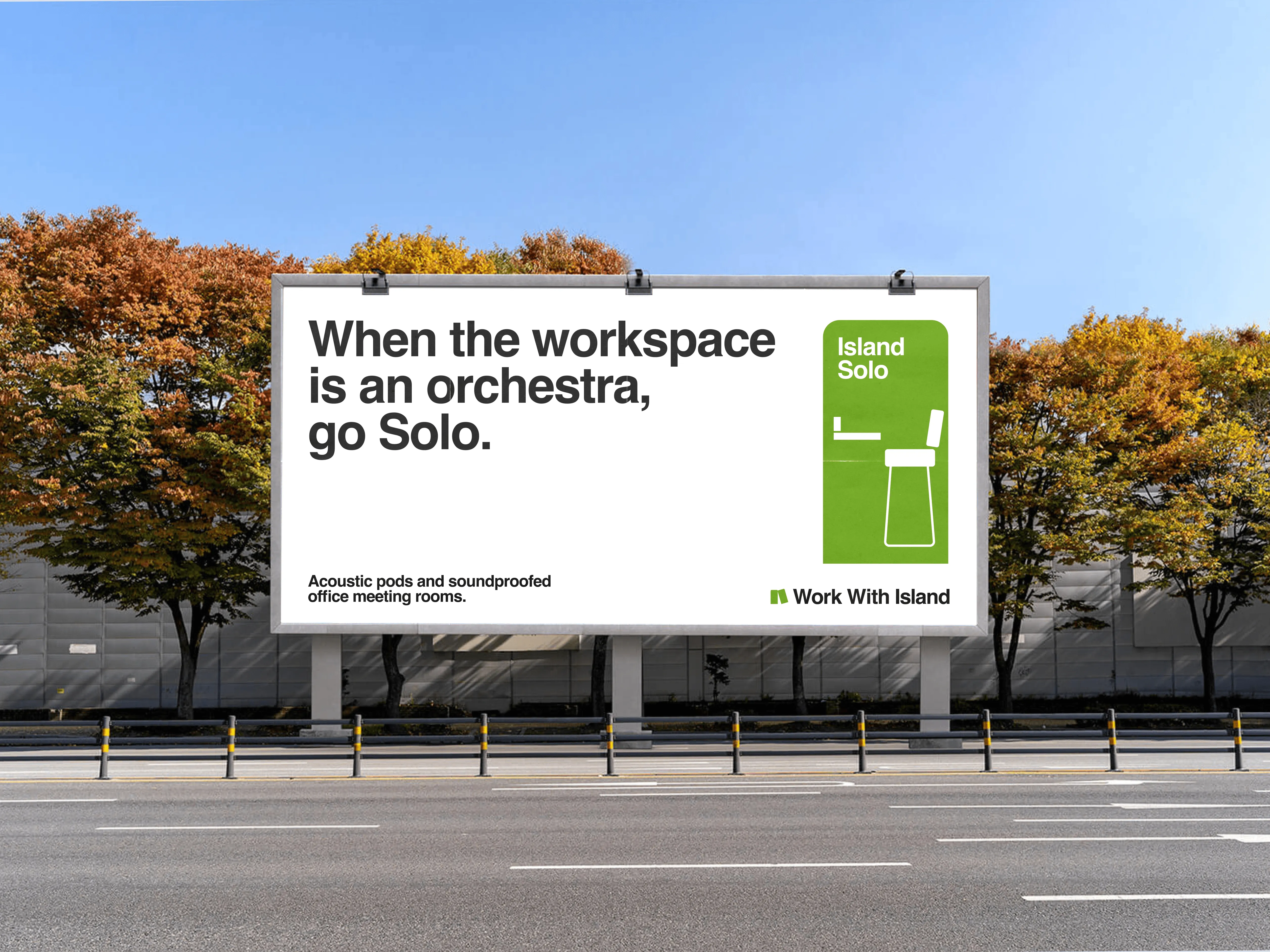
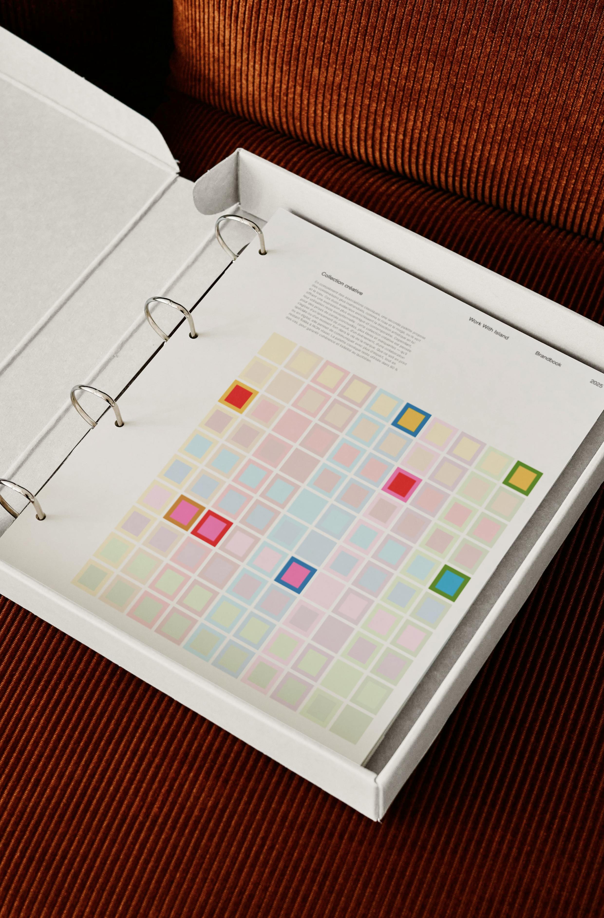
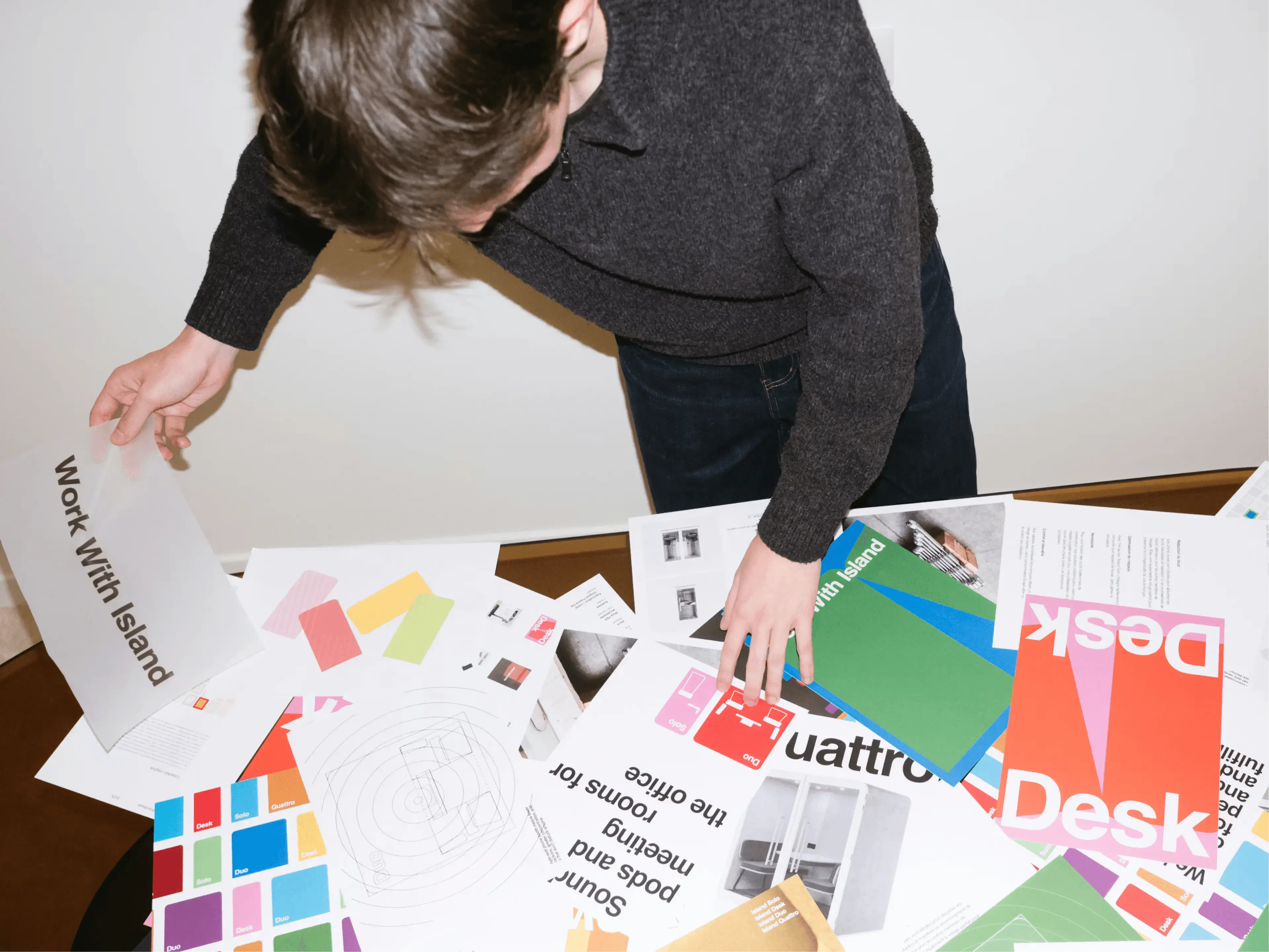
Work With Island is a vision of freedom. In its earlier campaigns, a sense of creativity was already present, and above all, the idea that an office pod isn’t solely about work. This was the foundation of our strategic thinking: the workspace of tomorrow is a hybrid space, where individuality must have a place. The brand promise followed naturally: to let the personal flow into the workplace, without letting it get in the way of the actual work. Speaking directly to the end user, the employee, was a deliberate choice. In the end, they are the gateway to the real business target: business owners and office managers. To elevate the brand to the level of this promise, we anchored it in furniture culture. Work With Island should be the one that dresses the new standard for workspaces. Simple. Modern. Universal. In art direction, our teams drew both from the legacy of Bauhaus, founding school of “design for all”, and from the contemporary codes of mass-market brands. The result: a timeless, grounded logo inspired by everyday icons like Scotch or Tupperware, a palette of bold primary colours, and the world’s most recognisable typeface, chosen for its radical legibility. Playfulness steps in through the graphic language, built around the distinctive rounded form of Work With Island pods. This shape becomes a modular system that can be endlessly reimagined. As for copywriting, it had to carry the voice of leadership: a brand confident enough to lay its conviction on the table.
Credits
Executive Direction
Leonard Chalvet, Barthelemy Chalvet
Strategic Planning
Camille Perez
Creative Direction
Pierre Jeannelle
Art Direction
Pierre Jeannelle, Yoann Verzeletti
Copywriting
Pierre Jeannelle, Léa Texier
Web Design
Yoann Verzeletti, Florian Serre
Web Development
Thomas Sanouiller
Motion design
Maël Masson, Shayan Fabre
Project Management
Paul Mathieu-Colin
Categories
Digital
Verbal identity
Visual identity
Strategic identity
Development
Marketing
Industry & Manufacturing
Professional Services





Rebranding Varsity, a European VC fund, with a warm and human identity built around one idea: founders think better when they're backed by more than one mind.
Celeres designs, integrates and supports the software and systems that critical missions depend on across space, defence, transport and public services. We created a strategic, visual and verbal identity, along with a new website, to reveal its essential role in environments where failure is not an option.

Alaska State Archives is a public institution responsible for preserving the state’s records. We redesigned the entire interface while respecting the institutional constraints of working with a government body, and brought Alaska’s history to the forefront by turning archival materials into core design elements.

For Pokémon’s 30th anniversary, Rimowa wanted more than a simple collaboration. Bruno reinterpreted its iconic aluminium suitcase through the visual language of Pokémon, creating an object where both worlds feel naturally connected.
Rebranding Varsity, a European VC fund, with a warm and human identity built around one idea: founders think better when they're backed by more than one mind.
Celeres designs, integrates and supports the software and systems that critical missions depend on across space, defence, transport and public services. We created a strategic, visual and verbal identity, along with a new website, to reveal its essential role in environments where failure is not an option.
Alaska State Archives is a public institution responsible for preserving the state’s records. We redesigned the entire interface while respecting the institutional constraints of working with a government body, and brought Alaska’s history to the forefront by turning archival materials into core design elements.
For Pokémon’s 30th anniversary, Rimowa wanted more than a simple collaboration. Bruno reinterpreted its iconic aluminium suitcase through the visual language of Pokémon, creating an object where both worlds feel naturally connected.
Qonto turned to the agency to lay the foundations of its brand universe. From digital design to web development, including the credit card design, the goal was to inject energy into a fast-growing brand.
Rebranding Varsity, a European VC fund, with a warm and human identity built around one idea: founders think better when they're backed by more than one mind.
Celeres designs, integrates and supports the software and systems that critical missions depend on across space, defence, transport and public services. We created a strategic, visual and verbal identity, along with a new website, to reveal its essential role in environments where failure is not an option.
Alaska State Archives is a public institution responsible for preserving the state’s records. We redesigned the entire interface while respecting the institutional constraints of working with a government body, and brought Alaska’s history to the forefront by turning archival materials into core design elements.
For Pokémon’s 30th anniversary, Rimowa wanted more than a simple collaboration. Bruno reinterpreted its iconic aluminium suitcase through the visual language of Pokémon, creating an object where both worlds feel naturally connected.