
HelloAsso
HelloAsso is the management platform for non-profits, free and built on solidarity. Bruno created a strategic, verbal and visual identity, based on a new brand architecture, that gives a face to the individuals behind every collective.

Paris
Barthélémy Chalvet
Co-founder & CEO
27 Rue de Liège
75008 Paris
+33 6 22 25 78 97
barthelemy@bruno.co
London
Léonard Chalvet
Co-founder & COO
32 Blackfriars Road
London SE1 8PB
+44 7488 812915
leonard@bruno.co
Informations
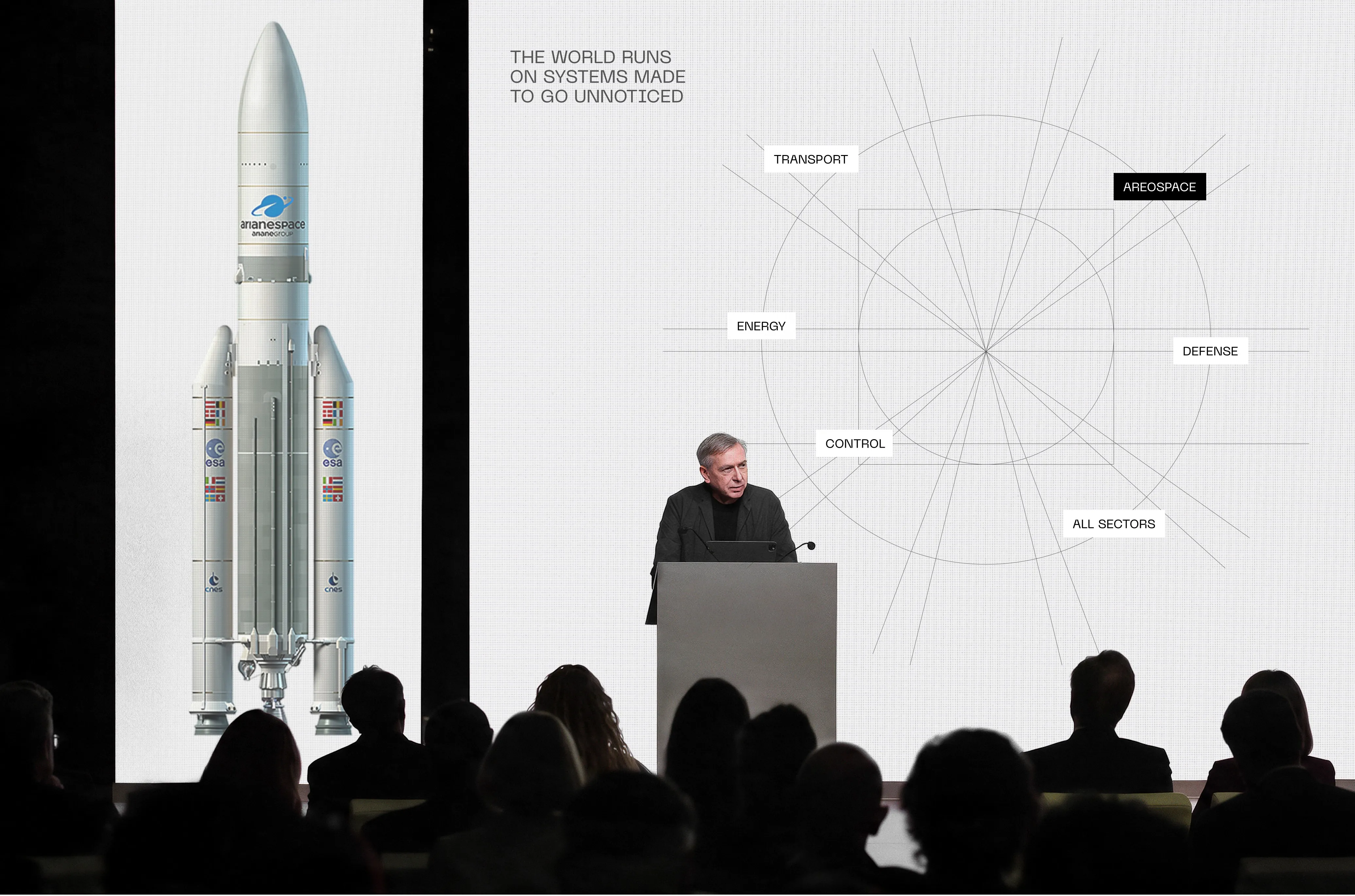
The world runs on systems made to go unnoticed.
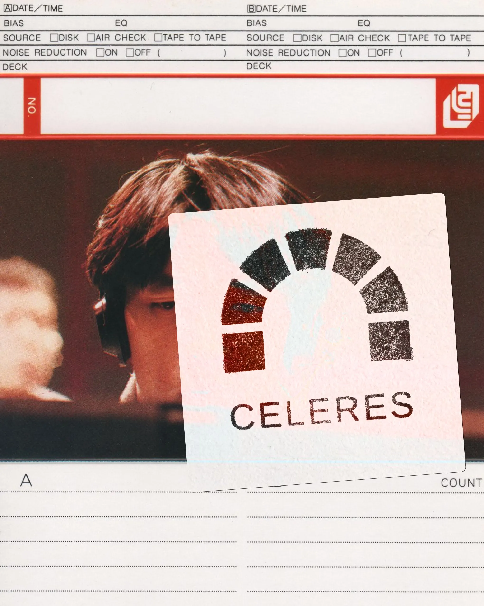
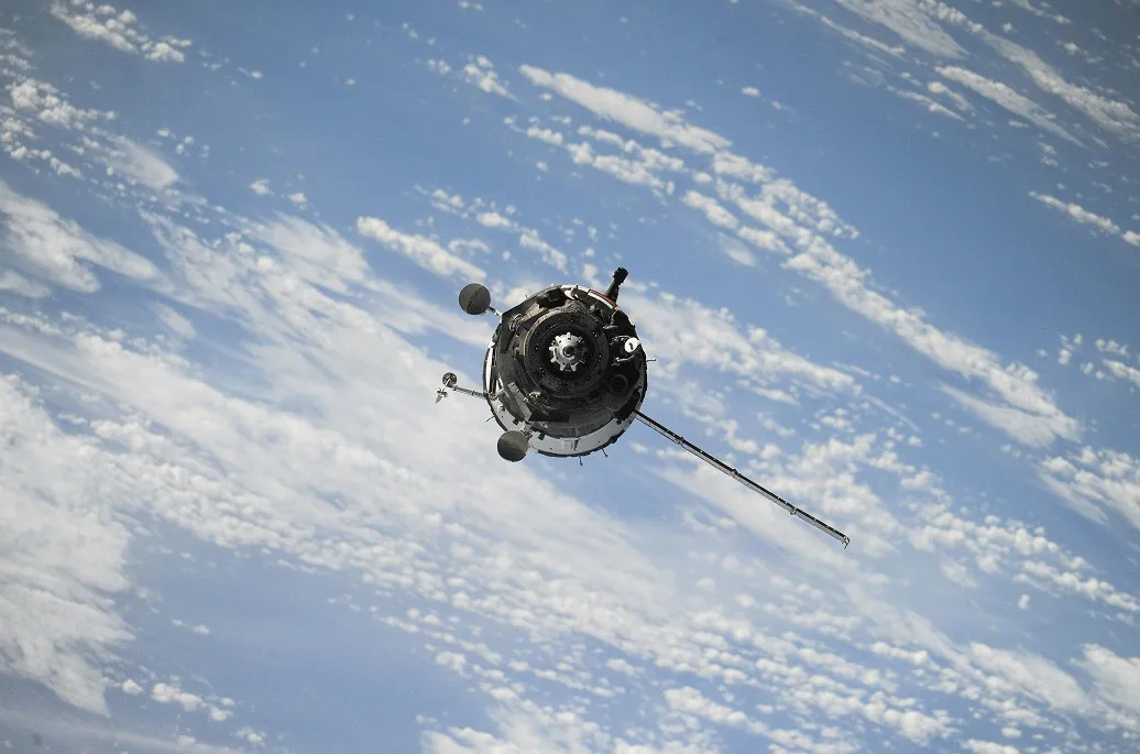
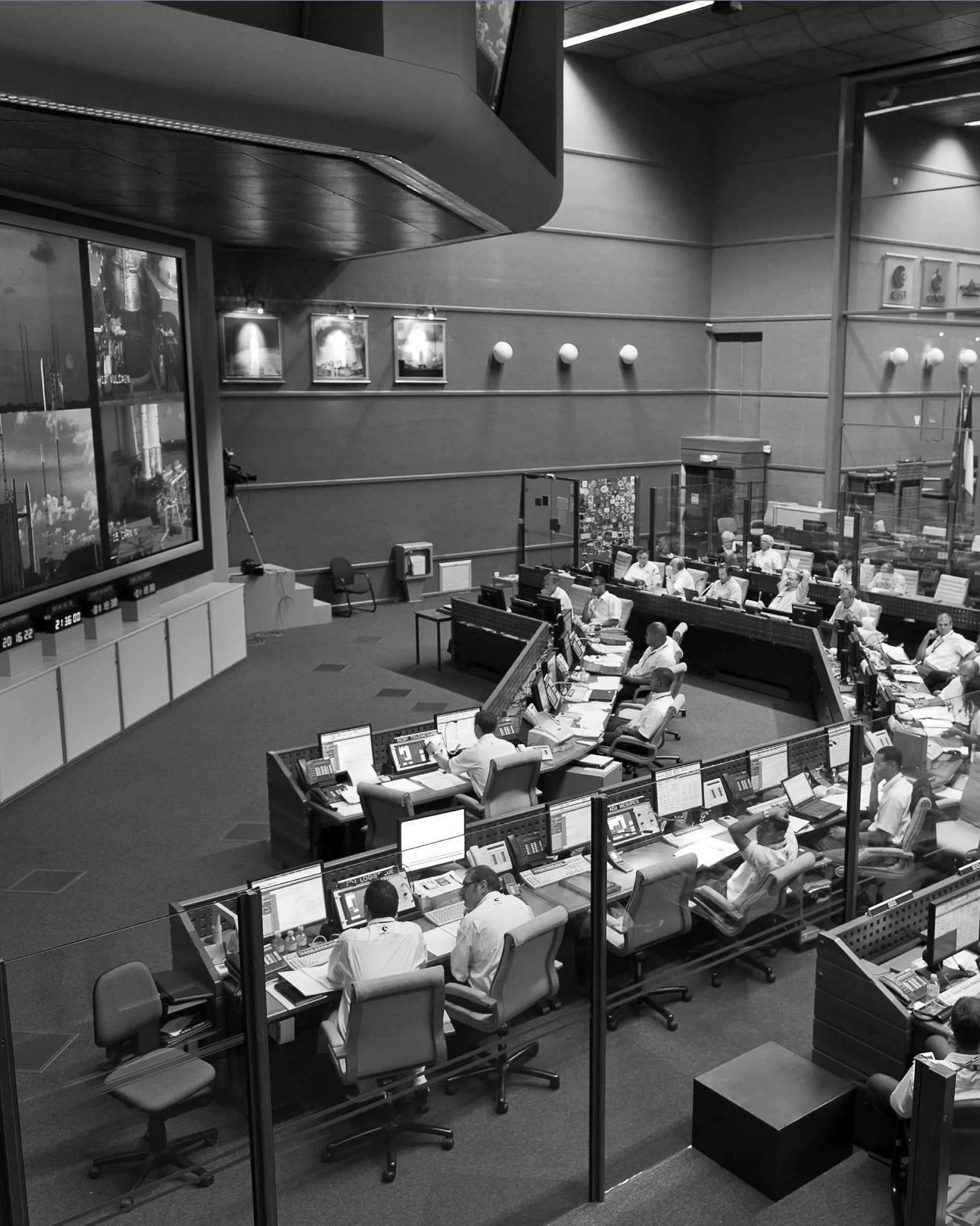
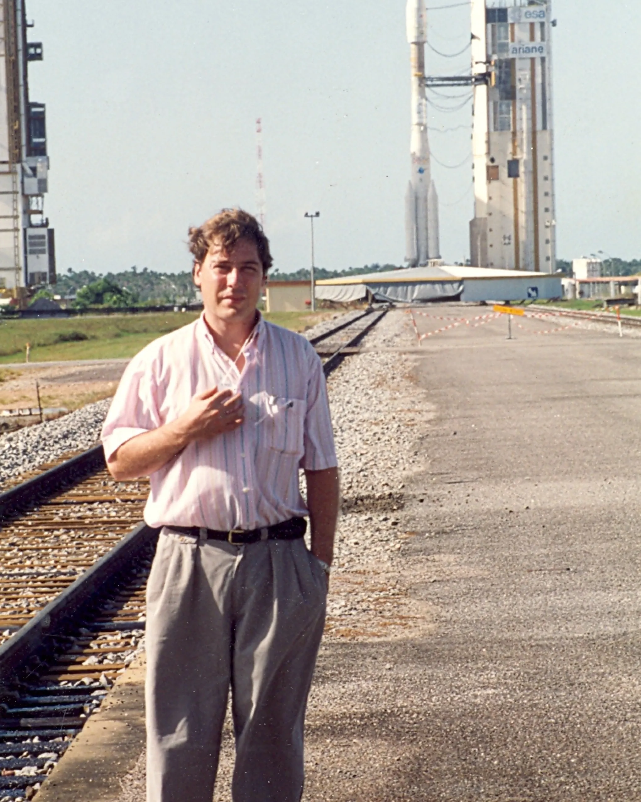
When GTD Space Security breaks away from its parent company to become Celeres, the challenge is not to reinvent itself, but to reveal what has always been there. Celeres brings thirty-nine years of critical engineering expertise across space, defence and energy, operating systems for environments where failure is not an option. At Kourou, the company is responsible for the security of France’s space launch site. Ground control, telemetry, real-time monitoring: when a rocket launches without incident, no one notices the absence of an incident. That was the starting point for our strategic positioning. Some of history’s most critical advances rely on invisible infrastructure. Celeres has always been that essential foundation, and its brand baseline captures this role precisely. The logo was therefore conceived as a keystone, the wedge-shaped stone placed at the top of an arch to lock the whole structure into place. The symbol also pays tribute to the company’s Franco-Spanish identity. Southern Romanesque architecture developed on both sides of the Pyrenees within a shared cultural landscape, long before borders divided it. Drawing on the same inspiration, the art direction embraces a deliberate paradox: making visible what usually goes unnoticed. Grids, margins and construction lines, the very elements that structure a layout but disappear from its final rendering, become the identity’s central motif. This was paired with technical typography, generous negative space and a restrained colour palette. Strategic, visual and verbal identity, website design and development, marketing and launch materials give Celeres a voice and a face, essential assets in making the company recognisable to future partners.
Credits
Executive Direction
Léonard Chalvet
Strategic Planning
Romain Quédreux
Creative Direction
Pierre Jeannelle
Art Direction
Claudia Carvalho
Copywriting
Léa Texier
Web Design
Louis Prochwicz
Web Development
Jim Zona
Motion design
Shayan Fabre
Project Management
Julie Comandu
Categories
Informations
The world runs on systems made to go unnoticed.
When GTD Space Security breaks away from its parent company to become Celeres, the challenge is not to reinvent itself, but to reveal what has always been there. Celeres brings thirty-nine years of critical engineering expertise across space, defence and energy, operating systems for environments where failure is not an option. At Kourou, the company is responsible for the security of France’s space launch site. Ground control, telemetry, real-time monitoring: when a rocket launches without incident, no one notices the absence of an incident. That was the starting point for our strategic positioning. Some of history’s most critical advances rely on invisible infrastructure. Celeres has always been that essential foundation, and its brand baseline captures this role precisely. The logo was therefore conceived as a keystone, the wedge-shaped stone placed at the top of an arch to lock the whole structure into place. The symbol also pays tribute to the company’s Franco-Spanish identity. Southern Romanesque architecture developed on both sides of the Pyrenees within a shared cultural landscape, long before borders divided it. Drawing on the same inspiration, the art direction embraces a deliberate paradox: making visible what usually goes unnoticed. Grids, margins and construction lines, the very elements that structure a layout but disappear from its final rendering, become the identity’s central motif. This was paired with technical typography, generous negative space and a restrained colour palette. Strategic, visual and verbal identity, website design and development, marketing and launch materials give Celeres a voice and a face, essential assets in making the company recognisable to future partners.
Credits
Executive Direction
Léonard Chalvet
Strategic Planning
Romain Quédreux
Creative Direction
Pierre Jeannelle
Art Direction
Claudia Carvalho
Copywriting
Léa Texier
Web Design
Louis Prochwicz
Web Development
Jim Zona
Motion design
Shayan Fabre
Project Management
Julie Comandu
Categories






HelloAsso is the management platform for non-profits, free and built on solidarity. Bruno created a strategic, verbal and visual identity, based on a new brand architecture, that gives a face to the individuals behind every collective.

For Pokémon’s 30th anniversary, Rimowa wanted more than a simple collaboration. Bruno reinterpreted its iconic aluminium suitcase through the visual language of Pokémon, creating an object where both worlds feel naturally connected.

McDonald’s Le Havre Docks and McDonald’s Grand Quevilly launched 24/7 home delivery; Bruno was given full creative freedom to design an outdoor campaign reaching a broad audience, from students to night-shift workers.
Bruno carried out a complete rebranding of Ornikar, the companion for young people and their families on the road and in life. From art direction to product, including messaging, UX/UI, illustration and web, Ornikar has become a more mature, established brand while still speaking to the younger generation – the very one it has now become a reference for.
HelloAsso is the management platform for non-profits, free and built on solidarity. Bruno created a strategic, verbal and visual identity, based on a new brand architecture, that gives a face to the individuals behind every collective.
For Pokémon’s 30th anniversary, Rimowa wanted more than a simple collaboration. Bruno reinterpreted its iconic aluminium suitcase through the visual language of Pokémon, creating an object where both worlds feel naturally connected.
McDonald’s Le Havre Docks and McDonald’s Grand Quevilly launched 24/7 home delivery; Bruno was given full creative freedom to design an outdoor campaign reaching a broad audience, from students to night-shift workers.
Bruno carried out a complete rebranding of Ornikar, the companion for young people and their families on the road and in life. From art direction to product, including messaging, UX/UI, illustration and web, Ornikar has become a more mature, established brand while still speaking to the younger generation – the very one it has now become a reference for.
Until now, Qwant was the search engine that knew nothing about you. That’s still true — but there are a few new developments. Qwant is positioning itself as a pioneer by integrating AI into its product and is gradually, yet steadily, moving toward independent indexing.
HelloAsso is the management platform for non-profits, free and built on solidarity. Bruno created a strategic, verbal and visual identity, based on a new brand architecture, that gives a face to the individuals behind every collective.
For Pokémon’s 30th anniversary, Rimowa wanted more than a simple collaboration. Bruno reinterpreted its iconic aluminium suitcase through the visual language of Pokémon, creating an object where both worlds feel naturally connected.
McDonald’s Le Havre Docks and McDonald’s Grand Quevilly launched 24/7 home delivery; Bruno was given full creative freedom to design an outdoor campaign reaching a broad audience, from students to night-shift workers.
Bruno carried out a complete rebranding of Ornikar, the companion for young people and their families on the road and in life. From art direction to product, including messaging, UX/UI, illustration and web, Ornikar has become a more mature, established brand while still speaking to the younger generation – the very one it has now become a reference for.
HelloAsso is the management platform for non-profits, free and built on solidarity. Bruno created a strategic, verbal and visual identity, based on a new brand architecture, that gives a face to the individuals behind every collective.
For Pokémon’s 30th anniversary, Rimowa wanted more than a simple collaboration. Bruno reinterpreted its iconic aluminium suitcase through the visual language of Pokémon, creating an object where both worlds feel naturally connected.
McDonald’s Le Havre Docks and McDonald’s Grand Quevilly launched 24/7 home delivery; Bruno was given full creative freedom to design an outdoor campaign reaching a broad audience, from students to night-shift workers.
Bruno carried out a complete rebranding of Ornikar, the companion for young people and their families on the road and in life. From art direction to product, including messaging, UX/UI, illustration and web, Ornikar has become a more mature, established brand while still speaking to the younger generation – the very one it has now become a reference for.